


SplashBoogie
-
Posts
284 -
Joined
-
Last visited
Posts posted by SplashBoogie
-
-
On 6/28/2017 at 8:48 PM, oldschoolvikings said:
Another Buccaneers' concept. This one gives them the chance to use a throwback;
I'll never understand why everyone is so in love with the Creamsicles. They weren't good uniforms and they weren't a good team wearing them. But if you must, this is a pretty inoffensive way to give them the throw back option. I echo the home base needing to be red and keeping the orange solely for the alt. I'd keep the flag red too.
Pretty cold on an all pewter alt. We already hate how Jacksonville looks in all gold, do we really want a duller version of that?
-
On 3/31/2017 at 4:41 PM, ImmortalChef said:
When I see this logo, I feel a rush of emotions, and none of them are failure
I love the Bucs but losing your first 26 games and going 13 years between winning records is failure.
-
 2
2
-
-
I honestly cannot believe my boy made it this far without a shoutout

-
1
-
-
The Stars have won of the bottom 5 NHL logos, there's nothing cool or clever or classy about it whatsoever.
I love their jerseys but hate the logo. They could have easily just recolored what they had, despite what the owner or whoever was said when they were unveiled.
I think they should've went with an entirely different identity when they left Minneapolis. I get the nod to the North Stars, but I've just never been a fan of what they later became (adding black for the most of it). I also think it looks incredibly weird that a Dallas-based team isn't using blue, but that's more of a personal perspective of mine. I still think their current look is the best they've ever looked as the "Dallas Stars".
Also, I would've prefer if they went with "Texas" instead of "Dallas" because they're the only NHL team in their state.
I'm excited to see Michigan Red Wings and the Massachusetts Bruins start up next season.
-
I see this and all I see are the Detroit Lions.
-
1
-
-
So roundels somehow make ads okay? I must say I do not understand that logic whatsoever.
Since NBA teams are moving toward roundel usage anyways I think either something like MLS/Premier League do with their uniforms wouldn't be the worst thing on Earth.
How the **** can it be done properly? Don't give me the crap that a little patch wouldn't be too bad, it's still horrendously out of place and a disgusting symbol of greed.Oh three more things
-Throwback for throwback's sake is worse than BFBS
-The new Bucks rebrand top to bottom sucks
-Sleeved NBA jerseys don't bug me that much and if done properly I wouldn't mind ads on NBA jerseys.
Obviously, it's clear to see how it can be viewed as "greedy", and I'm not hoping for it in any way, but there are companies out there that desperately want to advertise in avenues that are as marketable as NBA jerseys, so you could argue that denying them that privilege for something as silly as aesthetic value is also greedy.. Like I said, I'm not for it, and I'm a huge fan of maintaining the aesthetic integrity, but this is a business we're taking about, and they're in business to make money
Also in a reasonable world, the NBA would lose money from ads because the they'd turn fans off, but obviously most sports fans these days have become drones who will blindly accept anything their team shoves at them.
No. What I am saying is we have a template for how to make uniforms work with ads, be unique and still display the team logo. Do you think EPL fans are pissing and moaning like "Wow I'd love to buy this Man U logo if it wasn't for this dang corporate logo on the front. I guess I won't buy it!"
And if you think the number of fans who will stop buying gear because of sponsors on the jerseys will outweigh the money a theoretical sponsor would bring to team/league I've got a bridge to sell you.
-
I agree. In theory, I should hate Dallas's mismatched blues but in practice I prefer it. The concepts never look as good as I'd think they would.
I have not seen a single concept on these boards or elsewhere where the unified blue looks as good as the current look. People always go with the dark blue and I really don't care for how that looks on the whites with the silver-green pants, which I also defend. Cowboys have the best look in the NFL. No tweaks needed
I agree with most of these, don't know what the last one means but why is it OK for the cowboys to have two different blues??? It'd be such a simple fix and it would look so much better-The Dallas Mavericks should never have green in their uniform set again
-The Dallas Cowboys having two different blues is fine.
-The Buccaneers should NEVER go back to the Creamsicles (seriously, why would you want to wear a get up named after ice cream)
-The Miami Marlins current logo is great. Not every team is the Yankees and a 90s team from Florida shouldn't be pretending like it is.
-All Original Six teams, their mythos and their uniforms are highly overrated.
And to the O6 everything about it is overrated. It's super easy to stack 24 championships when you won 13 of them when there were only six teams in the league. It's like is anyone proud of going to the playoffs in the Arena Football League? 2/3 of your conference goes to the playoffs because it's a joke set up. NHL was little league until 1967 in terms of number of teams.
I just don't see it. How does navy look good with tiny amounts of royal blue and black? The "fixed" jersey concepts always look better to me
I just don't see it. How does navy look good with tiny amounts of royal blue and black? The "fixed" jersey concepts always look better to me
I just don't see it. How does navy look good with tiny amounts of royal blue and black? The "fixed" jersey concepts always look better to me
I just don't see it. How does navy look good with tiny amounts of royal blue and black? The "fixed" jersey concepts always look better to me
I just don't see it. How does navy look good with tiny amounts of royal blue and black? The "fixed" jersey concepts always look better to me
I just don't see it. How does navy look good with tiny amounts of royal blue and black? The "fixed" jersey concepts always look better to me
I just don't see it. How does navy look good with tiny amounts of royal blue and black? The "fixed" jersey concepts always look better to me
I just don't see it. How does navy look good with tiny amounts of royal blue and black? The "fixed" jersey concepts always look better to me
Once is fine Sleuth and that's fine if you don't agree with me. If everyone held my opinion it wouldn't be very unpopular now would it
-
How the **** can it be done properly? Don't give me the crap that a little patch wouldn't be too bad, it's still horrendously out of place and a disgusting symbol of greed.Oh three more things
-Throwback for throwback's sake is worse than BFBS
-The new Bucks rebrand top to bottom sucks
-Sleeved NBA jerseys don't bug me that much and if done properly I wouldn't mind ads on NBA jerseys.
Obviously, it's clear to see how it can be viewed as "greedy", and I'm not hoping for it in any way, but there are companies out there that desperately want to advertise in avenues that are as marketable as NBA jerseys, so you could argue that denying them that privilege for something as silly as aesthetic value is also greedy.. Like I said, I'm not for it, and I'm a huge fan of maintaining the aesthetic integrity, but this is a business we're taking about, and they're in business to make money
Since NBA teams are moving toward roundel usage anyways I think either something like MLS/Premier League do with their uniforms wouldn't be the worst thing on Earth.
-
Oh three more things
-Throwback for throwback's sake is worse than BFBS
-The new Bucks rebrand top to bottom sucks
-Sleeved NBA jerseys don't bug me that much and if done properly I wouldn't mind ads on NBA jerseys.
-
-The Dallas Mavericks should never have green in their uniform set again
-The Dallas Cowboys having two different blues is fine.
-The Buccaneers should NEVER go back to the Creamsicles (seriously, why would you want to wear a get up named after ice cream)
-The Miami Marlins current logo is great. Not every team is the Yankees and a 90s team from Florida shouldn't be pretending like it is.
-All Original Six teams, their mythos and their uniforms are highly overrated.
I agree with most of these, don't know what the last one means but why is it OK for the cowboys to have two different blues??? It'd be such a simple fix and it would look so much better
I have not seen a single concept on these boards or elsewhere where the unified blue looks as good as the current look. People always go with the dark blue and I really don't care for how that looks on the whites with the silver-green pants, which I also defend. Cowboys have the best look in the NFL. No tweaks needed
And to the O6 everything about it is overrated. It's super easy to stack 24 championships when you won 13 of them when there were only six teams in the league. It's like is anyone proud of going to the playoffs in the Arena Football League? 2/3 of your conference goes to the playoffs because it's a joke set up. NHL was little league until 1967 in terms of number of teams.
-
-The Dallas Mavericks should never have green in their uniform set again
-The Dallas Cowboys having two different blues is fine.
-The Buccaneers should NEVER go back to the Creamsicles (seriously, why would you want to wear a get up named after ice cream)
-The Miami Marlins current logo is great. Not every team is the Yankees and a 90s team from Florida shouldn't be pretending like it is.
-All Original Six teams, their mythos and their uniforms are highly overrated.
-
1
-
-
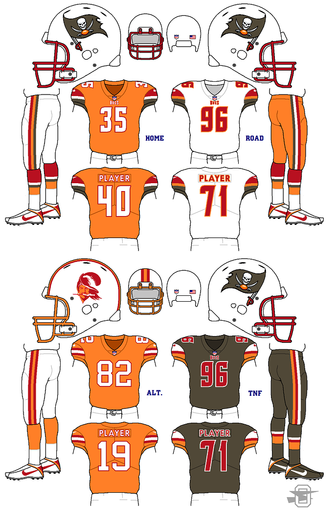
No you are not at all. Any team wearing that knock-off alarm clock font will automatically look unspeakably bad no matter what.My unpopular opinion: The Bucs aren't that bad. They're not great, by any means, but their new uniforms aren't the worst thing that's happened to the NFL like most would have you believe. Let's break it down:
The helmet: The logo is too big. That said, the old one, I feel, was too small, so the new helmet was a step in the right direction, just taken a bit too far. I like the "chrome" (really brushed metal) facemask. It adds to the pirate feel and reminds me of a sword.
The jersey template: When Nike said they were tweaking the Bucs' look, I assumed it would be more akin to the Panthers' new logo. The jersey didn't need to be changed, but if you're gonna modernize a jersey, you could do a lot worse than a plain shoulder yoke with a small, angled accent color. The pewter contrasts nicely with the red or white, and the orange brightens up what is an otherwise dark look, even with the brighter red than before.
The numbers: Alright, there's no defending these. I'm all for non-traditional, non-block numbers, and to be honest, I think the double outline on the old numbers were too thick and made everything look muddy. But this was not the way to go. I tried to think of something other than the popular "alarm clock display" putdown, but it's too accurate.
The pants: I like them. No real complaint. The incomplete stripe up the side also reminds me of a sword, which fits.
The logos: Not bad, but not great either. The old logos were starting to show their age and look very late-90s. They could have been cleaned up a little better than this, though. The new logo looks less like a skull and more like a robot.
Altogether, it's not awful. It's mostly unnecessary, but not bad.
With time I've also gotten used to the Bucs look. Ditch the pewter pants and socks, add an orange jersey with white letters and NOB and we're golden 'til the next rebrand.
I know the alarm clock font is awful. Unbearingly awful. Gut-wrenchingly awful. But the ditching the pewter pants and socks would turn the chicken poop into a somewhat palpitable salad.
The only thing I don't like about the New Bucs uniforms is the NOB and Number fonts. Everything else looks great to me. I love the chrome striping.

Oldschoolvikings' NFL concepts - Commanders concept added
in Concepts
Posted
This look has grown on me. It's bold and unique...just the damn alarm clock numbers throw it off. If they had normal numbers but still with the chrome, it'd be perfect. But it's a forward enough look where for me the old sets just look plain. So we're just in disagreement there nothing wrong with that.
Well if you want a clean look White/Red/White gets the job done. If you want to be adventurous keep the pewter pants or have more creative striping. Maybe if the orange wasn't a yellow-orange and more of the orange the Broncos used to wear? It's just a very 70s look and pretty garish. There's really no balance it's just a bunch of unnecessary bright colors.