

.jpg.4f6d856a41a89fb103eb6cc4b774713a.jpg)
Thomas
-
Posts
644 -
Joined
-
Last visited
-
Days Won
1
Posts posted by Thomas
-
-
10 hours ago, the admiral said:
How about you run across a busy expressway?
Nah, don't have time for that, i am too busy collecting baseball and hockey jerseys, and talking about logos and uniforms, it's a great hobby. You should try either of those things.
-
How about refs in tutu's and with pacifiers, i mean refs you suck, right?
-
2 hours ago, Rj0498 said:
I actually think that the sabres "edgy" 90s re brand was awesome. I think they should have stuck with that instead of, going back to the blue and yellow. It helps that I think their current unis are crap
I have a aut. jersey similar to this one.........they are not bad, to say the least


and this guy was cool af
-
 1
1
-
-
5 hours ago, PittsburghSucks said:
The banner on the right will be ready for opening night, it will be a huge photo of Adam Silver.
")
-
1
-
-
17 hours ago, tohasbo said:
The Capitals updated theirs and the "Regular Season Eastern Conference Champions" Banners are gone.

Yuck, the vastly superior diving eagle on a red backdrop


Caps "logo" sure is awful, you would think a child made that, with a square puck and everything !
Like a team from "Blades of steel"
-
23 minutes ago, AstroBull21 said:
In what world? That one screams 90's. It's not bad without the text but the current one is far better.
To each their own.
Better without text, yes. But new logo is not even a crest on the jersey like all the other teams have.
-
59 minutes ago, AstroBull21 said:
I like the change the Bolts did back last season after the 2015 Cup Finals....they made neutral banners that allowed for interchangeable logos...

wow, new logo looks really bad compared to the old one !
-
09, 16, 92, 91 ?
Should the banners not hang in order by year?
https://www.nhl.com/video/penguins-raise-stanley-cup-banner/t-282623160/c-45261303
-
will be fun to see all 4 Penguin cup rings side by side
-
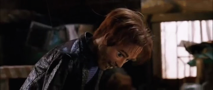
3 hours ago, DC in Da House w/o a Doubt said:
The word brilliant being used veryyyyy lightly there.
I imagine one of the guys who made this uniform reading this from the visiting room at the psych ward, one of their few remaining loved ones has shoved a laptop under their nose to show them Lights Out's friendly comment about something they designed many years back -- and in his head he can't help but think: did I really put that logo on the shoulders to emulate football style uniform stripes? I can't remember? I think I just added the logo on the shoulders cause that's what every hockey uniform had at the time... but then he puffs out his chest and says "yep! That's what we were going for all along! Football uniform!" And as he's getting carted away back to his room, the loved one who visited him begins to think that maybe he should have designed a hockey uniform that looked like a hockey uniform, not a football uniform -- further reaffirming the family choice to send him to the ward in the first place.
Actually i recently heard he was released from the nuthouse, he is now the head of the philly 76ers player scouting department / marketing department
-
1 hour ago, Lights Out said:
Still one of my favorite NHL uniforms ever:

Admittedly, the sock striping is terrible. But the sweater got way too much hate at the time. The striping looked nice, and the shoulder logo doubling as a football-style shoulder stripe was a brilliant idea.
My goodness, i never realized that before you mentioned it, they do actually look a bit like football jerseys.
.
-
2
-
-
7 hours ago, Ark said:
Agreed.
The Penguins should wear the Cup era set at home, that on the road, and this as an alternate when the home team is wearing a distinct jersey:
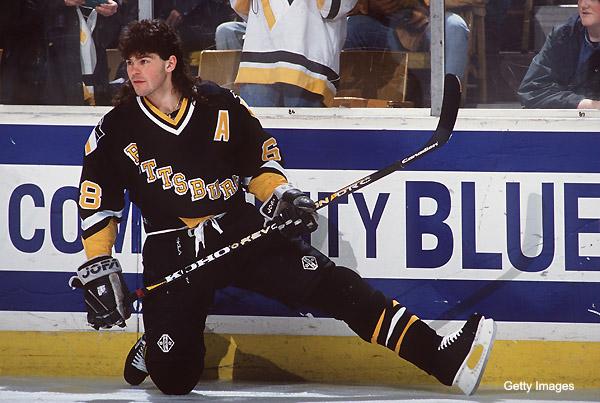
No doubt ! And when they wear that awesome black jersey, all players should have a fake mullet attached to the back of the helmet.
-
4
-
-
I hate the Brewers new glove logo on the sleeve of the blue jerseys, the M is a lot better.
And the gold is replaced by yellow ? I thought the gold like color was supposed to resemble beer ?


Unpopular Opinions
in Sports Logo General Discussion
Posted