


Zooropeanx
-
Posts
12 -
Joined
-
Last visited
Posts posted by Zooropeanx
-
-
1 hour ago, WSU151 said:
Yep; a modern example of a similar treatment of front number and NOB, with opposite team wordmark and back number:

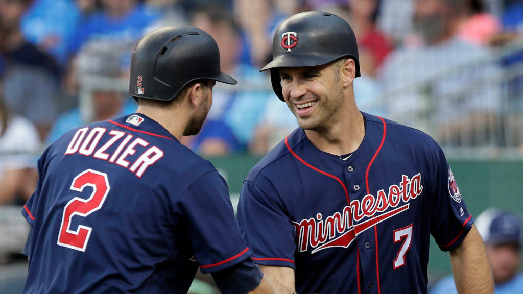
Or just look to the road blue alt the Twins wore the past few seasons:
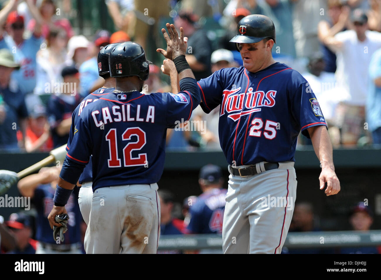
Or this blue alt:
-
 3
3
-
-
4 hours ago, logo-maker said:
Outlines must cost too much.
Ok-then why have the Twins' uniforms always had outlines on the script/lettering on the front of their jerseys since 1961?
If this is a dig at ownership it makes no sense.
-
On 11/12/2022 at 1:20 PM, WSU151 said:
Hopefully the white M hats are fashion only...from the photo (which doesn't provide the best look) the general shape of the M reminds me of the old Miami Marlins' M.
The Twins script is really nice...and I'm digging that pennant design for 2023.
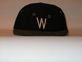
Even those those M hats are hard to see the background the first thing that came to mind seeing them is this Senators cap from the 1920s:
-
2
-
-
1 hour ago, Survival79 said:
Correct.
These are perfect.
While it's assumed the Twins will used a cleaned up 1960s script on the home uniforms, I have been advocating for the block Minnesota to return to the road uniforms with the M hats.
-
3
-
-
24 minutes ago, Survival79 said:
That script is horrible.
It's the ineffectual, privileged, effete, soft-penis'd, debutante of Twins scripts.
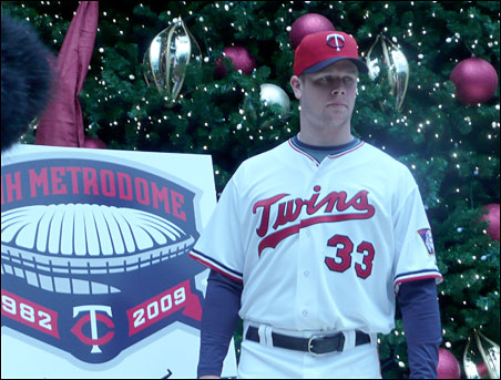
So then you have never liked it since it's been around since the 1960s. Just maybe a bit thicker on that 2009 jersey.
-
42 minutes ago, gosioux76 said:
My first impression is that this will play heavily off the 70s-80s double-knit era style.
My first thought circa 2009:
-
19 minutes ago, gosioux76 said:
I'm pleased to see the cap logo changes are subtle. I'll admit, until I saw them side by side, the only real difference I could detect were the more muted serifs on the T.
Assuming this is the new primary cap, this could end up being one of those changes where a majority of the fanbase won't even know the difference.
Just like in 2010 after the move to Target Field.
Not many people noticed the tweaks to the Twins uniform script.
Ironically the S stood out the most as I always thought the serifs on the S looked more like the serifs in the T from the hat.
-
4
-
-
They really could blend the 2 World Series era uniforms.
Home would go back to pinstripes with the updated 1960s Twins script. TC hat.
Road would go back to the pinstripes and Minnesota in block lettering. M hat.
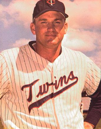
As for the alts I honestly like red at home and blue on the road (the blue road alt worn from 1997-2008 is my favorite Twins jersey).
-
2
-
-
Hmmm...
-
 1
1
-
-
I was listening to the Twins podcast 'Gleeman and the Geek' who had Twins writer Dan Hayes on.
Hayes briefly mentioned what he had heard about the Twins' new uniforms. He said he heard about the uniforms is that the Twins were "moving in the wrong direction."
The only other things I have read is that there will be a M logo with a star above it and supposedly Kasota Gold remains.


Minnesota Twins New Identity
in Sports Logo News
Posted
Their first blue alt jersey was this one they started wearing in 1997 (my favorite):
The Twins blue one came in 1998 to replace the awesome red Twins alternate.