


hereandthere
-
Posts
25 -
Joined
-
Last visited
Posts posted by hereandthere
-
-
Oh, come on, this has to be one of the most incredible and visually coherent home/away sets ever made.
(I understand if MNUFC fans don't love it becuase they want the wing back, but as a neutral non-US kit fan, I absolutely adore both of them)

-
 14
14
-
 3
3
-
 1
1
-
 1
1
-
 1
1
-
-
Other than the missing sleeve cuffs (downgrade) and armpit inserts (upgrade) the replica version is very similar to the authentic, compared to other kits.
One of the best kits of the season anyway (not restricted to MLS and adidas). With the old Alaska Airlines sponsor and without the centered logos it would have been absolutely perfect.
-
2
-
-
3 minutes ago, Digby said:
Also, what does any of this have to do with the Boston Tea Party?
That's the problem when you have to name every single kit, even when it is just a simple and kind of traditional design.
-
2
-
1
-
-
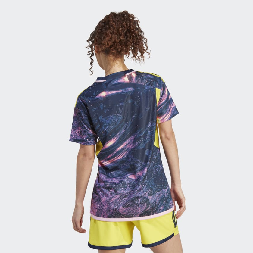
Plain back, as was to be expected. Would have worked better if the blue was a few shades lighter or a bit desaturated IMO. Or even better with a matching back, of course. But nonetheless a very nice kit.
-
5
-
-
8 hours ago, ATLJ said:
New Atlanta United away kit leaked by local basketball team:
Very nice kit. Has some Colorado 2023 feel to it, but way better executed. Only downside: all yellow will be completely absent from the replica jersey. But it is a regularly returning issue for MLS kits.
-
1
-
-
14 hours ago, JohnnyCowboy5 said:
More leaks
First, I am superglad that none of the leaked kits feature the centered sponsors and logos

I love that Charlotte FC mountain ridge theme. I hope it turns out well.
I don't like the Real Salt Lake one at all. It looks like a very bad fan design. Mountains? Good. Stripes? Good. Mountains and stripes? Hell no.
-
1
-
-
Anyway, the MLS 2024 kits will be the last to use the WC2022 Adidas template, which for me gave us some of the best kits from Adidas in the last 10-15 years (Roma, Celtic, Mexico, Japan, the WWC2023 away set, some of the MLS2034...) .
Looking forward to see these last 29.
-
1
-
-
15 hours ago, upperV03 said:
The purported leak of the Timbers’ new secondary kit has been making the rounds again the last few days, so I decided to try and recreate it and see what it would look like with their new sponsor logo:
This could be really nice. Would have been even nicer with the old Alaska Airlines sponsor
-
On 2023-12-20 at 4:42 AM, MJWalker45 said:
adult size look for Miami.
The only good thing about this is they use the old WC2022 template instead of the imminent (and very bad) Euro2024 template.
-
1
-
-
Tremendous collection by Adidas. Easily one of the best in years. The ones not shown on the teaser are very nice as well (Belgium, Mexico).
Also, and maybe even more amazing: on most of these the graphic continues on the back! Take that, MLS.
-
6
-
-
18 hours ago, MrOrange said:
I'm generally not a fan of monochrome looks either, maybe it's the addition of the red lines to the "classic" cheest hoop and/or the combo with this years shorts/sock design, but I actually like the 2023 "all white" look better for once.
My favorite Whitecaps look however is still the 2016 away/secondary one with primary navy socks and shorts + and navy/dark > sky blue > white shoulders/arms gradient jersey.
This remains to this date my favourite Whitecaps kit, and easily one of my favourite MLS kits ever. Stellar jersey and visual storytelling (which is not a must, but if is done right like in this case it is a plus).
-
1
-
-
I have only now realized that quite a few teams have customized side hems, a nice little detail that basically no team even advertised. Most appeared for the first time on the adidas website.
New England: Tricolor (@upperV03 already pointed this one out)
Orlando: Man every wall
Toronto: soundwave of the drum beat at the stadium
Vancouver: dark blue hem with light blue pinstripe inside
Minnesota: L'ETOILE du NORD
DC United: ALL ARE UNITED - ALL ARE WELCOME
Chicago Fire: CHICAGO FIRE FC
Philadelphia: Liberty bells
Columbus: NEVER STAND STILL
Of course, all these are missing in the replica version, and that's a shame, as usual.
-
3
-
2
-
-
10 hours ago, GriffinM6 said:
Agreed on this point. I got a Germany 2022 WC away jersey this week and it's pretty much indistinguishable from the authentic. It's a shame Adidas/MLS continues to shaft us North Americans. The day that each club can pick it's own kit supplier, the better.
7 hours ago, aawagner011 said:That last sentence is what is holding MLS clubs hostage. When adidas puts out a new kit for Real Madrid or Bayern, they have to put their best foot forward because they are directly paying the club. They also have 100+ years of history to respect and a fan base that expects the utmost care for team apparel. Anything less could result in a supporter protest.
Be careful what you wish for. This season is the best example, where basically every single team (29!) received a special treatment by Adidas and bespoke kits, most of them very nice and with very different colour schemes.
If you take a look at most European leagues, sure, the kits look (sometimes) more varied because there are more brands and more styles (not many striped kits outside of Europe), but usually at least half of them receive generic, basic templates. I mean, Adidas and Nike produce bespoke kits for maybe 7-8 teams each in the whole European and South American market. And these are markets with huge jersey sales. How many American teams do you think would get sponsored by the big brands (Adidas, Nike, Puma) in this situation? 1-2 each with bespoke kits and another 2-3 with basic templates maybe? And all the rest sponsored by the likes of Macron, Kappa, Castore, but all with generic templates and colours because of the low sales? I think the leaguewide Adidas contract is a blessing, even if it has its disadvantages (similar looks and templates).
And lastly, regarding the sentence "They also have 100+ years of history to respect": sure, if we are talking about Real Madrid. But those 100+ years of history were disrespected more often than not if we look at Barcelona, Juventus, Milan and Inter in the last 15ish years. After all, the more the brand pays (and the more the club needs that money), the more the brands can decide how the jersey will look.-
1
-
-
16 hours ago, GriffinM6 said:
You do know that MLS doesn't allow patterns on the name and number areas on the back of their jerseys right? So Adidas does actually have an excuse because of the dumb MLS rule. It's how you end up with crap like this....
But is this actually true? We keep hearing it, but that Vancouver jersey seems to speak differently. And numbers on most patterns that we've seen this year would clearly be way more legible than on Vancouver's hoop. I think it's simply a combo of Adidas' template and their will of playing it safe.
And as far as I know, this is also true for most other football leagues. For example in Italy and Spain, where stripes on the back are clearly permitted, if the number contrasts enough, but most brands (especially Adidas and Puma) prefer to produce plain backs anyway. I mean, Inter and Barcelona were even permitted to play in the Champions League with striped backs, and the CL is notoriously extremely strict on uniform rules.
-
1
-
-
1 hour ago, GriffinM6 said:
I know some people had their qualms with Colorado's kit, but I absolutely love it and I think it has to do with it reminding me of this beer can design.
The only qualm I have is that I expected something a bit more colourful after seeing the official teasers
 But the kit is very nice nevertheless
-
3
-
-
A few thoughts:
- all in all very nice designs and colours. The league deserves some colour and fantasy
- those plain backs are a disgrace though
- portland again with a kit for the ages
- that colorado kit is nice, but underwhelming given the promotional campaign. Someone still owes us a kit with that sweet sunset gradient of the first teaser
-
Another teaser. Looking forward to this. By now all my bets for kit of the season are on this one, and maybe the Colorado Rapids one if it looks like the first teaser with the gradient.
-
3
-
-
6 hours ago, SSmith48 said:
Rapids with a really colorful teaser. Could this mean that the yellow clash jerseys could be returning? I'm hoping the actual product turns out to be as bold as this graphic is.
Nobody of us know how the kit will actually look like, but if it resembles this teaser in any way, this could be one of the nicest kits of the season.
-
1
-
-
5 hours ago, upperV03 said:
More leaks below.
- NYCFC back to navy accents on their home kit. Looks like a good amount of orange too! Grid plan design on the shirt???
Looks more like some kind of mosaic to me.
-
3
-
-
It looks like the reverse jackets are a bit simpler than those of the WC and European teams. Meaning they seem to be missing the all-over graphics on the inside mimicking the style of the jersey.
-
13 minutes ago, MJWalker45 said:
I know in Europe this is because UEFA doesn't allow stripes in international competition to make numbers easier to read. I believe MLS copied that rule as well.
I don't know about the MLS, I've never seen the regulation. But about Europe, it's not 100% true. I mean, there are stricter rules in UEFA competions compared to domestice leagues, but most striped teams (for example last year's AC Milan and this year's FC Inter) have no problem playing with striped backs in the Champions League as well, given there is enough contrast with the numbers. The same can be said for Argentina's national team.
I guess most instances of plain backs are simply brands and clubs playing it safe, even safer than the regulations demand.
-
7 hours ago, aawagner011 said:
Additional photos of the Atlanta 23/24 shirt.
Was able to buy this from an online shop in France. Probably my second favorite shirt behind the original five stripes. Interestingly, I thought it simply had two black stripes (from the original leaks), but it looks like depending on sizing, the black stripes would continue towards the sides. I think this was the case with the original, too. I’m curious if there will be other differences between the authentic level shirt. Obviously it will have the star and differences in materials, but sometimes MLS authentics have major differences from the replicas like trim, cuffs, etc.
Really nice shirt, although it's a shame about the stripeless back.
The difference with the authentic will be some kind of jock-tag, black underarm panels and some cuff trim, I guess.
-
4 hours ago, Digby said:
The Revolution kit that leaked bizarrely early months ago appears like it'll have navy armpit panels on an otherwise white-with-red shirt, so I'd expect plenty more.
I think most kits will have differently coloured armpit panels. As the St. Louis one shows, this is one of the details completely missing in the replica version, and the recently leaked ones are all replicas (therefore, without coloured panels even if the authentic one will have them).
-
Neutral European fan opinion here. All in all, I think this is one of the most underwhelming MLS collections ever.
THE BAD: At least there are almost no white kits, but at the same time no real differntiation between the teams; basically one template; huge majority of plain coloured kits; quite the amount of teams using similar and non-traditional change colours (mint anyone?); heavy relying on almost invisible embossment; drastic differences between authentic and replica (yeah, I know, this has tradition in MLS, but never to this degree).
THE GOOD: Charlotte FC, Philadelphia, Vancouver; No white kits; Some collars and sleeve hems are a beauty, I hope Adidas continues on this road for the 2022/23 season in Europe and for the WC national teams; The few teams that tried to do something creative (Orlando, Portland, Montreal) even if the end result ended up pretty bad (NYC, Sounders).


.png?auto=webp)


MLS Kits 2024
in Sports Logo News
Posted
If anyone is intereste, the European Adidas store is selling the new Timbers kit in a sponsorless version