

ORLMagic86
-
Posts
55 -
Joined
-
Last visited
Posts posted by ORLMagic86
-
-
4 hours ago, McCall said:

aka magenta
-
 1
1
-
-
On 5/18/2024 at 3:53 PM, Burmy said:
I still remember when the Lowell Spinners had a program where they would donate Spinners little league uniforms to New England leagues in exchange for those leagues dropping the Yankees...given how these poor kids who played for the little Yankees would see no end of bullying, I always liked the Spinners' kind gesture.
You have to be insane to live in Massachusetts and name your child's little league team after the Yankees.
-
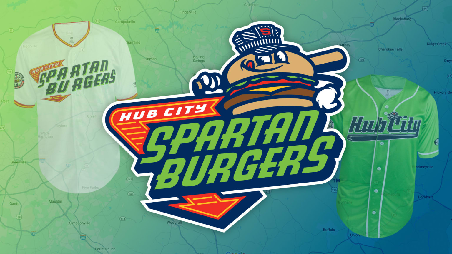
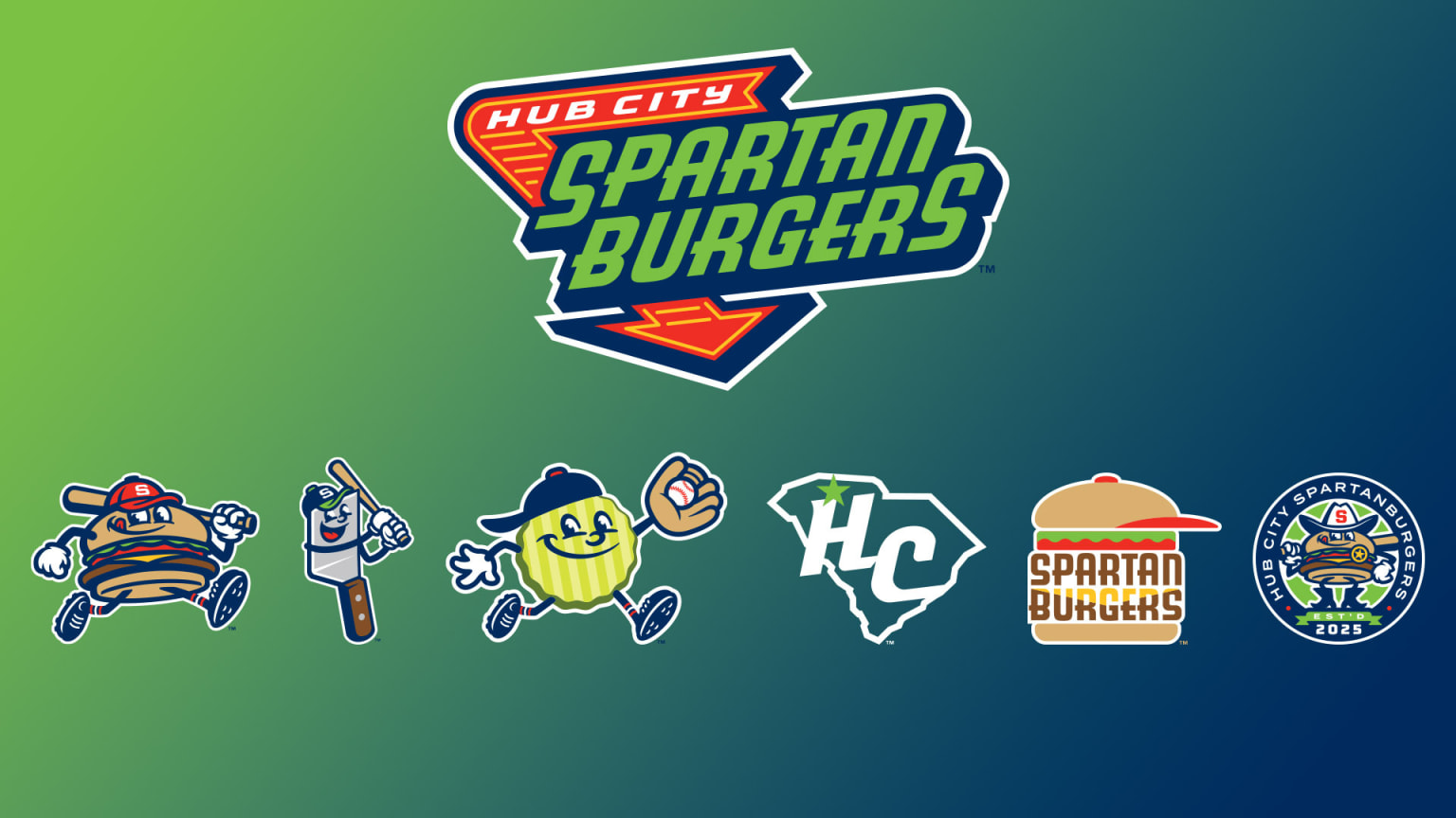
34 minutes ago, CaliforniaGlowin said:
SPARTANBURGERS ARE BACK!! In lime green!!! The single A Down East Wood Ducks will become them next year.
That name was used for a single season CPL team years ago.
That HC logo should be the main hat logo. The burger is too detailed for a hat.
Very nice!
-
18 hours ago, monkeypower said:
The Saskatoon Blades wore Berries jerseys earlier this season (same ownership) and these had more purplely purple.
Two different uniform suppliers hence the inconsistency between the two shades of purple.
The purple in the baseball jerseys reminds me of the purple used by the University of Washington.
-
1
-
-
2 hours ago, Sec19Row53 said:
Opinions vary.
I'm team blue

-
 2
2
-
-
1 hour ago, monkeypower said:
The team can call it "deep purple" in their Facebook comments all they want and it doesn't change the fact it looks blue.
But like I said, it also doesn't change the fact that it doesn't match the purple used anywhere else.
Unfortunately, UA appears to have only one shade of purple for all of the uniforms it provides to schools and teams. They're a summer collegiate team. It's ridiculous to expect perfection at that level. Personally, I admire the uniforms. Oh, and they do not appear to be blue. It's more of a dark purple or violet.

-
1
-
-
8 hours ago, monkeypower said:
These are blue and not purple right? I'm not seeing incorrectly? Regardless, it definitely doesn't match the purple of the hats and belts (nor the logos nor the merch).
I have to assume this is UA not being able to produce the purple because the team did tweet something a while back about ordering purple jerseys.
No, they're purple. It's just a deep purple. Others have been asking the same question on the team's Facebook.
-
The Gastonia Baseball Club of the Atlantic League debuted their White Sox-inspired unforms.
-
2
-
-
18 hours ago, FiddySicks said:
This immediately made me think of the original Wonder Years.
-
2
-
-
-
7 hours ago, Green27 said:
I am...whelmed. It's a good name but the logo is very busy with the dog, gloves, bat, and hat. Also so many colors I am unsure of what color to associate with them. I love the KO bell logo though, it should work on a hat wonderfully.
It's neither great nor bad. Just meh.
-
-
2
-
 1
1
-
 1
1
-
-
On 2/21/2024 at 12:46 PM, CaliforniaGlowin said:
As a road sign geek, I approve.
But it's red and blue. You hate red and blue.
-
2
-
-
43 minutes ago, Krona said:
The simplest explainer on the difference in finished product between Studio Simon and Brandiose. Dan Simon has such a sophisticated touch with even the most playful brands. Rarely misses and illustrates the quality vs quantity debate. Now that business has seemingly slowed down for Brandiose (unless City Name/Alleged Regional Food fad somehow continues), I look forward to seeing how/if they can step up their game with a little more time for craft.
Brandiose possesses the potential and talent to step up their game. For many years, they focused on quantity over quality. And, as you mentioned, now that business has slowed, they should be able to demonstrate their true abilities. And, for what it's worth, I don't fully blame them for their reputation in the designer community. They were paid by their clients to create those absurd logos and brands.
-
4
-
-
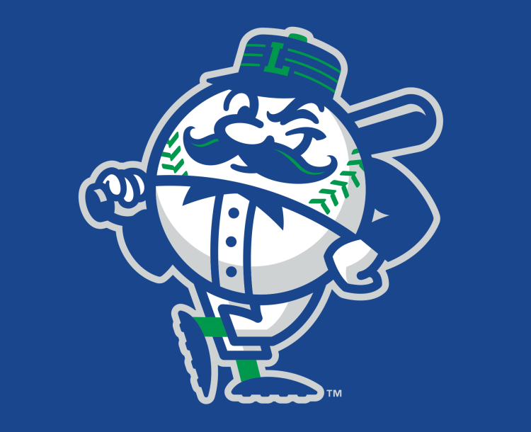
On 2/16/2024 at 9:57 AM, McCall said:
These two logos look like they were done by the same artist; the top one, as an experienced, top-of-the-industry branding and identity artist, and he bottom one, when he was 5 and just beginning to show signs of his future talents.
Believe it or not, Brandiose is responsible for the bottom logo. Despite their reputation for designing goofy logos for MiLB teams, I thought the logos they did for the Legends 11 years ago were pretty good.
-
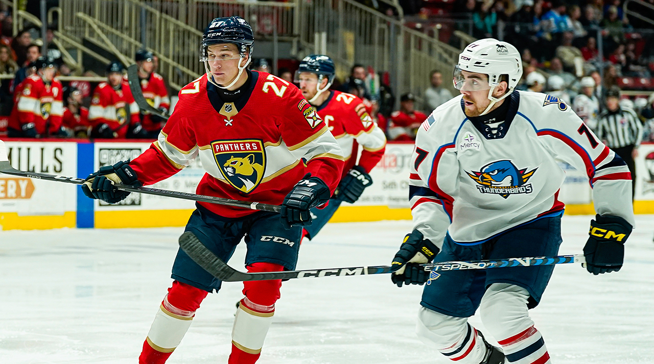
9 hours ago, monkeypower said:
The Charlotte Checkers did a Florida Panthers night, because that's the current affiliation, on Saturday and instead of having a themed Checkers jersey, they just dressed up as the Panthers.
This feels weird and almost patronizing to me.
Yeah, this is somewhat unusual. A Checkers jersey in Panthers colors would have been a better alternative.
-
1
-
-
-
9
-
4
-
4
-
-
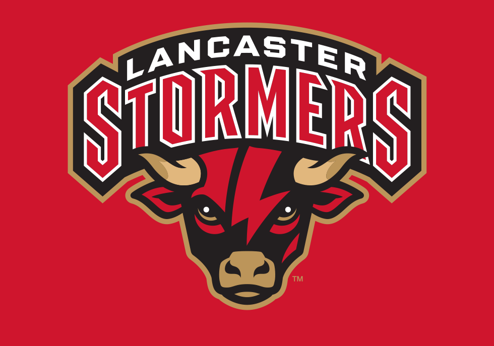
What a busy day it has been...
The Lancaster Barnstormers of the ALPB have rebranded as the Lancaster Stormers
The Appalachian League also has a new team. Say hello to the Tri-State Coal Cats
-
5
-
-
2 hours ago, hormone said:
Is it me or is every new brand a food item or some neon copa identity anymore. Both have been way overplayed for me.
On paper, Copa is a MiLB initiative to promote the sport and connect its teams to their Hispanic communities. Realistically, it was intended to boost merchandise sales by exploiting Hispanic culture.
-
1
-
-
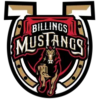
1 hour ago, Dilbert said:
Billings Mustangs of the Pioneer League have a new logo.
This is interesting considering they introduced several new logos two years ago.
-
1
-
-
57 minutes ago, Brave-Bird 08 said:
Yeah, I am kind of bummed Chattanooga is moving to adidas per its move to MLSNP, because their Hummel kits were all excellent.
With Adidas serving as the official kit supplier for MLS and MLSNP, I doubt they had a choice.
-
1
-
-
On 1/29/2024 at 6:36 PM, ruttep said:
The Hartford Wolf Pack just released a throwback jersey, although they did so in a horrible reveal video where you don't really get to see the jersey until about the 2:40 mark.
I enjoyed the small nod to Torpedo, the Wolf Pack's second mascot from the 2000s. He looked like a scarier version of Sonar. Before joining the Wolf Pack, I believe he was the New England Sea Wolves' mascot. This makes sense given that both teams were owned by MSG at the time.
-
Say hello to the Greenville Yard Gnomes of the Coastal Plain League.
https://ballparkdigest.com/2024/01/24/new-for-2024-greenville-yard-gnomes/
https://yardgnomesbaseball.com/
-
5
-
 1
1
-
 1
1
-
-
3 hours ago, Section30 said:
We need more pink in sports, it's such a good color when used right
Agreed. Teams avoid using the color because they are afraid of what others would think.
-
1
-


College athletics identity changes
in Sports Logo News
Posted
The sad thing is, I believe that was the intention.