


adsarebad
-
Posts
327 -
Joined
-
Last visited
Posts posted by adsarebad
-
-
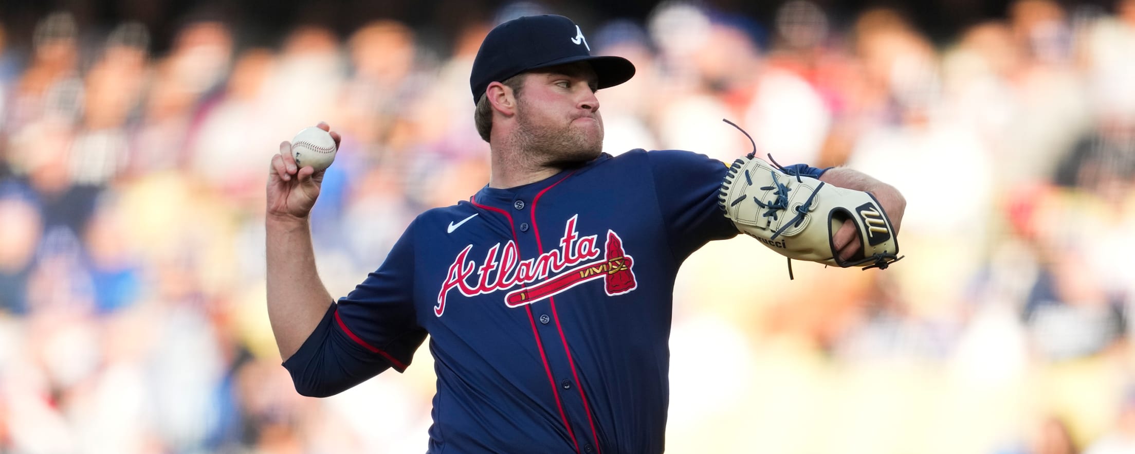
15 hours ago, Brave-Bird 08 said:
Their previous ST jerseys were sans piping.
Accounting for the fact I know from experience as a photog that lighting makes all the difference, I have seen enough of these two jerseys in different lighting to confirm that the difference in blue to what looks like purple is stark.
2023

2024
Just following the logic of color application, I should prefer the bottom jersey over the top one. But I don't.
What has bothered me more than anything about the Braves uniforms in general since this template switch is the wordmark-tomahawks have been shrunk considerably, which just makes these jerseys look more like cheap knock offs than they really are.
On the TV feed last night the red piping gets lost. I would rather it just be a solid blue jersey, because as I've stated before -- the red and blue mixing together without white to break it up just "purpifies" the jersey at a glance.
It makes me long for the old BP-esque road jerseys, which they wore too often and I very much disliked at the time. But just in photos there's such a difference to me in terms of one of these looking like a pro ball uniform, and one looking like the players are wearing something that should be retail-only.
right, the smaller wordmarks on the new Nike jerseys are just a joke.... has there been any explanation for it?
Always liked that Braves navy alternate you posted, they could have used red piping around the sleeves and perhaps the braves logo, the "A" on the sleeve, so it's looked more like a game jersey and not a BP jersey....... but other than that i think they were nice.
-
5 hours ago, Andrew_Gamer_NZP said:
Might look better in the sunshine.
Playing a summer game like baseball indoor should be a crime.
 i hate that dome.......
-
 1
1
-
-
17 hours ago, Foxxtrot44 said:
I don't know if I should post this in Concepts or not, but I finally finished creating some sweater mock-ups for the Utah Yetis.
I made sure to do Home, Away, and Reverse Retro. I'm not a wizard with Illustrator or Photoshop, but I think I nailed it.
-
36 minutes ago, ManillaToad said:
Magic is as bad or worse than Wild
No, Magic is a thing...... and Orlando Magic sounds great.
They are doing magic with the basketball........ can't really say wild have anything to do with the sport of ice hockey.
-
 2
2
-
 2
2
-
 1
1
-
-
2 hours ago, PlayGloria said:
To each their own...
Weirdly enough, I view the NHL the complete opposite way.
- Aesthetically I feel like they are tops among the 4 major sports. NBA and NFL are lost and MLB has literally the worst uniform rollout of all time going on.
- New franchise locations have been a massive success. Hell, I can't believe the NHL was the first league to put a team in Vegas. For once, they were a trendsetter.
- Playoff hockey is still just an unreal time of the year, especially if you have a dog in the fight.
- I know this Coyotes thing was a fiasco, BUT at least they didn't just abandon a city like the NFL and MLB have done in recent times. They literally tried everything they could to make the franchise stick in their hometown, and I respect that.
- Bringing the topic back to uniforms, I think the Reverse Retro series were much better than either the CC in MLB or color rush in NFL, or any of the mindless NBA jersey editions year after year.
All that being said, the nice thing is that if it isn't for you, it's all good. It's just entertainment.
Side note: One day when we actually validate bigfoot's existence, the Utah Yeti's name will no longer be cheesy or minor league. It will be just like any other animal named team like Coyotes, Jaguars, Eagles, etc

Love hockey..... but can't watch NHL anymore because of those :censored:ing moving board ads.
you just know they will change and move randomly, and just when there is action in front of the net ...... hate that looming feeling when trying to watch a game. You know it will change soon.
I am done with it.
-
1
-
 1
1
-
1
-
 1
1
-
-
16 hours ago, VDizzle12 said:
I don't understand the hate for the smaller NOB. If anything the old lettering was way too big. I mean we saw players with long names practically having a full circle of lettering around their number. Remember Saltalamacchia?
That was one player out of hundreds.
and if you are paying 400+ you want something that feels and look nice.
Not the kindergarden crap they are wearing and selling now.
-
Two grey CC in a row.
SMH
-
30 minutes ago, TBGKon said:
The team plays in a dome.....I think they'll be fine.
What about the fans, please think of the fans
-
2
-
-
On 4/24/2024 at 1:46 PM, BBTV said:
Yeah, lots of people didn't know what gambling was. LOL. Ever hear of numbers running? Maybe not in podunk towns (but even then), everybody that wanted to had a guy. And if you think anyone outside of the back woodisiest of back woods places didn't either know what gambling was or how to do it, that's just... something.
The narcotics point is much more complicated and I'm not sure we can have that discussion with mods shutting this part of the discussion down.
Again, we're way off topic now so I'm preemptively moving on before we're rightly told to by the mods. Feel free to have the last word.
Sorry, don't have time to get the last word, i have to take Shohei's dog for a walk.
-
On 4/24/2024 at 1:49 PM, McCall said:
Hey, I personally just wanted to give you a heads up that the entire internet system is going to be down for it's annual yearlong maintenance starting at 7am CDT. We'll notify you when it's back up and running so we can all resume reading your insightful thoughts. Can't wait. Thanks!
Okay bookie, you let me know the second the internet is back up, i gots some bets to place man!!
-
On 4/22/2024 at 9:48 PM, spartacat_12 said:
I mean when gambling was illegal people would be less likely to know about helplines or treatment options that are available to them, so it seems like common sense to be seeing record levels of calls. The toothpaste is out of the tube, so the best thing to do is take this influx of tax revenue and invest in robust youth education programs, while continuing to evaluate how you regulate the industry.
I mean when gambling was illegal, people would be less likely to know about gambling and how to access it.
Do you also think narcotics should be made legal, so many people would be more likely to know about helplines or treatment options that are available to them.
-
2
-
 1
1
-
-
Mets got a grey CC uni........ and they made their black uni boring af with the removal of white.
What the hell are they doing

-
22 hours ago, The_Admiral said:
No one ever Coca-Colaed away their kid's college fund.
oh yeah?...... dentist are expensive af.
but i digress, gambling ruins families and lives.
F the 4 big leagues and the TV networks for allowing it.
And bookmaker odds right in the game while you watch


-
On 4/19/2024 at 8:03 PM, Brian E said:
For the Mets, the process with Nike started after the 2021 season. Nike issued a brief on what goes into a City Connect uniform, and Goldberg and Benesh filled out a 12-page questionnaire posing queries such as, “What does New York mean?” Nike sent five design concepts based on the answers, and the team gave notes or directions to scrap whatever look altogether; five more designs would follow.
should have incorporated all these elements into the CC uniform
-
-
3
-
-
On 4/14/2024 at 3:07 AM, BBTV said:
This is a very naive take, as it assumes that if it's not legal, people aren't walking down the street to the local bookie to place bets if they want to. I can tell you from first hand experience (not placing the bet, but knowing the daughter of a bookie who may or may not have been mob connected) that it was huge business, and somehow, they still get action.
People who want to are just going to do it illegally (and get their legs broken when they can't pay their losses), so might as well legalize it, regulate it, and tax it. It's not for me, but someone with a problem is either going to lose their house legally, or lose it illegally, which leads to even worse things.
No need to waste limited resources stopping things that can't be stopped, so just make it as "safe" as possible, and instead of spending money policing it, make money by taxing it.
Oh really.......
-
"We’re killing the youth of America’: calls grow for crackdown on US gambling"
https://www.theguardian.com/us-news/2023/dec/01/sports-betting-regulation-gambling-addiction
Treatment clinics are grappling with an influx of patients in their teens and early 20s and helplines are reporting record levels of calls.
-
 1
1
-
-
On 4/10/2024 at 3:43 PM, Kg54mvp said:
You hit the nail on the head. It’s seeping everywhere around us and not just in sports.
Quick bucks and cash grabs are becoming even more prominent, with more buzzwords being thrown in.
It’s not just nostalgia either!
I will never understand why betting on sports was made legal in the US.
It can and will, only hurt regular people.
-
 3
3
-
 2
2
-
-
12 hours ago, dont care said:
David Ortiz has worn that jersey before, and I’m sure adding on to a product line that’s already in production is 10x easier that starting a new product line.
No, he has in fact never worn a Nike jersey.
And these retired player jerseys should be made by Michell and Ness and no one else.
But hey look, now you can also get that Ortiz jersey with the ad patch on...... remember that time David wore the Red Sox jersey with ad patch on it?
good times.... good times
.
only $415

-
They don't have the time to make alternates for teams, and customers have to wait over 2 months for the gold program Texas jersey...........
But they have time to make and stock these Nike elite jerseys these players never wore!!
So :censored:ing stupid, what moron buys this!?
-
10 hours ago, CaliforniaGlowin said:
The team may suck but at least they look good

No, both their play and look suck.
They had it right from the start.
-
-
7
-
1
-
-
On 4/7/2024 at 4:44 PM, SCL said:
Fanatics is responsible for the ens#!tification of the entire industry, they are co-conspiritors in this MLB mess.
oh absolutely.... i am not defending them, just saying that Nike designed and made these jerseys, and the tiny letters and numbers, moving the Batterman logo etc....
-
19 hours ago, DCarp1231 said:
white and gray shadow on letters and numbers on the front...... but not on the back.
.
-
14 hours ago, tBBP said:
That ain't even shade...that's a full-on eclipse.
so annoying when everyone in the comment dumps on Fanatics,
When It is Nike who is to blame for the new uniforms.....
-
https://uni-watch.com/2024/02/14/nike-and-fanatics-whos-responsible-for-mlbs-new-uniforms/
-
12 hours ago, aawagner011 said:
This doesn’t read like someone who is confident about the design. More like the executives showed him the uniform and internally he’s thinking how awful they are but feels obligated to praise them. He’s an Under Armour guy, after all.
https://www.mlb.com/phillies/news/phillies-unveil-city-connect-uniforms
exactly..... what do these clowns expect, the truth?
I don't think any player want to be "that guy" ....... the guy that tell the truth, sadly.
-
On 3/19/2024 at 8:10 PM, MJD7 said:
Of the 7 teams that have a navy & red color scheme, the Twins are now the only one that do not utilize an outline on their wordmarks & numbers.
In fact, they are one of only 4 teams in the league overall that don't use outlines on any of their main jerseys (the others being the Royals, Dodgers, and now the Yankees).
If anything, I think their lack of outlines helps them stand out possibly the most among the 7 navy & red teams, 5 of which utilize a red wordmark with a navy outline:
The Twins previous home jersey actually looked pretty similar to the Nationals, just with an ugly mustard gold color thrown in as an accent. Plus, their previous set was a complete mismatched mess, where that gold color only appeared at home, not on the road, and every single jersey had a different striping pattern.
I truly think the Twins went from one of the worst identities in the league to a Top-5 uniform set with their rebrand last year.
no outline.......you say it's unique, i say it looks cheap.
agree to disagree.
and again, they def. look like Cleveland.
That gold was nice, and it had meaning.
https://news.sportslogos.net/2019/01/23/minnesota-twins-add-new-navy-blue-and-gold-uniform/baseball/
-
1
-
4
-
1
-
/cdn.vox-cdn.com/uploads/chorus_asset/file/24496541/usa_today_20155081.jpg)

 i hate that dome.......


MLB 2024 Uniform/Logo Changes
in Sports Logo News
Posted
Terrible....... looks like a cheap 80's T'shirt.
Not a $400 MLB uniform!