


CaptainEricVGC
-
Posts
13 -
Joined
-
Last visited
Posts posted by CaptainEricVGC
-
-
On 7/24/2023 at 11:53 AM, bowld said:
Jets NEED to bring this helmet back full time or at least slap this decal on the current ones. Just look at how much better it looks than the current generic font does

The biggest improvement between the old helmet and the current is the white facemask. Jets could have a beautiful 1-2 punch with the current glossy green shell, speedbird wordmark in white and white facemask and a white helmet with a glossy green speedbird wordmark and green facemask
-
 2
2
-
 1
1
-
-
Lions by 100 when they play the Bucs this season
-
 1
1
-
 1
1
-
-
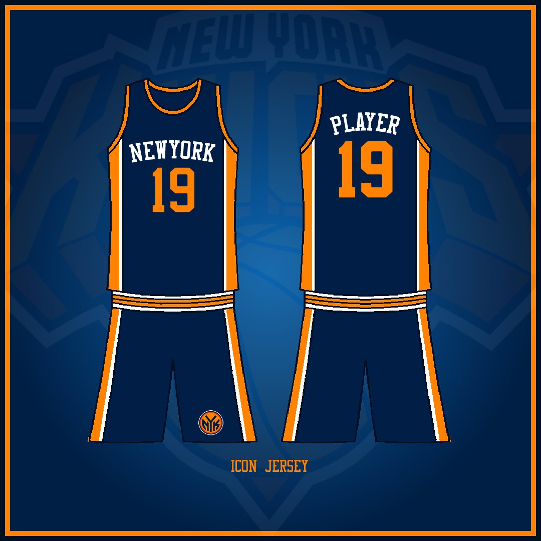
Edits: The waist stripes are part of the template as opposed to actually being segmented like that. I originally kept the tops blank on the side to match the current Knicks look but I'm going for a cleaner version of the 90s look with the updates to the homes and roads.
-
New York goes with a darker blue to split the difference between their royal blue roots and the black side panels from the 90s era. The silver in the triangle and shadowing gives way for a darker orange that pairs with a brighter orange
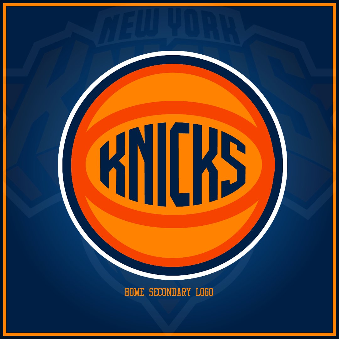
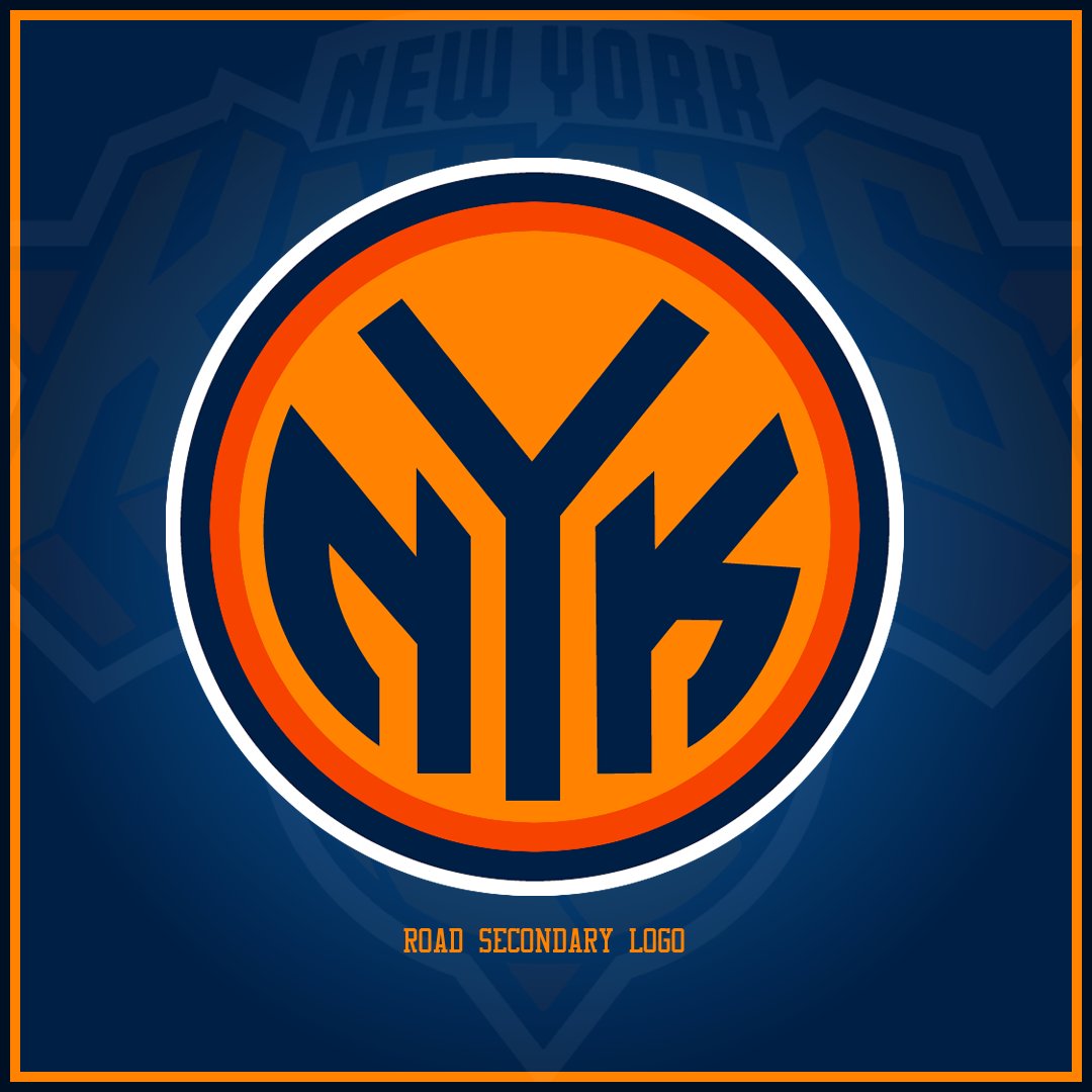
For the alternate logos we get updated versions of the Subway token and Knicks ball
With the home and roads, I decided to keep it a bit more simple and let the update colors do the lifting and then with the Statement jersey, bring out the heavier wordmark from the primary logo for a bolder look.
-
3
-
-
I'm going to wager variations of this title are going to be very popular on the forums the next few days since the Arizona Cardinals decided to cosplay Ohio State instead of doing a proper redesign. The goal with this was to be less about what I would have done for the Cards redesign and more build on what they already and try to make it a bit more interesting.
It looks like the Cards are going with a brighter red than their previous set which I actually do like. The most disappointing thing for me with this new set was after all the teasing of copper in the promo videos they went with silver. A metallic copper I think would be a nice distinguishing element so silver gets swapped out for copper throughout. I do like one thick stripe on the sleeves and contrasting thin stripes so I keep that but offset it and I think it gives a nice desert feel to it. A red facemask was a no brainer. I don't know why they didn't do that. In the spirit of building on their new look as opposed to undoing it, I keep the wordmark on the chest and just shrink it. You could pair this with the road red pants but I wouldn't recommend it.
As is my style preference, the road uniforms are just swaps of the homes. I think there's enough distinguishing elements on the home white pants that it wouldn't look bad for an all white look.First off, I am not of the mindset that the Cardinals should have a black jersey but if they must here's my take. The helmet isn't a gradient, that's just to show that it would have the light effect where it looks red when the light hits it. The striping is a little different here just because I think using the black to break up the stripes helps each one stand out a bit more. And a slightly different cardinal logo on the helmet and pants rounds out the blackout look.
-
3
-
-
10 hours ago, DG_ThenNowForever said:
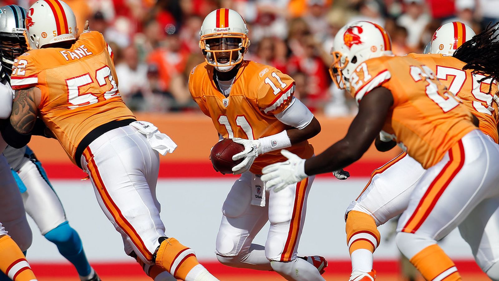
When I started watching football in the 90s, the Buccaneers only existed to me as a team on trading cards. I never played as them in Madden, I never saw them on TV, and they had basically no national identity until they switched uniforms and stomped an excellent 49ers team week 1 of 1997.
As a kid, I saw Bucco Bruce as a weird Donruss oddity for a team that everyone knew was a permanent doormat; 14 straight losing seasons will do that. I don't have any affection for them outside of general nostalgia for American society's economic peak in the 1990s before it all fell apart.
Finally someone with common sense
-
 1
1
-
-
8 hours ago, LA Fakers+ LA Snippers said:
These uniforms are an abomination. At least with black they would've fit the era
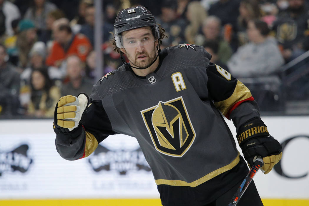
7 hours ago, Ridleylash said:
Switching the black and grey on these jerseys would vastly improve the look by giving more contrast for the metallic gold to shine. You can reference the Saints for a similar effect. This isn't hard folks.
-
1
-
 1
1
-
2
-
-
Two more for the fireplace
1) There's no grey jersey that wouldn't have looked better black
2)There's no cream/heritage white/bone jersey that wouldn't have looked better white.-
1
-
1
-
-
I will argue that any look that can be permanently replaced after 5-10 years, never needs to come back. Throwbacks for throwbacks sake is a blight on sports design.
The Super Bowl era uniforms are the best uniforms the Bucs have worn. I like the Alarm Clocks, the idea for reflective number is a neat effect though as stated before the font/slicing could be better. I like the heavier pewter look balanced against the brighter red. The one knock I would say about the Super Bowl era uniforms is it's missing an element on the top to make it look more like a football uniform and less a T-Shirt. Give credit to the Creamsicles but there's at least sleeve striping. Having pewter yokes gives that element. Creamsicle orange being nothing but an accent is a feature not a bug and they could've improved the look by deleting it all together honestly. -
I'd take the Alarm Clocks over the Creamsicles in a heartbeat without blinking.
Creamsicles commit the three cardinal sins
1) Throwback to a losing era
2) Obnoxious bright colors with weak contrast
3) Ridiculous logo
Alarm clocks just had bad numbers-
2
-
3
-
-
These are the worst uniforms in NFL history-
 2
2
-
3
-
 1
1
-
 1
1
-
-
22 hours ago, Rockstar Matt said:
I’ve long thought the NBA desperately needs a black and yellow team,
Same. We weren't specific enough. The monkey paw curled HARD.


NFL 2023 Changes
in Sports Logo News
Posted
It's definitely part of the era you grow up in. I started watching football in 1995 when I was 5 and became a Buccaneers fan in 1997 so the Creamsicles are not the Buccaneers to me. The Skull and Sabers are. I have memory of the Seahawks in royal blue and green, but when I was actually old enough to watch attentively they've always been navy and some kind of neon green. I think Chris had an article pitching the Eagles in Kelly Green saying the Eagles need to look like the Eagles again but to me Midnight Green IS what the Eagles look like.
This is kind of the tricky part with throwbacks when the uniforms are adjacent but not similar to the current set because a team is trying to marry 2-3 generations of fans together. I don't think any NFL team has it as bad as the NBA does where you cannot tell who is playing who on some days without the scorebug or half-court logo assisting but I can understand someone saying a look is out of place from what a team mentally looks like to them.