


Thunderbird35
-
Posts
8 -
Joined
-
Last visited
Posts posted by Thunderbird35
-
-
3 hours ago, MNtwins3 said:
Diamondbacks alternates both look fantastic. The teal really pops as intended on the red and black jerseys, but feels more muted on the home uniforms
Agreed, both of those look fantastic. I've never even considered buying a counterfeit jersey, but Nike/Fanatics and their BS is getting me closer than I've ever been. Still don't think I can do it, but I'd love to have either of those in my closet.
-
2 hours ago, BBTV said:
Didn't the coolbase material wick too? I don't recall them looking like that. I suppose this means that these jerseys wick more, which Nike would say is a feature not a bug, but sheesh - that's hard to look at. Even if he's dry on the inside, it looks like that'd be very uncomfortable.
Also - is "Wet-Ass Yankee" an acceptable user name? Asking for a friend.
These remind me of the NHL Reebok Edge 1.0, when the moisture wicking was too good, causing sweat to pool into players' gloves and making them heavier/nasty.
Yet another example of the disaster that is this uniform launch. Not only does it look awful, but as you said, there's no way that's comfortable.
-
11 hours ago, NOLAPelicans23 said:
Seeing the Diamondbacks' new home uniforms with the red helmets is interesting. The color balance with the uniform is great, but the logo just gets lost on the helmet with the teal outline.

I think this hat and helmet is unnecessary. They should just use the all-black alternate hat or the all-red snake D alternate with the home jersey. Both highlight the teal a lot more, and both look better IMO.
-
 5
5
-
-
9 hours ago, ruttep said:
They eventually got changed because of the random shoulder yoke outline that they added for the Reebok Edge transition
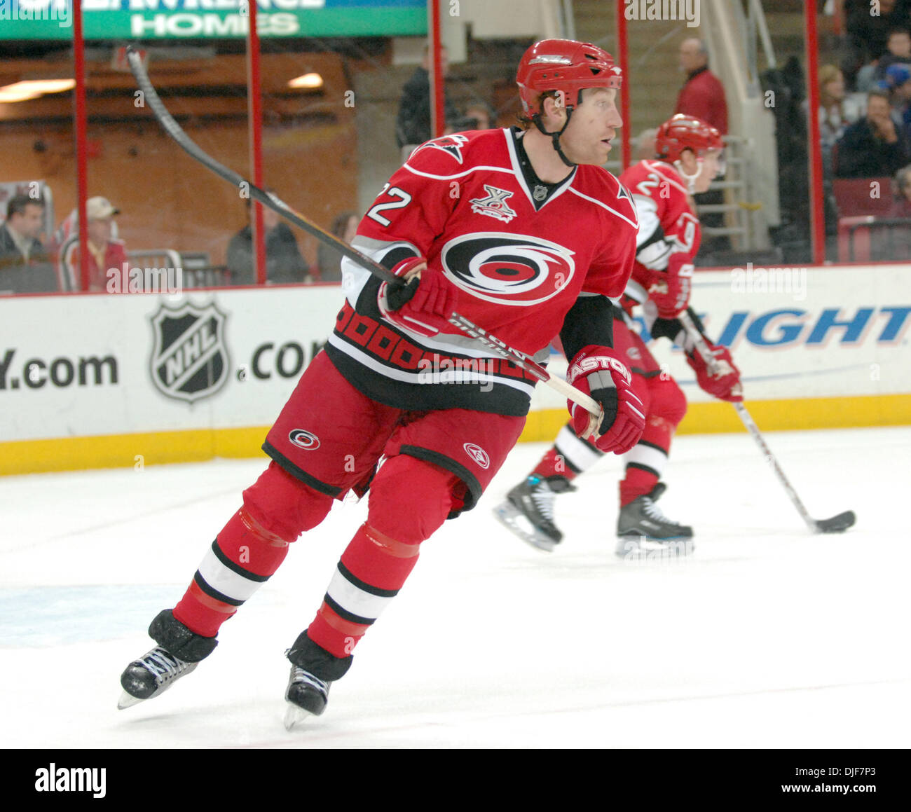
Tuomo Ruutu! Loved him in Chicago. When the Canes began, I hated their jerseys. Just too much red for my taste and clunky fonts. It wasn't until they started screwing with them that I realize how much they got it right the first time.
-
On 7/21/2022 at 2:25 PM, AFirestormToPurify said:
I'll never understand why people love that jersey. The very definition of a soulless and generic jersey. An expansion team from the early 2000s playing O6 dress-up because double blue jerseys, roundel logos and vintage white were trendy in the early 2010s
Especially now that we have yet another navy blue + light blue team in Seattle. They don't wanna look like the Rangers (which they absolutely don't, not even remotely close) but they wouldn't mind sharing their colours with the Jets and Kraken?
Since moving to Ohio, I go to A LOT of Jackets games, and I don’t understand the love for it either. I think it’s a fine alternate, but that’s all it should ever be. In person, it’s a drab blob of a uniform, and it’s always disappointing when I get to a game and it’s an alternate night. I can understand if people want minor changes to the primary (the font change a few years ago was a step backwards, IMO), but the logo and colors are fantastic and bold.
People have been predicting that the team would make this change for years, and it’s thankfully never happened. Yet.
-
I like the blue pants on the road, but I would hate to see them go that route for the home set. I feel like it's still a unique look for them, and it does a good job of breaking up the blue. Personally, I think the Tri-City look is a downgrade...too much navy, and nothing is accentuated.
-
On 7/9/2022 at 4:36 PM, adsarebad said:
Exactly........ if St. Louis can wear this beauty, Boston can wear that Sock hat as well
-
I own that hat, as a Cardinals fan, but I hate it and wish that they would stop using it. It changes the look of the home uniform so much by making everything...darker. Just my opinion. Then again, I'm one of the rare people that only wants the home red hat for all 162 games.


/cdn.vox-cdn.com/uploads/chorus_image/image/29553777/129591595.0.jpg)
/cdn.vox-cdn.com/uploads/chorus_asset/file/19414781/Untitled_14.jpg)


MLB 2024 Uniform/Logo Changes
in Sports Logo News
Posted
This is going to be two hot takes in one, but I love the Cardinals away jersey and I also loved when they went back to the red hat with it. The road grey set is my favorite of theirs. I love the bright red contrasting against the grey.