

.png.68727806ce154c1fb17b5471c17e8930.png)
DrunkKidCatholic
-
Posts
24 -
Joined
-
Last visited
-
Days Won
1
Posts posted by DrunkKidCatholic
-
-
Just now, Sec19Row53 said:
Meh - we're all allowed to have opinions.
yes and we can have opinions on those opinions.
-
 1
1
-
 1
1
-
-
The green appears lighter

-
6
-
 1
1
-
-
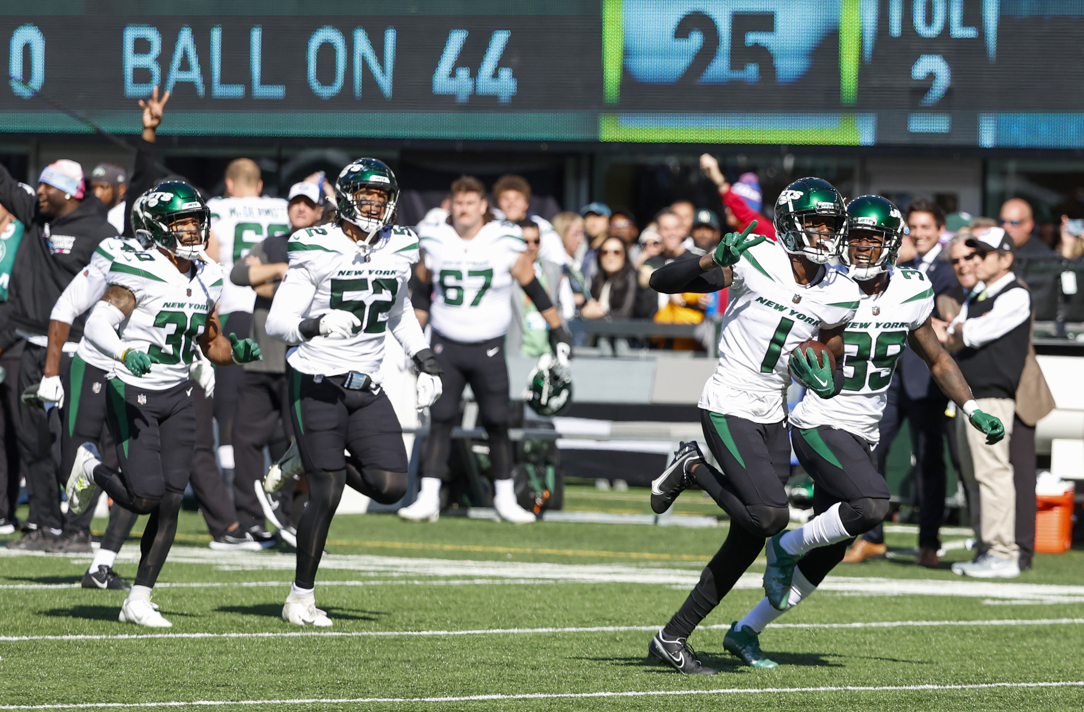
there's been talk jets are revealing on monday but there hasn't been any confirmation from team. so who knows
-
1 hour ago, SportsFan12 said:
Like the Jets would EVER pair the black jersey with anything other than black pants. It's too freaking FIRE to set aside and wear a somewhat appealing combo like black over green or black over white.
-
1
-
 4
4
-
-
-
It's an upgrade but almost anything would have been. I'm pretty underwhelmed by this rebrand. How many red white and blue teams do we need? The roundel logo is a swing and miss.
-
The black dot concern me.
-
1
-
-
these helmets lasted 1 season
-
1
-
-
2 hours ago, ManillaToad said:

no black cleats!
-
5
-
1
-
2
-
-
The Color Rush uniform pretty much solved the issues with the Parcells era shoulder stripes. Just replace that secondary dark green and it's pretty spot on.
-
5
-
1
-
-
1 minute ago, Old School Fool said:
I'm going to assume the Jets won't use the 80's logo. While it is a great logo, I can't see them messing with what they have right now due to logistics.
I think thats a poor assumption
-
3
-
-
17 minutes ago, BBTV said:
The other solution to the Jets legacy jersey problem would be to modernize it by putting it on the Texans template, have the sleeve white, and the shoulder insert green with surrounded by white piping.
Forgive the Lakers font, it's just what I was using last time I tried this and I didn't feel like finding a block one. I think it's a bad-ass football font anyways.
i really don't think anyone wants "modern" stripping. After the last 5 seasons Jets want to go back to a traditional classic football jersey.
-
1
-
-
25 minutes ago, DCarp1231 said:
Is there an actual color difference between the regular green Jets helmet and the throwback helmet?
No I believe they literally switched out sticker logos and face masks.
-
-
8 minutes ago, CC97 said:
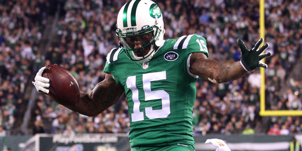
Anyone else remember just how excited everyone was that the New York Jets were ditching the 80s/90s look in favour of the 60s throwbacks?
Circle of life.
I think most Jets fans would still prefer a modern/cleaned up version of the 60's Namath/'98 Parcells era, but this is a clear upgrade over the current set by miles. Hopefully they'll do an alternate at some point and we can again decide which we like better.
-
1
-
-
32 minutes ago, WBeltz said:
The one thing I liked about the Jets uniforms were the helmets and the word mark on the helmet. I’d even say they should keep the helmet sans face mask and current helmet mark
Legacy helmet is infinity x better than current helmet.
-
13
-
-
Unless you can convincingly clean up the shoulders on Namath/Parcells era uniform which always had issues under Nike.
-
2
-
-
I've always thought the Jets should just steal the Colts template. Simply switch out the blue for green.
-
3
-
-
Will be excited to see an updated modern version of this.
-
10
-
3
-
-
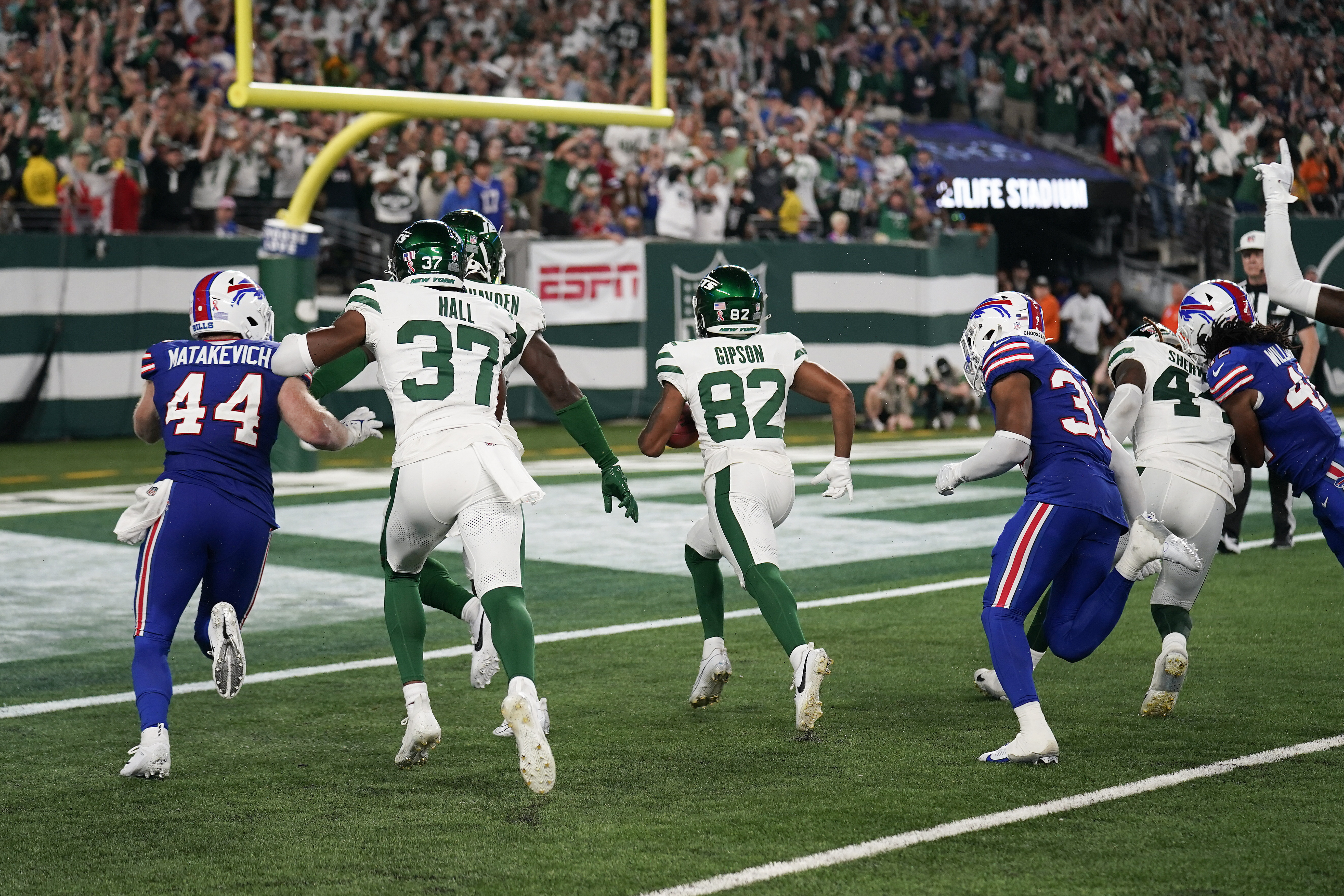
These just look soo much better on the field in action than the current set. Black as accent color needs to be gone forever.
-
14
-
2
-
 1
1
-
-
1 minute ago, jerrylawless3 said:
What a shame, in my opinion. I always thought the Jets’ current look was a good modern set – restrained and simple with just enough flair to make them unique.
All that y he “legacy” jerseys have going for them is just that – nostalgia. Without that they’re boring, nondescript, sporting goods uniforms.
the fan base despise the current uniforms and loved the legacy set.
-
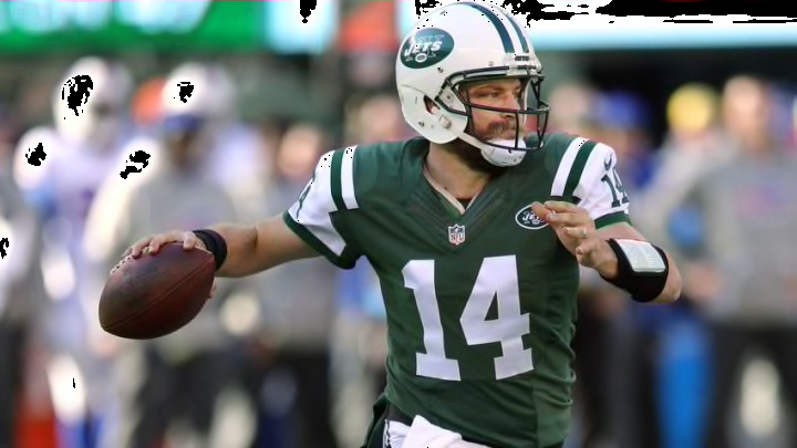
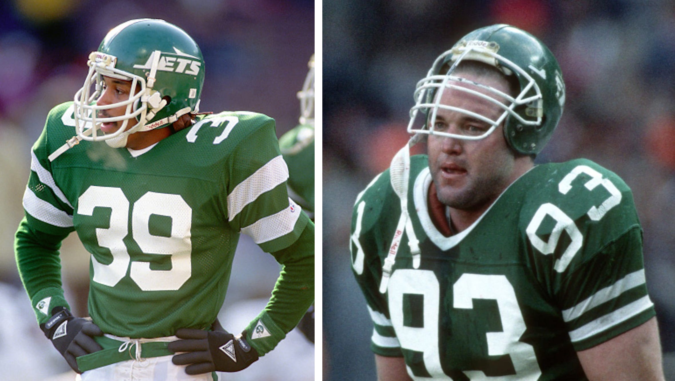
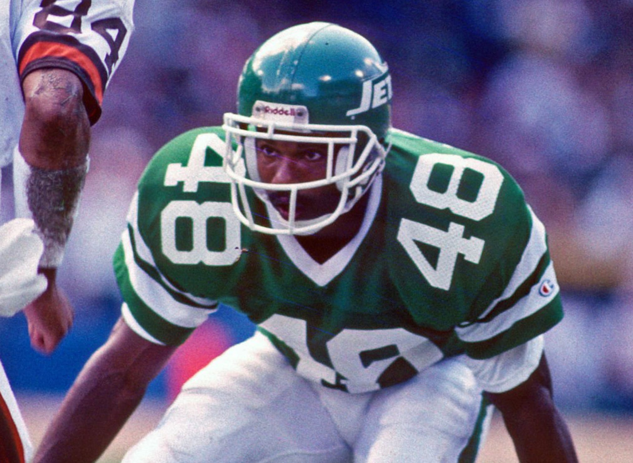
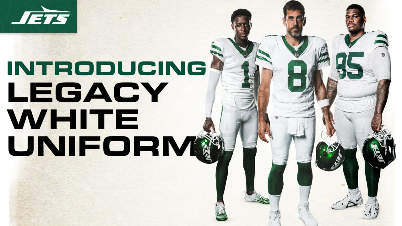
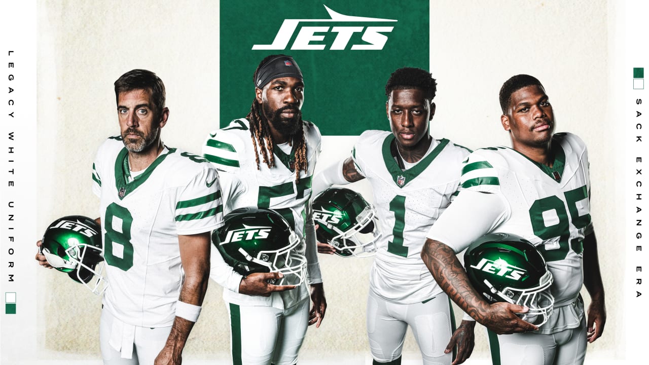
A reminder of what the legacy uniforms are...
-
7
-
-
-
2
-
2
-


:format(jpeg)/cdn.vox-cdn.com/uploads/chorus_image/image/53469519/usa_today_9781117.0.jpg)


2024 NFL Changes
in Sports Logo News
Posted
What's wrong with these? Lighter green was all they needed.