


Ringneck75
-
Posts
11 -
Joined
-
Last visited
Posts posted by Ringneck75
-
-
14 minutes ago, tBBP said:
We'll skip past the obvious BFBS and get to the part of this I've been hoping for the longest that KU would do: adopt the circus font for their football uniforms. What they have right now is solid; these are just more distinctive. (I know Wyo beat KU to it in football, but KU has had some version of the circus font for the longest time in basketball, so there's that at least.)
I'm surprised how much I like the circus font on the KU football uniform. I'm also surprised that they are doing this one game after rebranding the football program to a block font. I wonder if they really considered going circus with football, the rumor is the return of circus to KU basketball full time after this season. Trajan is mercifully being phased out it seems.
-
-
KU letters look better than the Jayhawk on blue helmets where it gets lost but I think it looks good on their white lids.
Blue helmet looks like it has a satin finish. I think the traditional look fits Kansas better than trajan for sure, rumors that basketball will be returning to the circus font and trajan is largely phased out of the athletic department.
-
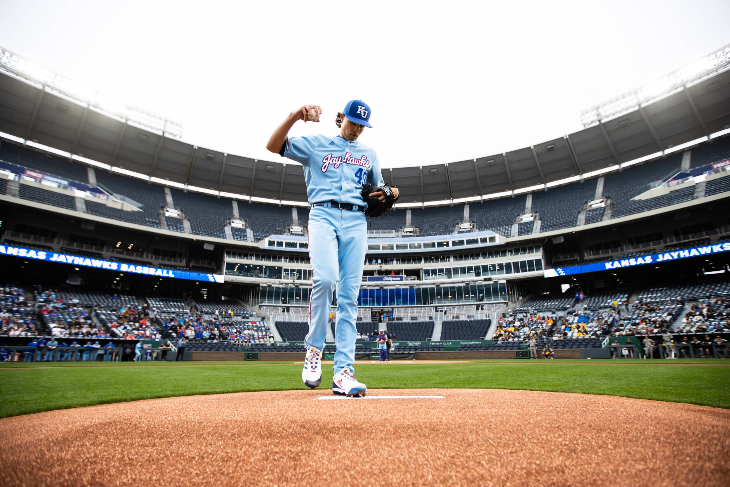
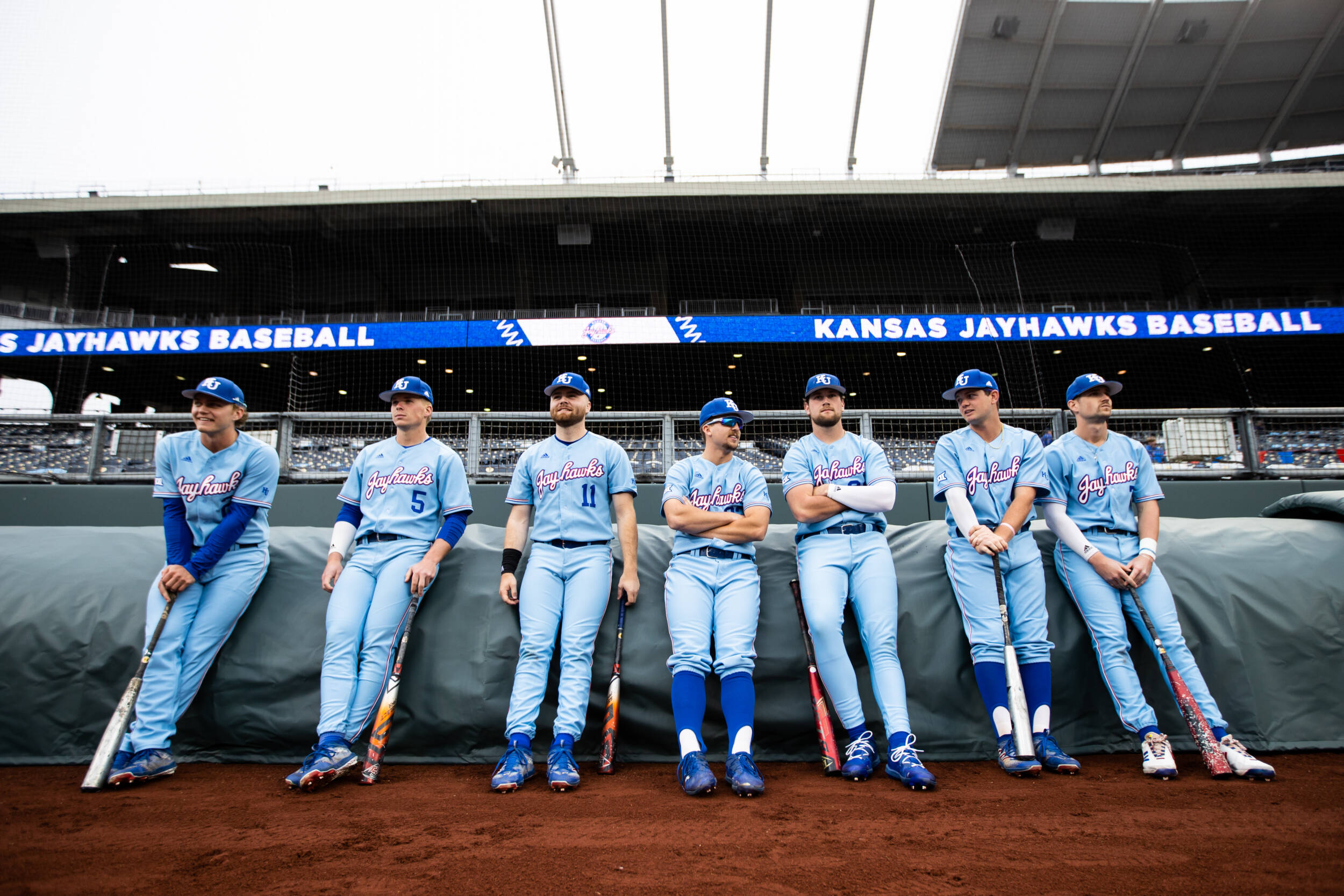
Kansas' powder blue uniforms are wildly perfect, IMO.

-
 6
6
-
-
Kansas' BLM uniforms are nice.
-
2
-
-
Kansas has worn these alternates a couple of times this season. Initially I wasn't crazy about it but they have grown on me and look pretty good in action. Font is based on the "Beware of The Phog" banner made by students in the early 90s that hangs in Allen Fieldhouse.
-
1
-
-
15 minutes ago, tBBP said:
Setting aside the fact that I always wanted KU to adopt the basketball program's old circus font across the rest of their sports...if they were to thin up those block numbers a bit & hold on to that striping pattern (and add it to a set of white pants while keeping their blue pants as is), they'd really be onto something there. There's only so many ways to do royal blue and cherry red--I think that arrangement in that photo does a great job of distinguishing the colors in a way that LA Tech used to perfect.
Now, with all that said: can someone explain to me why those jerseys say "Jayhawk" minus the s? Throwback of some sort??
People always think it's an error but I believe it's a reference to this WWII plane as the uniform was a WWII tribute that was only meant to be worn once.
-
3
-
-
Kansas is strongly rumored to be changing things up. Rumors are dropping the trajan font and adopting the 1941 Jayhawk "Warhawk."
I don't know if they are moving more toward a look similar to this or not but their coach does like to mix up uniform combinations.
-
Kansas broke out the powder blue jerseys with a new helmet against Baylor.
-
Pretty strong indications that Kansas will finally be moving away from trajan in '23. They started using this font in a lot of their social media last year and it's even being used on official signage now.


/cloudfront-us-east-1.images.arcpublishing.com/gray/4GXLLZDRYVFIRJFYFZ6JNCBFFA.jpg)


College Football 2023
in Sports Logo News
Posted
You don't change the Jayhawk because it is one of the most recognizable mascots in the NCAA behind the Irish Leprechaun. You do take it off the helmet though and just go with KU, particularly on blue helmets. You could monochrome the Jayhawk on the helmet and make it all white and blue and it might work.