


loholt
-
Posts
30 -
Joined
-
Last visited
Posts posted by loholt
-
-
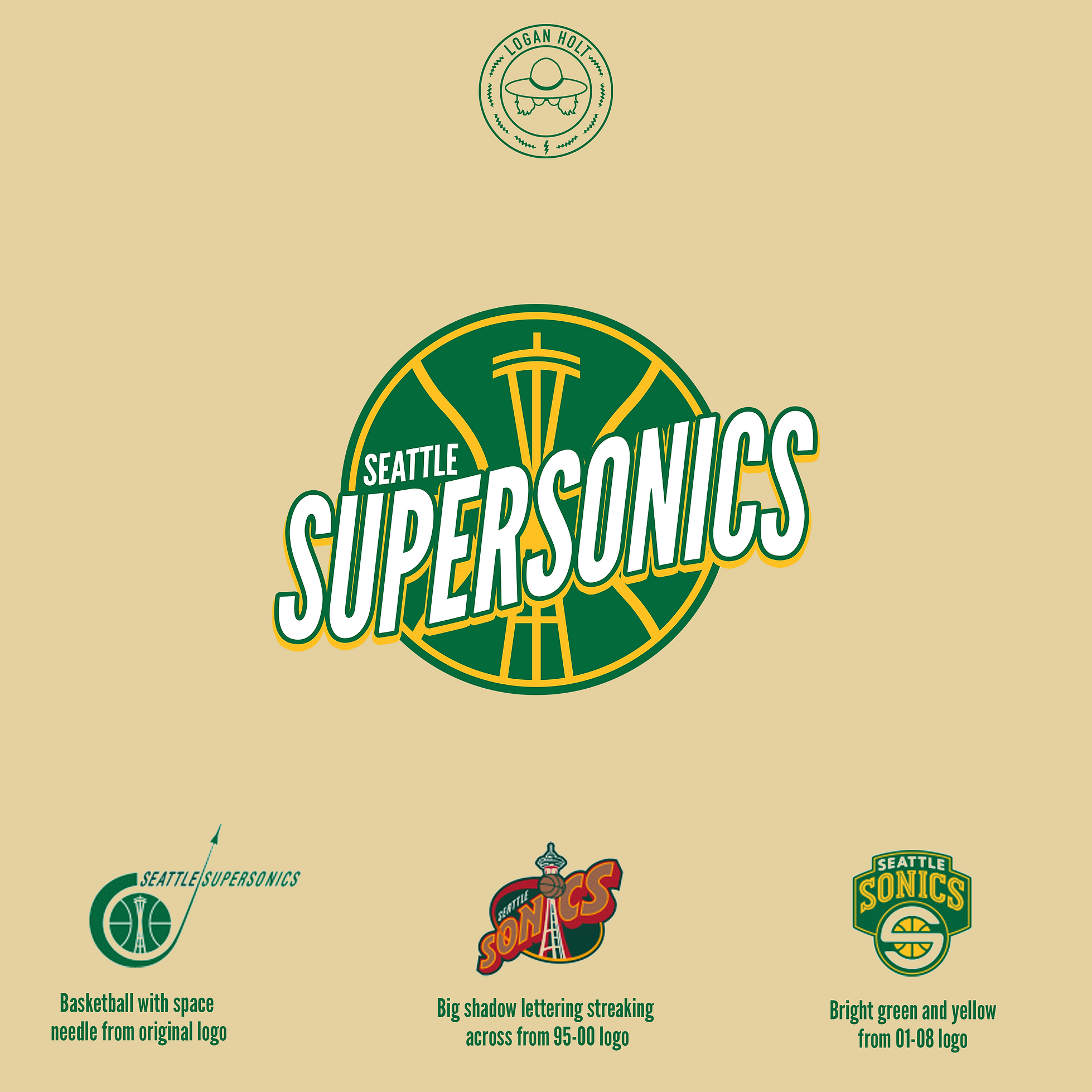
Here we go with another NBA brand refresh! This time the soon to be back Seattle Supersonics at the suggestion of @mistere79.
It's time for the Sonics to come back with a fresh brand that pays homage to the nostalgic and iconic looks of the past. The new primary logo ties in pieces from the original jetsetter logo of the 1960's, the iconic big lettered logo of the 90's, and the bright colors of the short lived modern Sonics that drafted Kevin Durant. Alternate logos range from modernizations of past logos to fully original custom marks. Jerseys are kept fairly simple as to honor the past and let the city of Seattle put their name back on the chest of an NBA jersey for the first time in nearly 20 years.

-
 1
1
-
 2
2
-
-
13 hours ago, CATLogo1 said:
So many questions I have as a fan of the Utah NBA team. First, why Pioneers as the team name? Second, is there a version to where I may be able to see the full uniform (jersey+shorts), logos & colors)? Third, the domain name Pioneers.com is already taken, but the domain name UtahPioneers.com is not & is available. Perhaps tweak the court design to incorporate it? Fourth, how were the colors chosen? I get purple, but why metallic gold? Also, the arena name changes back to Delta Center on July 1, 2023.
Pioneers seemed to go with the mountains and the history of the area and was suggested by someone on here. I've made some mockups of Utah Yeti and Utah Blizzard as well which are above on this post. With Yeti and Blizzard I go back to a little bit more of the purple. To see the full Yeti concept I have it up on loholt.com/utah right now. Good call on the website and the arena name, I didn't know they were changing it back to the Delta Center.
-
Alright after a little hiatus we're back and we're bringing the Jazz back to their rightful home of New Orleans. Kept it pretty simple mostly going back to versions of the original logo and color scheme but then again it is New Orleans so I got a little wacky with some of the jerseys.
-
2
-
-
1: Ghana #2
2: Switzerland #2
3: Ghana #1
4: Portugal #2
-
Holy smokes these just keep getting better and better. Well done everyone.
1: Costa Rica #1
2: Croatia #2
3: Canada #1
4: Canda #2
-
I’ll give it another go
-
1. Mexico 2
2. Mexico 1
3. Tunisia 1
4. Saudi Arabia 1
-
In for this one too
-
1. Senegal #1
2. U.S. #2
3. Iran #1
4. Ecuador #2
Super impressive work all around. Awesome competition looking forward to doing more of them!
-
I'll give it another go
-
10 hours ago, VampyrRabbit said:
The 90's AF purple and blue colour combination looks great. I would like to see a concept using those colours and Blizzard, since you have the Trail Blazers in the same division and Utah Blizzard rolls off the tongue nicer than either Pioneers or Voyagers.
Didn't do the full 3D Mocks for it but here's the general idea. Originally my only worry with this color scheme is you're getting a little close to the Hornets but they both had it in the 90's and it worked out just fine. I had a friend suggest Utah Yeti to me as well which rolls off the tongue nice and you could do with these same color schemes.
-
1
-
-
On 11/9/2022 at 7:57 AM, johne9109 said:
I like that idea a lot
On 11/9/2022 at 7:50 AM, Wildcomet said:I think I agree as well. Maybe an idea would be to make the pinstripes into rows of tiny stars? That way they look like pinstripes from a distance but you can see them as stars up close? The stars on the sides could also work well.
Was a little hard to figure out how big to make the stars but settled into this. Not sure I love it for an every night jersey but would be a cool city edition or something like that.
-
2
-
-
Man these are clean. The NBA takes some swings with jerseys but mostly with new designs that I don’t like as much. 90’s NBA is the peak and it’s cool to see a lot of them with different colors in this. As a Magic fan the T-Mac era logo with the black got me excited.
-
1 hour ago, Wildcomet said:
I think I agree as well. Maybe an idea would be to make the pinstripes into rows of tiny stars? That way they look like pinstripes from a distance but you can see them as stars up close? The stars on the sides could also work well.
1 hour ago, johne9109 said:I like that idea a lot
I do too. What they did this year was interesting but it still doesn't look enough like the old pinstripes for my liking. I'll see if I can put something together that looks clean.
-
2 hours ago, johne9109 said:
I dont think the pinstripes and the stars work together; it's a little too busy. If you wanted to use both I would try using one on the main part of the jersey and putting the other and jersey sides.
I don’t disagree it definitely is a lot. They actually sort of took your suggestion this year and did a modern version of the stripes with the stars on the side for their statement jersey. Maybe I’ll do another version with one like you said or maybe just have alternate versions, one with stripes and one with stars. -
Another NBA Brand Refresh, this time for my beloved Orlando Magic. Nothing too groundbreaking mostly just bringing it back to the 90's style (which almost every NBA team should do) and embracing the pin stripes and logos of that era. Also paying homage to the star jerseys of the T-Mac era with the jerseys as well. After I had come up with this they actually ended up leaning into this a bit with their statement jersey this year and having pinstripes in the lanes on their statement court which I love. Next year for the 30th anniversary I wouldn't be surprised if they fully brought back the pinstripes and a lot of the old logos for more prominent use.
-
4
-
-
I'm in for this for sure
-
Man those Cream City FC logos and the Blaze logo are awesome. I've always thought cream as a color is really underused today in sports logos and jerseys. When done right it can look really cool.
-
1
-
-
Alright I'm back with another NBA brand refresh and this time I'm heading west to Utah. We're taking the nonsensical Jazz name out of Salt Lake City (and eventually returning it to New Orleans where it belongs) and going with the Utah Pioneers at the suggestion of a few users on this thread. The Jazz has always been a goofy name for Utah and right now when they are transitioning to a rebuilding period would be a great time to embrace something new and fresh.
In my opinion the Jazz peaked culturally and successfully during the Stockton-Malone era of the 90’s so I’m throwing it back to that look with plenty of purple and white and an emphasis on the mountains for the logos. To incorporate the Pioneer theme a bit I’ve added a goldish color that is also pretty close to an alternate color they used in the popular 90’s logo. I know the Lakers technically are a purple and gold as well but with slightly different purple and a way different "gold" (there's is obviously just yellow) I felt like it was different enough.
Jersey-wise the home and away are basically modernizations of those 90’s jerseys and then I added a gold one for the statement jersey to embrace the Pioneer mascot a little bit more. Certainly could argue that the Pioneer mascot could come through a little more but any logo involving a pioneer or covered wagon or anything looked hokey to me. The nice thing about this brand refresh is they can keep the bear mascot they currently have as well.
-
2
-
-
On 10/28/2022 at 12:46 PM, Wildcomet said:
Those Pacers ones are nice! I was worried when I read the description before seeing the uniforms that pinstripes and checker board together would be too busy but you used them real well and it works. I'd be interested to see some new ideas for Utah as well. I've always thought Pioneers was a good name for teams in that region, but there's others that would work well too of course.
On 10/27/2022 at 2:54 PM, mistere79 said:Love the checkered lanes on Indiana, definitely something they should do. love to see a Utah concept with a new name (Mountaineers? Pioneers, something?) as with new owner and worst name and look in the NBA they need something totally new more than anyone.
Here's some options with some possible names on a logo for Utah. I feel like the purple and blue of the 90's is their most popular look so would probably be throwing it back to that in some capacity with the mountains and the nice thing with all 3 of these names is they could keep that look and keep their bear mascot they have currently too.
-
1
-
-
Wow I've never seen that one before but that is very cool. It will be interesting to see what they go with when they come back for sure so I'll work on that too!
-
3 hours ago, mistere79 said:
Love the checkered lanes on Indiana, definitely something they should do. love to see a Utah concept with a new name (Mountaineers? Pioneers, something?) as with new owner and worst name and look in the NBA they need something totally new more than anyone.
Great idea. They've really struggled in the last few years and I have no clue what they're going for this year with the black and yellow. I'm happy to see they're bringing back the purple jerseys next year because the Stockton/Malone era stuff is the best but still obviously doesn't fit with the Jazz name. I'll work on it and see what I can come up with!
-
Alright next up I'm doing a full brand refresh for the Indiana Pacers. I think their primary is already pretty good and widely recognized so I just polished it up a little bit and took the gray out of the current one (why is there gray?). I made a new alternate logo really leaning into the "Pacer" theme and trying to embrace the racing roots of the team and city a bit more by using the checkers. The jerseys combine the checkerboard with the pinstripes of the Reggie Miller era which in my opinion were their best jerseys. Added some checkerboard to the courts too to keep the theme going. Overall I feel like they could lean into the racing theme way more and tried to reflect that here.
-
2
-
-
17 minutes ago, Wildcomet said:
Nice! One thought, have you tried the two main jerseys with a little black for outlining the letters and logo? It's not as much an issue in the drawings, but in the 3D jersey renderings the cream and gold are close enough in color that I could see it being tough to read jersey names, etc. during a game. It's a good concept all around though, and I really like Revelers name. It's on brand with the community (and potential ownership), but not nearly as on the nose as some other name suggestions I've heard which I appreciate.
I've heard that before and definitely agree. Here's a little mockup of what they would look like. I was trying to figure out how to go without black on those two jerseys just to keep it the two main colors but I agree that it's probably impractical from a real life jersey standpoint.
-
2
-


NBA Brand Refresh: Seattle Supersonics (6/?)
in Concepts
Posted
Thanks for the kind words and the feedback. You were spot on with the logo edits and jersey changes. I like how all of them turned out a lot more after some tweaks.