


Dante_X
-
Posts
348 -
Joined
-
Last visited
Posts posted by Dante_X
-
-
-
-
-
New 1994-inspired alternate jersey for the Halifax Mooseheads

-
 1
1
-
-
Better pic of the jerseys:
-
4
-
-
Québec Remparts throwback inspired alternate jerseys
-
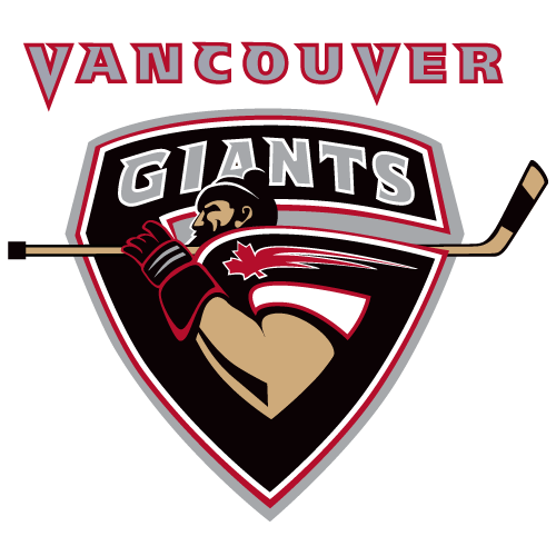
The Giants added "Vancouver" at the top of their logo
Edit: looks like this was an alternate logo now promoted to primary
-
13 hours ago, zubazpirate said:
That old logo has to be one of the wordiest hockey logos in existence. 8 different words/place names by my count.
Also someone once told me that the Sagueneens logo was a reference to blueberries or some other sort of berry that grows in the region... is there any truth to that, or was my leg being pulled?
yes, it is a blueberry
-
Chicoutimi reverting to the previous logo after some city counselors wanted the logo to say "Chicoutimi".
-
Blainville-Boisbriand Armada special alternate jersey to be worn on March 3
https://www.facebook.com/watch?v=166471856182630
-
New Gatineau Olympiques third jersey
-
1
-
-
Chicoutimi Saguenéens played a throwback game this weekend, throwing back to their inaugural uniform of 1973
-
Saskatoon Blades of the WHL got an updated logo
-
1
-
-
New Halifax Mooseheads logo
Along with a nice unveil video
-
5
-
-
1 hour ago, Frylock said:
Portland Winterhawks (WHL) will be unveiling their new sweaters at 11AM Pacific time this morning. Last year, they put the new crest and shoulder logos on existing Winterhawks blanks, using the Chicago template. Word is that the changes will be to the collar and sleeve stripes.
-
1
-
-
32 minutes ago, spartacat_12 said:
A bit strange having the flames from the torch overlap with the border of the shield, but not go past the shape. The 6 stars representing the 6 QMJHL titles, plus the bigger star for the Memorial Cup championship is a nice touch though.
But they have 7 QMJHL championships so I don't know what is going on with the stars
-
Gatineau Olympiques 50 seasons logo
-
1
-
-
10 hours ago, monkeypower said:
I think it's alright. Definitely an improvement over the old one which had way too much writing on it. I do think it looks weird that the S-river overlaps the rest of the logo, probably would look better if it was contained within the inner blue circle similar to the 73-79 logo. I also don't really think I like the amount of grey.
I remember reading somewhere, but I can't find it now, is the Sags logo supposed to be a blueberry?
Yes it is a blueberry as the area is known for their wild blueberries
-
1
-
-
New Chicoutimi Saguenéens logo
And the jerseys (which are the same as before except for the logo and the stupid vertical pipes now in silver instead of white/blue)
-
2
-
 2
2
-
-
-
50th season logo for the Chicoutimi Saguenéens
-
-
incoming new helmet for the Alouettes
-
Some people are reporting this as a CF Montréal leak for their away jersey


:quality(95)/cloudfront-us-east-1.images.arcpublishing.com/lescoopsdelinformation/BDORP4AKGVBWFJEIWA7OGNIGUA.jpg)


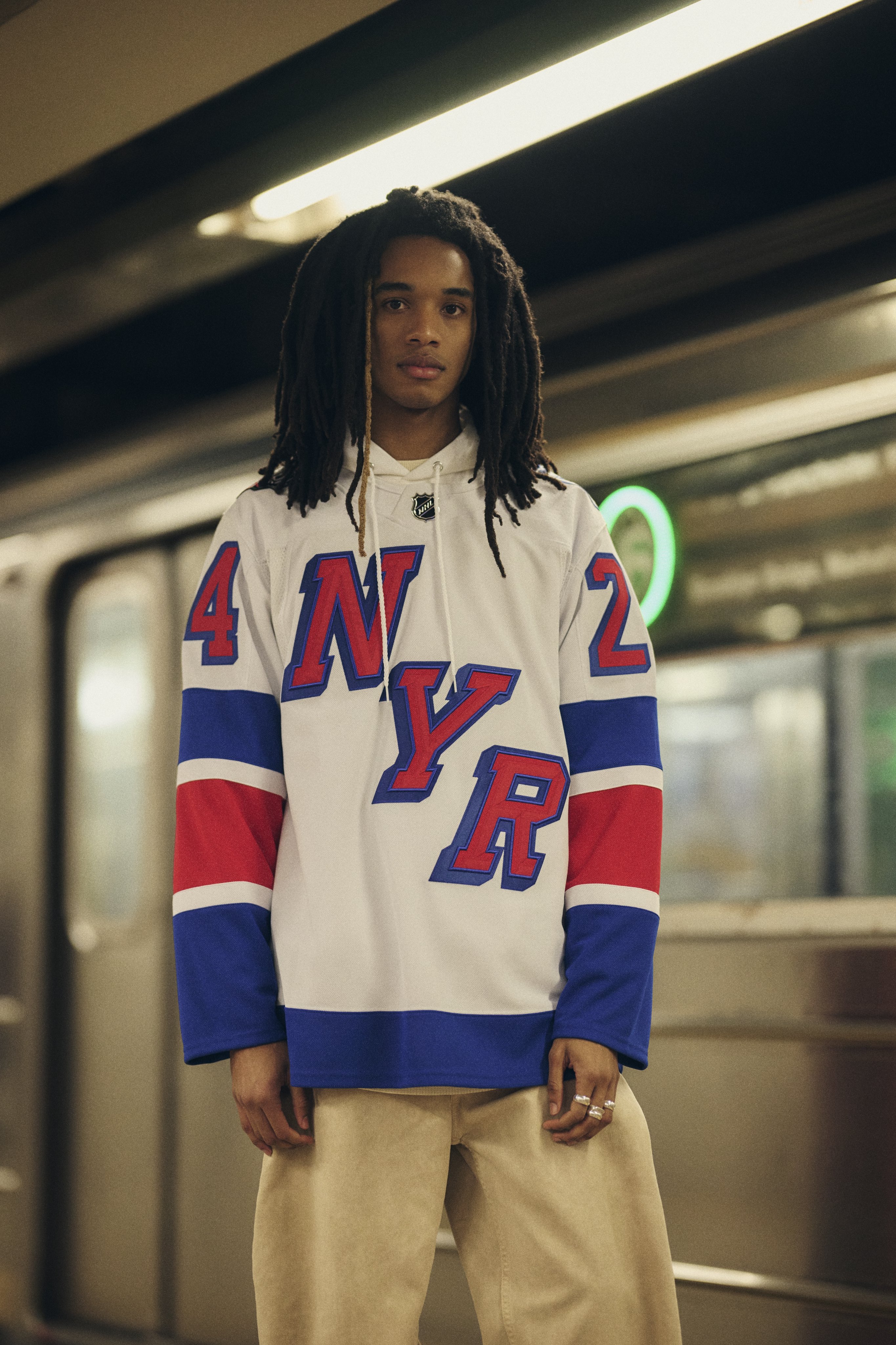
2023-24 NHL Jersey Changes
in Sports Logo News
Posted