

SenatorJake
-
Posts
916 -
Joined
-
Last visited
Posts posted by SenatorJake
-
-
52 minutes ago, Morgan33 said:
Agreed. "Yeti's" feels extremely forced.
Something about it as a sports team nickname does sound forced and almost uncanny. Like the opposing team in a long-forgotten Air Bud sequel.
-
Game over. It's gonna be Yetis.
-
2 minutes ago, TBGKon said:
Dont connect too much to this logo, remember Seattle started their generic imagery with red.
I get that this may be a simple placeholder, but this has to be a pretty strong indicator that powder blue will be one of the colours present on the jersey and/or logo.
For example, that second Seattle image has (more or less) two of the colours they ended up using.
-
 1
1
-
-
4 hours ago, OnWis97 said:
I think that this spells the end of franchise continuity in the NHL. Only MLB survives. For now.
It could be argued that it died when the Cleveland Barons merged with the North Stars, only to later "un-merge" and become the San Jose Sharks.
That certainly did a number on "continuity".
-
2
-
-
2 hours ago, SFGiants58 said:
It ended already, when the Senators tried to pretend they were connected to the Silver Seven. Speaking of which, I still wish the =O= set was promoted to primary status.
I would say that two teams that exist during different periods in the same league, that use the same nickname, in the same city are certainly "connected". They're just technically not the same franchise.
-
*June 27th
What if Mereulo doesn't win the bid or what if he doesn't even show up to the auction?
Would he then own the trademark for a defunct NHL team for the next century or whatever?
Or is there some kind of 10 year window thing going on here?
-
1
-
-
Ugh... again with this "ackshually, we should name the team HC" pretentious nonsense.
WHY DO THEY DO THIS? WHO HURT YOU?!?!
-
4
-
-
Utah Bobcats isn't bad. I like it.
Talons however... woof I'm not sure I could ever stop laughing at the team named after a bird's foot.
-
1 minute ago, tigerslionspistonshabs said:
As much as I'd love a bigfoot themed name (Sasquatch, Yeti, etc), it's not for the big leagues.
I agree, that's a valid point against it.
-
Top 5 Utah NHL team names, in order:
1 - Utah Coyotes (not happening, unfortunately)
2- Utah Grizzlies (strong name, if a case could be made that it pre-dates the NBA franchise)
3- Utah Yeti (fun to say out loud, it's grown on me)
4- Utah Roadrunners (built-in rivalry if the Coyotes do indeed come back)
5- Utah Blizzard (inoffensive, meets the double-z prerequisite)
-
The Florida Panthers and the Seattle Metropolitains. Two teams that got it right the first time around.
-
4 hours ago, BuckDancer said:
So you prefer their current logo over the unused 2007 version?
I do, but changing between those two logos wouldn't be the end of the world. Honestly if the current template is kept, then it would be somewhat of lateral move, all things considered. It certainly wouldn't upset me nearly as much as having my favourite hockey team skate around the ice draped in gold serpentine every night. That, to me, would be a real crime. Leave the gold serpentine to Vegas. They're kinda doing it justice, no? That can be their thing.
-
1
-
-
On 4/6/2023 at 4:37 PM, Ridleylash said:
Ottawa's another great example where they fiddled with their dark jerseys in the 90's and improved them dramatically by adding some white into the color mix.
See, now this guy's talking sense.
Those uniforms were the finest in team history, at least so far. You don't always have to start from scratch. A great uniform is honed over the decades and such. That's how you eventually get the timeless classics we all know & love.-
1
-
-
On 4/6/2023 at 6:34 PM, BuckDancer said:
Good examples, another thing I would add to Ottawa is that new 2d centurion logo which they never ended up using. That was a great, new, modernized, updated version of their original logo. I think most here on these board would agree that the new 2d logo is superior and should be their current main crest instead of the old '92 logo. That logo, on a jersey similar to that of their 2000-07 black alternate, but in red, and maybe a new updated S shoulder patch would blow their current look out of the water. That's the kind of tinkering and little tweaks that I'm advocating for, not just pulling out an old look that doesn't hold up that well today.
That concept has been done on this very board dozens of times. It does not, in any concept version of it I've ever seen here or elsewhere, "blow their current look out of the water". In fact I'd argue it looks kinda cheap, especially after years of seeing that unused logo plastered on some pretty shoddy team-branded merchandise.
But to each their own, etc...-
1
-
 1
1
-
 2
2
-
-
Vintage white should simply not be a primary colour for a jersey. In fact, it has no place in modern NHL colour schemes.
It totally breaks down the colour at home/white on the road* visual harmony that is so beautifully exemplified in the NHL. The white of the ice, combined with the crisp colours with a hint of white found on NHL jerseys. Both teams kinda matching because of it. It just all looks right. The NHL Match-Up threads are chock-full of visual examples of this, so I won't bother posting them here.
*white at home & colour on the road is also acceptable, if not preferable
-
Forget bringing back the Barons as a one-off retro reverse, in my opinion the team should be brought back as a full-fledged member of the National Hockey League.
Economics be damned, I just think they have a neat name and history.
-
 1
1
-
-
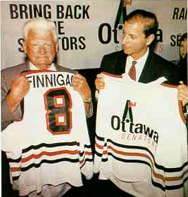
Ottawa Senators prototype jerseys.


-
1
-
-
You want pointless realignment, well feast your eyes on this. Here's something nifty I was working on when I was bored at work. It started with a conversation I was having. I said that with the influx of international talent, the NHL could expand by 2 to 6 teams. This generated much debate since most people think there are too many teams in the NHL as it is. Realistically speaking though, it's pretty much unavoidable that all sport leagues will keep expanding. That's capitalism, friends. So in the interest of taking my idea to the extreme, here's a 50 team NHL. Geographically speaking, I think it's :censored:ing impecable.
EASTERN CONFERENCE
Northeast Division
Halifax
Hamilton
Kitchener
Montreal
Ottawa
Quebec
Toronto
Atlantic Division
Boston
Hartford
Long Island
New Jersey
New York
Philadelphia
Central Division
Buffalo
Cincinnati
Cleveland
Columbus
Detroit
Pittsburgh
Southeast Division
Atlanta
Baltimore
Carolina
Miami
Tampa Bay
Washington
WESTERN CONFERENCE
Midwest Division
Chicago
Indianapolis
Kansas City
Minnesota
Milwaukee
Nashville
St. Louis
Southwest Division
Colorado
Dallas
Houston
Las Vegas
Phoenix
Utah
Pacific Division
Anahaeim
Los Angeles
San Francisco
San Jose
Seattle
Portland
Northwest Division
Calgary
Edmonton
Saskatchewan
Vancouver
Victoria
Winnipeg
Thoughts?
PS: I apologize that my post isn't about moving February to the Summer division. For the record, I think that moving February would crush an already disillusioned fanbase that has, thus far, lost 3 days to free agency.
-
Didn't this thread used to be called "Legends in the wrong uniform"?
Did we run out of legends?
-
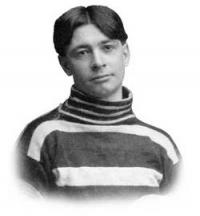
King Clancy in an Ottawa Senators uniform.


2024-25 NHL Changes
in Sports Logo News
Posted
I thought Bobcats was kinda fun while still sounding like a proper pro sports team name.
I suppose it is a tad generic, but it works really well for Utah. And if it comes to be, the "Jazz-Bobcats-Hornets name trade" folks will have their first moral victory since the Hornets came back.