


Harmening
-
Posts
1,275 -
Joined
-
Last visited
-
Days Won
1
Posts posted by Harmening
-
-
Most Underated set of Stros unis:

Yes folks, the firearm stripes. These would look so great as a alternate jersey for the team. I love everything about them. That being said, the 90's set is a close second with me. The set they have now is meh. Nothing over the top, but too simple.
My favorite part of that uniform were the caps.
-
Girls would turn the color of an avocado when he would drive down their street in his El Dorado.

I like it when you post.
-
I hate white face masks. They just seem to stand out too much. IMHO...
-
I liked the black-trimmed Tennessee numbers on the away jerseys.
-
Herp-a-derp... brown is the color of poop! I bet no one's ever said that before! It's especially funny since I don't like their team! Derp!

If it walks like a duck.....
And I've been a Browns fan since likely before you were born (at least hopefully you aren't older than I am and still using words like "derp" to seem cool online...) Allow me some self-deprecating humor, it's all we really have. Plus, ya know "BrianBrown" doesnt have a great ring to it either.
Where was the self-deprecating humor?
-
Herp-a-derp... brown is the color of poop! I bet no one's ever said that before! It's especially funny since I don't like their team! Derp!
Was just about to post something to this effect. Doodoo, turd, poop? Really?
-
He burned a lot of bridges...
-
I'm not getting all the hate for the Ravens' ring.
I'm guessing it's because the thing is butt-ugly.
-
 2
2
-
-
As much as I hate this, here is the Ravens SB ring. https://pbs.twimg.co...x8rCEAAW98u.png
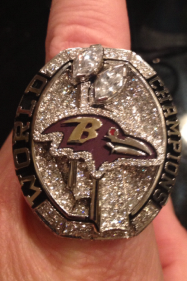
Looks like one of those rings you buy off EBay that come from Hong Kong.
-
Standford's Rose Bowl Rings

Other RIngs from The Orange and FIesta Bowls with Luck
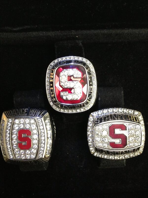
That ring reads "SANFORD", was that a guy's name?
-
I liked the red Arizona helmets paired with the red face masks. Not sure why, I just do.
-
Since we're discussing Oregon uniforms in an "unpopular opinions" thread:
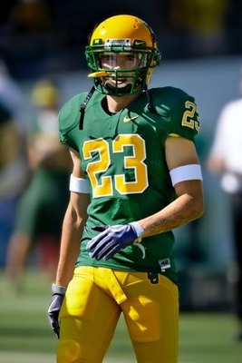
I think this is by far their best look ever. As in, this uniform is miles and miles better than any of the "modern" stuff they wear now.
I have a feeling that'll be an unpopular opinion on these boards.
I agree with you. The more "innovative" they try to get, the worse they look.
Being in Iowa, these colors make me think of John Deere. Never liked these two particular colors together.
The kid's got a nice farmer's tan, though...
-
Taking inspiration from another thread:
I HATED UCLA's stylized football numbers. The below is maybe my favorite CFB jersey ever:

I'm with you on these. Love 'em.
-
After reading the forums for some time, I realized that I have quite an unpopular opinion.
I love the look of the New Orleans Saints when they wear the black pants with the black jerseys.
-
Looks like a 'roided up bird...
-
Kurt Warner for the Iowa Barnstormers of the AFL:
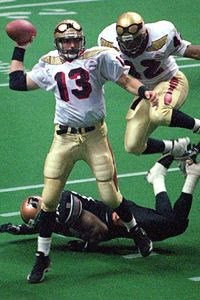
love those unis...
-
They even put his nameplate on the wrong side of the jersey.

-
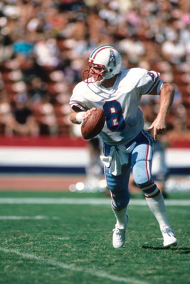
Archie Manning
While looking for a shot of Archie in a Vikes uni, I ran across this video of Archie with Minnesota in 1984. It's priceless x 2:
- the hilarious Vikes helmet rendition on the network starting lineup graphic (helmet horn is all the way forward like the Eagles' helmet wings), and
- the Vikings with awful white facemasks. I didn't know they ever wore white masks.
Hmmm, I kinda liked the white masks.

-
everyones talking about Favre as a Jet..... But what about this...

I don't know, maybe it's just me, but since I knew from early on that Favre started off with the Falcons, I don't find that pic strange.
What I find strange in that picture is a quarterback wearing that style of facemask.


Unpopular Opinions
in Sports Logo General Discussion
Posted
Another unpopular opinion is my love for the Vikings with a white face mask.