


SoxSteeler
-
Posts
526 -
Joined
-
Last visited
Posts posted by SoxSteeler
-
-
8 hours ago, HOOVER said:
If the Ravens just kept it limited to these two looks, fixed (or removed) their helmet stripe and updated their workmark, number font, and "B" logo on the hip, they'd have a modern classic. Unfortunately, those few elements severely date this set:

They need to just pay the artist that came up with the original shield logo. It was so much better.
-
 3
3
-
-
13 minutes ago, Silver_Star said:
Oh dear god! No pants stripe? Oh god! I am done with this crap!
I thought they were stripe-less too but the article on the main page points at the reflection that shows a large red stripe and small white stripe on the pants. I hated these when I thought no stripe but now I think it's a small downgrade instead.
-
4
-
-
everything here is great. The only think that is a little odd is the third city uniform looking more like a hornets alt with those colors.
-
looks great. I've always liked the falcons red helmet. This concept is very University of Georgia which I think is what the falcons were originally going for.
-
1
-
-
9 hours ago, ruttep said:
Also, the captain (or alternate captain if the captain is off the ice or if there is no captain) is the only player allowed to speak to the refs to protest or clarify a call.
This. They do serve a function in the sport.
-
1
-
-
3 hours ago, CaliforniaGlowin said:
Like I said, The Titans don't really use red on their uniforms. Red and light blue and less Navy would separate them pretty good.
Red and Light Blue won't look as good as Red & Navy IMO. It differentiate them but why do it if it's a worse brand? They should just drop their dream of returning to the light blue. They lost that color when the Oilers left. I just can't see the light blue working with their current logo positively.
-
1
-
-
I think the Texans are going to ruin their identity adding the lighter blue next year. I think if they want to go to a red helmet full time or add a alternate with the horns prominent similar to how the eagles use their wings that works just fine but adding oiler blue even as trim ruins their look.
they have perfectly good uniforms in my opinion. Non-Houston fan here. Tennessee does the double blue decently well because red is the trim. I just don’t see it working well swapped. Tennessee should go back to a white helmet to remain a little less navy but theirs isn’t atrocious or anything.
-
4
-
-
58 minutes ago, ramsjetsthunder said:
I must say, the Cards look great from a distance. Not as good up close, but a great starting point to work with.
the red in the stripes don’t show up well and they almost look all silver at first. Definitely better than what they had before but also kinda boring since everyone seems to wear solid white these days. Would be better with different socks, either half red or stripes.-
2
-
-
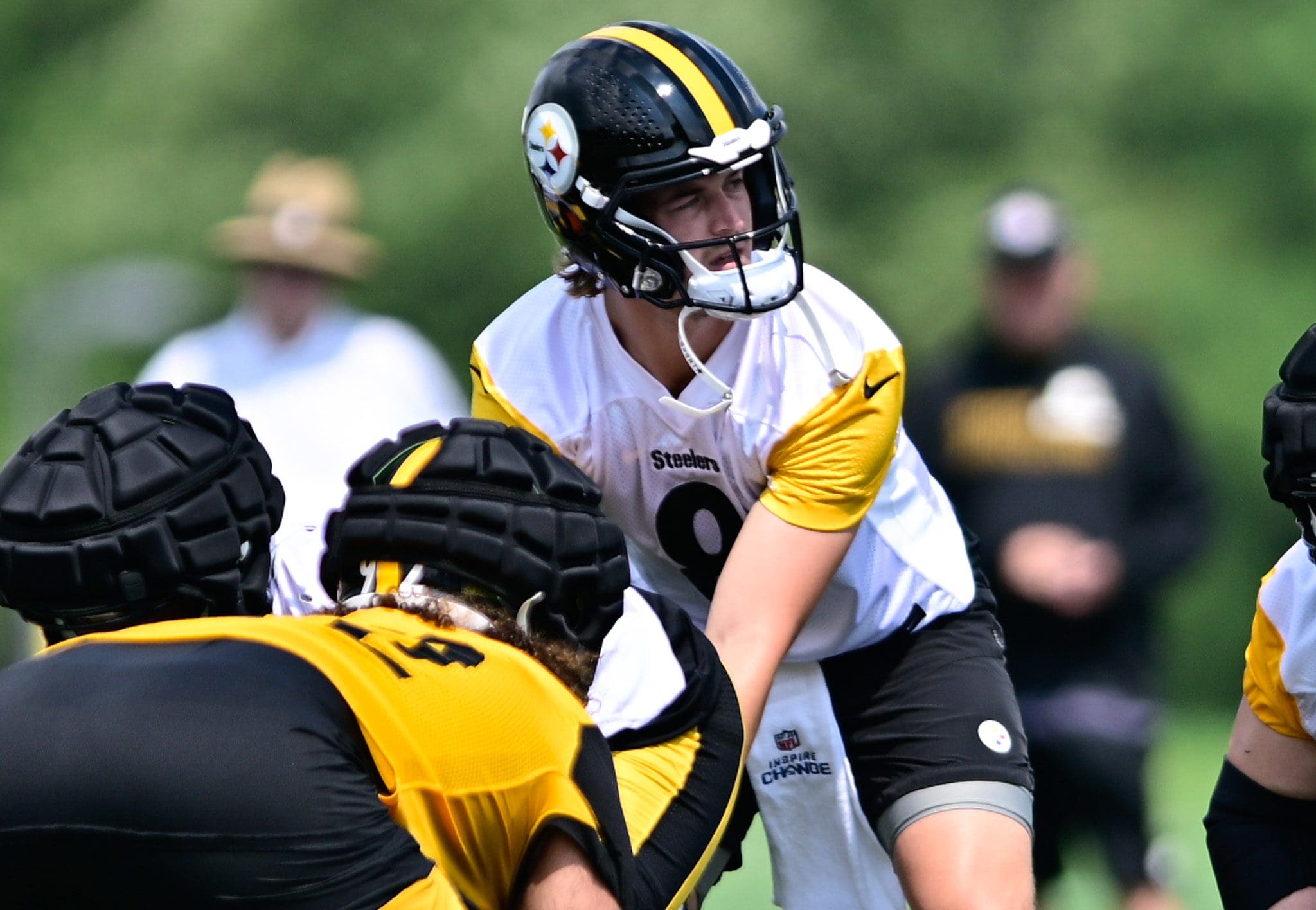
3 hours ago, GriffinM6 said:
I know it's just a practice jersey, but I wouldn't mind a throwback with either of these designs.
I’ve always like those and would be up for a throwback. I’d choose the 1962 to bring back the gold helmets though.
-
1
-
-
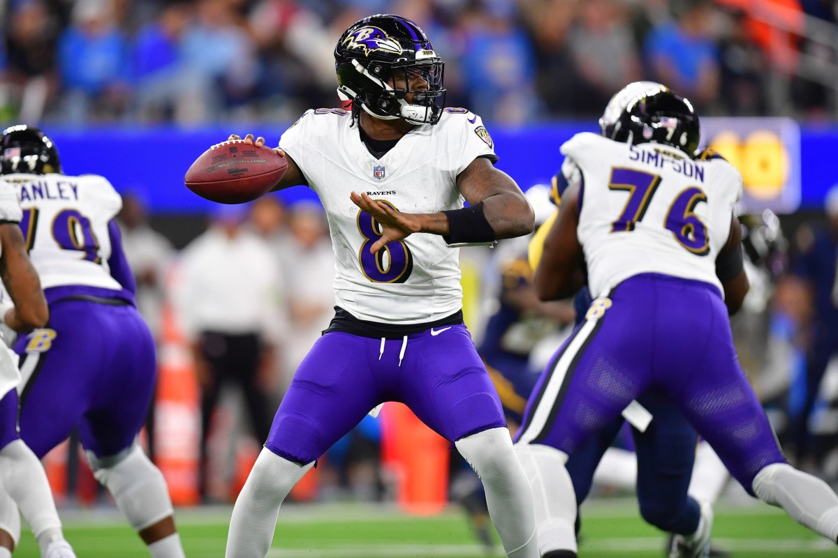
3 hours ago, BBTV said:
Interesting that they don't have a special QB jersey. I know it's "non contact", but figured they'd still have a red or some other special jersey.
Yeah, they’ve never had a special non-contact qb jersey since I’ve been following the team. I can’t say never but at least the last 25 years and probably never.
-
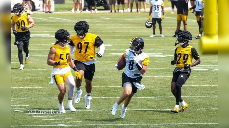
The Steelers got new practice jerseys with contrasting sleeves at the start of camp.
-
5
-
 2
2
-
-
On 7/1/2023 at 4:04 PM, SoxSteeler said:
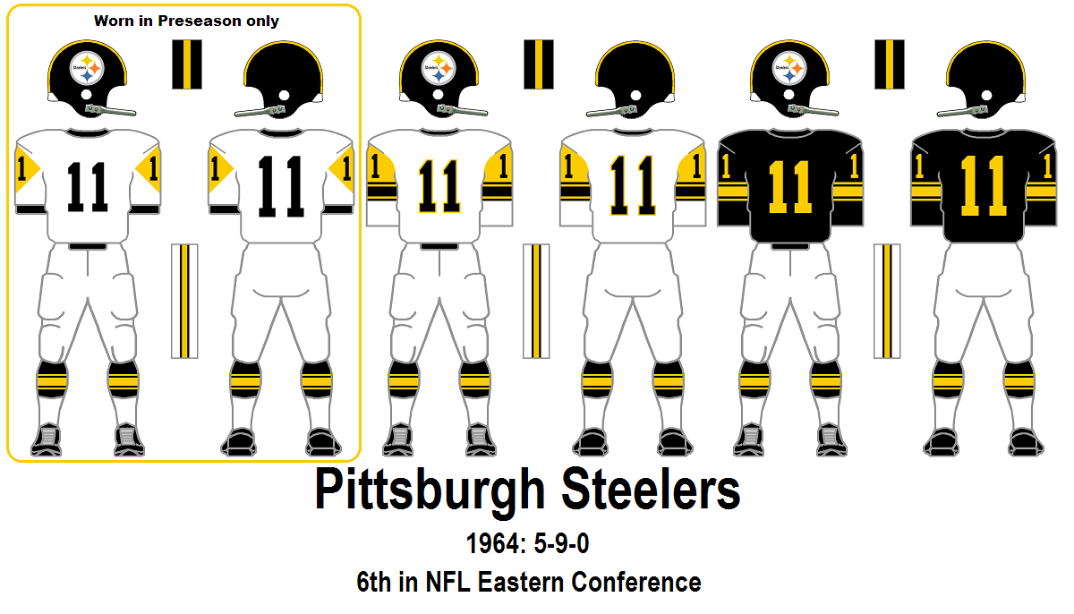
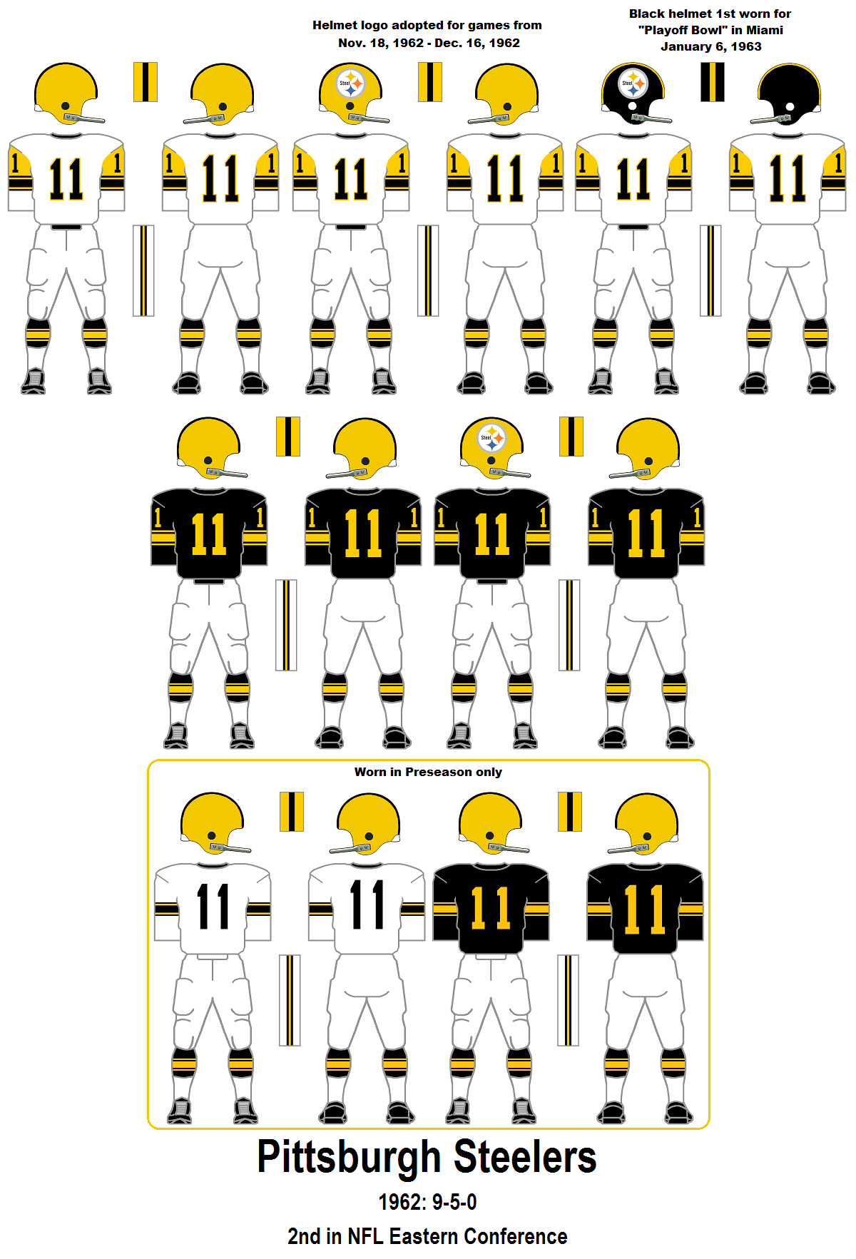
Nothing is perfect for the 66 jersey. It was a horrible uniform that no one liked. The players hated it and it went away quickly. It's the only uniform they haven't thrown back to for a reason. Apparently the team said they'd never wear them in a game again but I can't find the actual quote. It's mentioned and cited on wiki but the citation link is dead. It will be unfortunate but I'm sure at some point they'll do it for the money since it's pretty much the only one they haven't done.
I think the better choice for something interesting from that era would be the 1962 all white with yellow helmet. I always thought the 1963 white jerseys with athletic gold diamonds on the sleeves was interesting but as well all know, sleeves aren't really a thing anymore.
As a big steelers fan, if they were trying to justify adding a yellow alt helmet, I'd like to see these or a return of the home version they throwback to in the late 2000s.
-
2
-
-
On 6/29/2023 at 3:40 PM, Old School Fool said:
The new jersey template would be perfect for a 1966 throwback.
Nothing is perfect for the 66 jersey. It was a horrible uniform that no one liked. The players hated it and it went away quickly. It's the only uniform they haven't thrown back to for a reason. Apparently the team said they'd never wear them in a game again but I can't find the actual quote. It's mentioned and cited on wiki but the citation link is dead. It will be unfortunate but I'm sure at some point they'll do it for the money since it's pretty much the only one they haven't done.
I think the better choice for something interesting from that era would be the 1962 all white with yellow helmet. I always thought the 1963 white jerseys with athletic gold diamonds on the sleeves was interesting but as well all know, sleeves aren't really a thing anymore.
-
8 hours ago, DG_ThenNowForever said:
I was thinking about that too, actually.
I'm really upset I can't buy this on a hat:
Or at least not on a 47 brand Clean-Up style hat.
Wish I could remember where I saw it but a Guardians fan brought up the same question about the G logo on a hat, a 5150 I believe, and someone with the club, store, or in the know said hopefully by opening day they'll have G logo hats on sale.
Edit: Page 76 in the Cleveland Guardians thread - after the Guardians official twitter announced the 5950 hats being available to fans someone said they would buy one if they had the fastball G on them. the Guardians official account responded with they hope to have those by opening day.
-
1
-
-
Deon played on 5 teams. No team really looks more wrong than right when you switch that much. If any of them is odd you could argue for the Ravens due to his number change.
-
Kentucky´s banners look like the eye test at the optometrist
Due to the vertical nature of all the text?
I work at rupp in the tech dept. and we hang the banners. That was put up pretty quickly since we had to get it up for the post game "party" the following day. In the summer we spent a good hour moving them all and making sure they were straight, symetrical, and level. The other guys probably hated how precise I was directing them. That picture makes the new one look lighter but I a sure you it is the same shade. It was lit for the party thing which is why I think it comes across brighter in that picture. I believe I heard something about Tony Delks' jersey being retired soon so we'll be up there again.
-
I don't know if you're still doing these but they all seem to be really well done. Thanks. If you have the time i'd love to see some more updated Kentucky logos. I saw the one you did and i've used it as the desktop on my phone ever since.
I can't find logo only images unfortunately which is why i haven't posted them sooner.

i don't know if there is anything to do to these.


There is a full body version of the logo that you have already touched up. It's hard to find though.

if you have time some of these would be great. i understand if you're busy though. i feel like some of these will be lost for good since they are so hard to find already. The only thing keeping some around are vintage looking t-shirts.
-
Boston is right for ray Allen. He won a championship there. A lot of success in that jersey.
-
A team retiring a number is the samething as putting that player in their hall of fame.
I understand both sides of it. It's impossible to do with dynasty teams. the steelers retired only one number and that came per-dynasty era. There is no way they can retire all the HOF players' jerseys. With that being said they no longer give out certain numbers like bradshaw's 12. There hasn't been another 36 since Bettis. #86 may be another to not be handed out. They can still be handed out though. Swann and stallworth both get handed out.
-
Right jersey, wrong #.
Hines as a rookie

-
Long-time New York Jet Jerricho Cotchery


He took Randel El's number. They never should've released him.
This was preseason, he switched to his normal 89 for the season.
Hope Pittsburgh can resign him. He seems to love it here and really came on later in the season when he got healthy and learned the offense. He's a more spry version of Hines(at this point).


-
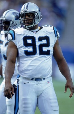
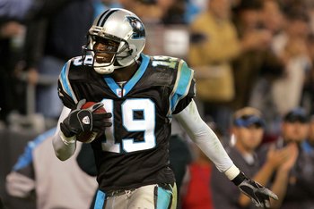
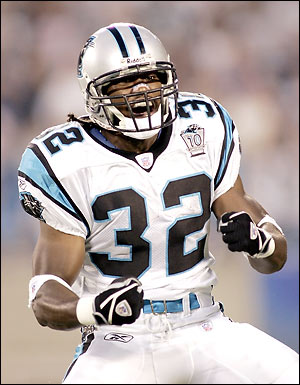
In honor of the Carolina Panthers FINALLY getting new duds:
Reggie White
Keyshawn Johnson
Vinny Testaverde

Rod Smart
Kevin Greene
Wrong jersey and wrong hair

forgot he played for the rams

-
Johnny U for the Steelers. Rooney always says that's one of the biggest personnel mistakes the team ever made. Dan Rooney drafted him(a steal in the 9th round) but the boneheaded coach cut him before he even played a preseason game. He thought he already had 3 good qbs and didn't even want to entertain the thought of seeing another. Pretty sad for steelers fans since he's was a hometown Pittsburgh kid.

-


2024 NFL Changes
in Sports Logo News
Posted
Steelers and Ravens are the only ones I believe.