


evanmaldonado
-
Posts
912 -
Joined
-
Last visited
Posts posted by evanmaldonado
-
-
I feel bad not knowing who most of these players are and their right jerseys
-

 (minus the alternate)
Were some of my favorite initial Edge jerseys
-
Not sure if this is unpopular persay, but I haven't really heard what people think about these... Personally I'm a big big fan of this set.
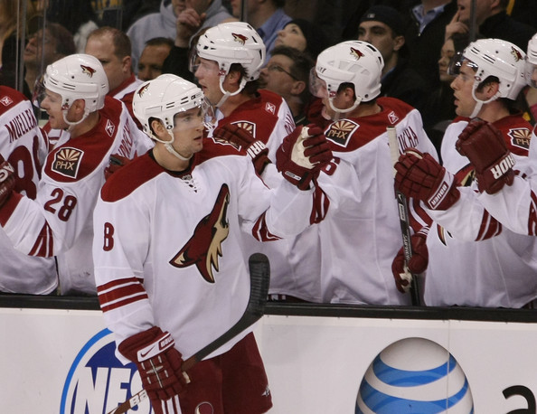
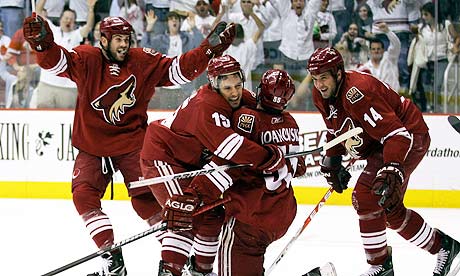
I really like the Coyotes identity too... it's clean and simple, something you wouldn't expect from a non-traditional market. Even the black alternate jersey is pretty nice.
I was with you until the last part.
-
Four 16-team mega conferences. The four conference championship game winners meet in a final four (semifinals & championship) to determine the national champion. Simple as that. No more BCS.
Oh to be young and naive.
Oh to be old and from Ohio
I love Ohio

I just can't wait until this conference nonsense stops. Superconferences will kill the game
-
I hated the Iverson-era 76ers uniforms and every element of them. I never want to see those colors or graphics again.
I agree. I'm actually not sure if we're in the minority on that.
I actually like the look that the Tennessee Titans have right now. I like the colors and even the logo. Sure, some aspects of the uniform are sloppy, but I don' hate it as much as everyone else. Their white jerseys worn with the light blue pants is a really nice look, in my opinion.
I like them a lot too. Though it took me years to notice they had both a navy and a light blue jersey
-
I don't get it. The players can commit an NCAA infraction for accepting dinner, yet they get these expensive championship rings? Makes no sense
-
NBA:
I think the look that all 30 teams are wearing now is each franchise's best look

Memphis looked better in Teal and black.
So much for the current look being the best one, eh?
Haha thought I'd get past the joke and actually talk about the uniforms
-
NBA:
I think the look that all 30 teams are wearing now is each franchise's best look
The Heat belong in the red jersey full time.
Cleveland is a mess and always has been with jerseys. The current ones suck almost as much as the LeBron era jerseys.
Memphis looked better in Teal and black.
NFL:
Pat Patriot is horrible compared to the Elvis patriot, but I love the red as a throwback.
The Bengals would have the best uniforms in the league if they got rid of the side panels.
I like the Broncos in navy instead of orange.
The Colts need blue pants for away games.
Buffalo needs to bring back the red helmet, and I'd like to see them with red pants.
MLB:
The Giants' best alt was the Bonds era black one. Scrap the orange one.
The Marlins rebrand is significantly better than the old uniforms.
The Blue Jays 2004 grey cap was beautiful.
Arizona's uniforms look better after the color switch, but I'd still rather them be in teal and purple.
NHL:
I loved the Isles first edge jerseys.
The Blue Jackets have the best home/away set in the league.
The Red Wings home jersey has way too much red for my taste.
I would like to see Montreal in a blue alternate, as well as the white version of the home full time.
Pittsburgh's Vegas gold has grown on me, though I do want a black and yellow alternate. The blue needs to go.
Calgary's jerseys are not that bad.
While I love Nashville's new jerseys, I miss the silver dominated away
-
It looked like they stuck the logo in a dryer before they put it on. And I knew those numbers touching the stripes were off.....
-
Saw my first counterfeit in person today (red and green Devils Kovalchuk) and I never imagined they looked that bad in person. Wow
-
Ozzy as a blue:
Even the isles looked better than this
-
I hate the Colts jerseys (yet I love Ohio U's, which is the same thing but green). I think they looked way better with the blue helmet too
-
I'm sure it's been covered before, but

will never look right.
-
I love the phantom yokes. They look so nice to me
-
NHL:
- I love the Blue Jackets' old CBJ logo.
- Nashville's Mustard Gold jersey is my favorite jersey of all time.
- The Ducks' script logo is better than the webbed D.
- The Rangers' alternate jersey is far superior to their current home.
MLB:
- The Blue Jays need to go back to the grey hat.
- The Phillies need to drop blue.
- The Mets can actually pull off black (though the blue and orange is superior).
NFL:
- The Bengals have a top 5 uniform in the league, including the helmet.
- Kelly Green looked terrible on the Eagles.
- The Seahawks have a beautiful lime green alternate.
NBA:
- The Lakers' logo needs an update.
- The Mavs look better without green.
-
-
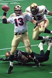
Kurt Warner for the Iowa Barnstormers of the AFL:
-

I'm doing a project of making every hat worn in the MLB, but can't find that logo. Anybody know the font??
-
But really....
Emmitt:

Jerry:

just looks awkward
-

Seriously? Not only is it beyond old, LeBron was just posted on the previous page. I think it's high time that people got over it.
I think he's trying to make a joke that the Cavaliers uniform is the "wrong" one for LeBron...
I think.
Correct. Whether one thinks it's wrong or not he's going to be in that Heat uniform for a while. Eventually that's what he'll be associated with
-
-
Probably really generic but what's the name of the font of the Dallas Stars? If it's just varsity font i'll be ashamed in myself
-
I love the Buffaslug....
-
I don't know if this is just for me, but the tab for the classic NHL templates won't open.

Players in the "wrong" uniforms
in Sports Logo General Discussion
Posted
I think Yankees, but they're really the only baseball team I follow