


Pixelboy
-
Posts
121 -
Joined
-
Last visited
Posts posted by Pixelboy
-
-
Wilson, I think that is actually Dom Casual Bold, and judging by the image it's vertical scale is 75% or something... unless the image itself is distorted.
My earlier guess at DC's font inquiry of Univers Extra Bold Oblique is close, but no cigar on further review. I just noticed the numeral 2 on his other sample, and the lower curve looks more like Helvetica than Univers - unless the designer used Univers for letters and Helvetica for numerals... doubtful. My Univers suggestion would be a reasonable facsimile though.
-
Sorry Nick, I don't give away company assets for free. Besides, it's a violation of the EULA.
There are plenty of cheap OCR fonts available, many for less than 20 bucks. Here's one list:
-
Does anyone know what the font they use for the numbers on barcodes?
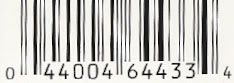
It's probably an OCR-optimized font (optical character recognition) that several foundries make. I have FontFont's OCR-F, which looks like a match.
-

Okay guys, work your magic. I need to know this font. Thanks.
After playing around a bit, I think I know what it is.
It's Univers Extra Black Oblique, with horizontal scale set to 150%, and a Shear transform of 10% applied for a bit more slant than the normal italicization provides.
-
Anyone know where I can find these fonts?
Meta Plus Bold
Meta Plus Book
Minion
Thanks in advance.
The Meta font family is made by the FontFonts type foundry. It is quite a remarkably extensive family of weights though, if you go to their website http://www.fontfont.com and do a search. They have a subgroup called Meta + (not Meta Plus), but have no Bold or Book listed under that "+" subgroup; lots of choices for Bold or Book in other subgroups though. Perhaps some other foundry has a font with the same name if that isn't it. FF Meta is a sans serif family.
FontFonts have tons of interesting fonts for sale - they, along with T26, have always been a good source of unique fonts for me, especially when I require distressed or grunge fonts.
Minion is an Adobe font. I believe that's the body text font they use in all of their manuals.
-
Can anyone name this font ?

I'd say that was House Gothic Condensed, with a few manual tweaks - and envelope distortion of course.
-
This may be a stupid question but here we go: If I created a logo in Illustartor and want to make it smaller to say put it on a uniform, the image gets smaller, but the stroke sizes stay the same so it end up looking all jumbled up. Is there anyway you can adjust the size of an image and have the stroke size increase or decrease with it??
In the Scale dialog, make sure the "Scale Strokes and Effects" option box is selected.
-
When using CS2, after using the Live Trace function, I can't figure out how to make it a normal vector image w/ outlines that you're able to move and adjust and whatnot, like if you had made the image yourself from scratch.
Can Anyone Help?
Thanks in advance!
I don't have it open in front of me, but I believe what you want is to then select the Expand submenu item from the Live Trace menu. That will give you your anchor points for editing. Or to perform it as one step, instead of using the Make submenu option to create your vectorized image you can use Make and Expand instead.
-
My virtual invoice is in the virtual mail

It certainly can be a tricky thing the first time or two, can't it?
-
No, use the black arrow tool. Click and drag the text cursor toward the inside of the circle, not around the perimeter. The text will "flip" to the inside of the circle.
I just fired up the CS2 version of Illustrator to make sure it works the same as v10 and earlier... the cursor is now a vertical "stick" instead of the old "I-beam", but it works the same.
-
In regards to the Path Type tool question that I posted last week - the answer was half of what I was looking for. I think the first article that joel_fiasco posted addressed my 2nd question, but the image links on the article were broken so I couldn't really follow what the author was saying. (Plus it was from 1999 and written for a Mac user.)
How can you change the text with the Path Type tool so that the TOP of the letters follow the path, rather than the bottom of the letters following the path? I need to have two phrases following a circle path, with the first phrase on the top of the circle and the second phrase on the bottom of the circle, but I don't want the second phrase to appear upside-down. Thanks!
I'd posted this tutorial in another thread, so here it is again.
(Assuming you're working in Illustrator)
You actually create the top and bottom text segments as two separate objects, and combine them later. Here's how:
1. Type the upper text on a circle object using the Text on Path tool.
2. Duplicate this object.
3. On the duplicate text object, with the text tool, highlight the text completely. Retype the text to what you want the bottom half to read. Click and drag the text cursor "I-beam" toward the inside of the circle using the solid selection arrow. Your text will flip inside. The selection can be a bit touchy, so keep trying.
4. Drag the cursor around the circle to align the text at the bottom.
5. In the Baseline Shift box of the Character palette, type in a negative number to move your bottom text below the circle. That amount depends on your font size, it's trial and error. Start with a negative number a few points less than the font size and you'll be close.
6. Align your two circle text objects together at the circles' centerpoints. Group 'em.

Name That Font!
in General Design
Posted
Going by the image, Doom definitely looks to be from a hand-drawn sketch, not from a font.