


Captain Poncho
-
Posts
404 -
Joined
-
Last visited
Posts posted by Captain Poncho
-
-
23 minutes ago, SportsFan12 said:
This is the last time I recall seeing a different uniform matchup between the Cowboys and 49ers. Oddly, this was actually the weekend before Thanksgiving of the 2008 season.

Those 49ers uniforms are vastly superior to what they're wearing now.
-
 3
3
-
 1
1
-
 2
2
-
 5
5
-
-
You're a BAD PERSON if you use the old name! It is forbidden!
FORBIDDEN!
-
1
-
 5
5
-
 1
1
-
-
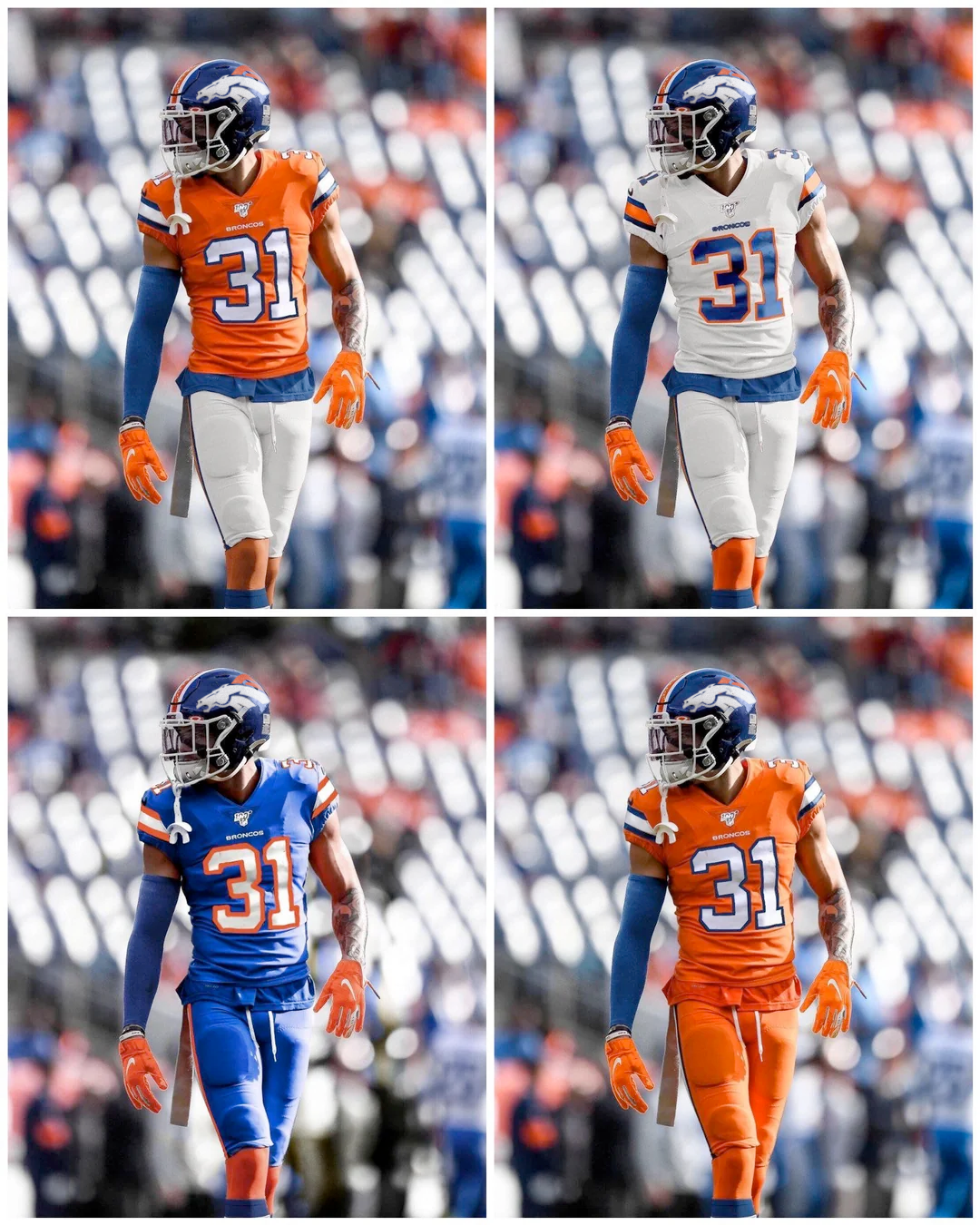
3 hours ago, KouPilot said:
I don't mind the uniform combos on the mannequins at the broncos stadium store
These are BEAUTIFUL.
We FINALLY have some color in our road uniforms. I'd love for this to be the standard set, but I'm pretty sure the Broncos will do uniform roulette for the entire year, thus keeping anything from being the "standard."
-
11
-
 1
1
-
-
13 minutes ago, Cujo said:
You're about 24 hours late, pal.
My most profuse apologies, transplant.
-
3
-
1
-
-
Sorry. Didn't scroll back far enough apparently.
-
1
-
-
1 hour ago, SFGiants58 said:
I moved to Denver in 2019 and I go out of my way to avoid Colorado flag merchandise. Hell, the Denver flag is a better design, but even that feels ripe for co-opting by transplants.
I can see more points in favor of “Seal on a Bedsheet” these days.
Chicago and San Francisco fans (and I assume former city residents) moving to Colorado and then crapping on "transplants" and the state flag seems pretty ironic.
I was noting for my oldest son how at most Avalanche games, whenever a team like Boston, Chicago, NYR/NYI, etc. visit, the crowd of visiting fans is absurdly thick, because natives know we can sell the tickets to the new transplants for a mint and basically pay for the season ticket package in one game.
It never goes the other way around, because Colorado people rarely leave for the perpetually grey, crime-infested, bung hole cities out east.
In fact, my son is using this to build a portion of his senior thesis, tracing eastern city residential flight by tracking visiting jerseys at western venues. Could be an interesting bit of research.
-
1
-
1
-
 3
3
-
2
-
-
3 hours ago, TruColor said:
I think I lost mine after the Cardinals' fiasco.
The hell you did.
I would hope most of us here would recognize a spotlight addict vs. a genuine contributor, regardless.
-
8
-
-
6 hours ago, PurpleHayes said:
I seem to recall Elway refusing to wear the monochrome unis, so Nike had to scramble around and come up with some white pants pronto. Originally there was only the blue pants and the white pants with the blue stripe.
The only time he ever wore them was in the preseason vs. New England in 1997. I also remember him saying at the time that he hated the monochrome outright, but I'm not sure if Nike had to scramble based on his dislike, though that's a thing that definitely could have happened given his importance to the team.
-
15 hours ago, Pigskin12 said:
Agreed. I’m beyond tired of this orange jersey especially. Never should’ve became the primary.
Well, the Broncos absolutely, without exception, fully own orange jerseys in pro football. It was a dumb, 90s-laden trend that pushed them to navy jerseys in the first place, and anyone who has ever been to a Broncos game (and multiple away games), sees that the fans fully embrace the orange jersey.
To stray from that again would be brand suicide.
-
4
-
 1
1
-
-
18 minutes ago, Cujo said:
Okayyy.. And the Blue Lives flag has only been around for 8 years or so..
Anyhow, dropping this topic because it's probably gonna expose people's views on human rights.

I once had to talk down a major athletic outfitter who had proffered a "patriotic throwback" to wear in international competition that looked almost exactly like the Confederate battle flag. Took me showing them a side-by-side comparison to get them to scrap it, and thankfully, they did right before the eve of production.
In an almost opposite example, Cujo here is wildly projecting an imaginary link to something entirely unrelated based solely on his own biases, which is akin to the likes of hating every red baseball hat in existence because red ballcaps belong to you-know-who.
Navigating these two extremes (the Imagined Offense one being far more frequent) in sports design is often an enormous obstacle in getting meaningful work done.
-
6
-
 1
1
-
-
1 minute ago, Carolingian Steamroller said:
They've won a lot of big games in the all whites, starting with the one in Green Bay at the end of 2022 which really kicked their present run into high gear. If the win on Sunday, I promise the all-whites will become a classic that people will clamor for in 20 years.
This is, unfortunately, spot on.
-
 1
1
-
-
33 minutes ago, leopard88 said:
It's not about the Vikings wearing gold pants. It's about the Vikings being a purple and gold team.
Gold is a tertiary color, at best, for the Ravens. Any uniform that puts it on equal footing with purple and black will inevitably invite comparisons to the Vikings.
This is like saying LSU and the Washington Huskies wear the same colors. One is yellow, one is gold, and the visual difference is apparent and obvious.
-
2
-
-
44 minutes ago, Jezus_Ghoti said:
Am I crazy for thinking these would also be totally acceptable with the current logo on the helmet? I know it's a bit of a weird mishmash of eras, but we don't often see teams change logos and I'm not sure that the D logo is actually better than the current logo.
-
6
-
-
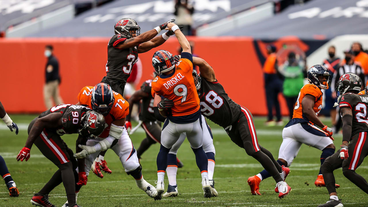
23 hours ago, ruttep said:
Just don't do this ever again, please:
It's weird that Denver has now had this 3-game history of the league allowing color v color (without consulting the Broncos), which seems to indicate to me that the Broncos can wear orange in almost any road game and get away with it. Theoretically, they could ditch the white jersey altogether and simply go with orange or navy tops.
Looks like the same treatment is headed the Titans way when they wear the Oilers throwbacks...
-
"Athletic Gold"
-
3 hours ago, Clintau24 said:
Had to fix that and at least one other team's conference placement. It happens lol.
No "buts" on your very excellent efforts, Clint. I spent my morning rolling through your incredibly thorough and very entertaining breakdown of the upcoming college ball season's uniforms. Thanks so much for toiling away on this stuff - it's appreciated!
-
1
-
2
-
-
The Broncos released their Game Themes, and, on Instagram, the post carousel hints at what the uniform combos will be for the year, with the color backgrounds they use for each home game.
https://www.instagram.com/p/CwGN6Lip4LA/?img_index=1
If this is accurate, the Broncos will go navy over white vs. Washington, and all-navy vs. Minnesota, with the already-announced "Whitecapped" color rush unis vs. NYJ and NE.
-
1
-
-
Everything about this is cool... EXCEPT the white lids.
The Broncos are not a warmed-over version of a the 70-to-mid 90's Bucs.
Blue lids - royal or Navy - but blue lids regardless.
-
11
-
-
-
1
-
2
-
-
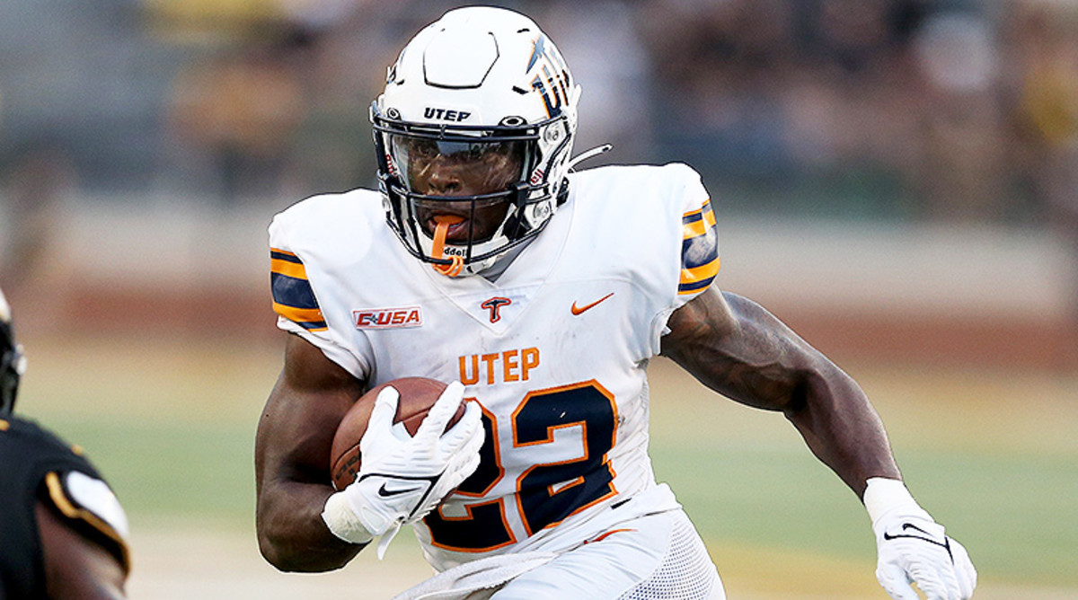
On 7/11/2023 at 5:10 PM, cajunaggie08 said:
New uniforms for UTEP as they switch from Nike to Adidas. Its a much cleaner shoulder stripe as Nike used a single decal last year to act as the stripes
I thought UTEP wore orange... Does this strike anyone else as yellow?
-
2
-
-
This has happened to Denver twice now (the league decides if a road team can wear a "contrasting" jersey, not the Broncos), which to me just makes the case that the Broncos never need to wear white under pretty much any circumstance. Navy and orange is all they technically need. Of course, this sort of thing would happen regularly then.
-
Given the new ownership group, we have no idea what the Broncos are actually doing here, but a radical break with the traditional helmets to hop on an overused all-white trend seems way too obvious.
The new group is very aware of the comically bad teams fielded recently, and anything that seems like a late-to-the-party, chasing trends vibe would likely be avoided. If that's the case, the all-white teaser might be a red herring, and the "alternate" helmet is not going to be "icy."
Or, it could just be an ownership group who wants to parrot the Bengals' all-white uni successes, and has no better ideas.
Given the impending redesign and the fact that an alternate helmet has to stick around for five years (right?), it'd have to take into account at least some elements of the potential new designs.
Regardless of the outcome, it'll be a great indicator of whether the newest and richest ownership group to the league is actually innovative, or a carbon copy of the truly incompetent Al and Mark Davis-type owners, who consistently steer their franchise into the sun.
-
1
-
-
Looks very much to me like the Panther's draft caps have dropped silver entirely.
Can't quite tell if the threads inside the text are silver, but it looks like the "no silver"rumors are true.
-


/cdn.vox-cdn.com/uploads/chorus_image/image/70029091/1190481757.0.jpg)
2024 NFL Season week by week uniform match-up combos: From HOF Game to Super Bowl LIX
in Sports Logo News
Posted
First of all, I definitely knew I'd be stirring the pot with that take, but it wasn't just to be gratuitous.
I do not want to go straight to jail.
Also, I'm totally on board with pretty much all of ruttep's take. The darkening of the red was unnecessary, and the black could have been more elegantly utilized.
But the current uniforms are simply straight fan service - grey face masks especially. I get that all of the team's titles came in those old uniforms, but now, so has their 3-straight Super Bowl defeats.
At least the '08 uniforms had some integration of the complete palette of team colors, and also did their best to create a comprehensive uniform as opposed to the nondescript 70s era mail order catalog they wear now.