


doogie24
-
Posts
40 -
Joined
-
Last visited
Posts posted by doogie24
-
-
http://www.ebay.com/itm/260959640503?redirect=mobile#ht_5953wt_1010
I wonder if he hung out with Brent Gretzky as well. The best part is that "Brent" didn't even wear this style, its what they wore last year when they won the championship. Also, they even confirm that fact with an actual pic of "Brent" in the auction. Jenious.
Got a good example of this seller's "tactics"
I emailed them about this jersey:
They have some London Knights jerseys available, all of which look a little "off" when it comes to the name/numbers. For starters, Pat Kane never wore that jersey in London, and second of all, the coloring is way off. People do like getting older players on new jerseys, but usually do it through the Knights team shop. Their email response was that they do all lettering in house. So im assuming they cut their own tackle twill numbers and letters to the best of their ability, and sew them on.
Here is some others that are a little off
if you look closely, the 6 just looks like a photoshopped upside down 9.
Again, the 9 / 6 is off... the hole in the number is too small.
Just thought id throw in another example considering its the same seller.
-
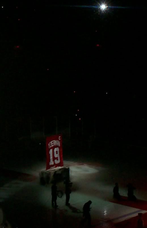
I was at the Steve Yzerman retirement night, unfortunately my camera is pretty crappy.

-
Ill put this here, as I can not start threads yet. I saw an ad for the new Slap Shot movie, and the team on the cover is called the hounds. the logo is text with a dog above the text. If anyone has any ideas of how to get a better look, let me know! (p.s. imdb has no photos yet)
Other Design Help
in General Design
Posted
Using photoshop cs5.
Just wondering if their is a way to eliminate the "brown" color and replace it with white. Without using the eraser tool?
http://www.sportslogos.net/logos/view/707/Cincinnati_Reds/1960/Alternate_Logo