


jefrsn
-
Posts
198 -
Joined
-
Last visited
Posts posted by jefrsn
-
-
Both Delaware State and Siena were Phoenix designs. Ineteresting they both get upgrades at same time.
-
 1
1
-
-
Apparently they are replacing three different mascots with the one. I have never heard of a community college that fielded teams from different campuses each with different identities.
-
1
-
-
1 hour ago, stumpygremlin said:

I love Trajan for them... It'll be a sad day if they move away from that to this relatively generic-looking athletic font.
As a KU alum I gotta say I'm not a fan either. I can see that font used on their newly released basketball schedule PDF from their website. It's a font called Jawbreak Sans. I hope this isn't going to be the official font moving forward. The "K" especially looks odd to me.
-
1
-
-
12 hours ago, Cujo said:
Kind of them to celebrate the Raiders, 49ers and Cowboys championship seasons
I noticed that too. Instead of saying 1982 for the 82 season they chose 1983 for the game in January of 83.
-
Just saw that Tulsa tweaked their logo in December. I like the subtle change.
Old version
-
6
-
-
2 hours ago, stumpygremlin said:
The link to the athletic website no longer works. I wonder if UCF paid HCA off to take the wordmark.
Try here:
-
1
-
-
10 hours ago, nash61 said:
On 11/15/2021 at 12:21 PM, tron1013 said:
Their branding page does a good job showing the development of the new set.
-
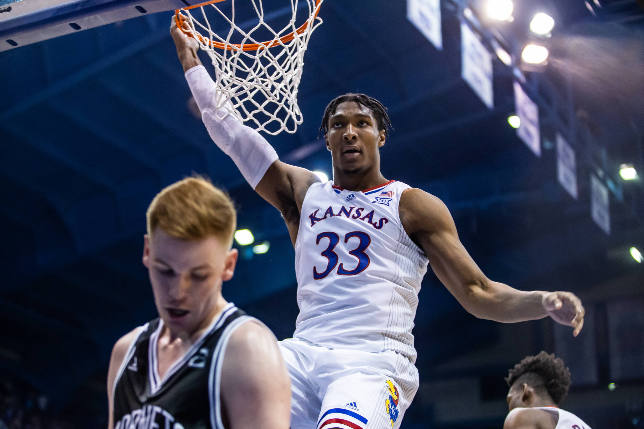
Last night the Jayhawks played their first (exhibition) game rocking new uniforms. The stripes down the sides feature the rules of basketball text. Pretty cool.
-
1
-
-
The Big West Conference released a new look this week.
https://bigwest.org/news/2021/7/20/cross-country-the-big-west-reveals-new-brand-identity.aspx
-
The Citadel released their identity upgrade yesterday.
-
4
-
-
38 minutes ago, cajunaggie08 said:
Western Michigan seems to be taking design input from Washington Football Team and are going with a W in a circle as well. The new logo appears to be for both the school itself as well as for the athletic teams. The athletic department website features the new W logo throughout yet the football team social media pages are still using the bronco logo. It will be interesting to see if all the teams have new uniforms and equipment that match the new branding and colors.
As far as the new main logo, its ok. The biggest issue I have is there is nothing distinctive about it that lets you know its Western Michigan. Brown and gold are unique colors for sure in college branding. Unfortunately they only other school that comes to mind with the same colors is Wyoming, so by using just a W it could be mistaken for a logo for Wyoming, if Wyoming were crazy enough to ever move away from the bucking cowboy logo.
New logo
Old Logo
Based on this video, the bronco stays with some mods.
-
I haven't seen this one mentioned. Colgate released a new identity this fall.
https://gocolgateraiders.com/news/2020/10/15/colgate-raiders-Introduce-new-athletics-identity.aspx
-
1
-
-
Wow, really emphasizing Kansas City. I agree, I love the interlocking KC.
-
20 hours ago, ren69 said:
Pretty sure Chanclas logo was done by Fooser Sports
Wow, looks like you're right. Weird that Brandiose would call out a logo they didn't create. I guess they were just talking about the weird latin names for Copa.
-
20 hours ago, Derek said:
I’m pretty sure the “Brandiose Guys” didn’t do the flying chancla’s.
I recall from the video they posted that they did do that logo. Check it out around the 5:00 mark
-
2 hours ago, stumpygremlin said:
I'd say that that wasn't worth the refresh. It's not different enough to warrant the changes, IMO.
I think it's a good modernization and Rickabaugh created a more complete and unified package than what they had.
-
2
-
-
This is on their site:
-
5
-


Minor/Independent/Collegiate League Baseball Logo/Uniform Changes
in Sports Logo News
Posted
Ooh , that one has potential!