


The Impaler
-
Posts
499 -
Joined
-
Last visited
Posts posted by The Impaler
-
-
Overall an upgrade for the Broncos.
Pros:
-Jerseys are actually decent
-don't mind the pants although wish the orange stripe extended all the way
-Parenthesis stripes gone
-the 6 mountains on the jersey's are....interesting
-3 pants options, really like that
Cons:
-that helmet stripe, oof
-is the navy blue now black? So instead of going more royal which more people seem to want, they go darker on the blue
-perforation in the numbers is awful
-did I mention that helmet stripe
-not sure on this yet, but the matte finish on the helmet
-
 4
4
-
 1
1
-
-
1 hour ago, Cujo said:
Not a single fan will agree with these players
That's because these players are all looking at the throwbacks and that's not what we're going to see tomorrow.
-
4
-
 1
1
-
-
16 minutes ago, Carolingian Steamroller said:

These guys can't even tuck in the damn undershirt on a friggin uniform reveal photoshoot, smdh.
-
3
-
 1
1
-
-
16 hours ago, Lumbergh said:
I designed this as a concept a few years ago. The Broncos Wire beat writer has been in contact with me since yesterday regarding this. I'm not sure how it happened either...
Sir, it's a damn shame they didn't just roll with this.
-
2
-
2
-
-
3 hours ago, HOOVER said:
So you like these...
...over this?
Ok.I prefer the striped pants for the red bottoms but either way, absolutely. FRIGGIN HATE the all white for NU.
-
6
-
 2
2
-
1
-
-
On the uni-watch article about the 3 helmet rule it states that Denver has hinted at using 3 helmets. That was a couple pages back here. At any rate, they also state it's been confirmed Denver's primary will be white. Did I miss something? I've only seen the speculation but not a confirmation.
-
15 hours ago, HOOVER said:
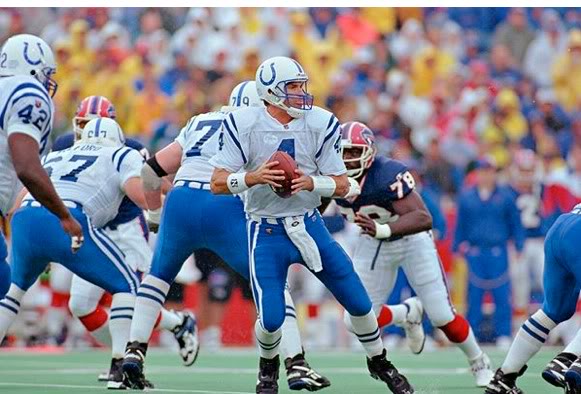
These White/White combos don't suck at all...in large part because the teams wear White helmets.I always advised my clients: White helmet = White pants. If you wear a dark pant under a White helmet & White jersey, you're just going to have a very unbalanced, bottom-heavy look. The exception was teams that had a very light color that they wanted to use for a pant, such as the Chargers with Yellow pants or the Buccaneers with Creamsicle Orange pants, or the Dolphins in Aqua pants. Even then, it's slightly unbalanced and just doesn't look as good as White/White/White/contrasting sock.
Examples of this being a bad combination:
As a Husker fan, couldn't disagree more. I love Nebraska's road look. And I think the Colts looked better above than they do now. Nothing wrong with that Cards uni combo either.
-
3
-
2
-
1
-
-
14 minutes ago, rfraser85 said:
I'm trying to remember if there was a term for that style (jersey and pants match, but socks contrast). The term that comes to mind is unitard (uniform +leotard) or clean if the jersey and pants are white. Most of us know the jargon, but it would help to have a distinction.
I've always thought of unitard as like what the Saints and Ravens do. Solid pants and socks that match the jersey. For the record, I am 49, so not a young whippersnapper and I enjoy the pants and jersey's being the same color. But only generally when the pants are striped and there is contrast with the sock. Which doesn't seem to happen too often.
-
4
-
-
3 hours ago, ManillaToad said:
It's not monochrome if the socks contrast the pants & jersey
Fair enough but I think we all know what was meant.
-
I don't think monochrome is bad, in fact the only monochrome I really don't care for is white, just think it's boring. However, I think monochrome is just poorly executed too often. Saints and Ravens are the first to come to mind. Put striping on the pants and opposite socks and all the sudden those two looks are much more palatable. I'm not saying every team should have a monochrome look by any means, and I think for teams such as the Patriots silver pants should be standard home (actually white, scrap the silver, but that's another story).
-
2
-
-
1 hour ago, oldschoolvikings said:
unsurprising that the Seahawks aren't changing their terrible uniforms. Except for last year's throwbacks, they haven't made a good uniform decision this century.
At least their last set was unique in shades of blue. This one? Just like every other team out there that switched to navy blue.
-
3
-
-
8 minutes ago, ruttep said:
The main problem was that they darkened the red when they switched to that uniform. Even the current uniforms have a slightly darker shade of red to the 80s uniforms (the 80s red was the same shade as the Chiefs). I'd prefer the original 80s shade of red, but the current red is light enough that it isn't an issue.
I don't think those 90's unis were bad, they just aren't as nice as what they have now.
-
2
-
-
On 3/29/2024 at 12:22 PM, HOOVER said:
The 49ers wore Red facemasks from '96-'08. It wasn't an improvement.
Some looks truly are timeless and don't need to be modernized. Here are two of them:
However, if you're asking for a future alternate, I'm sure you'll eventually get it, and this is what it would look like:
Of course that uniform was an overall downgrade. But red mask doesn't have to mean that uniform. Red on the current uniform is light years ahead of red on that older uniform.
-
3
-
 1
1
-
1
-
-
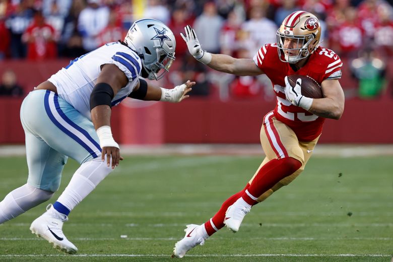
I know I will get blasted for this. But the niners uni's would be perfect if they either went red or gold facemask. Cannot stand that gray mask. And for the love of god they should never wear white pants.
-
2
-
7
-
-
Brady doubling down on the Broncos board with the white helmets and city connect for the Broncos. What the hell does city connect have to do with white helmets?
-
1 hour ago, oldschoolvikings said:
That number font is a disaster.
I'm honestly sitting here just waiting (like I'm watching a golf ball hang on the edge of the cup) for that 3 to fall over. It's so hideous.
-
9 hours ago, oldschoolvikings said:
I'm a fan of all of these...
As long as the pants are Yellow, gold, silver, or some other light color, I think it's an enjoyable little quirk, in small doses. Those Charger and Breaker uniforms especially are two of my favorites.
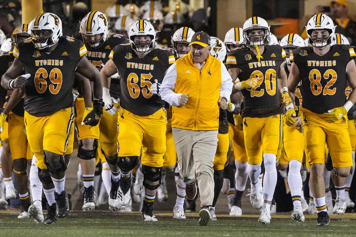
I'm probably in the minority judging from other comments, but I've always LOVED that Wyoming uniform. White lid, brown jersey, yellow pants and the license plate logo. It's uniquely Wyoming all over the place.
-
6
-
1
-
-
That's a really nice looking set, the color rush is cool as well, love the way the red pops against it. Can't say I am a fan of the number font, at least for the "2," the top half has WAY too much space between the horizontals. Maybe it's just me, but my eye just is very reluctantly drawn there.
-
1
-
-
1 hour ago, Pigskin12 said:
Agreed. I’m beyond tired of this orange jersey especially. Never should’ve became the primary.
I could stomach a royal blue primary, but my preference will always be orange for Denver. It's just who they are, they never should have made blue the primary. That's what's funny about this stuff though, we all have differing opinions.
-
5
-
-
3 hours ago, Survival79 said:
So... does anyone already miss these?

As much as I don't like what is described, I think I'd still like it over these. Just way too tired of this set.
-
6
-
-
SMDH. No pants stripes, solid socks matching pants colors, sublimated :censored: everywhere, white helmets, 4 facemask colors, white logo on white helmet. Please make it stop. Just SO many bad ideas all in one uniform. FWIW though, most people over on the Broncos forums think this guy is full of :censored:, but I guess we have to give him credit now for talking to Lukas. It's possible he saw or heard about some prototypes or alternates and isn't completely full of :censored:, I guess.
-
3
-
-
42 minutes ago, Cujo said:
If there is a change in Denver, I believe that "old meets new" makeover would satisfy 99% of Denver fans -- even the ones who love the IcEy WhItE SnOwCaPpEd lids. (Those need to be discontinued ASAP)
100% agree.
-
On 2/16/2024 at 6:52 PM, Cujo said:
Broncos uniform rumors are ramping up again today..
If the top is true then not too much to complain about here. yeah, the white helmet thing, but at least that would just be an alternate. Of course I'd prefer a modernized D logo on the helmet I can live with this in this format. My only other thing would be to add blue pants and jersey options.
-
2
-
-
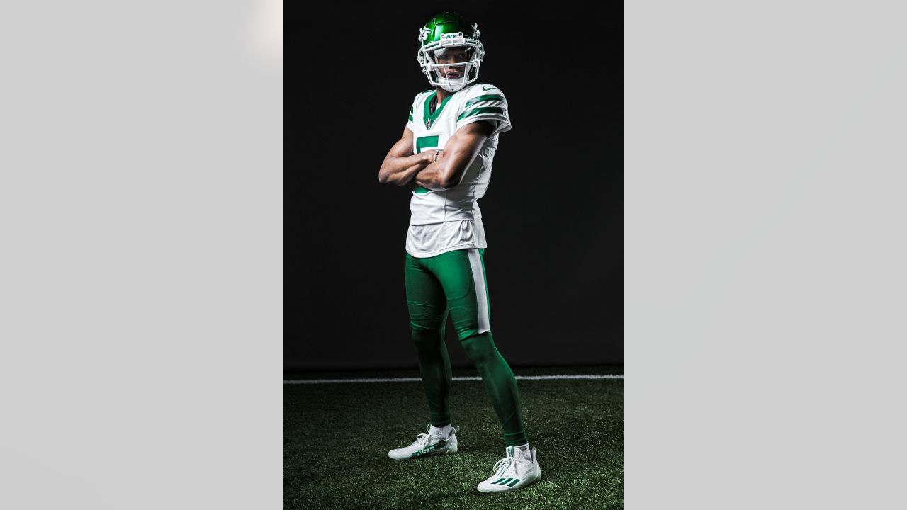
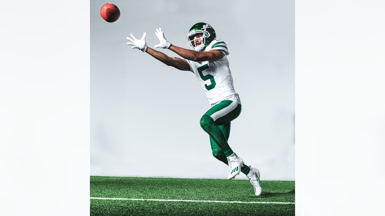
Put me in the category that the only constant thing with the Jets is that they consistently underwhelm with their uniforms. For me, it all comes down to the logo on the helmet. Right now it's garbage, but I'd say the only halfway decent logo they've ever had is the 80's era as it's the only one that has a jet on it (I forgot about that hideous logo back in the early days). I really wish they'd get more creative with their branding and do more than just a wordmark on their helmet.
-
1
-


/cdn.vox-cdn.com/uploads/chorus_asset/file/21969586/1171384248.jpg.jpg)

:format(jpeg)/cdn.vox-cdn.com/uploads/chorus_image/image/56180647/08281994_Nebraska.0.jpg)


:format(jpeg)/cdn.vox-cdn.com/uploads/chorus_image/image/55451023/56562425.0.jpg)


2024 NFL Changes
in Sports Logo News
Posted
I don't know if I'd say the worst but I will say had they just extended them down they'd e pretty damn good.