


Cyclone20
-
Posts
248 -
Joined
-
Last visited
Posts posted by Cyclone20
-
-
I believe there is a free version called "ShadowRun
Thanks
-
Can anyone tell me the font of "Electronic Arts Sports Network"? Thanks.

Kinda hard to tell because it's so small, but I would venture a guess that it's Futura Extra Bold or Futura Black.
I was wondering if anyone knows the fonts for these two wordmarks. Thanks


the second one is the arizona wildcats font, i think i've seen it on here before but cant remember
First one is a modified version of Emigre's Matrix, while the second looks to be Friz Quadrata.
is there a free version similar to the font used in "south dakota state" on the bottom of the second logo.
-
Anyone know the font used on the wordmark here?
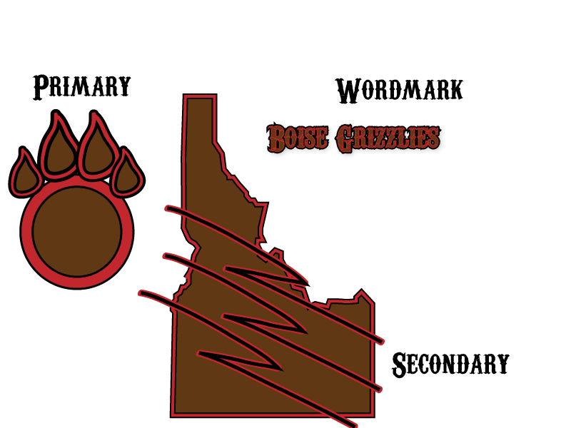
And the number font on this uniform?
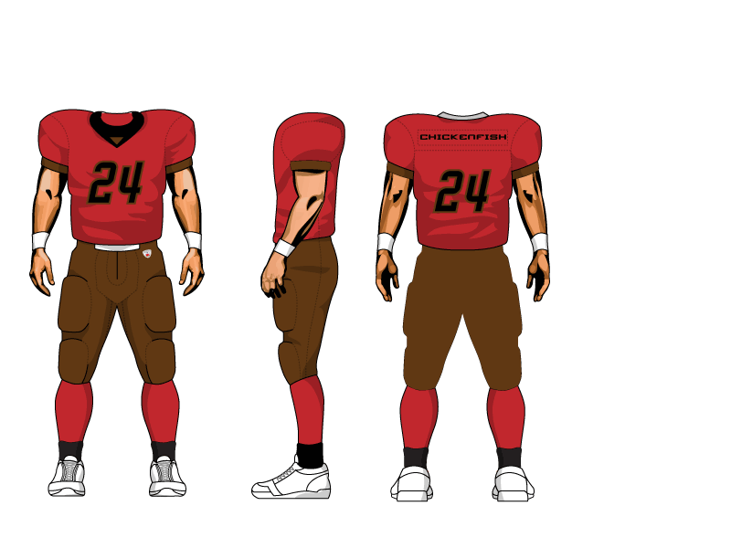
Thanks.
PM Chickenfish and ask him.
I did, he didn't know.
The number font it 4th and inches on dafont.com dont know about the wordmark though
-
I was wondering if anyone knows the fonts for these two wordmarks. Thanks
the second one is the arizona wildcats font, i think i've seen it on here before but cant remember
Name That Font!
in General Design
Posted
any body know these fonts or ones similar. first is the padres font and the second is the villanova football font
i am aware of eriq's site but im looking for the letters for the padres font
thanks