


sabretooth47
-
Posts
38 -
Joined
-
Last visited
Posts posted by sabretooth47
-
-
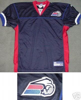
The Buffalo Bills were gonna slap a secondary logo on their ugly ass jerseys they unveiled in 2002, making them an even bigger train wreck of color.
well, slap me for being silly, but I kinda like that...even though it reminds me of Amtrak a little bit

-
 1
1
-
-

thank god they didn't use this.

Yeah, cuz their current jerseys are so much more creative


Unused Logos and Uniforms
in Sports Logo General Discussion
Posted
The Bucs current uni's and colors are one of the best in all pro sports, but I gotta say, this would have been pretty cool to see on the field. Then again, anything is better than that fruity Captain Hook they were using before, LOL