


KJHillis
-
Posts
115 -
Joined
-
Last visited
Posts posted by KJHillis
-
-
I'm late to the party, but I've been interested in Minnesota High School hockey lately. There are some great jerseys in Minnesota.
I love green and yellow. This may be unoriginal, but Edina has some great unis. Some of my favorites in any sport. Plus, Lakeville North's are great, too (in the same picture below).

These are pretty cool, too - Cloquet-Esko-Carlton Lumberjacks.

-
 1
1
-
-
Cubs, Blackhawks, Bears, Bulls - Born in Chicago, raised a fan
South Carolina Gamecocks - raised there, went to school there
Valpo basketball - My mom went there
-
I prefer jerseys without players' names on the back.
My case: #2 wouldn't be as iconic if "Jeter" was on the back. That's my opinion

Also:
Lou Holtz also did this:
I'm not sure what it is that I like. It seems more like a united front.
-
The Cubs' home uni looks cheesy with it's logo and pinstripes. The whole thing really just looks lame and tired to me. The road uni looks great, and they should go with something similar:
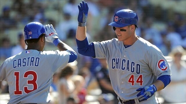
They should go with something similar to what they've worn in the past:

I somewhat agree. These are so much better than the current home jerseys:

-

I think this is one of the top five looks in the NFL.
I agree. I have always thought that.

AHL/ECHL/Minor/Junior League Hockey Changes
in Sports Logo News
Posted
Yeah, they don't dress like cake-eaters.