


Popmart
-
Posts
218 -
Joined
-
Last visited
Posts posted by Popmart
-
-
19 hours ago, MJWalker45 said:
Copperplate gets a bad wrap, it's not like it was Comic Sans and it looked better than some of the other fonts used in the initial rollout.
That's not exactly a high bar.
-
 1
1
-
-
Something to do with chocolate chip cookies?
-
Those Abbotsford jerseys are amazing.
My only gripe would be the white portion at the bottom of the jersey across the hemline. It makes it look they're wearing an undershirt they forgot to tuck in.
-
On 2/2/2021 at 5:07 PM, Brian in Boston said:
The new identity was inspired by a statue - The Spirit of the American Doughboy - that sits just behind the team's home stadium, TVA Credit Union Ballpark.
This is a nice sentiment and source for inspiration, but these statues were mass-produced in the 1920’s and are found all over the country.https://www.atlasobscura.com/articles/wwi-doughboy-statue
-
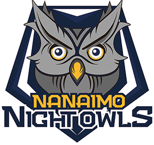
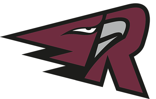
Some West Coast League logos:
Edmonton Riverhawks:

Kamloops NorthPaws:
Nanaimo NightOwls:
Port Angeles Lefties:
Portland Pickles:
Ridgefield Raptors:
-
"Our new triple bacon cheddar jalapeno burger melt, for a limited time, only at Huskers!"
-
3
-
-
Swing and a miss.
-
1
-
-
1 hour ago, Oso said:
Sad reality is, they are going to replace a classic name like Snappers with something off the wall and that sounds completely ridiculous.
If they get Brandiose involved, it'll be the Beloit Blankity Blanks.
-
1
-
-
I liked the AC St. Louis branding for that 10-month period they existed.
-
9
-
-
-
On 7/31/2018 at 8:54 PM, stumpygremlin said:
I vaguely remember there being a thread about non-sports logos that would make for good sports logos. I can't find it on the search. Can someone link me to it?
It’s been a few years, but here you go:
-
Old football Chicago Cardinals.

-
1
-
-
Or Gortex

Or maybe velvet.

-
2
-
-
7 hours ago, C-Squared said:
I am a huge Senifeld fan, but ould anybody really make the connection without the Kramer picture alongside the jersey for context?
Me too, and nope.
-
-
The Red Peak flag was my favourite in the New Zealand flag referendums.

-
1
-
-
Australia and its territories have some pretty great flags. Northern Territory:

Norfolk Island:

-
2
-
-
-
Paypal took Pandora to court last year because Paypal (rightly) felt Pandora’s new logo redesign was too similar to Paypal. They settled out of court and terms weren’t disclosed, but supposedly Pandora has been using different variations since.
/cdn.vox-cdn.com/uploads/chorus_image/image/54899889/pandora_paypal_logo_battle.0.jpg)
https://www.theverge.com/2017/5/22/15678296/paypal-pandora-lawsuit-logo-design
https://www.jdsupra.com/legalnews/update-paypal-v-pandora-settlement-33241/
-
2
-
-
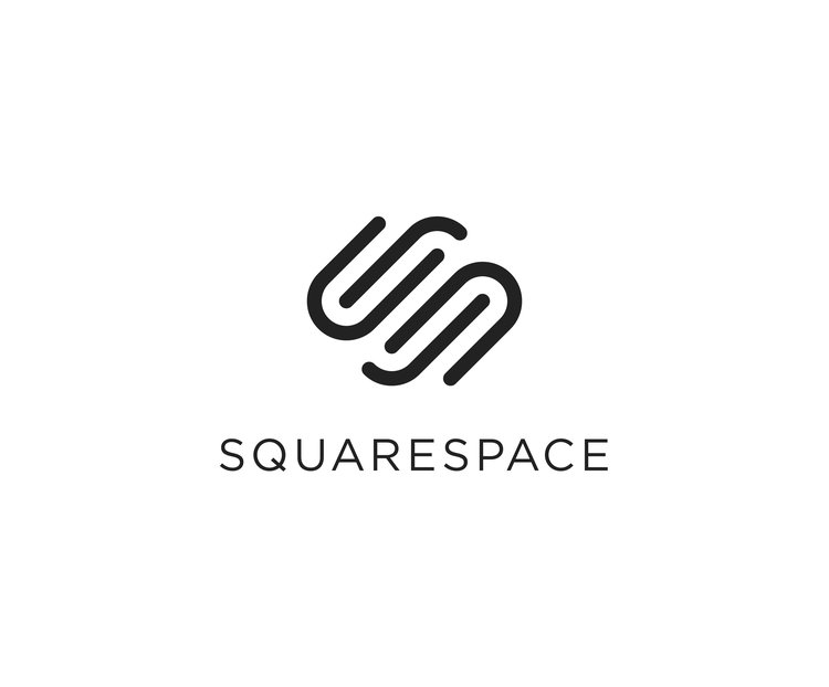
On 3/23/2018 at 11:54 AM, CS85 said:


Guess which one's Shazam and which one's Authy?
It also drives me nuts that Squarespace and Mutual Mobile are in the same vein.

-
2
-
-
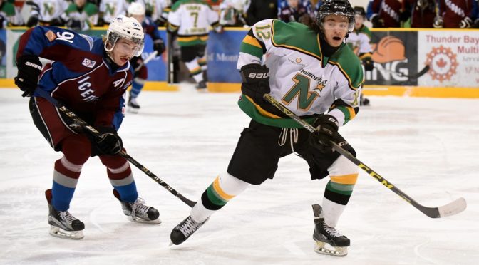
On 12/29/2016 at 2:36 PM, chcarlson23 said:
Has anyone seen this before? I was at a local mall, and I saw this in a sports shop... I actually saw a signed Modano Jersey like this hanging from the ceiling, but the Broten jersey was easier to get a photo of...
.thumb.JPG.d5ebd89c08f69ca1119846fb10f27961.JPG)
I think this might be a Thunder Bay North Stars jersey without the "Thunder Bay" over the N.
-
5
-
-
Brandiose has some more pictures posted on their Twitter: @brandiose
I'm a sucker for blue and green, so I'm a fan of the middle and green hats.

I also love the railroad inspiration in the word marks.

-
AHL alignment is set for next year:
East
Atlantic: Bridgeport, Hartford, Hershey, Lehigh Valley, Portland Pirates, Providence, Springfield, W-B/S
North: Albany, Binghamton, Rochester, St. John’s, Syracuse, Toronto, Utica
West
Central: Charlotte, Chicago, Grand Rapids, Iowa, Lake Erie, Manitoba, Milwaukee, Rockford
Pacific: Bakersfield, Ontario, San Antonio, San Diego, San Jose, Stockton, Texas
Do the two teams in Texas get the special snowflake schedule, or do they have to play full slates like everyone else?
Not sure on how many games they'll be playing, but glad they lumped the Texas teams in with the California ones. Makes sense to have the Cali teams travel east since they're all NHL funded more so than it did having any of the independent eastern teams travel down to Texas.
Agreed. This is also ideal because all the New York teams are in the same division, all the PA teams are in the same division, and all the New England teams are in the same division. Having Toronto and St. John's in the same division is also best for St. John's because of the air traffic that flows between the 2 cities.
-
Also, Udinese Calcio have updated their logo:


.JPG.0dc396ce3db68a2dae9cbce8cebbb1a4.JPG)

Warner Bros. Discovery Logo
in General Design
Posted
I was thinking the same thing. I wouldn't be surprised if they dropped Discovery from the company name in the next few years.