


TheFloridianLogoMan
-
Posts
210 -
Joined
-
Last visited
Posts posted by TheFloridianLogoMan
-
-
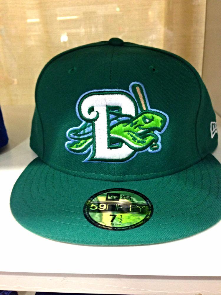
I just came back from Daytona Tortugas batting practice this afternoon, where I made a weird discovery. Along with the rest of their uniform set, which consists of green hats, green alts, green scripts and numbers, and green stirrups, their batting helmets are black. They are the THIRD team (that I know of) in Minor League Baseball that uses a predominantly green palette but uses a black helmet. Is there some unwritten/unknown rule in MiLB that forbades green batting helmets from being used?
This is going to drive me crazy all season because this look was would be perfect if it wasn't for this one thing. -
I like the new Teddy set but still:

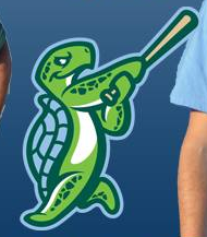
The Tortugas swinging turtle logo was actually designed by Studio Simon......so, it's really an MiLB-wide design phenomenon
-
Robbie Aaron of the Tortugas posted this on Twitter today
Looks even better in real life!
-
So, they're not the Pawtucket Red Sox anymore, Now the Pawtucket Pawsox? I guess that's fine, but I have a question that burning my mind.......why are ALL these teams adding light blue jerseys all of a sudden, even when the parent club doesn't have the color in its palette(sp?)?
Unrelated note, here's a SWINGING Tartouga!!!!
-
Here's a better look at BOTH Home and Road Uniforms
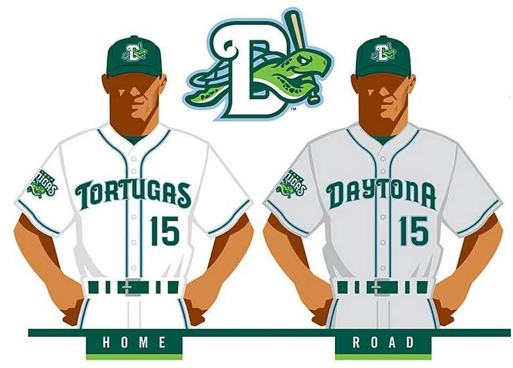
Same Colors, Same Piping, Same Arching Font, Same Numerals, SAME Cap and (presumably) Helmet.......on BOTH Uniforms
Nickname on Home White, City on Road Gray......
These are as perfect a set of baseball uniforms as you can get. 11/10 if possible -
Apparently, Daytonans (is that what you call them?) are complaining in droves, mainly crying that "it's not an American team name," etc. etc.
Reminds me of the backlash that the El Paso Chihuahuas got last year...an identity which I LOVED gets blasted by lots of people initially, but in the end, most of them get used to and appreciate it.
I always called us DAYTONIANS, but I guess that was incorrect the whole time
LET'S GO 'TUGAS!!! clap clap clapclapclap
-
As for Daytona, ANY NAME that's not "DAYTONA SPEED" should be fine with me, and given Studio Simon's past work, I don't think we're going to see a name like that. (fingers crossed)
You do know that Studio Simon, Brandiose etc do not choose the names right?
How embarrassing for me. No I didn't.
 Now I do
 -
As for Daytona, ANY NAME that's not "DAYTONA SPEED" should be fine with me, and given Studio Simon's past work, I don't think we're going to see a name like that. (fingers crossed)
-
Yeah, if I'm a minor league team owner, I don't even let Brandiose in the office. Simon or Bosack are the first calls I make.
I'm not dissing Brandiose (everyone knows I'd give anything to be in his spot).......but why is it that we don't hear as much good about Studio Simon as we hear bad about Brandiose? When was the last time Studio Simon did a Minor League team? I can't remember.
-
http://www.milb.com/documents/2/6/2/102504262/Daytona_Baseball_Unveiling_at_The_Jack_snmgn33a.pdf
Sounds like a lot of hoopla for what we all know will end up being the "Daytona Reds."
I'd bet you my last dollar it won't be "Daytona Reds"
Anyway, I will be at the unveiling in person next Thursday.
-
-
Charlottesville Tom Sox (yes, that's right, Tom Sox) unveil identity - Valley Baseball League - named to honor Thomas Jefferson - your thoughts?
my thoughts...the script is a bit sloppy, but solid - i like the way the M and S interact - it's a bit inconsistent in weight in places, but that actually makes it look more hand-written...the name is a bit silly, which might work in the VBL...the colors are solid if you like the Seahawks...the lettermarks are terrible (you can see it in the link) - the T looks more like a J (perhaps that was intentional...working TJ in for Thomas Jefferson?...but it still looks like a J) and the TS lettermark is really just two letters placed beside each other - they don't interact in any interesting way at all...nothing that says Charlottesville anywhere...
i give this a C- based primarily on the Tom Sox script
http://www.nbc29.com/story/27416103/tom-sox-chosen-as-name-of-charlottesvilles-new-vbl-team

Oh man, a missed opportunity to call them the "Sonichus"
-
The Jaguars helmet needs to be just one color.
GOLD is that color.

That's not an unpopular opinion at all, everyone hates the Jags' helmet.
NOT Everyone hates it.........I like the Jags helmet......and yes, that opinion belongs here
-
I enjoyed tonight's Bucs-Jags uniform matchup JUST BECAUSE others hated it. lol
-
I wish the Padres would return to the 1984 Uniforms full time (maybe sans the Kroc memorial).......for some reason, I like them a lot; the script, the hats, the numerals, and the fact that it used buttons and belts.
-
Wasn't the old Arkansas Travelers logo an alien, the idea being that they were traveling from outer space?
That's the Asheville Tourists
-
I would prefer an all-black helmet, but I can't do anything about it, so I look on the bright side instead. As for the logo, I LOVE it......it just grew on me over time.
-
I guess I'm the only one that kinda likes these current Jaguars uniforms better than what they had from '09-'12........but I do, especially the teal numerals. And I can't wait to see the black unis in action soon.
-
It may seem stupid nowadays, but I miss MLB team logos being on the outfield walls, especially when it was league specific. This year's College World Series at the new Omaha stadium, they had the team logos over the left field wall above the bullpen, and it reminded me of when Major League teams used to do that.
-
I personally think they would be crazy to take Detroit out of the Western Conference, where Chicago will most likely still be.....that rivalry is just too steeped in tradition to separate....but that's just me.


Minor/Independent/Collegiate League Baseball Logo/Uniform Changes
in Sports Logo News
Posted
When I see the new NWL emblem, I think of "happy little trees".........it's so soothing to look at, from the colors to the symmetry of the landscape....and yet, the roundel, the initials and the baseball solidify the identity that this logo portrays..... a baseball league of the Northwestern US.