


MrAstrodome
-
Posts
632 -
Joined
-
Last visited
Posts posted by MrAstrodome
-
-
After digesting the unveiling, these are my thoughts.
Pros
- Not as disjointed as I thought it be. Thankfully it's no Dallas.
- I like the brighter red.
- I like the red bull helmets.
- At least we have stripes on all pants albeit incomplete.
- OK with the Old English H. My mother and brother don't like it.
- Unpopular opinion: I do like the number font. It has grown on me. It's on all jerseys giving them all one unifying element.
- Red jersey is ok. Like the previous set, it's actually symmetrical with the white.
- I do like the Color Rush though I wish that jersey was light blue but I guess the BESFs threw a pi$$y, hissy fit.
- At least H-Town is only on one jersey.
Cons
- NAVY IS STILL THE DAMN PRIMARY.
- The primary is the most basic of all basic. Now we look like a Bears ripoff
- Navy numerals on the away.
- Two navy helmets? Should be just one navy candy-colored paint swapping the decals. Should have used white or light blue for the third.
- Like what we seen with the Broncos sample, Texans will probably wear yoga pants with in every combo like they did a most of last year. I was one of the ones that said last year "Hey, the Cards were OK outside the college wordmark, maybe they'll wear them in good combos". Boy was I wrong.
6.9/10. May buy Madden to play with combos.
-
 2
2
-
 1
1
-
19 minutes ago, coborjobs2010 said:
I saw this about an interview Cal did this morning, "For those wishing a different uniform was home or away, the league basically told them which ones they had to use for home/away."
Seems like most Houstonians prefer the red as well, but I guess it wasn't possible? -
And navy's the primary again. Ugh.
-
1
-
-
6 minutes ago, paul_mucus said:
All I see with the darker blue is UTEP.
Or UTSA.
-
12 minutes ago, M59 said:
You type that like it's a bad thing! IMO there are several teams that should take a hard look at their late 90s kits...and then revive them. YMMV.
It's not a bad thing. Just an observation. I love actually the game combos.
Especially since the current Mariners are that nice midpoint between the colorfulness of the late 80's/early 90's (teal) and the darker mid to late nineties (royal -> navy).
-
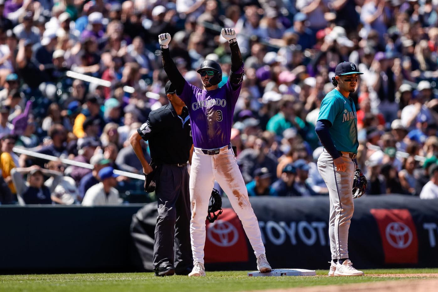
3 hours ago, SportsFan12 said:
Loved this uniform matchup in Colorado yesterday.

The definition of the the 90's.
-
1
-
-
Just now, MCM0313 said:
With blue socks that’s passable. With trash white socks it looks like Boise State.
Blame Color Rush. The answer is always Color Rush.
-
1
-
1
-
-
1 minute ago, MCM0313 said:
Royal blue isn’t intimidating and aggressive like navy. Or some other bullscheise explanation.

Traces of the Toughening remain. With the shine of championship victory.
-
1
-
-
7 minutes ago, Germanshepherd said:
The far left combo is the only properly color balanced one here.
They theoretically could wear blue socks with white pants, orange with blue, and blue with orange, but there’s gotta be a reason they’re not showing it.
Like the Cardinals last year, believe these teams when they show you the combos. They’re not gonna mix in match in any way that looks good to us.
Far right's not to shabby either. It's the only other one that has contrasting pants and socks. Depends on how you feel on the white helmet.
-
3
-
-
I say not bad on the Broncos. On the other hand this does legitimize the leaks.
Please
 let the red be the primary....
9 minutes ago, NH4 said:
let the red be the primary....
9 minutes ago, NH4 said:“Icy like the frozen Tundra of Lambeau Field” I can see it now
-
1
-
-
1 minute ago, DCarp1231 said:
We’ll definitely see more monochrome and less good combinations like blue over silver
Sadly yes.
-
1
-
 1
1
-
-
@Chi-Tex_Kidd You have chosen violence today.
As for Detroit, I'll parrot everyone here. Stripes need to be on the other pants, all in all good. Blue/Black/Blue/Black will go hard.
-
7 minutes ago, ManillaToad said:
Oh God they're going to subject us to a year of "Lol the Stars are playing Hockey Team
 " before we even get to whatever terrible collective noun they choose as a name
-
2
-
 1
1
-
-
I think the reason a lot of Texans fans like the newer stuff is because like Orange Crush and the Creamcicles, the now-old set represents futility. Not getting past the divisionals. An endless quarterback carousel that has just now seemingly ended. Wasted hall of fame careers. Easterby.
All with a uniform that could be for any team, a color scheme overused in sports in general (including 3 teams with some extras in the NFL, our archrival being one of them) and a name that would have fit 70 years ago but not the time in which the team was founded when we were expecting something more local.
Plus replacing an identity that is apotheosized even on these boards, is a tough sell.
I'll wait to see whole thing in action.
-
38 minutes ago, bowld said:
I need to see the full uniform before making final call.
Lets just be happy we didnt get H-TOWN on the helmet
Look closer on the bumper...
-
1
-
-
So the unis live up to the statement. Now we just got to see the pants.
-
2
-
-
2 minutes ago, GriffinM6 said:
Oh no, it's a great helmet. Most people here would agree I think. It works because the red is so dark. The Jags took this idea and failed miserably.
Also works because it's a horizontal gradient with the same finish.
18 minutes ago, rfraser85 said:Yeah, Washington should have left the uniforms alone once the Native American imagery was removed. There was nothing wrong with those uniforms, and I could easily see Washington changing back to them the first chance they get. They probably can't go back to being the (Commanders), but the uniforms should be acceptable.
They're probably choosing a name behind the scenes. We'll see the classic uni again. Clock got reset with the sale.
-
4
-
-
16 minutes ago, Pharos04 said:
so if they continue to do typical Jets stuff, can we refer to them as the ZT3Ls?Z! T! 3! L! ZT3LS! ZT3LS! ZT3LS!
-
3
-
-
They did it once for a photoshoot in 2019.
-
8
-
-
Texans Redesign mini-movie.
-
 1
1
-
-
I'm guessing red, white and navy helmets for us,
-
JJ's one but he's retired.

-
1
-
-
11 hours ago, CaliforniaGlowin said:
In the Texans reddit they're called the T*ts

Used to hang out the Battle Red Blog a lot where they were called Baby-Eating Sister Fornicators or BESFs, a play on the Greek mythological lore of the Titans.
-
1
-
-
17 minutes ago, MNtwins3 said:
I'd argue the Steelers moving their entire striping pattern down to accommodate the manufacturer logo is a worse offender than the Vikings
Or the Niners going from three strips to two.
13 minutes ago, HOOVER said:
Using "vibrant" and "Houston Texans uniforms" in the same conversation is a Texas-sized stretch.It was vibrant as it could be during the Toughening. I remember when the original got unveiled, my eyes lingered on the away way more then it did on the navy homes.
10 minutes ago, McCall said:They literally wore red socks with the navy pants from the beginning of their existence. And looks light years better.
Look at that combo. The red POPPED on there. And the all-white version with the navy socks weren't to shabby either.
And Battle Red. There's a reason why I want them to the primary.
-
8
-
 3
3
-


2024 NFL Changes
in Sports Logo News
Posted
Always bet on Black.
What would have in mind? Any plans for a concept?
Found this triple mismatch on twitter.