


logodawg
-
Posts
1,148 -
Joined
-
Last visited
Posts posted by logodawg
-
-
The Green Bay Packers uniforms look like they belong to a high school team.
-
 2
2
-
-
On 10/4/2018 at 5:25 PM, Zeus89725 said:
:censored:ing dope.
All those hats are good looking and well done. Phoenix, Washington, New York, Denver, and Indiana are my favorites.
Agreed. Somehow they made it work.
-
1
-
-
I'm just waiting for when these schools realize being in these 14-16 team "superconferences" isn't all it's cracked up to be and start looking for greener pastures.
-
I wouldn't say the Big Ten is well behind the SEC financially. They're pretty close...although they have taken opposite approaches to TV revenues.
I've know I've seen on ESPN.com that the Big Ten's tv contacts for football are the biggest of any of the conferences, and that's even without the revenue from BTN.
-
Notre Dame may not want to admit it, but I think they might need the Big Ten to stay relevant.
-
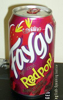
Does anybody knows what the font used for "RED POP!" is? It would be prefect for a project I'm working on.
-
^Thanks mucho
-
Does anyone know where I can find the font used for "The Crow" logo?

-
I would like the baseball helment templete. That one is great. The only problem with it is that now I would have to make a design as cool looking as the helmet.

Sports Graphics Packages, Historically
in Sports Logo General Discussion
Posted
Personally, I don't find the new Bally package that bad. At first I thought the ticker to the right was distracting, but at least on BS Detroit they started using that space for relevant stats like a batter's stats against the opposing pitcher.