


generalshepherd141
-
Posts
428 -
Joined
-
Last visited
Posts posted by generalshepherd141
-
-
3 minutes ago, Magic Dynasty said:
No. Vegas already has 2 sports teams now and the Rays will do just fine when they get their new ballpark in Tampa proper.
-
At one point there was the Boise Burn of the af2 as well.
-
My take on MLB:
NL EAST
NY Mets
Phillies
Pirates
Nationals
Reds
Braves
TB Rays
Marlins
NL WEST
Cubs
Brewers
STL Cardinals
Rockies
DBacks
LA Dodgers
SF Giants
Mariners
AL EAST
Red Sox
NY Yankees
Orioles
Blue Jays
Cleveland Spiders
Tigers
White Sox
Twins
AL WEST
Royals
Rangers
Astros
Vegas expansion
SD Padres
LA Angels
Portland Athletics
Vancouver expansion
-
Nashville=CST
Columbus=EST
That's why those teams are in their respective conferences. Putting Nashville in the East would make them the only team in the conference who's home city is running on anything other than Eastern Time. Vice versa for Columbus.
-
Some unpopular opinions:
*Pewter is an abomination
*The Florida Panthers' logo change is an awful, awful idea, especially since the unveiled logo is 10 million times worse than the current
*Carolina Panthers in electric blue is way outdated
*Orange numbers for the Browns look much better than white numbers do
*Lions should keep black in color scheme
*Chiefs should add black to color scheme
*I hate the Texans' identity so much that I basically refuse to acknowledge their existence
*Colts need to fix their striping inconsistency
*Pat Patriot was an awful logo, and the Patriots' look right now is almost perfect
*Seattle would've looked much better with their original look/colors if their home jersey was green, not blue
*Rams look good right now
*Lightning look fantastic right now
*Capitals' logo is awful
*Maple Leafs' simple leaf logo (67?-2016) is the best logo they've had
*Sabres in the 90s were fantastic-looking
-
With the Sharks/Barracudas situation, I honestly think it'll be the Sharks to move out of San Jose. To where? The new arena the Warriors are building in downtown San Francisco.
-
The Buffalo Sabres red, black, and silver 90's look is not only miles better than what they wear now, but an example of a modern classic that got the boot way too early.
-
On 8/27/2015 at 0:14 AM, ConcreteCharlie said:
This might actually get me crucified, but here goes.....I like the bengals helmet that says BENGALS more than the one they wear now with the stripes. Yes you read that correctly
Completely agree, the current helmet looks like it was made for the circus, while the block font "BENGALS" helmet is pure awesome. Plus their current uniforms remind me of the no-huddle fad in the late 80's-early 90's (although most teams use it today but whatever, it's still a fad) and the Ickey Shuffle. Time to leave the one magical season in the past and go back to the franchise's roots.
-
On 1/23/2016 at 11:24 PM, FinsUp1214 said:
This has always been my favorite 49ers set:
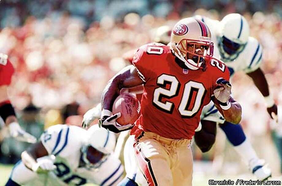
...with the '94 throwbacks a close second. I do like the current set and Montana set, and get the historical significance behind that particular look. But I feel like this set did a very good job of modernizing while honoring and respecting that history, as well as being a solid, cohesive, and strong uniform in its own right. It brought eras together and is essentially what I wish they were wearing today.
And to be totally honest? I love drop shadow numbers (that may be an unpopular opinion in and of itself), so there's another big reason there. The 49ers just pulled them off so well.
Might just be the very best uniform in NFL history, in my opinion.
The Jets and the Colts really need to spice up their unis. Maybe go double green/double blue, possibly modernize the striping, I don't entirely know, but they need to do whatever it takes to get rid of their current bland, boring unis.
-
 1
1
-
-
That pattern looks futuristic to me, and I like it. However, I wonder if this uniform would age quickly, and if I had to guess, I'd say yes.
-
1
-
-
This will never happen, but this would be the way I realign the NFL. (San Diego Chargers moved to Los Angeles)
AFC North:
Cleveland Browns, Indianapolis Colts, Kansas City Chiefs, Pittsburgh Steelers
AFC South:
Houston Texans, Jacksonville Jaguars, Miami Dolphins, Tennessee Titans
AFC East:
Baltimore Ravens, Buffalo Bills, New England Patriots, New York Jets
AFC West:
Denver Broncos, Los Angeles Chargers, Oakland Raiders, Seattle Seahawks
NFC North:
Chicago Bears, Detroit Lions, Green Bay Packers, Minnesota Vikings
NFC South:
Atlanta Falcons, Carolina Panthers, New Orleans Saints, Tampa Bay Buccaneers
NFC East:
Cincinnati Bengals, New York Giants, Philadelphia Eagles, Washington Redskins
NFC West:
Arizona Cardinals, Dallas Cowboys, San Francisco 49ers, St. Louis Rams
-
This. Even if it was a decent logo, it's way too retro-looking to be brought back anyway.This is a terrible logo

-
NHL with a few changes:
Predators and Coyotes are contracted
*Panthers move to Quebec
*Hurricanes move to Portland
*Devils move to Seattle
*Blue Jackets move to Hamilton
*Lightning move to Houston
Atlantic Division:
Boston Bruins
Buffalo Sabres
Hamilton Tigers
Montreal Canadiens
Ottawa Senators
Quebec Nordiques
Toronto Maple Leafs
East Division:
Chicago Blackhawks
Detroit Red Wings
New York Islanders
New York Rangers
Philadelphia Flyers
Pittsburgh Penguins
Washington Capitals
West Division:
Calgary Flames
Dallas Stars
Edmonton Oilers
Houston Aeros
Minnesota Wild
St. Louis Blues
Winnipeg Jets
Pacific Division:
Anaheim Ducks
Colorado Avalanche
Los Angeles Kings
Portland Hurricanes
San Jose Sharks
Seattle Metropolitans
Vancouver Canucks
-
For the sake of being retro.Give me the traditional northwestern stripes at home, UCLA stripes on the road
I'm sorry, but that's a terrible idea. Why would you have two completely different uniform designs in the same set?

Damn, I completely forgot that they did that. Either way I think they should stick with one of those and just go with it for both, preferably the UCLA stripes.
If they go with the UCLA stripes it would look too outdated, in my opinion.
-
I love the Rams' current uniforms and hate their athletic gold ones.
-
2
-

United Baseball Association - 3/3 Memphis Posted
in Concepts
Posted
I love the double green, especially for a Seattle team!!! Don't change a thing imo.