


AlexWilson
-
Posts
308 -
Joined
-
Last visited
Posts posted by AlexWilson
-
-
here 's one most people don't know about:

That's John Elway, for those who don't know.
-
Simple question: How do you conduct a poll?
-
Doug Flutie:

-
is that New Orleans Night logo real? it can't be real. it just can't be.
It's real:
-

In Canada, at least.....
-
Played "spot the fake" at the Jay's game on Saturday. Here's what I saw:
More than half the people were wearing fake jerseys, specifically those with "Reyes", "Bautista" and "Dickey" on the back for the Jays
Saw 5 fake Red Sox jerseys (one had the black lettering instead of navy)
Saw 4 legits the whole day, all of which were throwbacks (not including my own Kelly Gruber jersey, which I got for 8 bucks at Goodwill last year).
Did you win a Cito Gaston bobblehead?
I won 25 bucks.
-
Played "spot the fake" at the Jay's game on Saturday. Here's what I saw:
More than half the people were wearing fake jerseys, specifically those with "Reyes", "Bautista" and "Dickey" on the back for the Jays
Saw 5 fake Red Sox jerseys (one had the black lettering instead of navy)
Saw 4 legits the whole day, all of which were throwbacks (not including my own Kelly Gruber jersey, which I got for 8 bucks at Goodwill last year).
-
Knowing these are fakes, there still the best fakes I've ever seen, but then again I'm not going to waste my money on something like that. I'd rather go to a thrift shop and get a real jersey or buy one from the team shop.
-
Right... I think Ray Allen is a player who has multiple right uniforms.
Same here, I always think of Ray Allen as a Buck or Sonic, then maybe a Celtic, because he did good with all those teams. At the moment he looks wrong in a Heat jersey, but one day that might look right.
Ray Allen not in green is his wrong uniform in my opinion. He wore green for the first 3 teams he played for.
-
I think I've figured out a realignment for the NHL that makes some sense, given the screwy geography and potential relocation of the Coyotes and eventual poorly thought out expansion.
Conference 1 - Pacific/Smythe/Gretzky conference
Vancouver
Edmonton
Calgary
Colorado
San Jose
Los Angeles
Anaheim
Phoenix
Eventually Seattle by relocation or expansion
Conference 2 - Great Lakes/Norris/Howe Conference
Winnipeg
Minnesota
Chicago
Detroit
Toronto
Buffalo
Ottawa
Eventually Markham by relocation or expansion
Conference 3 Northeast/Adams/Orr Conference
Montreal
Boston
NY Rangers
NY Islanders
New Jersey
Philadelphia
Pittsburgh
Eventually Quebec City by relocation or expansion
Conference 4 - Southern/Patrick/Hull Conference
Columbus
Washington
St. Louis
Carolina
Nashville
Dallas
Tampa Bay
Florida
Once the relocation/expansion is done, each conference could be split into two divisions
The Pacific into North and South divisions
Great Lakes into East and West
Northeast into North and South
Southern into East and West
The purpose of the divisions would be for seeding and keeping travel costs down with an unbalanced schedule.
Top team in each division would get an automatic playoff berth, with the top two remaining teams in each conference getting the remaining playoff berths.
You sadly need a 34th team. 33 teams equals an odd number, which would make the playoffs almost impossible.
-

Was this a pre-draft work out type thing? Nice find
yep. the Kings invited him to a workout session before the draft because they were interested in him. I believe Crosby was allowed to keep the practice jersey as well. I've never seem a picture of this before, only video, so nice find.
-
Has anyone posted Gretzky on the racers?

-
This is the nest logo the Sabre's have ever used, and It should be used now as the primary with a few tweaks here and there:

I have 2 versions of that logo. How's this?

i like the second one more. It really pops.
-
This is the nest logo the Sabre's have ever used, and It should be used now as the primary with a few tweaks here and there:
-
Nevermind my previous post, I got that now. Thanks for the insight!
I have one more question though, and it's probably dumb, but I'm new haha
I've noticed people with championship banners of their favorite teams as a signature...how do I get that? That looks so awesome! Thanks!
I was a follower of the site before i joined, and people will sometimes do banners of creative things for signatures, like the scarf I have, in the concepts section. You have to ask for a request from the person who made the banner of scarf in order to get it for your signature. Not sure if you could get a champ banner though, because i believe requests are finished for that.
-
 1
1
-
-
Fake. The black Beebok logo that is no longer in use is a dead giveaway.

Do you mean the Reebok logo on the lower part of the sleeve? Because A.) It's blue B.) All replicas come with the Reebok logo stitched on there, and the fact that it uses the old logo could simply mean that it's from a few years ago. Not exactly sure how that's a "dead giveaway", but sure.
It looks black to me..... but it could be navy.
-
Another Isles one here...Has the R. Probably learned his lesson about the lack of jock tag, hence whole jersey isn't shown:
He also made this one cheaper........... I wonder why?
-

Listed as a "Reebok Premier Replica" Don't see a jock tag though. Is it legit?
Fake. The black Beebok logo that is no longer in use is a dead giveaway.
-
[
The Oilers should have kept this look (maybe lighten the blue so the navy didn't look black on TV):
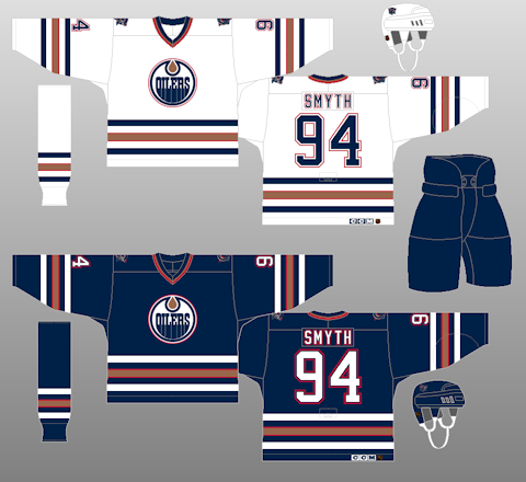
YES. i understand why they went away from this look, but i still like it ten time better than their current getup
You guys are in the majority. The navy and copper make Edmonton's "throwbacks" look dated, boring and meek.
What if the Oilers did a combination of the two? Hardcore Oilers fans like the current jerseys because they are similar to the 80's but the 90's jersey change was more clean. Could the solution be 80's colors on a 90's jersey (and maybe keep the "Rigger" shoulder patch retired)?

That looks really good, but Oiler fans wouldn't like it. Most miss the copper and how it looked on the jerseys. If this were copper, I'd buy it.


Players in the "wrong" uniforms
in Sports Logo General Discussion
Posted
He wasn't a pitcher, he was a outfielder for Stanford. He was supposed to play left field.