


SuperLeafsFan
-
Posts
549 -
Joined
-
Last visited
Posts posted by SuperLeafsFan
-
-
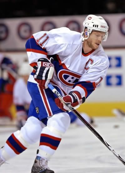
I miss this uniform and prefer it to the current away:
-
I think it is gone, as It's no longer showing up for me either. And that was probably the issue.
-
I'm getting the same issue as JP.
-
I feel bad for everyone here. Work/Templates getting stolen just sucks.
-
The main issue here isn't the mods, but the fact that most people don't see the comments these people have written because its been deemed offensive by a mod.
What exactly is the criteria behind a mod-edit worthy post?
Seems to me that it differs from each mod.
Just my 2 cents.
-
You don't want to see what they make us clean up in the bathroom O.O
I thought the Ugliest Bathroom got closed due to virus spreading guys....
-
Then search up that persons name, and you'll find more stuff by them.
-
Here's a huge unpopular opinion:
I love this logo. Everything about it works. It fits in well for it's era, and the head alone would make a great logo.
-
Congrats to the new mods. I'm gonna miss the Graveyard though..... all the laughs in there, people...... even more than the Goldmine.
-
 1
1
-
-
Agree with Number 2. Red and Twins doesn't work.
-
Fix the numbers and put teal on the yoke instead of silver, and I agree that it could work, but only as a alternate.
-
Take the
orangeyellow out of that Padres set and you have the start of something workable.My unpopular opinion is stated in the above "FTFY".
Actually I agree that the current bland garbage is better than the 1984 look. However...

was great and I wish they'd stuck with the scheme.
I agree 100%. Brown and Orange is what the padres should be wearing......... maybe bring back the sand too?
-
You want a Ranger as someone's wrong uniform, here is two guys who it is:

Bobby Holik

Marc Savard
Funny thing is, these two guys met with one another shortly after in Atlanta......
-
1
-
-
Yeah, it didn't look like the site at all. But thanks guys cuz I was worried. I had previous experience getting in trouble on Forums and didn't want to break any rules.
-
Yeah, kinda weird eh? Can someone PM Chris and let him know that this is been happening?
-
Has anyone else had a random orange banner appear telling you you've been suspended?
-
1
-
-
Ducks Vs Nucks in 2007:
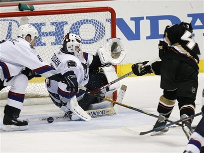
Then again, any pre-edge against the Ducks that season was odd.
-
Most Underated set of Stros unis:

Yes folks, the firearm stripes. These would look so great as a alternate jersey for the team. I love everything about them. That being said, the 90's set is a close second with me. The set they have now is meh. Nothing over the top, but too simple.
-
Sergei Fedorov as a blue jacket :

I always forgot he played for them.
Nah man, Fed as a Duck is way weirder (Same for Lupul and Kunitz LOL):
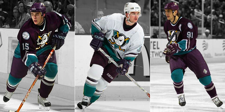
-
As good as the Boston Celtics uniforms look, I wouldn't mind it if they used gold as an accent color. Not only would it work with the Irish motif, but it would be a nice tribute to their championship legacy.
Gold would be better than the black they use in their alts.
No doubt. Heck, they have gold in their logo. Either use that shade or lighten it up a bit and use it.
You guys are talking about this as if they've never worn these
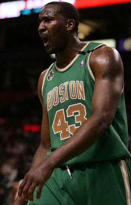
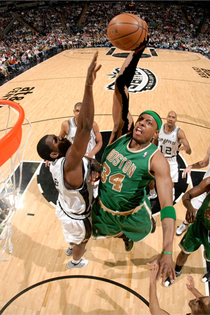

Reverse the colors and we gotta winner for what the Celtics could do if they ever change there uniforms.
-

The Lightning should have never changed these... Sure the logo is poorly designed but so are a lot of the so called "classic" logos in the NHL (NYI, Buffalo). The colours more than made up for it... same with the Stanley Cup triumph associated with it.
Just take the Edge logo and slap it on these already............
-
Marcin Gortat:(this qualifies now)

-
Okay:

I Hate This Logo. I just personally think that a bee and a fleur-de-lis shouldn't be merged together.
-
Already posted this but it applies here as well:
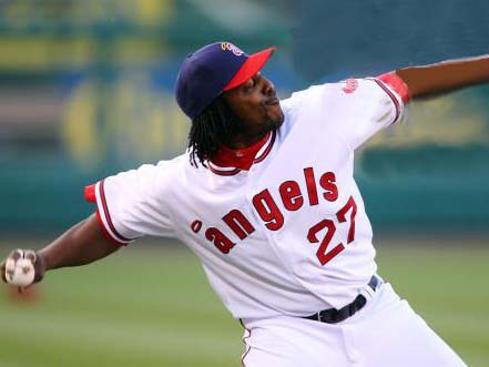
The Angels 1971 set is fantastic in every way possible. Shame it was only worn for a year, considering it looks great even to this day. The little A just looks so sharp along with the jerseys. Would love to see this sweater make a comeback as a full-time alt.

Minor/Independent/Collegiate League Baseball Logo/Uniform Changes
in Sports Logo News
Posted
I like it. The look is sharp, but I'm not sold on the colour change. That's my one big issue here with this. Other than that, I'd have to see the rest to get a good feel for what they're going for.