


mamiller99
-
Posts
1,364 -
Joined
-
Last visited
Posts posted by mamiller99
-
-
1st - Denmark #2
2nd - Australia #1
3rd - Argentina #2
4th - Saudi Arabia #1 -
1st - Wales #1
2nd - USA #2
3rd - Netherlands #2
4th - Iran #1
-
Give us Warrior/NewBalance or give us death!
I actually really dig what Warrior does for the Champions Hockey League other than having to conform to a kinda weird template. Plus their past work in the collegiate level has always looked nice
-
Can we pretty pretty pretty pretty pretty please get an updated Team USA look please? Thanks
-
 5
5
-
-
While I am a BXII fan through and through, I feel like their designs might be easier since they have less conservative branding. So I guess count me in the SEC column? Although obviously I feel like you should do both if the time permits

-
This has been an awesome project, much like every other one you’ve done on these boards. Love the template too (Raysox is the template GOAT).
Quite impressed with both the Waterdogs and Whipsnakes, although an inclusion of the blue from the water pattern with the Waterdogs as a quaternary color would be welcome imo.
Looking forward to what looks like the
SpoilerOhio Machine
-
1
-
-
A flat and layered baseball jersey template that plays nicely with Inkscape would be awesome. I’m working on a personal project and almost all the links on the template megathreads are dead links
-
On 8/2/2017 at 7:05 PM, shrapnell said:
I haven't posted on this site in over 8 years... but I came across this video on youtube:
It's put out by these guys: https://sportstemplates.net/
I can't find out a thing about them, no critiques, articles, evaluations, nothing! Can anybody post experience with this template? How flexible? How customizable is it?
I've never worked on photoshop, but I'm so impressed by what I see so far I'm actually considering taking the plunge and joining the photoshop cult.
Any feedback or advice would be most appreciative.
All I really know is that these are way too overpriced, although I have noticed that many a good concept is made using this template.
-
1
-
-
Really excited to see what you do with this! Will this league have more parity like the BPL in real life?
-
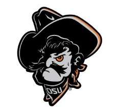
Various Oklahoma State logos (Phantom Pete, Pistol Pete athletic team logos, baseball cap logo, and the Marshall Badge logo)


-
1
-
-
Wow, that's truly inspiring. In a way, it has shades of the architecture at the Perot Museum
-
A complete NCAA hockey revamp, except thet must follow the super modern college football/basketball theme. And it's mainly the powerhouse conferences
Actually, I may start on that soon
-
The photo editor isn't working right now

-
Umm, it means with the cities. Because the franchises still own their players, unless they trade the players. Granted, we may see Springfield move, because that's around 37 hours on the road. I don't know the distance via air though. I do think Ohio should be all Blue Jackets, save for Toledo because it's the Detroit of Ohio(mainly socioeconomically speaking).I would think multi-year affiliation means with the franchise itself, not necessarily the city.
-
I'm excited for the graphical change. And I'll be able to see them play Charlotte, thanks to the convoluted conferences in the AHL
-
Hate to bump this, but according to multiple Jackets news outlets, Lake Erie is the affiliate of the Jackets.
-
How do you post an image on your sig on mobile (my iPad)? I want to use Silent's sigs
-
Also, I was at the PNC Arena to see the Jackets win. The odd thing was that there were not flags for all the NHL teams.
-
I think Saskatoon or Regina would make a good AHL city. And it could work for Winnepeg.
-
So, Florida is having goalie tryouts.
-
A Columbus or St. Louis affiliation and the promise of better talent may help bring in some bigger crowds. I wouldn't mind Cincinnati at the AHL level one bit.
In a perfect world, I want Cleveland affiliated with Columbus, Kansas City with St. Louis, and Cinncinati with Nashville. Just my two cents.
-
I'd switch the Isles with the Jackets. I love the Pens/Jackets rivalry too much.
-
Can I just tell you how awesome these are? The templates are phenomenal, and I love how each guernsey is different.
-
1
-
-
These are all great! Murray State and UTEP are my favorites, not to say that the others are bad. Oh, and it'll be fun playing you in the WAFA soon


College Football Uniform Concepts FBS, FCS, D2 & D3- Lehigh Mountain Hawks
in Concepts
Posted
I think the issue with FAMUs logo (imo), is that it’s got multiple perspectives going on at the same time. The skull and neck are both at a profile while the lower jaw, mouth and teeth are at a skewed 3/4 perspective. If you make the perspective consistent across the entirety of the logo, I think you’ve got a winner. I appreciate your ability to change an illustration to an actual logo