


Rays
-
Posts
533 -
Joined
-
Last visited
Posts posted by Rays
-
-
Did my chewing tobacco tread get deleted ?
-
I hate the Fisherman logo (too cartoonish and detailed, not a strong enough identity), number font and execution of the striping from that era, but I do LOVE the concept of the wave striping/shoulder yoke and the color scheme.
But what if they added front buttons ?
-
-
A car with 200 adds on it, is a uniform ? LOL
-
Yoenis Cespedes in a red sox jersey.....absolutely disgusting.........what a bonehead trade, may all the A´s get crabs in their hobo-beards
-
I've said it before, and I'll say it again: the Blackhawks logo is outdated, ugly, over-colored, and altogether too busy.
Something beautiful can ever be outdated..........would anyone call the classic beauty´s in old hollywood movies outdated ? no way.
-
but also the greatest and most beautiful......it´s classic, timeless, a combo i never get tired of seeing........ohh say can you seeeeRed, navy and white is a cliche colour scheme.
-
not a big fan of him myself.......Tigers got real lucky dumping that fatass......Rangers just dumb as hellI hate "Beerbarrel Man"
-
 4
4
-
-
McDonald's ?I hate hate hate the St Louis Blues McDonald's arch 3rd jersey.
-
What about donald duck, he also still looks good
-
as i allways said...loose the huge grin and wahoo is great................. but then again, why does all logos/mascots have to be angry ?
-
Not really mad, just don´t understand this.........the reason he left the cavs was to win, now that he got 2 rings he returns.....for what ? to win with cleveland ? then why just not stay in the first place........is it "me first" then we will see if my old team can get a ring as well ?.....very strange thought process imo........how can leaving 2 teams make his image better ?Not in that yellow piece of
 uniform..........btw, what kind of :censored:ing clown is that guy ?
-
Not in that yellow piece of :censored: uniform..........btw, what kind of :censored:ing clown is that guy ?I think LeBron will be looking A LOT better this time around in Cleveland.
-
deleting my posts ? when i was just responding to an old post , why is the post by Cujo okay, but mine is not ?
-
I am probably the only person who likes this logo, therefor making my liking of it a very unpopular opinion.

Nice.
-
deleted
-
Everyone but me seems to have a rock-hard boner for these uniforms.
 ]
]Looks like age is catching up to me.
-
1
-
-
well, can´t the city and some companys who get great advertising space in the new park get together and find the money ?
Who, exactly, do you expect to pay for a new park?insted of san jose, why can´t they just build a new ballpark in oakland ?
.
They did in Miami, and they have zero spectators compared to the popular A´s
-
insted of san jose, why can´t they just build a new ballpark in oakland ?
-
White sox have great home unis and so did the florida marlins......why should the yankees be the only one allowed ??Never liked pinstripes on Basketball uniforms. Always thought the old school Charlotte Hornets stripeless replicas made by Champion looked better than the authentics.
The New York Yankees are the only team in major North American professional sports that should wear pinstripes.
-
Jesus man !......where is the uniform ? all i see is skin......not a fan of the uniform or the XX-small look for that matter ! LOLThis is the best uniform set the Suns have ever worn:

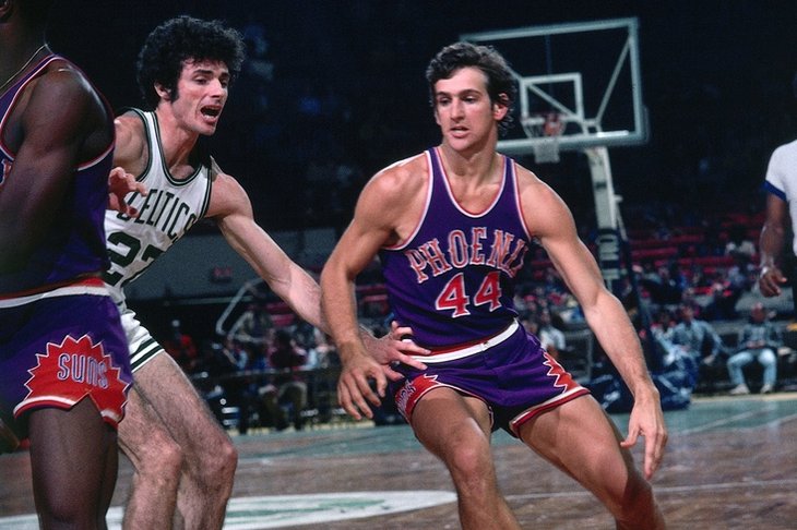
No gray, no black, no sublimination, nothing to clutter it. Admittedly, it would've been better if the home uniform used a "Suns" wordmark and the wordmark fonts matched, but it still forms a great set.
-
Yeah, and i still don´t understand why the Ray is not on the sleeve of any of the 2 blue jerseys !?
-
"roided-out".....LOL.......just keeping it authentic to the game
-
1
-
-
Rays home white jersey is baseball perfection.......blue piping, nice script with the sun burst, and a sleeve logo........not too little, not too much going on.

 uniform..........btw, what kind of :censored:ing clown is that guy ?
Ask A Moderator
in Forum Policies and Announcements
Posted
okay, but could´t you just have moved my post into that tread insted of deleting it ?