


(probably)notabandwagonfan
-
Posts
706 -
Joined
-
Last visited
-
Days Won
1
Posts posted by (probably)notabandwagonfan
-
-
40 minutes ago, BJ Sands said:
Jaime Garcia, Minnesota Twin.

Never even got to Minnesota.
-
 6
6
-
-
-
-
3 minutes ago, Cujo said:
Dirk Nowitzki - Milwaukee Bucks
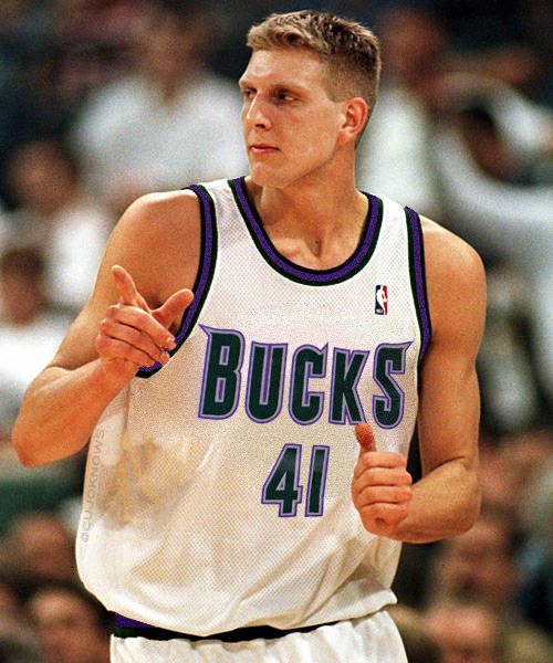
Wait what?
-

Dansby Swanson is changing his number to 7.
-

You can't tell me this man is in the wrong uniform. Whenever I think of the Rays fauxback, I think of Maddon modeling.
-
3
-
-
Last year's #1 pick Dansby Swanson is making his MLB debut tonight
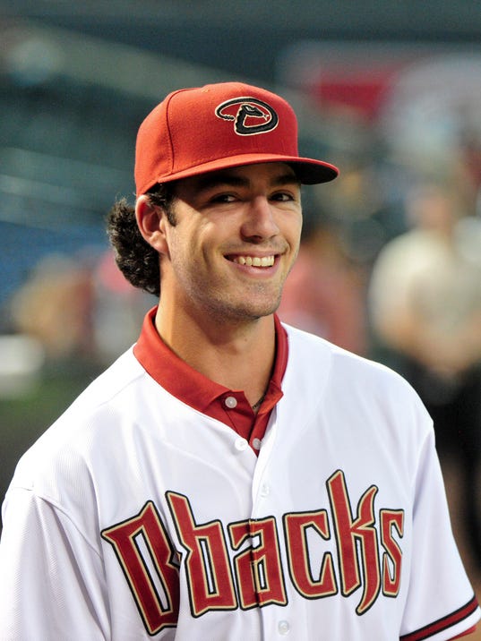
Just not with the Diamondbacks.
-
1
-
-
7 hours ago, insert name said:
Also, I don't know if it's because people didn't like it or MLB teams just don't wanna wear them anymore but some teams need to bring back vest uniforms because they looked good.


Especially the Pirates.

This is my personal favor, and it's cut better
-
MLB 2k5 used the same number font for every team
-
Seriously? You're going to be that way? ROYAL.
Navy is blue....
The shade is too bright. I think it makes the uniform look cheap. If I'm not mistake, the mets have a darker shade. By blue, I mean blue. Not navy.
not to mention, taking blue pinstripe to be any shade of the colour blue, the yankees as well.
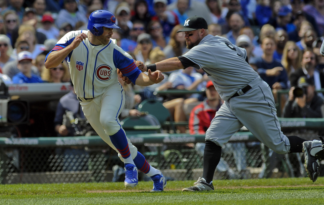
Care to explain how blue pinstripes look amateurish? You must think the Mets home looks amateurish too, right?I'm starting to dislike the entire Cubs identity. The home jersey looks really amateur with the blue pinstripes and the whole Cubs in the circle looks... Boring. The vest they wore as a throwback a couple of years ago looks way better IMO. I absolutely hate the road jersey. From the font to the color of the number being different than the script. It just looks bad. I always thought the road jersey with the red line under it was their best look. The alt road speaks for itself. The blue jersey is probably the best of the set.
-
The shade is too bright. I think it makes the uniform look cheap. If I'm not mistake, the mets have a darker shade. By blue, I mean blue. Not navy.
not to mention, taking blue pinstripe to be any shade of the colour blue, the yankees as well.
Care to explain how blue pinstripes look amateurish? You must think the Mets home looks amateurish too, right?I'm starting to dislike the entire Cubs identity. The home jersey looks really amateur with the blue pinstripes and the whole Cubs in the circle looks... Boring. The vest they wore as a throwback a couple of years ago looks way better IMO. I absolutely hate the road jersey. From the font to the color of the number being different than the script. It just looks bad. I always thought the road jersey with the red line under it was their best look. The alt road speaks for itself. The blue jersey is probably the best of the set.
-
I'm starting to dislike the entire Cubs identity. The home jersey looks really amateur with the blue pinstripes and the whole Cubs in the circle looks... Boring. The vest they wore as a throwback a couple of years ago looks way better IMO. I absolutely hate the road jersey. From the font to the color of the number being different than the script. It just looks bad. I always thought the road jersey with the red line under it was their best look. The alt road speaks for itself. The blue jersey is probably the best of the set.
-
Yeah sorry, looked blue. A darker teal into black I think would workBlue? You mean teal? Honestly there aren't any colors that could make that design work.
-
I think the jags helmet would look good if it went from blue to black.
-
I don't get the love for the 89-97 bird... It's awful, what's wrong with it's face? Why is it's head so round and why is it's beak almost nonexistent?
-
1
-
-
Really? How can you even read that from what he said?
Really? Hopefully your statement isn't connected with his sexuality.Michael Sam...any NFL uniform is the wrong one.

CFL is better suited for his abilities.

-
2
-
-
Jimmy Rollins.
who is that?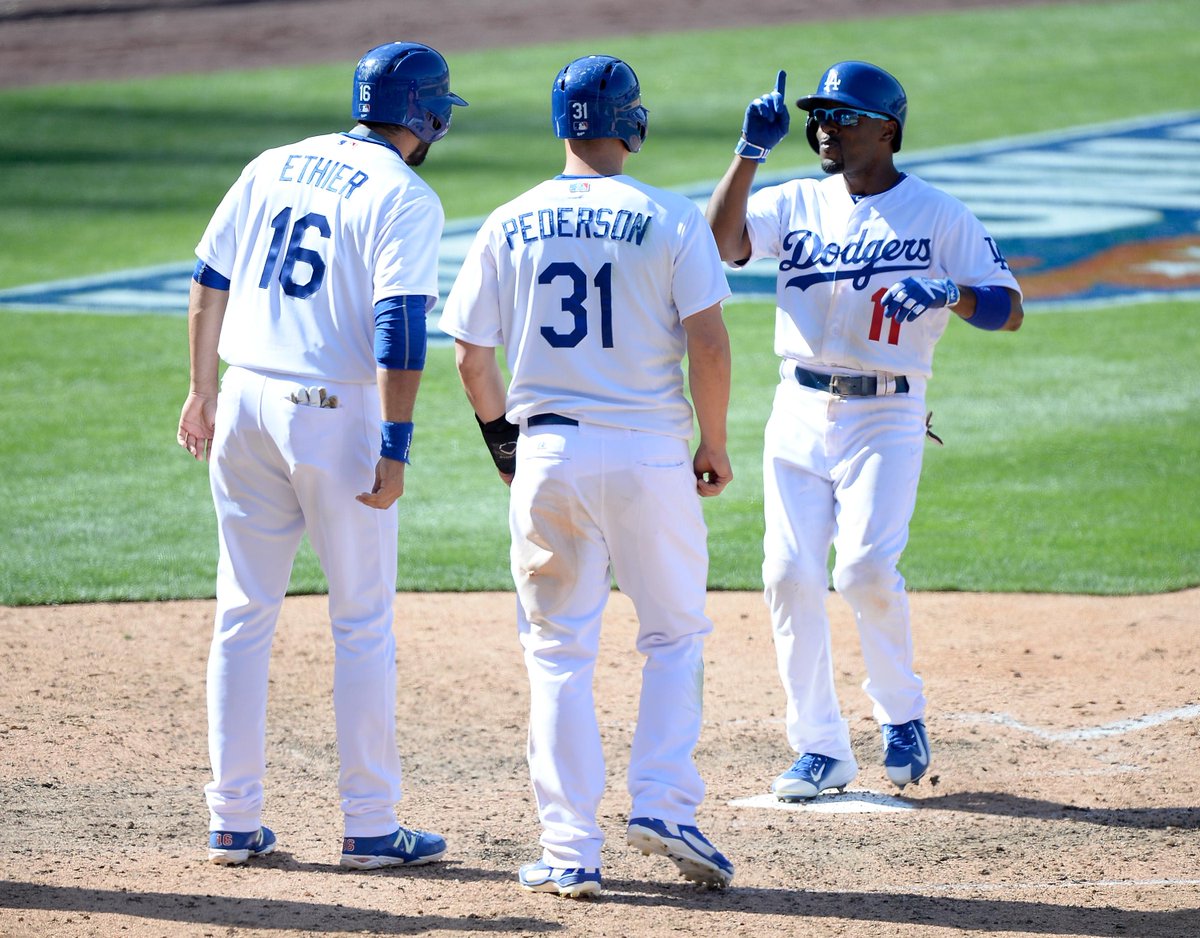
also papelbon is a douche
I don't know, I kind of feel J-Roll looks right in a dodgers uniform.
-
Bullets maybe?Aside from baseball scripts on jerseys, has another team used lower case letters on a jersey? I can't think of any at the moment.

-
Why does my clock on the board keeping going an hour of the time zone I'm in? I went and changed it yesterday and it reverted back to +1 my time by today.
-
The only thing I think doesn't work is Atlanta in the west. I know they were there until '93, but it doesn't make since that teams like St. Louis and Milwaukee are in the east when Georgia is a pretty eastern state.
-
Why rename the Grizzlies and not the Jazz?
-
Me too. I didn't realise part two.
I feel better knowing that last part. I thought they would be stuck in that
1. They don't have much choice. The only other option they want is San Jose, which they can't have.No. No. Noooooooooooooooooooooooooo. I'm not even an A's fan. Noooooooooooo. How could they do such a dreadful thing?
2. The extension reportedly contains a clause allowing them to leave early if they can secure a new ballpark elsewhere, so why not sign it?
 hole for another 10 years.
 -
No. No. Noooooooooooooooooooooooooo. I'm not even an A's fan. Noooooooooooo. How could they do such a dreadful thing?
-
I'd be shocked if Delgado didn't want your logo.


 hole for another 10 years.
Players in the "wrong" uniforms
in Sports Logo General Discussion
Posted
Haha. It does. He designed that shirt when he was with the Braves.