


OffCenteredScoreboard
-
Posts
75 -
Joined
-
Last visited
Posts posted by OffCenteredScoreboard
-
-
Anybody know why the Prudential Center has two sets of Devils retired numbers?
here's the best picture i could find

-
I think a lot of the "artifact title" teams have now had plenty of history in their current locations that their name doesn't sound "wrong" anymore. Jazz, Lakers, Dodgers, etc. None of those names really make sense, but it doesn't matter. All have become established.
THIS THIS THIS THIS THIS THIS
-
i hate the use of alternate jerseys in sports.... except for baseball. with 162 games you need to switch it up occasionally
-
Not sure how unpopular this is, but i hate Color on Color matchups.
-

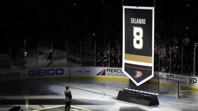
Seemed fitting today. Kimo Timonen.
i was gonna post this one hahaha. im happy for Timonen though.
-
i hate color on color matchups... and i dont know if this next one is unpopular, but i think the NBA should consider wearing darks at home
-
anybody got a pic of pittsburgh penguins banners at consol energy center? in particular their metropolitan division champs banner?
-
I liked these

Yeah, I miss those too.
is there any pics of these against a home team wearing a cream based jersey? maybe vs San Fran? the colors are kinda similar so im interested to see a matchup of that.
-
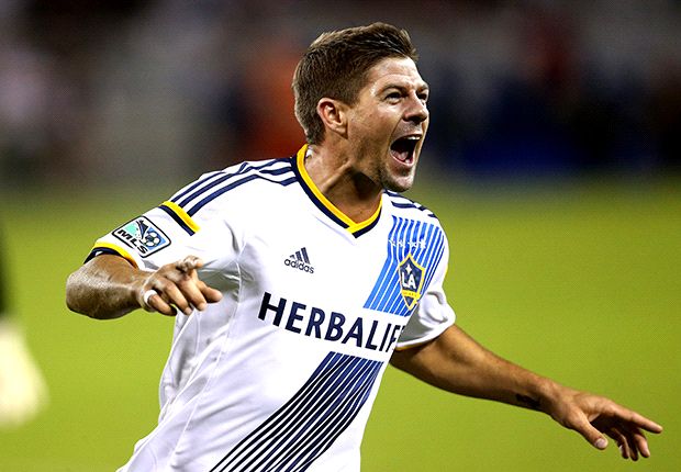
wont actually happen until July but Steven Gerrard in a Galaxy jersey is just wrong
-
-
- NFL:
- Giants: Too much separation of red and blue
Yes.


The amount of love this garbage gets is truly mind-boggling. The colour balance is horrendous - to have both jerseys completely devoid of one of your primary colours looks cheap and amateurishly inconsistent. The all-red jersey with the primarily blue helmet is comical; they look like a rec team who ordered their helmets, then found out money was tight and could afford only one colour on their jerseys. Then there's the fact that the jersey designs are completely different, which makes them look like two completely different teams. Again, horribly inconsistent. And that home jersey? Literally the only non-mandated design element is the "ny" under the collar, which is so short width-wise that is looks awkward. There's minimalist design (Colts), and then there's boring. This looks like the same rec team went "Shít! We can't even afford customized stripes, either!". This might be one of the worst looks in the entire league.
this is a whole lot of hate and it is 100% spot on
- NFL:
-
Chris Matthews Winnipeg Blue Bombers

-
if the kings used a better font they would have some of the best banners. really like how its the same template just recolored. ruined it with a goofy font. (also quick question, how many years did blake wear black and silver versus black and purple? i remember him as black and purple but i am 18 so that might explain it)
-
-
i dont think the nhl all star jerseys are terrible. i think they work for the event.

-
The Miami Heat continue their proud tradition of superfluous banners with the addition of a HOF notation on Zo's retired jersey.
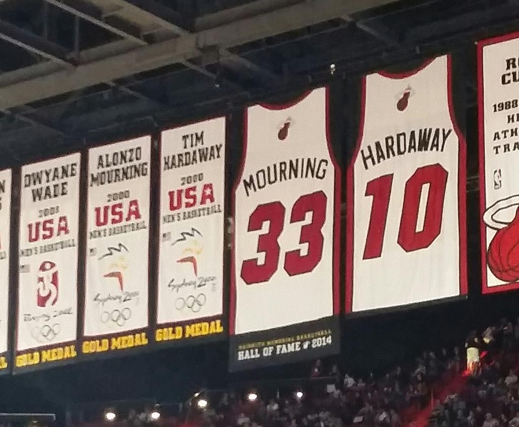
Wow. Do they really put up banners for players on the team who won gold medals in the Olympics? That just seems really dumb. They didn't win them for the Heat... they won them for the pride of their nation. Jeez. I'd like to see an NHL team try and do that

Here's a serious question though: who would get the raise Shaq's number up in their rafters? Or has that happened already? I really don't follow the NBA.
The Carolina Hurricanes have done this, but I assume just for Olympic years. When we went to a game there in 2010, they had each player that played in the Games a separate banner featuring their name and their country's flag.
Apparently they did this last season, too.

great their boring jersey stripes even replace the storm flags when it comes to banners as well. hope they bring back the storm flags before they win a division championship or something.
-
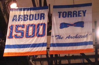
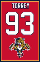
bill torrey's islanders banner is one of the all time greatest banners. i mean look at that bow tie! so much better than his panthers one where they gave him a number even though he was not a player
-
Kelly green sucks. There's something that feels washed out and unsubstantial about it.
YOU SHUT YOUR WHORE MOUTH!!!!
(Ahem... I think kelly green is the most underrated color in sports and isn't used nearly enough.)

-
New York Islanders have a team hall of fame banner to honor some players without retiring the number. (note Bourne, Westfall, Morrow, Flatley, Johnson are the ones whose number is not retired) They are missing some key players though (Goring, Tonelli, come to mind)

-
even tho these teams play 4 times a year and these hurricanes unis are entering their second season, this is the only matchup of these two uniforms. hurricanes always wear black against the isles for whatever reason (same thing for the isles old black jersey vs canes) in fact the canes will wear black the other islander game they will play in carolina.

-

Rick DiPietro, Charlotte Checkers
we can all go home now

Unpopular Opinions
in Sports Logo General Discussion
Posted
Isles black jerseys look good on the ice.