


WissX
-
Posts
298 -
Joined
-
Last visited
Posts posted by WissX
-
-
On 5/27/2018 at 3:30 PM, Cujo said:
Cool story bro.
Hit me up in October, we'll see who's still playing.
In 100 years when you win your next world seriess? but to the point


All 3 different teams
-
 1
1
-
-
On 5/21/2018 at 7:01 PM, Cujo said:


You see the cubs fly the flag when an "L" is taken. The two logos show no coloration, if you made it a dark blue instead of light blue id be agreeing
And whos winning the division? -


The cubs always seem to be flying the L and I see some similarities
-
2
-
-
there is some connection between the two.
-
1
-
-

Posession of this logo should result in immitate disporval from parents.
-
2
-
-
-
-
thoose two images above are awesome Id love to be a photgrapher for a major sports leauge
-
1
-
-
I love the current ones that dont really use gradients.
-

Wore the wrong uniform when pinch hitting
-

some say it looks like a nuke was dropped
-
mod edit
-
I like 12 and 16
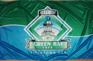
Milwaukee may have a new flag!

-
and someone really bad at MS paint
-
1 hour ago, goalieboy82 said:
this should be the Flag of Earth:

I like that a lot. Richard Nixon would approve.
")
-
1
-
-
Here is my concept flag for Wisconsin. Kinda cheesy

-
2
-
-
one of my more liked flags
-
I'm sure they're busy going through 12 months of concepts and determining what fits where. I believe patience is key in this matter.
I agree, but BMA said "a week" 12 days ago. (it's fine, BMA, we understand) TVIXX, and myself, frankly want to know if there is any update. He is not being impatient, just wanting a check-in.
I would do a X award for best concepts in each sport. Not as glamours but something nice to have as a award
-
1
-
-
Theese good for paint.net


Logos that Look Alike
in General Design
Posted