


AstroCreep
-
Posts
2,422 -
Joined
-
Last visited
-
Days Won
3
Posts posted by AstroCreep
-
-
3 hours ago, wildwing64 said:
It's alright. Perfectly adequate for its purpose, for now.
They are hockey jerseys alright.
-
7 hours ago, ruttep said:

Quick reminder that this was a Monday Night Football game between a teal team and an orange team
Reminds me of this Thursday Night Game between the Jets and Jaguars where they decided to not use any exciting colors at all.
-
 1
1
-
-
It's just another uniform that further cements my problem with this "minimalistic" era of NFL (and sports in general) uniforms. It's boring. It doesn't stand out. I'm gonna put the game on and it'll take me a long time before I realize "oh it's the Vikings".
It's a white uniform that hides almost everything that makes the Vikings brand stand out. Why would I wanna wear this? Why would anyone wanna wear this? No one will know "oh it's the Vikings". I may as well wear a regular white t-shirt.
-
8
-
-
5 hours ago, JohnnyCowboy5 said:
There's no reason for this to exist other than, it looks cool as hell.
-
3
-
-
I was expecting more purple out of the jersey since it was heavily featured in the teaser. I don't really care for them as is. Like a lot of CC's, these are just another swing and a miss.
-
1
-
-
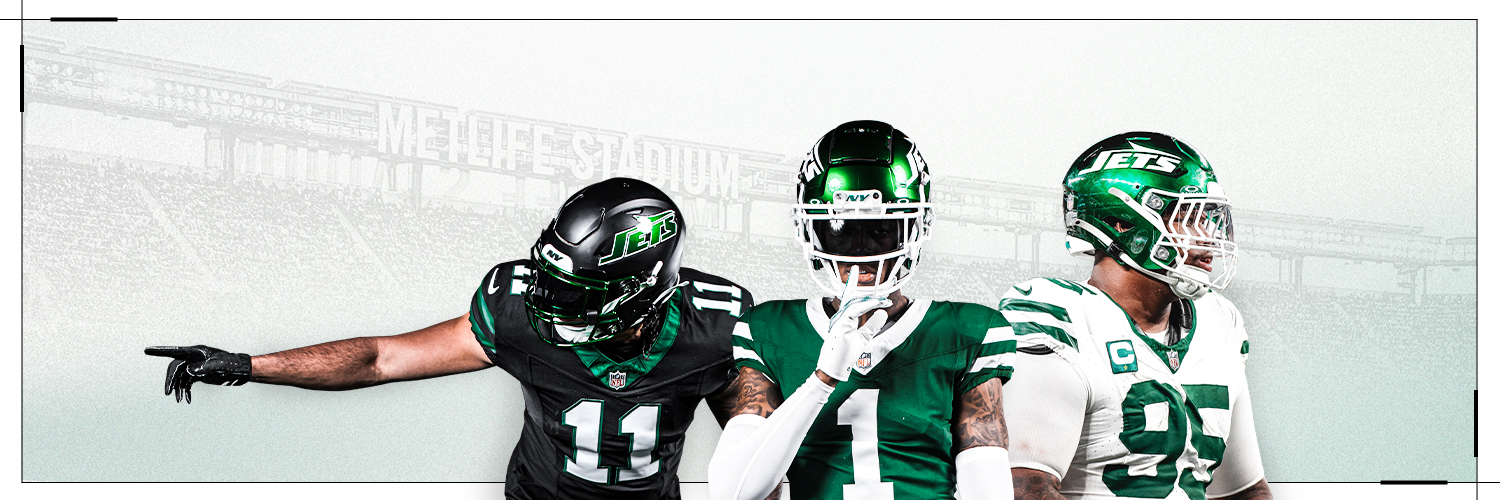
On 4/15/2024 at 9:01 AM, DCarp1231 said:
I'm super late with my reaction because stuff but it's great to have the Jets look good again. I don't care for the black uniform but it's not offensive enough to bother me. As long as they don't overdo it like last time.
The uniform just fits the modern template better than it did in the past. I actually love "Gotham Green" more than Kelly Green and that's the only compliment I'll give the previous set.
We may never again speak of that debacle that was the 2018 redesign.
On 4/15/2024 at 1:59 PM, Cujo said:Predicting the Jets will revert back to these in ten years.
Super bias because it's what I grew up with but this to be is still the my favorite Jets uniform. They'll probably use this as their throwback alternative next season and if that's the case, we may have the best of both worlds. As long as they inverse the loop, which is all they had to do to begin with. I still think it can work in today's almost sleeve-less template, it just needs slightly more effort.
That being said, I'm very happy with this change. If they play bad on the field, at least they'll look good doing so.
Is that now 3 teams that have gone back to their previous throwbacks after the "Nike-ified" changes? Says a lot about their creative department. I wonder what's next for the Lions? I didn't think they had a bad set. It just needed a white outline.
-
1
-
-
On 4/15/2024 at 11:17 AM, Sec19Row53 said:
I know it isn't marketing speak, but they could have just said 'We made the logo look better'.
Just one day, I want them to say exactly that.
-
1
-
 1
1
-
-
I figured they'd use the 7 Train as inspiration. I have low expectations since most of the CC jerseys don't do anything for me.
-
I can only imagine how this will look once July hits.
-
3
-
4
-
-
5 hours ago, ruttep said:
They eventually got changed because of the random shoulder yoke outline that they added for the Reebok Edge transition
Why was this even a thing?
-
Just now, aawagner011 said:
Looks like those knockoff jerseys they used to sell back in the day.
-
7
-
-
On 3/6/2024 at 9:23 AM, VandyDelphia Mike said:
If the Braves want to use their spring training webcast package in a post-Bally world, it wouldn't be the worst.
It bothers me to no end how nothing aligns properly.
-
I just noticed, is the bottom of the ship suppose to be a basketball? The NBA still has that (honestly silly) rule about having a basketball somewhere on the logo, right?
-
Might be the best Clippers logo since the San Diego days. My only gripe is the logo looks like a cruise ship. I get what they were going for but maybe they should've done it from a different angle.
This is def one of the best rebrands in this era.
-
4
-
-
4 hours ago, aawagner011 said:
This article claims that it was MLB, not Nike nor Fanatics, that led the decision to move the batterman logo down. The reason? Greater visibility.
The quote is from Eduardo Perez from the Baseball Tonight with Buster Olney podcast.
So they made it smaller and less visible as a result. Seems logical.
-
Even the casuals are starting to notice. This heat Nike and Fanatics are receiving might not go away anytime soon.
-
9
-
 1
1
-
-
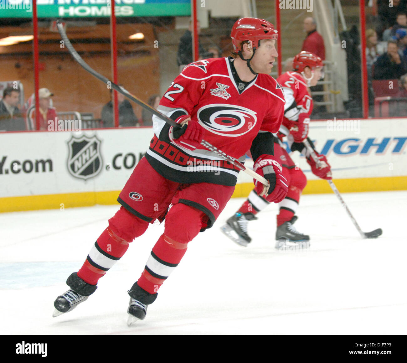
6 minutes ago, gothedistance said:
Is 34 Ricky Williams? That's my favorite aqua jersey of the Dolphins.
I always thought that was a black drop-shadow but only recently realized it's navy.
-
11 hours ago, Old School Fool said:
It's funny how video games today cost the exact same as they did throughout the 80's and 90's. It somehow has avoided inflation.well now many games jumped to $70.
-
1
-
-
MLB, Nike and Fanatics are in full PR mode now.
-
1
-
-
I'm praying for Fanatics' downfall. They've been a walking disaster in this market.
-
7
-
 2
2
-
2
-
-
I want the people responsible for removing the Conference logos to be fired.
-
2
-
-
11 hours ago, Brian E said:
all of them...except the ONE TEAM i want to see lol
Right?
Judging by what other teams have done, the Mets can do another Mr. Met hat or include the 80s racing stripes like Cleveland.
-
1 hour ago, Morgan33 said:
Navy or not, it's an absolute travesty that this is not their full time alternate.
It should be. That's their most popular alternative.
-
Lions have been so dumb in the playoffs. First they want all blue but now all white. Not even blue socks? Why are NFL teams so bad at this???
-
12
-


/cdn.vox-cdn.com/uploads/chorus_image/image/29553777/129591595.0.jpg)


2024-25 NHL Changes
in Sports Logo News
Posted
Just to understand, they're keeping the Adidas template correct?