


AstroCreep
-
Posts
2,422 -
Joined
-
Last visited
-
Days Won
3
Posts posted by AstroCreep
-
-
I don't see this lasting long. I'll be shocked if it goes past 2 seasons.
-
On 11/12/2023 at 1:17 AM, Cujo said:
Very real.

oh jeez, I didn't know they had more "Finalist" banners.
-
3 hours ago, adsarebad said:

-
Just shrink the logo.
I can see why the D-Backs always shied away from using their full name on a jersey. It looks awkward as hell.
Overall I think it's a neat set. I'm glad they're leaning more towards the torque color.
-
 1
1
-
-
If they just added the name and left well enough alone with the uniform, everything would be fine.
-
4
-
-
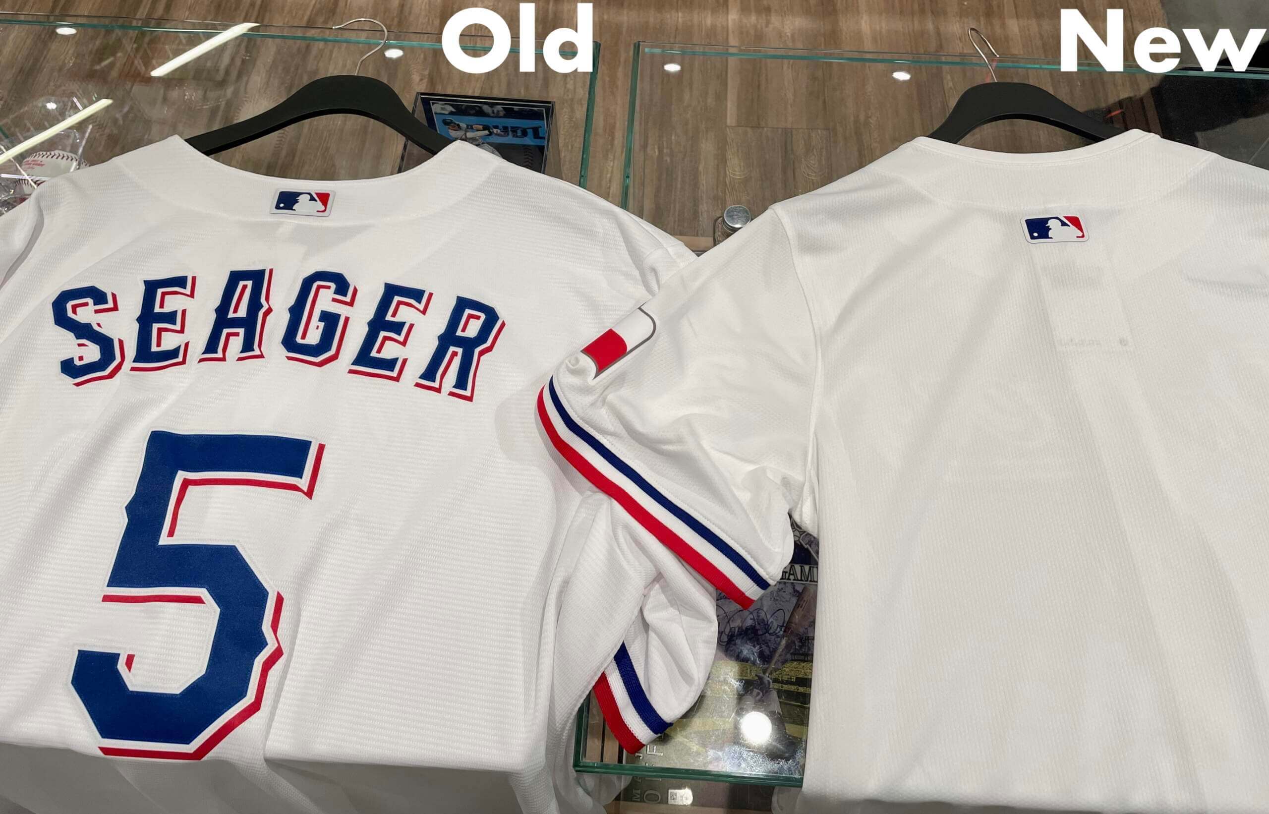
Why does the MLB logo have to be so low?
The ASG jerseys they had on sale this year were based on the new template.
-
The jersey itself is whatever. Rangers shield logo has always been a weak logo for a sweater. It's obvious why they almost never use it on anything, even alts. It's very boxy and awkward, despite how iconic it may be.
That's not to say it can't work because it has but only with the retro, more round shield.
They missed a huge opportunity to bring back the NEW YORK scrip in some form or fashion on the alts.
-
3
-
-
12 hours ago, adsarebad said:
So WS patches will now be on the front of the jersey.
thanks to the sleeve ads, even for teams that do not have them.
Holy cluttering Batman!
Looks like :censored:, and the patch is also much smaller than previous 35+ years, of course, since there is less room on the front than on the sleeve.
Man,
 MLB and their greedy boss and team owners.
Reminds me of what some teams do in the College World Series and it looks awkward and bad there too.
-
3
-
-
6 hours ago, canzman said:
Raiders @ Lions
THIS is the team you wanna wear silver against?
-
9
-
 7
7
-
-
17 hours ago, Cujo said:
Well, that's because they're all in the uniform match-up thread -- a thread which I have no idea doesn't get merged with this one. The exact same convos that happen in here simultaneously go on over there.
/mini-rant
oh good, I'm not the only one annoyed by that.
-
6
-
-
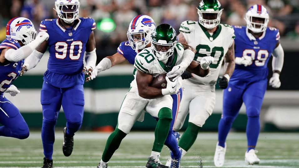
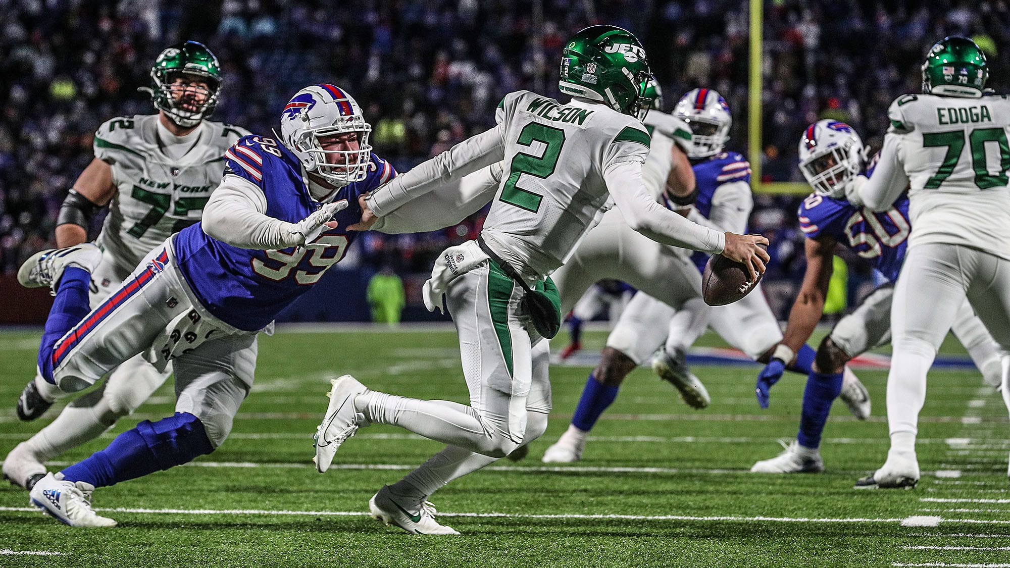
1 hour ago, Sport said:
One thing that made the Jets throwbacks really sing last night - THEY WORE THE CORRECT SOCKS!
Class
vs.
Ass
Yeah but the Bills should've been wearing white pants yesterday.
-
11
-
-
22 hours ago, Pigskin12 said:
Teams continue to avoid color this opening weekend. Really wanted green pants for this one.
can't even do green socks? What's the appeal because this is boring as hell.
-
5
-
-
wow week 1 and the Lions already messed up wearing white pants. great start.
-
8
-
-
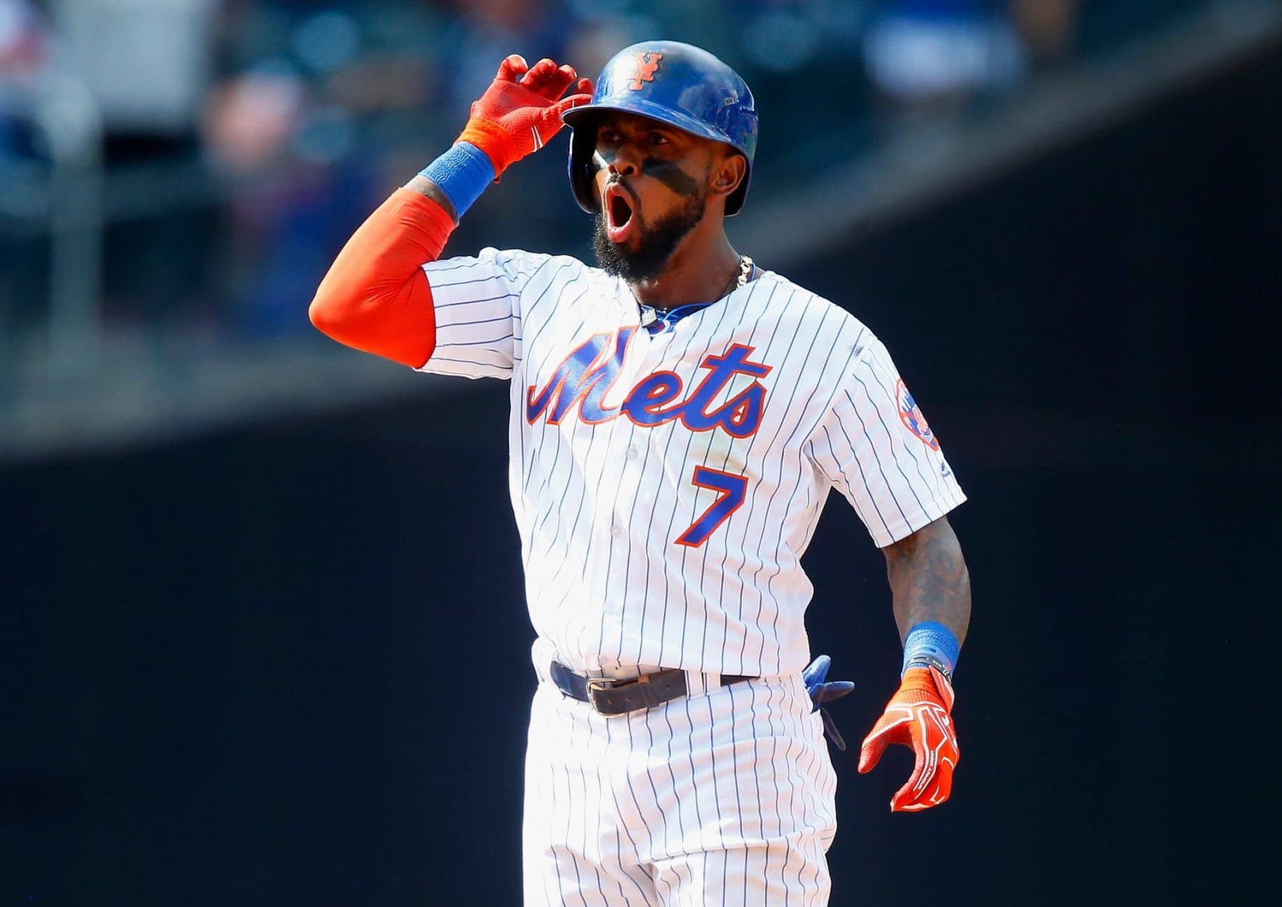
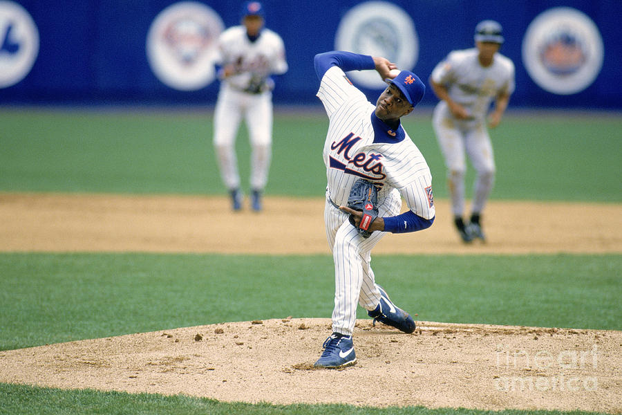
Mike Piazza and Jose Reyes in traditional Mets pinstripes without the black drop shadow.
Doc Gooden's final season with the Mets in 1994, sporting an unfamiliar Mets script.
-
1
-
-
21 hours ago, RyanMcD29 said:
Because Fox is Fox, they added a diamond pattern that's always in motion to the scorebug they debuted at the Super Bowl for... reasons
It's fine I guess. Scorebugs on the bottom just suck in general and distorts the screen when the ticker has to pop up. These are problems that can resolved if they left everything on top of the screen.
-
 1
1
-
-
Their new uniforms look fine. I can't wait for the Suns to NEVER wear them in favor for some gimmicky city shirt that says "DESERT CACTUS" or something.
-
2
-
2
-
-
3 hours ago, Berlin Wall said:
Chelsea's home kit looks so weird on field.
They needed to do more with the collar. I dunno what stopped them from using a normal collar than, whatever this is.
The glossy crest is just ugly. Should've just went with a gold and call it a day. Depending on the light the logos can disappear or look green.
-
2 hours ago, Pigskin12 said:
According to pretty much everyone, no team should have a throwback uniform because every team’s throwback should just be its permanent uniform.
You can never go wrong with the classics.
-
1 hour ago, Survival79 said:

This was so unnecessary.
-
2
-
-
39 minutes ago, fouhy12 said:
They used to have different midfield logos for a short while in the late 90s. That time the Jets had their logo but the Giants used the NFL shield.
-
This is Adam Silver's fault. He opened the floodgate with this BS.
-
8
-
-
This could've looked nice if the National League wore grey pants and not black.
-
3
-
-
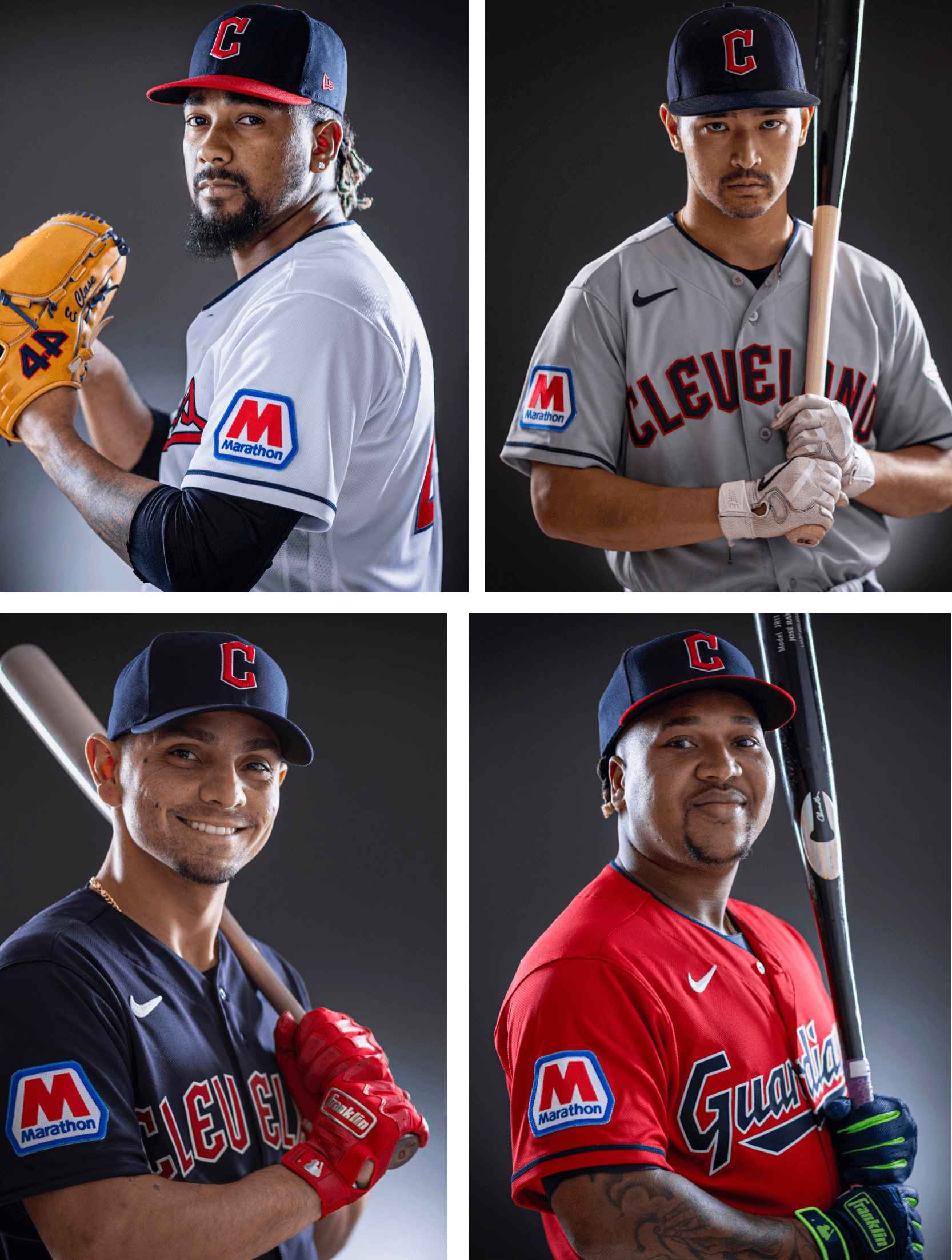
16 hours ago, MJWalker45 said:
Cleveland's new ad space.

The person who came up with the idea to move the ad depending on the batter's position, I hope they walk with pebbles in their shoes for life.
-
10
-
-
8 hours ago, gothedistance said:
The Nike version of the Broncos orange doesn't have the same charm like it did in Reebok.
What Tebow is doing in the pic is my expression towards many teams' uniforms with Nike.
Maybe it's my eyes but the orange used to pop out more. They look muted with Nike.
-
5
-
-
On 6/18/2023 at 1:23 AM, bosrs1 said:
They haven’t wasted any time have they…
That's just really sad and pathetic.
-
4
-


 MLB and their greedy boss and team owners.


.jpg)


2023-24 NHL Jersey Changes
in Sports Logo News
Posted
oh wow I actually forgot about the Fanatics takeover.
God help us all.