


San Diego
-
Posts
298 -
Joined
-
Last visited
Posts posted by San Diego
-
-
As a Kings fan I'm really happy that Sacramento is back on a jersey.
-
I wonder if that Kings city jersey is real because it is a Buddy Hield one. He's been off the team since last season.
-
Kings still haven't released a throwback or a city jersey. I'm tired of waiting. Am I missing something?
-
The black is so terrible. The Washington Steelers.
-
 5
5
-
-
Man those helmets are awful
-
3
-
-
I didn't know the Raptors nearly changed their name in 2013.
-
1
-
-
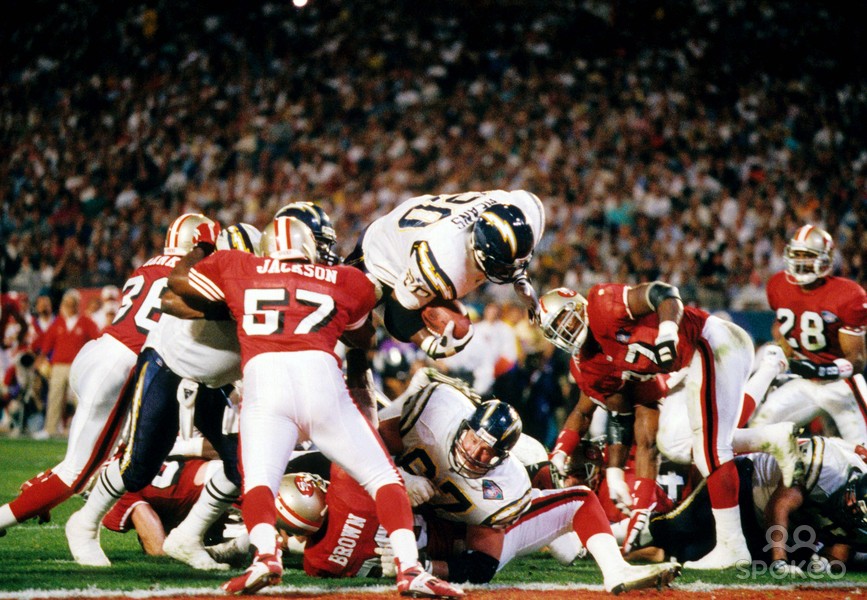
Chargers have had many good looks. Hard for me to pick just one. They're gonna look great this year with the powder blue as the primary and yellow facemask.
-
2
-
-
On 7/19/2017 at 7:56 AM, kimball said:
I spot this in another thread, but what caught my eye was Chris Webber's jersey compared to Ben Wallace (I believe it's him since JR Rider is on Portland). I believe this was a pre-season game since the Bullets did this with their numbers and NOB during that time frame during the 90s.

The Blazers look so much better without the grey.
-
4
-
-
6 hours ago, Davidellias said:
Since his retirement looks immenent, here's Nene in the 2002-2003 Nuggets Uniforms
Best they've ever looked imo
-
3
-
-
I love those grey nets uniforms
-
5
-
-
-
On 11/4/2018 at 8:47 PM, Ark said:
The Rangers uniforms (the away uniforms at least) should say NEW YORK instead of RANGERS
It would be way better for branding, and it would look better too.
I had to read that twice until I realized you were talking about the hockey team.
-
4
-
-
Well, to be fair I never said I like that logo. I just said they could have something better than a ugly C as their primary especially some sort of bear.
-
22 hours ago, Ray Lankford said:
Um:

Oh wow! A cap. Great.
-
3
-
-
I hate everything about the Chicago Bears look and I hate that they have a cool name but don't use any actual bears.
-
Divisional banners are so lame. Championship or nothing imo.
-
I love the Kings look
-
4 hours ago, pepis21 said:
If Kawhi still gonna act like a b#^%h, this will be his Raptors uniform:

He's too busy being a b/#$h to even show up to games while he's "hurt".
-
On 7/7/2018 at 3:30 PM, pepis21 said:
It's so wrong:

So very wrong. Ronaldo could be wearing Juve kit soon, that'll be wrong as well. They're already selling Ronaldo shirts in Turin.
-
1
-
-
Merton Hanks as a Seahawk
-
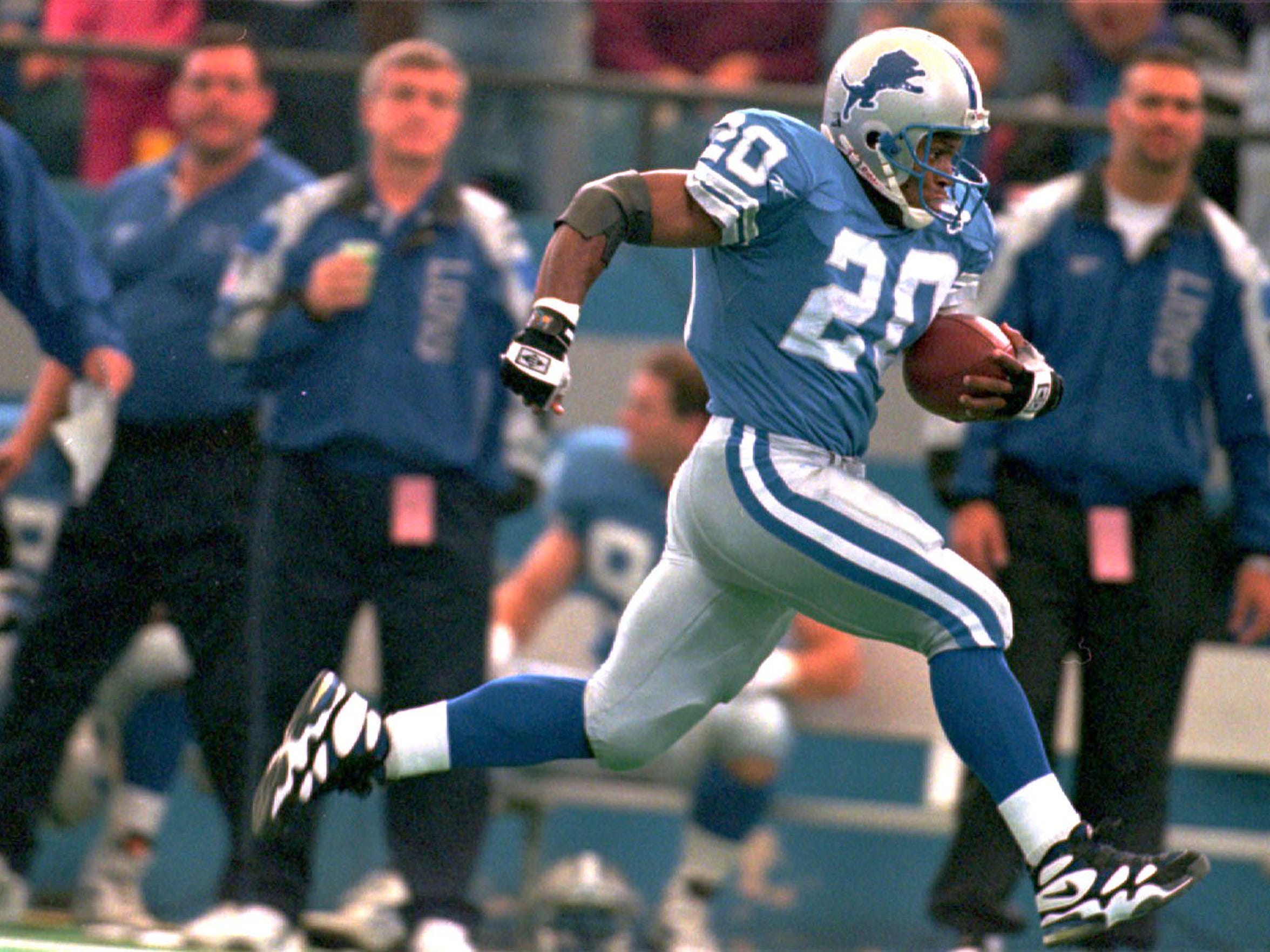
1990s Bill's uniforms are overrated.
-
4
-
-
The Cubs C logo is terrible.
-
-
On 2/2/2017 at 5:33 PM, prof said:

That Suns court looks so goood.
-
4
-


2022-23 NBA Logo & Jersey Changes
in Sports Logo News
Posted
As a Portland local I love the city jerseys.