


ShaziersMissingEyebrows
-
Posts
5 -
Joined
-
Last visited
Posts posted by ShaziersMissingEyebrows
-
-
On 9/6/2015 at 9:50 PM, oldschoolvikings said:
Next is a Tampa Bay Buccaneer set. For myself, like a lot of you, I'd just want to see them go back to the previous set. It was pretty close to perfect. But, I know they aren't going to do that. Teams can't just go back that quick... its like admitting they were wrong to change. Which they were, but still.
So, what if I was asked to keep the "feel" of the new uniform, but fix what just absolutely can't stay? Here's what I came up with.
Things that MUST go;
- Oversized helmet logo
- Pewter yoke
- Worst number font EVER
- Mismatched sleeve logos
- Blocky pants graphics
- Pewter socks
What I can work with to keep a bit of the new uniform's feel:
- New helmet logo at a decent size
- New emphasis on orange
- Modern number font
- non-traditional stripes on sleeves and pants
I decided to simplify overall... drop the sliver/chrome idiocy, reduce black to logos only.
Here's what I got...
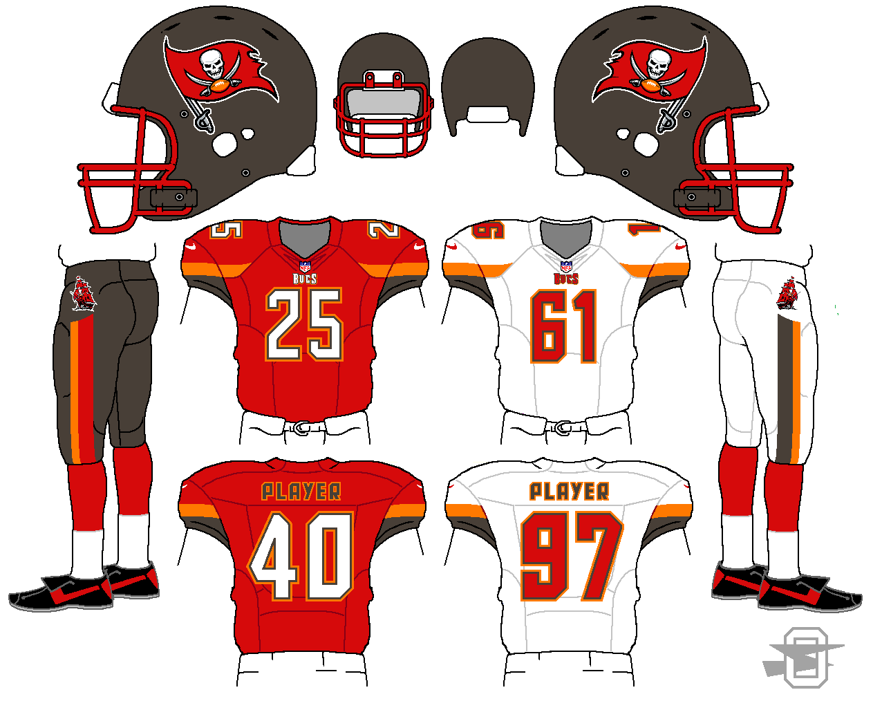
Something about the ship on the pants is really cool. Awesome set here. I don't get what they were thinking with the alarm clock numbers or the giant helmet logo.
-
 1
1
-
On 7/24/2014 at 10:23 AM, oldschoolvikings said:
OK, lets give the cardinals a try...
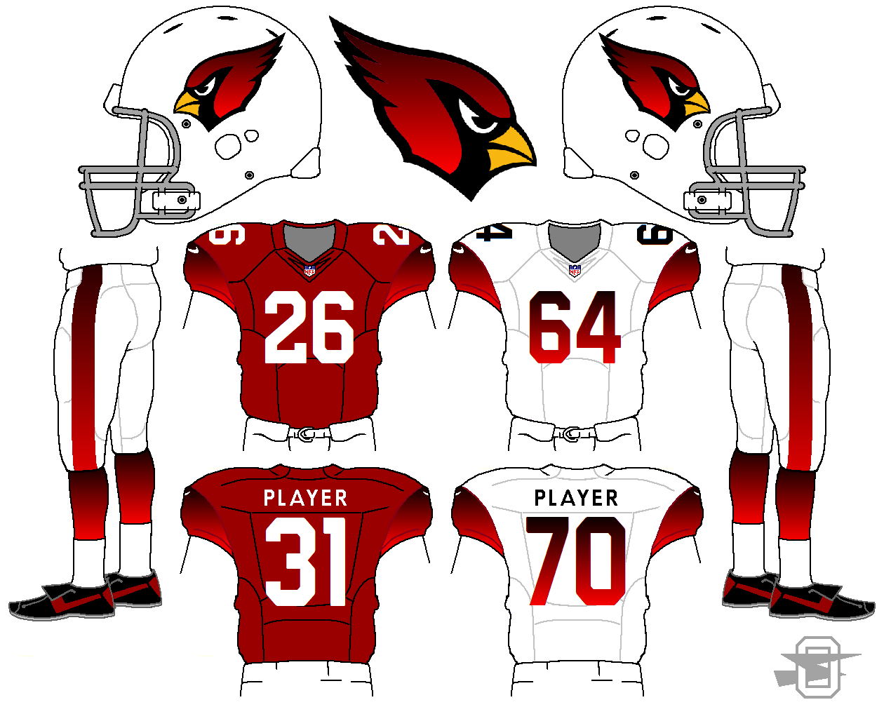
1000000000000000000 times better than what they already wear
-
2
-

Oldschoolvikings' NFL concepts - Commanders concept added
in Concepts
Posted
Blue pants for the Lions is a must. I think in their current set they look a little too much like the Cowboys.