


Typhoon
-
Posts
35 -
Joined
-
Last visited
Posts posted by Typhoon
-
-
Inexplicably the Ticats are back to wearing their solid black pants with no stripe for tonight’s game against the Argos?! Are we to believe they have two sets of black pants this season. Is there a limit to the number of pants a team can have?
really disappointing for their look. I thought they had left the solid coloured pants in the trash for good
-
Not a fan of ads on uniforms and yes I would prefer they move the ad to make room for the Stanley Cup patch but in fairness it only looks like a disaster on the captain and alternate captain uniforms. Not sure why each team choose to show those jerseys in their posts.
For the majority of players who aren’t captains, the patch will look fine in it’s current location.
just sayin
-
 2
2
-
-
Ticats Instagram shows what appears to be new black pants with a yellow stripe. Hopefully finally getting rid of the yoga pants look for all their game pants.
https://www.instagram.com/p/CsWp2JwvTuq/?igshid=NTc4MTIwNjQ2YQ==
-
 1
1
-
 3
3
-
-
All that Rams hype for nothing
-
Quote15 hours ago, CATLogo1 said:
I'm also a Denver Broncos fan, and I'll say that these uniforms would be okay with me if the team adopted them as its next uniform rebrand. Is there a royal blue alternate uniform version of these?
yes. Again credit to Moss Uniforms on Twitter for these
-
5
-
 1
1
-
-
12 hours ago, j'villejags said:
Hypothetically, couldn't they flip the horse inside the D logo for the helmet decal when it's on the left? Kinda like how the Ravens do it?
Wow, of all the Broncos concepts I’ve seen, i don’t believe I’ve ever seen anyone flip the horse inside D logo. I actually really like that.
Regardless the point was I don’t trust Nike to not botch their look even worse. Unless they pull a “Tampa Bay” and just go right back to a complete design that worked.
-
4
-
-
As a Broncos fan, I’m ready for a redesign. And I think it’s a layup what design to go with. Pictured below. Or some variation of this would be perfect. The shade of blue open for debate. But after the recent rebrands by Nike, I almost don’t want it to happen. Just leave it be. I don’t want a black Broncos jersey or giant DENVER across the home uni or orange to navy gradient. No thanks.
credit to Moss Uniforms on Twitter
-
13
-
 6
6
-
-
8 hours ago, bowld said:
Anyone else think that when shown side by side the old version just looks outdated? Obviously the collar is crap but the white in the logo makes the logo seem off now when compared to the new one-
probably an unpopular opinion, but I enjoy the removal of white in the logo but miss the white around the numbers-
1
-
-
It’s definitely an upgrade but still not perfect.
I can live with the white numbers on the home jersey, although I’m sure a die hard Edmonton fan would disagree. For me, it would have been even better with a yellow outline on both the home and road numbers
also what about shoulder numbers? That area looks so empty without them.
-
-
I’m hoping this is real as I feel it’ll help complete their look. Ticats players wearing black pants with yellow stripes at practice. Similar to their previous set before New Era took over.
-
1
-
-
Im not someone who has any sort of photoshop ability but can anyone mock up each jersey with a different pant/sock combination?
I’m just curious the possible improvement with the right combo. Not saying it’s going to save this look but anything other than mono will help it somewhat.
-
On 2/2/2022 at 4:42 PM, canzman said:
pretty sure this is what we got going on based on the images that have been made available.
Dark
White
Alt
canzman, any chance you could mock up a few more of these mixing and matching the pants? I’m sure they’ll be trying out as many possible combinations next year-
1
-
-
Any rumours regarding new uniforms for the Edmonton Elks?
The official team shop only shows the “Third Jersey” for sale
-
-
2003 Denver Broncos vs Cincinnati Bengals
According to Gridiron Uniform Database, this is the first and only time the Bengals wore all black under their previous uniform set.
Man I really miss this old Bengals look.


-
6
-
-
I'm sure this one has been posted here before so I apologize in advance, but does anything top this matchup?
1995 Wild Wing vs Burger King
Bonus rare old NHL on Fox broadcast
-
2
-
-
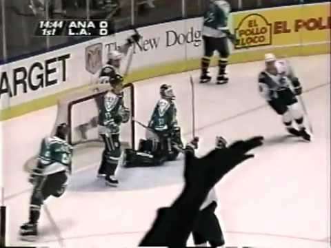
2006 Ducks vs Capitals
only happened one season before Caps total rebrand

-
1
-
-
With Ottawa currently in the East final, starting thinking about their early looks. Their inaugeral road jersey with the red numbers only lasted one year. Difficult to find a picture of game action against another team. Best I could do was the Islanders, who would change their look a couple years after

-
2000 St Louis Rams at Seattle Seahawks
First Year of Rams new look w/ Gold pants that no longer exist
vs
Old Seahawks look, two years before the rebrand
Also this was before they were in the same division. Seattle still in the AFC West.


-
2
-
-
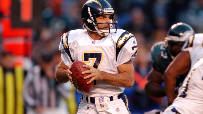
Not sure if it's the number font or the placement of the bolts on the shoulders but I prefer this look for the Chargers

-
5
-
-
2003 Jacksonville at Atlanta
Final year of Jacksonville Road Jersey w/ Teal numbers and short lived 2002-2003 black pants vs First year of Atlanta's current look in the no longer used Black jersey w/ black pants


-
3
-


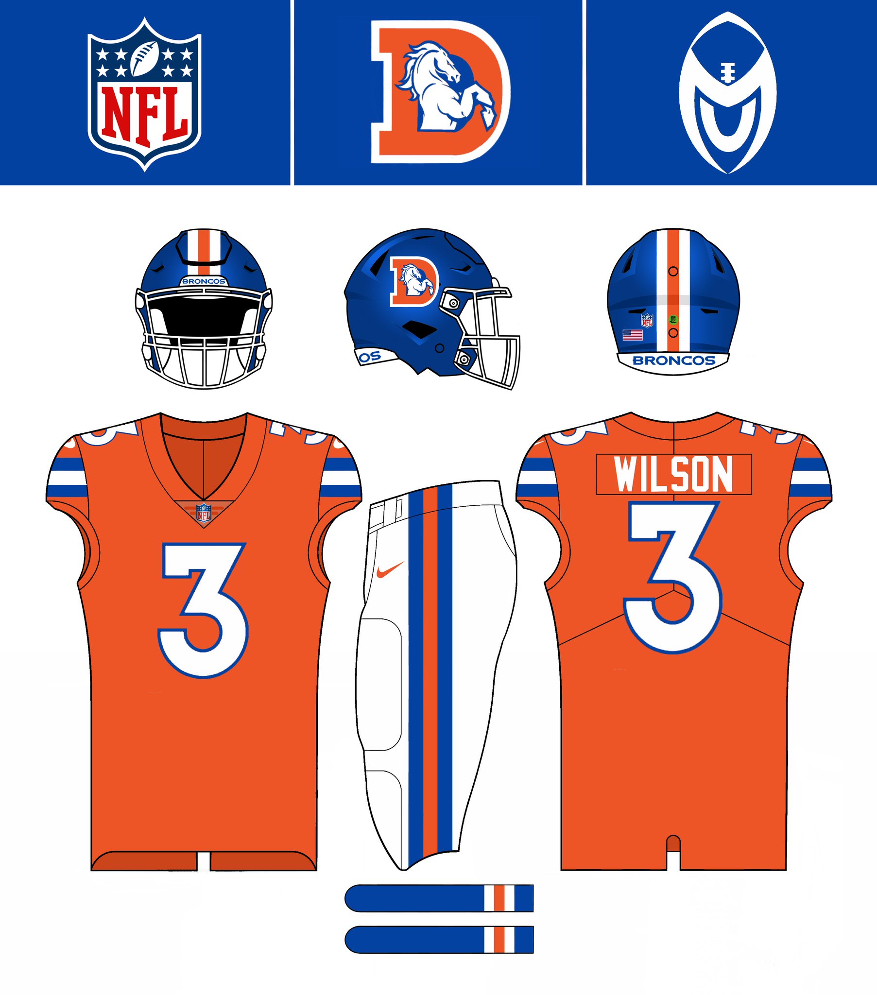


Denver Broncos New Uniforms Concept
in Concepts
Posted
stumbled across this randomly. This actually looks a lot like what has been rumoured to be the new Denver Broncos jerseys, only a heck of alot nicer! This would be a nice refresh for Denver. Very clean