


L10nheart404
-
Posts
529 -
Joined
-
Last visited
Posts posted by L10nheart404
-
-
2 hours ago, See Red said:
I hope so. I'm not crazy about the Gators in orange but that's a nice looking jersey.
That'd be a great Broncos Jersey.
-
 2
2
-
-
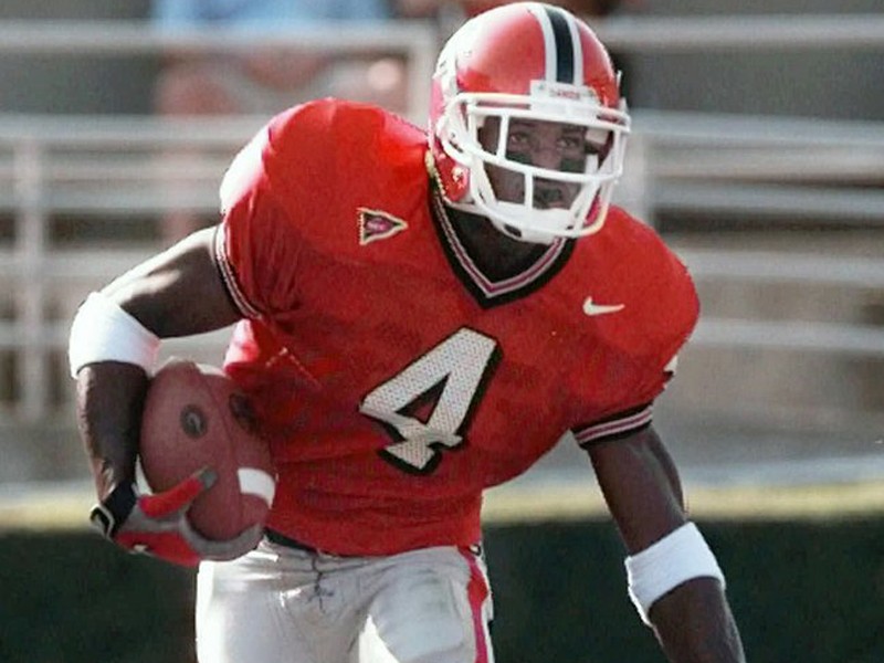
Wish UGA would bring this stripe pattern back on the helmet and jersey

-
1
-
-
Those colors in the Atlanta set are gorgeous. The beehive ATL is superb! Also love the trolleys identity, as orange and gray is one of my favorite color combinations.
-
1
-
-
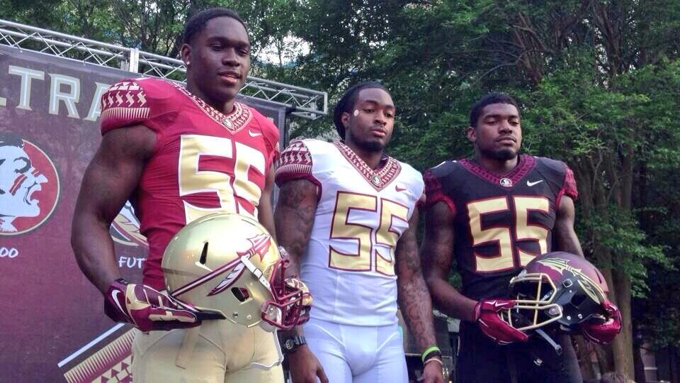
23 hours ago, TenaciousG said:
This is still the only acceptable FSU look:
Nike, ya blew it.
10 hours ago, AndrewMLind said:The pattern isn’t the issue. It’s that the Mach Speed template brings the pattern to an abrupt stop rather than all the way down to the point if the collar (like it did on the Hypercool template when the set was initially unveiled).
I was just thinking to myself "the pattern looks good though"... FSU has a great set of uniforms, they just need to switch over to the clean Vapor untouchable template, which is probably the best Nike template there is. The collar is a tad too thick in this pic, but the overall presentation is pretty good.
-
1
-
-
11 minutes ago, Delicate Genius said:
This isn't that big of a deal to me, but why in the hell does every branding event (new uniforms,logos..etc) always have to have some deep reasoning behind every aspect? Not everything needs explaining. I could live with: " Hey, we like the way this looks. End of story"
-
7
-
-
22 hours ago, pianoknight said:
Making your own logo is such a basketball thing. Like it's just the next step in a streetball kid's dreams.
Play in college, draft early, hit the league, win some hardware, drop an album and make a brand.
It feels so formulaic and overplayed.
Easy with the undertones, dude.
-
6
-
-
On 5/20/2020 at 10:24 AM, dcameronh said:
2018 gives off a Christmassy vibe. That one is nice
-
1 hour ago, j'villejags said:
Some variations with the white/white and black lid.
Yeah, something about the red helmets take this concept to another level. I'd have the black jersey as the Home, red as the fauxback alt.
-
1
-
-
4 hours ago, j'villejags said:
Great, last one... Can you do that same combo for me, but with the black he's instead?
-
5 minutes ago, AgentColon2 said:
Oh.....

Lol... Yeah, my thoughts exactly.
-
1
-
-
My favorites are St. Louis and NY. Houston isn't bad, either. Washington just has too much red for my taste.
-
3 hours ago, 4_tattoos said:
It also has a horn versus what appears to be an ear on UAB's dragon.
One looks medieval, while the other looks like a sea dragon.
-
Guardians and Renegades have the best colors in my opinion. Overall, pretty decent.
-
17 hours ago, GDAWG said:
he's one of their top stars. 13 time World Champion in WWE. He has been criticized at times as not putting in 100% effort in the ring.
It's not like they're called "The Randy Ortons" lol. So they're not named after him, but his moniker is transferrable to a sports mascot.
-
9 hours ago, kimball said:
Nah, green, red and black ...
I thought the ATL Hawks colors were hated? I guess it could work if done right
-
1 hour ago, oldschoolvikings said:
Falcons... unsure about the sleeve stripes, particularly on the black jersey.
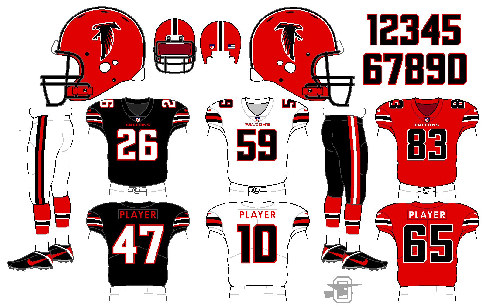
If you ask me, that looks damn fine. Especially the black over white. I'd like to see those uniforms with the current helmet, which is actually pretty sharp in my opinion.
-
3
-


College Football 2020
in Sports Logo News
Posted
Yeah, but that template has a million seams lol. They could've went with the much cleaner vapor untouchable