


M59
-
Posts
808 -
Joined
-
Last visited
Posts posted by M59
-
-
14 minutes ago, DCarp1231 said:
Orioles announce T. Rowe Price as uniform sponsor
Eons upon eons ago, my rec league softball team had a screen-printed sponsor patch. That's the vibe I'm catching here.
We knew this would happen eventually. It still sucks. Defacing the jersey for the price of a backup infielder is just...sad.-
 4
4
-
-
20 minutes ago, Zooropeanx said:
From Twitter...
Well, I wasn't expecting the Twins' Cash Grab Connect to not suck, so I can't say I'm surprised or disappointed. Nike/MLB needs to get out of this sublimation for sublimation's sake phase with the jersey bodies. It's just...tacky. (And the loon(?) looks like a fish, so there's that.)
-
1
-
-
11 hours ago, bowld said:
Looks like the Rays color palate
I was going to comment that it looked like the Brewers...
-
3
-
-
Meanwhile, down in Tampa, the Orioles (wearing their orange alternate Saturday jerseys) are playing the Rays (wearing their Cash Grab Connects), I know which team I think looks better. Check out the video of Bradish's nine K's for evidence at https://www.mlb.com/orioles. Woof. The only thing you can read on the Rays' jerseys is the NOBs.
-
2
-
-
10 hours ago, coco1997 said:
Dodgers’ new City Connects will apparently have player names below the numbers…
The usual Cash Grab Connect issues aside, I'm particularly enamored with how well they aligned the buttons and buttonholes. Exactly the quality level I seek in a $150+ replithentic jersey. Jeebus.
Give Nike's basketball division another couple of years with the MLB account...and it will be well-nigh impossible to distinguish professional baseball from clown fighting...except perhaps for the makeup. -
10 hours ago, SportsFan12 said:
Blue Jays are wearing their mediocre City Connects way too often? Now who could’ve predicted that?
Saw a quick couple of minutes of that game on TV last night. Those uniforms look...bad.
-
4
-
-
7 hours ago, adsarebad said:
right, but i don't want a scrub jersey. i want the stars.
although you could say vladdy......... and Goldie and Nolan from the cards are all scrubs at this point

A scrub jersey...and some magic from Bill Henderson = a "star" jersey.
-
On 6/2/2024 at 2:13 PM, adsarebad said:
You can't even buy the authentic (elite) Blue Jays city connect jersey, nor the Cardinals one.... so all the Cardinals promo talk about the chain stitched birds is BS.
I can't believe people are paying 175 for the awful screen printed replicas!
those are garbage.
3-400 $ is a lot, but at least you get the real ones, but as i said, none available online
The Blue Jays were one of the first teams to sell game-used jerseys directly to the public. I would assume they still do. Rather than pay an absurd amount for a "real" jersey, why not check with the Jays' team store and see what see what game-used scrub jerseys will cost you?
-
The back of the Jay's Cash Grab Connect jerseys aren't horrible. The rest of the set is. But shoddy and ugly is how Nike plans to roll with MLB, so I don't know why anyone would expect otherwise.
Meanwhile, here's Bill Henderson with a video on new vs old number fabric. A disheartening watch.
https://www.facebook.com/gamewornguides/videos/1630073587809778 -
8 hours ago, Marlins93 said:
What makes that "good" then, if you don't mind me asking? I personally don't like that particular CC at all, but "The Lou" is kind of the only added design element there aside from the stripes. So if you take that out of the equation, why not just opt out of the CC program altogether and wear their normal uniforms?
Opting out and (re)introducing a red alternate jersey without the pinstripes would have been a great idea. The Cardinals made the best of a bad situation, IMO.
-
1 hour ago, MJD7 said:
Blue Jays City jersey has leaked:
I don’t hate it. I might prefer that they went with their regular font.
WTAF? I expect Cash Grab Connect jerseys to be poorly designed, but seriously? WTAF? A sewn-on sublimated "Toronto"? An apparently sublimated Jays sleeve logo patch? Soutache braid when we were told that was out? The only thing that doesn't surprise me is that the most thread and effort expanded on this mess went into the two-color, embroidered mark of the beast.
Let's face it: we all knew that Cash Grab Connect was the beginning of the end, but I really didn't think Nike would push us to sublimation THIS FAST. Jeebus.-
3
-
-
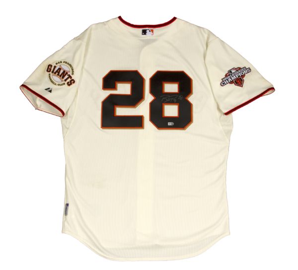
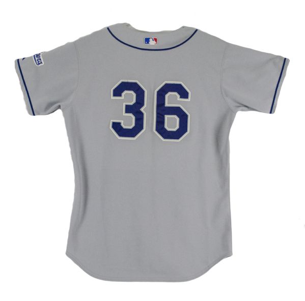
14 minutes ago, SFGiants58 said:
That’s partially because they did it wrong. It should’ve used a bigger, higher number. Like this:
Not this:
I miss when the Giants had no NOB’s at home.
Not a fan of the NNOB look, but other than that, the Dodgers road pictured is much better than the sartorial Sominex they're wearing now.
-
1
-
 1
1
-
-
19 hours ago, coco1997 said:
Well, I might change this:
I can't imagine there's anyone on these boards who disagrees. The only good thing I can say about this ad patch (and the Angels' as well) is at least it's not as big as it could be. The Red Sox Mass Mutual patch is 2/3 negative space. Why?
-
1
-
-
20 hours ago, MJD7 said:
Go into detail! That’s what these boards are all about.
Quick version...
1) I dislike "custom" NOB fonts. They're generally harder to read than good old MLB block.
2) I dislike most custom number fonts. They're generally not all that...and they don't slow down the bootleggers one single bit.
3) I dislike single color scripts and numbers. I find them boring...particularly on road uniforms.
4) See #3 above for one of the reasons I dislike the Yankee$ road uniforms. The second one is that, IMO even if you don't have NOB on your home kit, you should have it on any jersey your wear on the road.
As always, YMMV.
-
2
-
2
-
-
12 hours ago, MJD7 said:
I'd nominate the Twins:
Their essentially perfect rebrand from last year has (thankfully) been largely unaffected by the template change, including the NOBs. That image above shows the perfect size for NOBs in my view, the league-wide change illuminated to me that many of the old NOBs were too big (teams like the Mets and Cubs come to mind), while obviously most all of the new ones with outlines are far too small.
Plus, they don't have an ad patch (yet), which even many of the classic teams, like the Yankees, Cardinals, Dodgers, and Tigers, can no longer say.
14 hours ago, Ark said:I think the Yankees have the best uniforms in baseball this season. They are the only team not plagued by the terrible NOBs, and IMO the new road design is an improvement
Next season (when the NOBs are fixed supposedly) there will be a debate again.
13 hours ago, aawagner011 said:I agree. Yankees look perfect now and the new road is beautiful. I would not change a single thing about them. I even like the satin batting helmet on the road (it kinda gives off a retro feel) while the gloss works with the pins. If they aren’t the best, they are absolutely top 3.
Without going into detail, let me simply state that I strongly disagree with the opinions expressed above. YMMV.

-
1
-
-
22 hours ago, PlayGloria said:
St. Louis definitely has a pretty deep connection with the fleur-de-lis. Much like New Orleans, it was a French territory. The Fleur de lis is all over the place in the city TBH. St. Louis has one of the best Mardi Gras celebrations outside of New Orleans as well. The French history in the city runs pretty deep.
Thank you for that info. I was not aware of this.
-
2
-
-
22 hours ago, TBGKon said:
Its on the flag of St. Louis, so its not like they forced something that didn't need to be there.
As I'm not a vexillologist--or from that area--I only became aware of the St. Louis city flag when it was posted here. Pretty decent flag design, IMO.
-
1
-
-
20 hours ago, adsarebad said:
Most folks def. think of New Orleans and the Saints when they see that logo
Agreed. When I see the fleur-de-lis, I think of New Orleans...or France. St. Louis, MO doesn't immediately leap to mind.
-
1
-
-
20 hours ago, coco1997 said:
Agreed. As soon as the Yankees adopted an ad patch the whole "sanctity" of their brand kind of went out the window. Plus, nothing stopped them from participating in the Players' Weekend promotions in years' past.A monochrome navy design with something that pays homage to the city of NYC and/or team history and doesn't incorporate any off-brand colors would be fine.
I'd say that the Yankee$' "sanctity of the uniform" argument was negated as soon as they allowed the Mark of the Beast to appear.
-
14 hours ago, coco1997 said:
What kind of crazy upside-down alternate reality version of Cash Grab Connect is this? No funky basketball numbers or fonts?
This has to be fake!
Seriously, though: This, IMO is by far the best CGC kit of the lot...despite the moronic cap design. They used pinstripes (always bad in my book) but they were subtle about it. They kept the birds on a bat design. "The Lou" seems kinda dumb to me, but I don't live in that area, so I'll defer. (As if any one cared.) These jerseys point to what the Orioles should have done: Change the name on the orange jersey to "Charm City" and roll with it. This is the first CGC jersey I haven't actively hated. Good work, Cardinals!-
1
-
-
21 hours ago, Sec19Row53 said:
Do people from the DMV area not realize that most of the rest of us think of the Department of Motor Vehicles when we see DMV?
Oh, yeah. We're aware of it. Could be one reason the Nationals didn't go with it. Could also have been the whole "Orioles are 30 miles away" thing, too.
-
1
-
-
7 hours ago, Silent Wind of Doom said:
Actually, Washington's airports are DCA, IAD, and BWI. That makes WSH even more off-putting. I've always seen Washington abbreviated as "WAS" for the most part, although everyone has already covered that locals would prefer DC. But everyone loved the rest so much they wound up embracing them anyway.
Thanks for pointing out the airport abbreviation thing. If the Nationals had wanted to do a regional twist, I suppose they could have gone with "DMV"...although that might seem odd to people who don't live here.
-
1
-
-
19 hours ago, Marlins93 said:
If not for the orange, I'd say I like those unis more than what the Marlins are wearing now.
As a fan of orange and black, I would have loved to see the Marlins add orange into their original teal and black kit. As a hater of pinstripes, I was glad when the Marlins dropped them.
-
21 hours ago, tBBP said:
To the first point: I feel you on that. But, while that is true, I will say that a small number of these CCs have turned out pretty nice. Two or three would actually suffice as permanent brands--inasmuch as anything is permanent in this current era of sports branding/merchandising. And speaking of that...
...To your second point, these CCs--as well as all the other alternates Nike has churned out and will continue to churn out--aren't going anywhere. And if you wish to understand some of the business reasons behind why that is, I will refer you, and anyone else, interested, to the video linked in this thread (oddly enough, from one of the best baseball YouTube channels out there), that really digs behind the scenes at the sheer amount of capital Nike has poured into all of this--and as such, is reaping dividends from alongside the three leagues whose uniforms their swoosh adorns.
So much money spent...and apparently none of it on competent designers. Maybe they just threw a bunch of random basketball jerseys into Midjourney and applied those designs to baseball jerseys. However they got here, the results have been bad...just bad.


MLB 2024 Uniform/Logo Changes
in Sports Logo News
Posted
Re: the Twins Cash Grab Connect set: we've had area codes, airport codes, and now a state postal abbreviation code. At some point in Cash Grab Connect, Round Two, I fully expect to see Nike slap a zip code on a jersey and call it a day.