-
Posts
786 -
Joined
-
Last visited
Posts posted by M59
-
-
On 6/8/2023 at 6:48 PM, CaliforniaGlowin said:
Just be glad we're not getting 30 new uniforms per season!

That's probably gonna happen in 2024, when MLB is yoked to the Nike template.
-
 1
1
-
-
On 6/6/2023 at 12:41 PM, adsarebad said:
Yes, but still hard to imagine the CC jersey is yellow and with huge letters PGH across the chest, right? ..... right?

When it comes to the Cash Grab Connects, one always dreads the worst and hopes for the...marginally less worse?
-
 1
1
-
-
2 hours ago, adsarebad said:
No pirates city connect leaks yet?
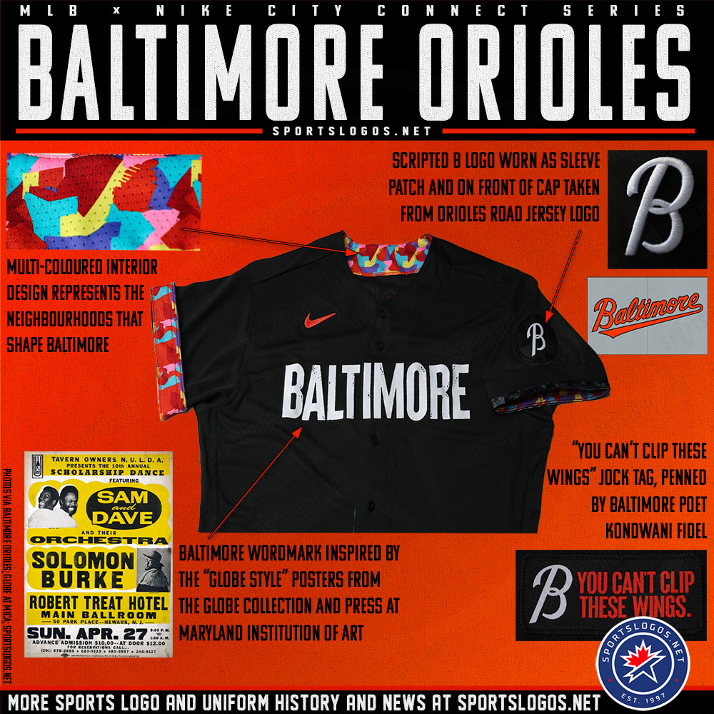
strange... we saw that Baltimore jersey leak long before they unleashed the horror on us.
Did the eye wounds from Baltimore's snoozefest heal? Are you ready for them to start bleeding again, this time because what you're seeing is ghastly instead of boring? Then by all means, bring on the Pirates' Cash Grab Connects!

-
 1
1
-
-
I've been an Orioles fan for a very long time. I was hoping they'd get humiliated tonight and that someone would go full Chris Sale on the CC set. The first thing happened. Hoping against Nike for the second to occur. First Friday night loss of the season for the Orioles. They were 6-0 on Fridays before pulling on the CCs. Ugh.
-
 2
2
-
-
6 hours ago, Yac12 said:
http://www.uniformlineup.com/Lineups/bal-lineups.html#bar17
Looks like they wore an all black cap with the cartoon bird with the black jersey back on May 26, 2017.
Good use of that year's BP cap...on the road. Thanks for pointing it out.
-
 1
1
-
-
-
9 hours ago, projectjohn said:
The Tigers have added Meijer as their jersey patch sponsor.
They had the opportunity to make a 4" x 4" blue patch with white lettering...and didn't take it?
Hey, Mass Mutual and Red $ox: you paying attention to this?

-
22 hours ago, rainmaker17 said:
Unpopular opinion: The Rangers need to drop the whole powder blue faux retro thing altogether and bring back the red alt.
Agree. I'd also have them get rid of the stupid points on the numbers, return to a standard block NOB font, fix the script "Rangers" and ditch the drop-shadows...but that's just me.
-
 1
1
-
-
On 5/24/2023 at 9:25 AM, BadSeed84 said:
I like some whimsical logo's, but don't need most of the league having them.
The Reds, Orioles (Tho the Ripken era bird I did really like as well) I do like and it suits them.
But then there's teams like the Blue Jays who best logo is when its just the regular bird head.
And to me this is easily the worst logo they had.
And yet, it was associated with (IMO) their best uniform set. For me 2001 was peak Blue Jays, uniform-wise.
-
 1
1
-
-
2 hours ago, AndrewMLind said:
This may very well be a case of the fans of the team liking something more than outsiders. The O's hat is fantastic, and most Orioles fans I know agree with that sentiment. I like the City Connect hat because it's new and a unique twist on something they only wore for one season, but I don't like it more than the O's hat or want to see that replace the O's hat, only add to it.
I have hated that cap since the day it was introduced. Don't like the CC cap because the "B" should be orange (really orange with black and white trim!).
-
 1
1
-
-
1 hour ago, tBBP said:
Count me in as an fan of the cartoon bird white panel cap (that's got to be my fave baseball cap thus far) and as one who would also prefer to see a cursive B cap in place of the O's cap.
Not for nothing, but the day I attended a game at the Yards I saw those white panel bird caps flying of the shelves (one of which landed right in my left hand, in my bag, out the door and directly onto my noggin)...meanwhile I don't think I saw a single O's cap move.
Disagree. The white panel cap is just too 70s for me. I'd use the current road cap at home, an all black cap with the cartoon bird on the road and a cap with either an orange front panel or an all orange cap with black bill with the orange jerseys. You wanna put the swinging bird logo on one of those caps (probably the orange alternate)? I won't fight ya.
-
 1
1
-
-
1 hour ago, bowld said:
Well, at least they're boring bad, instead of ghastly bad...
When the only orange element on the front of an Orioles jersey is the Nike ad, you've failed.
When the most interesting part of the jersey requires the players to cuff their sleeves, you've failed.
When you finally give the team a "B" hat and the B is white, you've failed.
When you borrow your number font from the NFL, and the one looks almost like a seven, you've failed.
When you don't have front numbers on your CC jersey, you're cheap.-
 8
8
-
-
-
22 hours ago, the admiral said:
I've always wanted a B hat for the Orioles. The idea that people would confuse a black and orange hat with a cursive letter with a navy and red hat with a Tuscan letter feels like a reach. May it one day replace the terrible cartoon bird.
May that day be...never.
-
 3
3
-
-
11 hours ago, McCall said:
That was their BP jersey that they added with the 1998 update (along with the new primary logo and Sunday caps). They mentioned that they may use them in actual games, but that one-time game in 1999 where they auctioned them off afterwards was the only time they ever did wear them.
The jersey they wore in 1999 was definitely knit. Used to own one, when I still had a jersey collection. I have pix on Photobucket, but my attempts to "insert image from URL" have all failed. (I wonder if it was because I didn't have enough clout before getting my old account merged into this one. IDK.)
-
Thank you!
-
I had an account that was...let's say...inactive at the time this was announced. Mistakenly opened this one. How can I go about fixing that issue?
-
6 hours ago, BBTV said:
I dislike both Cardinals alts with the headspoon, for the sole reason that there's no need for any additional decoration on a jersey that features the ionic birds-on-bat logo. It's already fancy enough - doesn't need any superfluous trim to enhance it.
But the red jerseys - the Cardinals, Phillies, and Angels, all suck. Not simply because the lettering is red-on-red, but if there needs to be two outlines on any jersey, it usually stinks. I can't think of a situation in which a jersey script with two outlines looks better than one with only one.
I wish the Phillies would drop their white outline altogether, but at least they've significantly reduced its weight in the past few years (at the expense of adding a gray outline to the road script, but at least that's not visible in most cases... though when it is, it sucks.) They should definitely not have a royal outline on the red script. Looks terrible.
Look, ma! It's opposite me!
 Pardon me whilst I go flog my dead horse for a bit.
-
9 hours ago, seasaltvanilla said:
Hasn't stopped the Angels with their red on red on red jerseys.
Fully trim them in the other colors (instead of this awful partial double drop-shadow thing they're doing) and they become much easier to read.
-
 2
2
-
-
57 minutes ago, VampyrRabbit said:
That huge white outline looks wretched on the red uniform. The cream uniform with the headspoon looks far nicer and doesn't need a massive outline for the birds and bat, though as a home alt I wish it had the Cardinals Script instead of St Louis.
The Cards used to do a one-day special red jersey for "Cardinals Care" day. While it lacked a front number, the white trim on the front logo was thinner. The one I had also featured headspoon and sleeve piping. It was a front number away from glorious.
-
13 hours ago, adsarebad said:
What is? If you don't mind me asking.
McCall's probably gonna mind, but here goes...
IMO the Orioles made a huge mistake when they went from orange/black/white lettering and numbers to orange/black lettering and numbers on their black alternates. If you're gonna cheap out, why not save even more $ by just going one-layer orange? It's not like anyone can see that black trim layer most of the time. Even going back to orange/white like the 1993-94 alternates would be preferable to what they have now. Hell, black/orange would be better. I'm getting horse dust in my eyes, so I'll stop now.
-
 1
1
-
-
7 hours ago, sonny said:
Not that anybody's gonna be surprised, but I really hate these.
-
5 hours ago, adsarebad said:
My guess...and it's only a guess...is: "just because it looked 'good' on your monitor doesn't mean it's gonna translate to fabric". See how much better the rendering behind him looks than the jersey lettering itself.
-
 2
2
-
-
On 5/9/2023 at 8:32 PM, McCall said:
How can anyone not when you literally bring it up in every post.

It's my personal dead horse, and I shall flog it until it turns to dust! To dust, I say!


MLB 2023 Uniform/Logo Changes
in Sports Logo News
Posted · Edited by M59
Clarification.
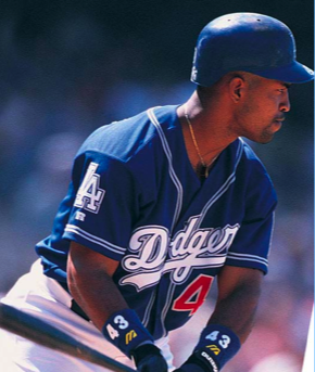
Late to the party on this one. I disagree. The Dodgers uniforms (the roads in particular) have become a snoozefest since the removal of the white trim layer. Sartorial Sominex, IMO. Stripping the white layer from the Cubs' road set sends them down the same sleepy path. Your mileage obviously varies.