


M59
-
Posts
774 -
Joined
-
Last visited
Posts posted by M59
-
-
13 hours ago, Andrew_Gamer_NZP said:
This is good news. Until we know the full scope of Nike's "retreat", we don't yet know if it's great news. Personally, I'd like to see a return to the previous placket size, and not forcing standardized front number sizes on the teams, as well as the changes outlined above.
-
 1
1
-
-
1 hour ago, TheBigFiz21 said:
The Orioles Cash Grab Connect Set: now half as hideous as it originally was!

Next step is to get rid of the jersey and we're all good. Just do a black (or better yet, orange) version of the road jersey, call it your Cash Grab Connect for 2025 and be done with it.-
1
-
 2
2
-
-
23 hours ago, SilverBullet1929 said:
I need to know how this is even possible, like how was there even a 2023 jersey available in the clubhouse for this to happen? And was this a mistake by him or did he know what he was doing?
IIRC, players used to be able to take home one jersey per season. (This was back when players generally were issued two homes, two roads and one each of any alternate jersey.) My guess is that a player of Harper's stature would be able to order as many extra jerseys (and apparently pants, too) as he wanted. My guess is also that he would have paid for them. For all we know, the man has a closet full of previous uniforms.
-
1
-
-
8 hours ago, MrAstrodome said:
The definition of the the 90's.
You type that like it's a bad thing! IMO there are several teams that should take a hard look at their late 90s kits...and then revive them. YMMV.
-
1
-
-
7 hours ago, adsarebad said:
Mets got a grey CC uni........ and they made their black uni boring af with the removal of white.
What the hell are they doing

Trying to be more like the Yankee$?
-
1
-
-
19 hours ago, Silent Wind of Doom said:
Full graphite at home has got to be against some rule since the traditional away is gray. While we've gotten some stupid same-color matchups in the past, I can't imagine the league would let a team wear full-gray at home.
I was wondering about that when the jersey leaked. Gray vs gray would be peak Cash Grab Connect: boring and confusing.
-
1
-
-
23 hours ago, bowld said:

Woof. Those are...not good. Another Cash Grab Connect where the word that best describes them rhymes with "city". It still shocks me to think that a) people get paid to design these things and b) teams actually approve them.
-
1
-
-
2 hours ago, MJWalker45 said:
I wish the ad patches weren't there, but since they are this is the best option.
1000% agree with this post!

-
1
-
-
1 hour ago, Old School Fool said:
No one is going to point out the Diamondbacks have a sick new helmet logo for the City Connect?
Nothing quite like being kitted out in a uniform that says "ah, the urine sample is here"!
-
 1
1
-
2
-
-
39 minutes ago, McCall said:
On-field jerseys have had velcro closures for many years.
SOME TEAMS on-field jerseys have had velcro closures for many years. I'm an Orioles fan, and they stopped having the Velcro closures (as a standard issue, on every jersey item) when they stopped using Russell Athletic at the end of the 1990s.
-
Despite the fact that I've been watching little to no baseball this year, I did catch a bit of the Orioles-Twins game tonight.
The Twins' jerseys definitely seemed more blue than their pants did.
In close-up, during his postgame interview, Cedric Mullins' Orioles jersey looked like waffle weave (?) or circa 2003 OG Cool Base. Very textured looking. Looked like it might have had a velcro closure between the 2nd and 3rd buttons as well.
-
2
-
-
15 hours ago, BBTV said:
I don't disagree at all, but to my point, the latter was happening regardless. I don't get needing a joint when I'm going to work on the subway at 7:00 AM (it's actually worse on the trollies for some reasons that I can only speculate about) but people gonna do what people gonna do no matter what. I'd rather invest the resources in fighting crimes that have a higher impact than on controlling the uncontrollable.
But you're right, and it sucks.
IDK why people can't confine themselves to edibles in public, but maybe that's just me. The gambling ads have been wonderful for me: they gave me the final push to stop burning time watching baseball on TV. I just pretend the games aren't available, and catch the highlights on orioles.com. Saves tons of time!
-
1
-
1
-
-
22 hours ago, NYCdog said:
Another possible Mets leak.
No "sun collar", and the placket doesn't seem to be insanely narrow. If this is real, it would appear to be retail. Either way, it's fugly. Also, I'm reading the base color as gray. Better hope the opposing team has an alternate jersey. If not will we have gray vs gray games? Should be super...drab.
-
8 hours ago, Sodboy13 said:
Fanatics seems to have a bit of a City Disconnect.
If all the trucks containing all the teams Cash Grab Connect uniforms were to crash and burn (and none of the drivers were hurt) the world would be a better place!
-
31 minutes ago, schlim said:
Are we sure the new Phillies jersey wasn't made by AI?
I would say Artificial Stupidity would be more likely responsible than Artificial Intelligence!

-
3
-
1
-
-
5 hours ago, BadSeed84 said:
The hat is the only thing I like.
First impression: holy :censored:, these are terrible. I had to look up Trey Turner’s number to figure out exactly what that digit was on the back of his jersey. Second impression: is Nike starting to walk back miniscule NOBs? Third impression: what’s the deal with spiking either texture or clarity in Photoshop for the images of the player’s wearing the kit? It’s NOT a wise choice.
-
16 hours ago, FiddySicks said:
That’s been there for quite awhile now. They lose the button there so there’s less of an issue with the jersey script. A lot of authentics have a hidden velcro strip there to keep that spot closed.I'm aware of previous button spacing. It looks like the gap between buttons one and two has been narrowed and the gap between buttons two and three widened...by a lot.
-
1
-
-
7 hours ago, AstroCree said:
I can only imagine how this will look once July hits.
In addition to the fact that this jersey appears to have been pulled out of the washer and put on without being dried, check out the spacing between the second and third buttons. You could drive a truck through that hole. Noticed the same thing on the Orioles' jerseys during Gunnar Henderson's postgame interview today.
-
On 3/29/2024 at 2:26 PM, aawagner011 said:
The Braves play in an hour and we will get an answer about the belt loop piping. It’s been modified to work on the new Nike home pants but has been inexplicably missing from the road pants. It’s weird because they should be identical, save for white vs gray. I’m hoping that’s been fixed.
The problem here is that with the new belt tunnel placement, the piping doesn't line up and it just looks weird. More unintended consequences, one supposes.
-
1
-
-
5 hours ago, bbush24 said:
Is it just me or do these jerseys not match with the pants?
My "watched the Orioles opener on TV" observations...
The changes look bad on the Orioles, but ghastly on the angels. WTF is up with white trim on the front but not the back? Does that somehow make the Angels 0.00025% faster? The smaller NOB and front numbers were particularly evident on the Angels' kit, as they used the larger NOB and front number fonts last year...and it was not a good look.
There was no reason whatsoever to change the Orioles' front numbers, so eff you very much Nike for that change. It also appears to me that the Orioles script is smaller this year. The NOB change is marginally less jarring, as the Orioles used smaller NOB letters anyway, but it still sucks. Let's hope against hope that this massive downgrade of a uniform "system" is quietly shelved before 2025.Members of the new Orioles ownership group were roaming Camden Yards wearing jerseys in last season's template. The comparison between those jerseys and the ones their players donned for on-field use was, shall we say, not flattering. SMDH.
-
19 hours ago, MNtwins3 said:
Teams have different jerseys for the minor leaguers. Twins have a red version of their current home uniform that only the minor leaguers use
It says a lot about the current state of MLB uniforms that the minor leaguers have better gear than the major leaguers...well, except for the teams that have already succumbed to sublimation.
-
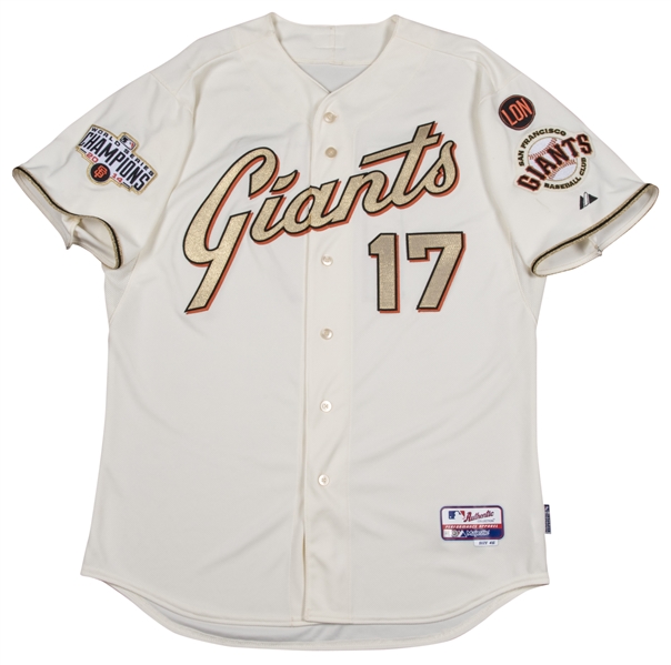
8 hours ago, Old School Fool said:
Still the best champion uniform that ever existed.
I'd love for the Orioles to be able to do something similar in the near future!
-
 2
2
-
-
And...the Nikepocalypse has made it to Slate!
https://slate.com/culture/2024/03/fanatics-mlb-jerseys-baseball-pants-uniforms-monopoly-regulation.html -
2 hours ago, namefornamesake said:
How did they manage to get the LA script break right if they couldn't with the regular Dodgers script?
It seems that since fans don't much need to get anywhere fast, the "limited" jerseys don't have the micro plackets. Go figure.


:format(webp)/cdn.vox-cdn.com/uploads/chorus_image/image/73229500/usa_today_22818285.0.jpg)
:format(webp)/cdn.vox-cdn.com/uploads/chorus_image/image/73229928/usa_today_22744746.0.jpg)
:format(webp)/cdn.vox-cdn.com/uploads/chorus_image/image/73240868/2036206447.0.jpg)


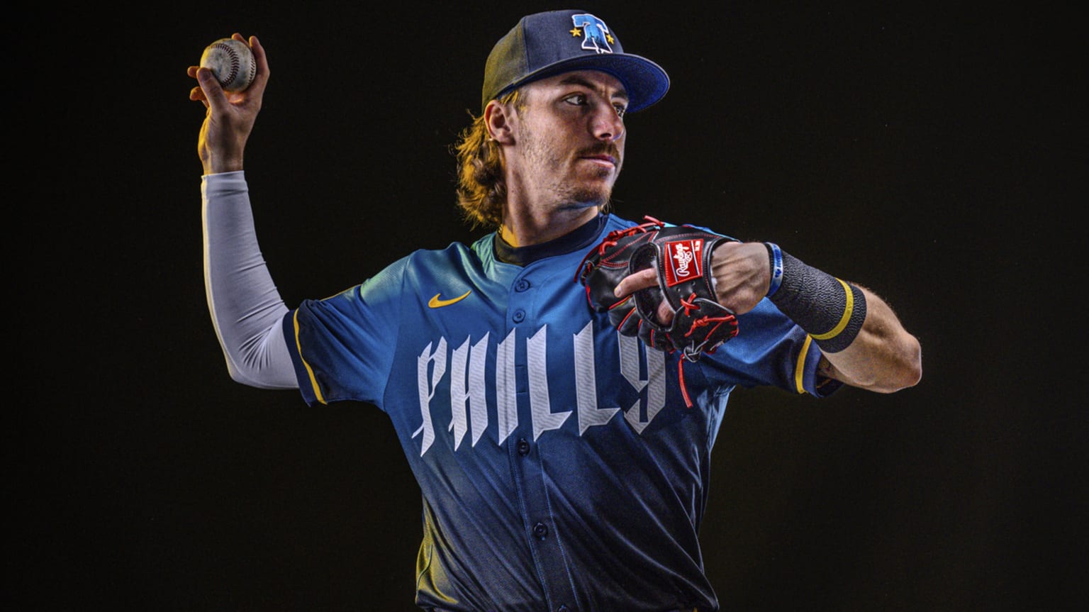
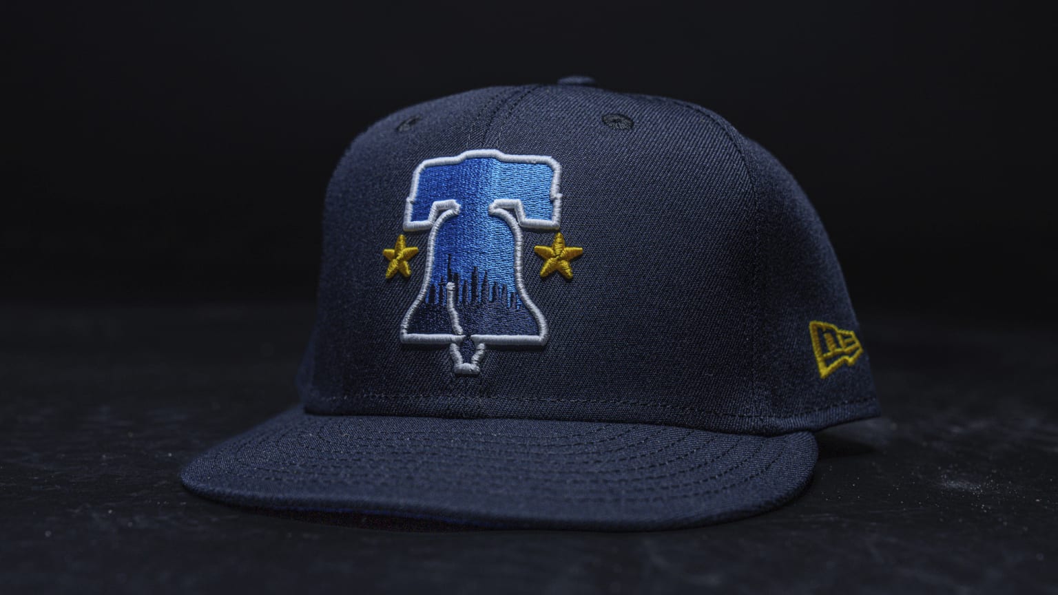
MLB 2024 Uniform/Logo Changes
in Sports Logo News
Posted
Since Nike's MLB directive is clearly "cheaper is better" I understand why they kept the gradient to the trim of the wordmark and numbers rather than the wordmark and numbers themselves. As previously noted, both would read better on a different color jersey. (My vote would be purple.) The single sleeve stripe harkens back to the original (but scrapped) Rays black jersey. Number font reads NASCAR to me. I am somewhat amused by the NOB and mark of the beast being the easiest to read things on the jersey. "See, you CAN read tiny NOBs if we make 'em bright enough" sayeth the Lords of Nike.