


mjarvie
-
Posts
65 -
Joined
-
Last visited
Posts posted by mjarvie
-
-
13 hours ago, sky1324 said:
In the Xfinity series:

That's his normal number. So that just happened to be a coincidence. But the ones I can remember is Kyle Busch running 75 in the all star race for M&M's 75th anniversary and there was a Best Buy car that was 66 because that was the year it was founded.
To the original poster, I didn't know Target had a university, let alone one that had been around for 50 years, Do they have an athletic program? I'm curious.
-
5 hours ago, nash61 said:
Not to un-UtahJack this thread, but has anyone heard anything on the Bruins' plans for '24-25? Their centennial jerseys were decent, but everyone seems to be clamouring for the logos to stay, no matter what happens.
The Centennials were one year only jerseys and they from what I remember will revert to the jerseys prior to this year.
-
Out of all the names, I prefer the Utah Outlaws. It just seems to flow and it feels right.
-
 1
1
-
-
If you're not going to go with Eagles or Grizzlies, then I say go with Gulls. I know a lot of people would question that but it is the state bird. Or go with the state animal, Elk. Any of those four are simple and solid.
-
2 hours ago, burgundy said:
They even creamed their pants.
Forget Indiana and those uniforms that look old and dingy, those Purdue uniforms look great!
-
14
-
-
1 hour ago, DCarp1231 said:
This scheme for John Hunter Nemechek is… certainly a choice.
JTG Daugherty Racing and Kroger have 24 hrs to respond
Over the past couple years, his Safeway/Vons-Albertsons schemes have sucked. The slap them together and then add black. I've been disappointed at them.
-
55 minutes ago, See Red said:
What’s the deal with Austin Hill? Haven’t followed closely the last few years but a lot of people seem to dislike him winning.He wins a lot and people hate that. I also think a lot of hate comes from his and RCR's baby act last year at the November Martinsville race when Sheldon Creed actually raced him instead of laying over and letting him win Martinsville. It made him look like an adopted Childress grandchild who is going to suck at the Cup level and people are tired or Childress children as a whole.
-
3
-
-
3 hours ago, The_Admiral said:
To what extent was the players' union consulted on these new uniforms? They're the ones who have to wear them. We're not talking about player input for aesthetic purposes, but more like "will your pants split."
They were consulted. That's one of the issues players have is they said that there would be adjustable pants and now they're being told pants can't be adjusted. I forget where I read that as there are so many articles on the issues.
-
6 hours ago, Pabig93 said:
The M&M's schemes were never symmetrical. So I don't think that asymmetrical schemes are forbidden.
You're missing the point of symmetrical. They are talking about colors, so one side can't be black and the other side red. It's been done in the past, but Terry Labonte's 2014 Talladega scheme where it was a Kellogg's scheme on one side and a Piedmont Airlines scheme on the other side. https://www.sportingnews.com/us/nascar/news/nascar-wont-ok-tribute-paint-scheme-for-terry-labonte/kvemhdpesnt01ohgtzbw40p12 I know it's been done it the past, but that scheme I think NASCAR said, "We're done."
-
1
-
-
3 hours ago, Haz_Matt said:
I don't think that's the case any more. Pretty sure there have been some asymmetrical schemes in the last 5-10 years. None of them specifically come to mind at the moment though
Nope there has not been any asymmetrical schemes. I know for a fact that in 2017 the #5 of Kasey Kahne had to change his Justice League scheme because it violated the rule.
Here's what the rule book says:
“Both (left-hand side) and (right-hand side) of the vehicle must emulate each other in all colors, markings and graphics. Vehicles with a longitudinal centerline split in appearance extending from front bumper to rear bumper will not be permitted.”
JJ's scheme might be able to skirt the rule since it just fades towards the back and is not the entire side. But that also may just be a show car and not the real scheme.
-
8 hours ago, DCarp1231 said:
Furniture Row Racing vibes from this McDowell scheme
Are you talking about the Eric Jones 5 Hour Energy scheme that had more black on it?
-
4 hours ago, DCarp1231 said:
Two drivers that I absolutely believe who should be on the hot seat if they don’t perform well during the first portion of the season are Daniel Suarez at Trackhouse and Corey LaJoie at Spire.
Valid. I also throw Chase Briscoe and Ryan Preece on that list. And for next year Austin Cindric and Ricky Stenhouse. I realize Stenhouse won the 500 last year, but I feel like he's only at JTG because he won the 500. The driver that should be on the hot seat that won't be for obvious reasons is Austin Dillon.
-
1
-
-
7 hours ago, sky1324 said:
Turns out the reason the Gragson car looks like that is because that's what Rush's current trucks look like. So blame the sponsor on this one.
That RFK Consumer Cellular car is absolutely amazing. Honestly, all of their schemes look fantastic. Am I becoming an RFK fan?
Can you give us an example? The Rush trucks I've seen are white with the logo on the side.
-
4 hours ago, DCarp1231 said:
Noah Gragson may have just secured the absolute worst scheme for 2024. It’s almost impressive how bad it is.
That scheme is representative of Noah's Cup career... bland as can be.
-
4 hours ago, henburg said:
I think that the only chrome helmet setup that even kinda works is LA, and those would still look 100x better if they were simply a metallic sliver finish.
I'd much prefer more teams to try a matte finish like what the Coyotes opted into with their third jerseys. Would fit most teams' jerseys better and still adds a really nice elevated touch to the uniform
Their sponsor is Goodwill? Dear Lord the perfect sponsor for a team who takes everyone's unwanted crap.
-
 7
7
-
-
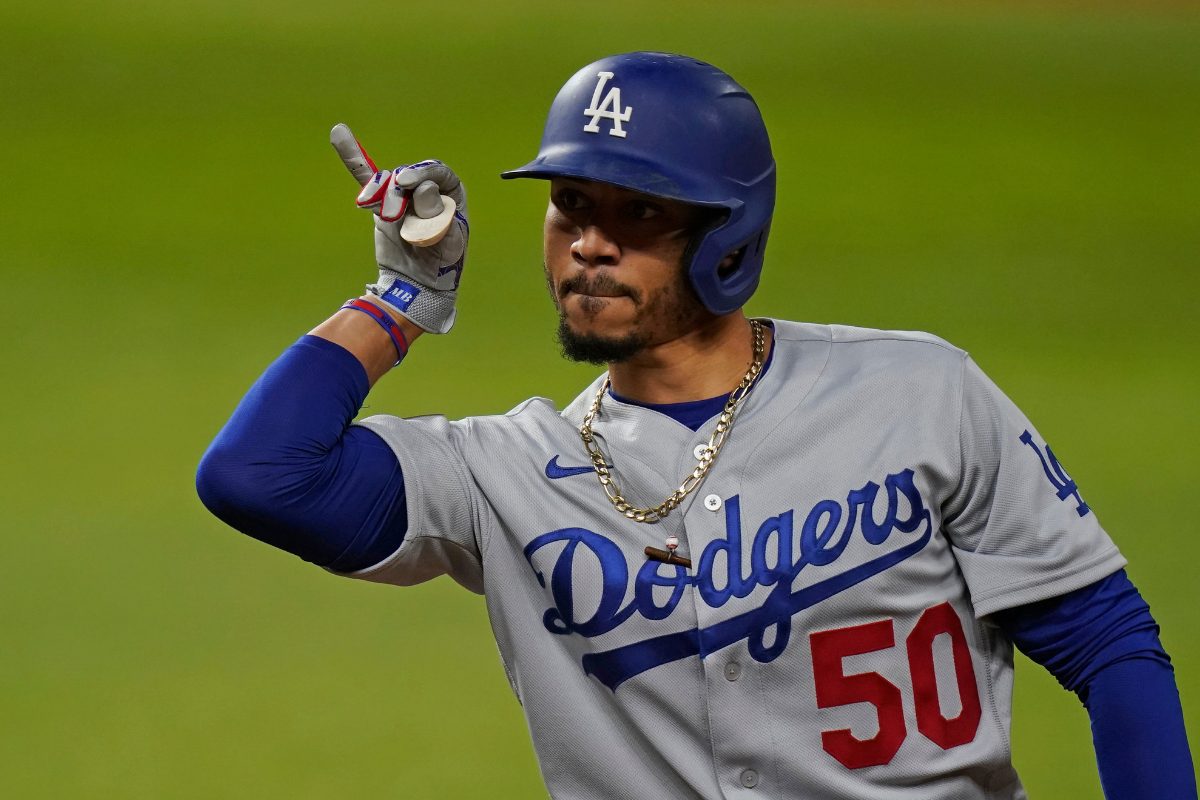
8 hours ago, BBTV said:
It sucks that Nike either cant, or is choosing not to, make heathered fabric that replicates the old flannel look. That would make the Yankees even better.
As for the Dodgers, this is the best they've looked on the road since being in LA:
This is a factual opinion. If you disagree with this, your opinion is not only wrong from an aesthetic perspective, but also an arithmetical one. Just as wrong as if you said that 2+2 = 5.
As for the Dodgers, this is not the best look. It's ruined by the stupid "LA" on the sleeve. If you take that off then it's by far the best look, but the "LA" on the sleeve ruins these to an average look.
-
4 minutes ago, Nordiks_19 said:
I was at the Islanders-Kings game in december where Los angeles wore their alternate with chrome helmet.
My god, these are even worse in real lifeLike the Islanders?
-
3
-
-
5 hours ago, DCarp1231 said:
Wendy’s moves from Legacy to Trackhouse (and by association Kaulig). Primary sponsorship will be for SVG’s Cup race at Talladega (April) as well as an unannounced Xfinity race when he drives for Kaulig.
https://www.trackhouse.com/fresh-partnership-with-wendys
The article also says
The wording is a tad confusing. So will Wendy’s be the primary sponsor on Suarez’s 99 car for Daytona? Is Suarez driving a Kaulig car for the Xfinity opener? Or are they unsure of which car is getting the sponsorship?The way I'm reading it is that Suarez will be running the xfinity race with an unkown team as of now, say Green Light Racing (#07 or #08).
-
I had a graphic design teacher once say that he tossed a kid a quarter and told him, "Here's a quarter. Go call your momma and tell her that you're not gonna be a a graphic designer!" Can we toss that same quarter to Bieber and say, "Here's a quarter, go call your momma and tell her that you suck at design."
-
1
-
-
On 1/9/2024 at 6:37 AM, stumpygremlin said:
Yes, I'm fully aware of how it actually works. I'm just stating that I wish teams would change number fonts if a driver becomes legendary in a particular one. It's a wish. Nothing I know will ever happen.
Why? Why change your brand from something successful? It makes no sense.
-
 1
1
-
-
On 12/20/2023 at 6:45 AM, stumpygremlin said:
I actually think that great drivers associated with a particular number should have their number font retired in a sense. Like, I'd like to see Austin Dillon's "3" look different from Earnhardt's "3", or Byron's "24" different from Gordon's "24", or Bowman's "48" look different from Johnson's "48", Bell's "20" look different from Stewart's "20", Jones's "43" look different from Petty's "43", etc.
You realize that the number is not the driver's at all and rather the owner's that they lease from NASCAR. Why would you change a successful brand? That's like the Yankees going away from pinstripes because Babe Ruth isn't on the team.
-
1
-
1
-
-
10 hours ago, tBBP said:
The funny thing is that is that's the thing I most liked about it. It's one of those things that shouldn't work in theory, but for some reason, mixing the dark navy neutral, the bright vibrant sea blue (I forget the actual color name) with vintage white was just an interesting contrast. Topping it off with the red S and jersey numbers was (almost quite literally) the cherry on top. It was just an interesting application and I guess somewhat bending of color theory in practice, at least to me.
On the other hand, the vintage white did not work on the Vegas jerseys, because it and VGK's gold trend toward the same shade thus the contrast "pop" isn't really there. (I also wish they had applied the gold braiding in the back numbers to the sleeve numbers; I'm still curious as to why they left that off.)
That is one whole heaping of "bleh".
I don't know, and this may just be me, but something about "lightning" and "hockey" conveys speed, power, and at any rate dynamism. This jersey is almost the exact opposite of all of that.
Of course, this is all just—you knew this was coming—one man's opinion...his two rusted Lincolns.
I did grab the Kraken jersey, but like others have said the vintage white didn't work with Vegas. It worked with Seattle because I think they actually had a dark color to counter act the vintage white whereas Vegas was gold om vintage white. It works with some teams, but not others. It just feels like a copout because it's been used so much. If you go back through the history of the Winter Classic, the jerseys that use white and not vintage white are far superior. For refernce: https://www.tennessean.com/story/sports/nhl/2019/12/31/nhl-winter-classic-jersey-ranking/4402901002/
-
3 hours ago, MJWalker45 said:
https://www.instagram.com/p/C1s46q6OsKq/?igsh=cWhoeG03ZnE1eGM3
Adidas All American Game uniforms. Pretty meh. Did they forget they had games this weekend?
They probably realized that no one watches the games and the uniforms bring in 0 money and and real advertising.
-
6 hours ago, Digby said:
One thing I find kind of confusing, aesthetically, about some of these games is how the on-ice product is meant to look "faded" or retro or fauxback or whatever, but then you have all the elaborate, theatrical decoration around the ice, putting up fake shipwrecks and docks like it's a touristy mini-golf course. Feels like those two things are a little at odds.
I don't mind the stuff around the ice.... you have to fill in empty space somehow. Otherwise it looks stupid. The issue I have is the shoving down our throats of vintage white... look people if you look back in time, the vintage white is actually white, not tan like you claim. Make it white!
-
1
-


2024-25 NHL Changes
in Sports Logo News
Posted
Maybe he does, and all these crappy names for the team is to throw people off base. I doubt it, but I can always hope.