


FGWB
-
Posts
1,226 -
Joined
-
Last visited
Posts posted by FGWB
-
-
-
Fun fact: he was given a key to the city that was technically revoked. The mayor gave it to him contingent on getting 10 TDs and a playoff spot. He had 5 (and obviously no playoffs). I hope they asked for it back.one season of popcorn without butter

Second fun fact: I was at that ceremony at the local art gallery (Albright-Knox) which was also filmed for an episode of his VH1 TV show. I forgot the title. But I'm in it.
-
Forgive the quick, messy isolation of each logo, original on left and theft on right.
Thieves' adjustments: removed star, darker color, different whiskers, missing tooth, thinner mane accents, and no back-of-mouth detail. Otherwise everything is exactly the same. (Not condoning, just comparing, while exhibiting the laziness of logo thieves these days.

-
thanks to Buc for finding this guy on behance. he has 3 days to remove the project before things get really interesting for him.


As far as I can tell, all they did was remove the star?
I wish logo thieves would be a little more creative at least...
-
Habs don't have lace collars now, and having one of the most classic looks in the league
I honestly like the laces, but do think that they are becoming overused, honestly.
Another original six team who doesn't use them currently.

I'm very traditional-minded about most things. But I just think they're overused these days.
-
Maybe I'm one of the very few who feels this way, but I think the NHL lace-up collars are overused and pointless. I don't think they add anything to the uniforms at all and would hardly be noticed if taken off.

-
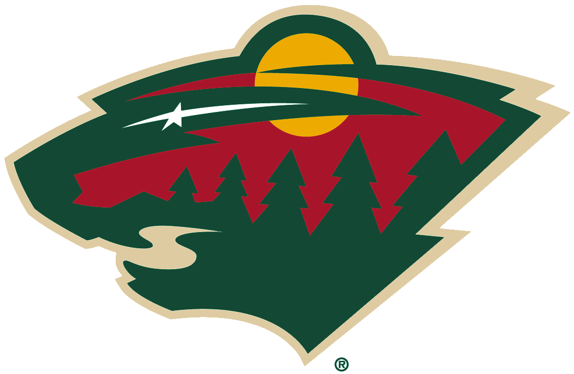
Most underrated has to be the Minesota Wild. Once you realize it's also a bear's head, it's like taking the red pill in The Matrix
I'm always confused when I read someone saying this. What else could you possibly first see?
-
I don't think so. The two are done from different enough perspectives, in different enough styles that I think you both came to it on your own.
They're similar, but it's very very possible to end up at the same place you ended up without having seen your artwork.
Well I said it in my original post, just found it coincidental. However, my Miller wallpaper was a definite straight-up theft.
-
I see your point, but I also think the rays are an art deco thing and that's an art deco building.
Sure, that was another source of the inspiration for my piece. Can I just get one person to agree that the two other examples were created from nearly the same angle looking upwards? The ad is definitely VERY close to my original piece, just more detail in the building.
-
I know I'm late to the party here, but that's not just some random building... that's City Hall (and the McKinley Monument). It's not really suspicious that people would use that as a symbol for Buffalo.im not so sure about the poster example, it looks like both of you used the same inspiration and arrived at a similar thing, using a pretty common composition of top placed headline, 2 point perspective building-from-the-street view and a sun burst background. you could just as easily make the same connections between the two to Shepard Fairey's work.
Yeah I totally understand which is why I can't be 100% sure. However, you have to admit that it IS a little suspicious that it was used for a local Buffalo event as well as local Buffalo-area credit union.
Well yeah, that's why I used it in m original piece. It's not the fact of using city hall is suspicious, but the similar use of the rays behind it as well.
-
im not so sure about the poster example, it looks like both of you used the same inspiration and arrived at a similar thing, using a pretty common composition of top placed headline, 2 point perspective building-from-the-street view and a sun burst background. you could just as easily make the same connections between the two to Shepard Fairey's work.
Yeah I totally understand which is why I can't be 100% sure. However, you have to admit that it IS a little suspicious that it was used for a local Buffalo event as well as local Buffalo-area credit union.
-
Most blatant theft of my work is my first example. Ryan Miller wallpaper I created (with photo credit to Bill Wippert and also my own name along the bottom) was used by some seller on eBay from Indonesia and honestly, I wasn't that upset since I saw that people actually purchased the case which meant they liked what they saw.

And my second, not-so-clear ripoff of my work is this ad from a local paper (Artvoice). I created the poster on the left maybe about 3 years ago now while still in college, and the ad on the right was published just around a year ago. The similarities are definitely all there, enough to make me question if the creator saw my poster and played off of it. Also, the logo for the WNYFCU uses a logo which also looks similar to my created poster.


-
This hurts my heart and brain as a Sabres/Vanek fan...

-
He meant, the actual prototype logo with the moon and all.
-
Had to post just to give another kudos to Ren.
F---ing unbelievable man. Great updates.
And I'll also toss another request your way, see what you can do with this Bills logo.

-
-


(far left)
Zetterberg without a beard?
Insanity.
-
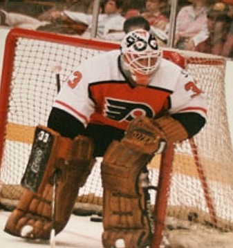
Dominick Rousell must have been a big Resch fan!
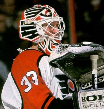

Because they both used the logo on their helmet?
Similar. Not the same.
-
-
No pic just yet, but Modano is said to have accepted an offer for a one year deal with the Red Wings. I just can't imagine him not wearing Green and yellow/gold
Correct me if I'm wrong, but Modano hasn't worn a green or gold jersey in ages.
He didn't say the jersey was green or gold. Nitpick fail.
How silly of me to assume he meant Dallas' undetectable green and gold trim. Nitpick fail nitpicker.
You didn't think maybe he was referring to the main team colors he's worn for 20 years?
Are these green? With yellow/gold on them? I can't tell.


-
No pic just yet, but Modano is said to have accepted an offer for a one year deal with the Red Wings. I just can't imagine him not wearing Green and yellow/gold
-
The Rocket as a Lexington Legend

Seems to me this legend is in the exact right uniform.
I see what ya did there
-
Ok, I think i checked out this entire thread and didn't see Franco Harris as a Seahawk!
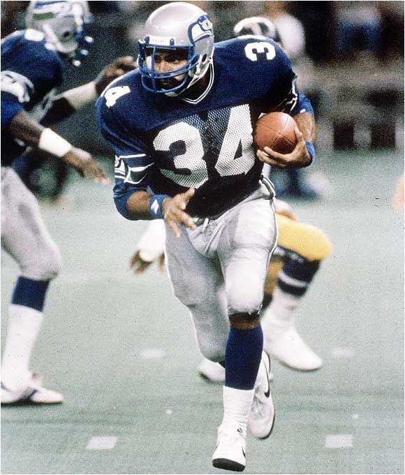

Technically it's in this thread in the first post in the SI photo gallery
-


Inaccurate colors/uniforms in video games that should know better
in Sports Logo General Discussion
Posted
EA can add team-specific game presentations and mascots, but can't manage to use the correct number style.