


Brian in Boston
-
Posts
8,459 -
Joined
-
Last visited
-
Days Won
3
Posts posted by Brian in Boston
-
-
Of the identities we've seen listed so far, I'd go with either Utah Yetis or Utah Mammoth.
-
 3
3
-
 1
1
-
-
I suppose I should have anticipated this day coming. Recognized that interests wax and wane and - sometimes, for one reason or another - completely peter out. It would appear that my passion for all things sports branding-related has reached that point.
The sheer, unadulterated excess of primary marks, secondary marks, tertiary marks and wordmarks... home uniforms, road uniforms, alternate uniforms, and throwback uniforms... City Connect this, Color Rush that, City Edition the other thing, and Reverse Retro who the f*** gives a s***... they've cumulatively overwhelmed me.
The cycle between the introduction of any new logo, uniform, or other brand identity component by a team and the roll-out of its next new design element seems to have sped up. For example, the Detroit Lions last introduced new uniforms less than a decade ago... seven years to be specific. It would seem that "timeless" design has given away to "you're on the clock". Combine that with the fact that the introduction of new creative elements by clubs across all leagues is taking place at the same heightened pace and the reveal of such elements have been stripped of their individual "WOW" factor. The result is that these so-called "events" on the part of teams and leagues have become commonplace to the point of meaninglessness. It has gotten to where I picture the team owner, coach, and players who are involved in these unveilings walking off stage only to be immediately ushered into meeting rooms where brainstorming sessions and focus groups with graphic designers, uniform manufacturers, marketing executives, and fans get underway in order to facilitate the rollout of the inevitable next team brand-related unveiling.
Finally, it doesn't help that the branding elements that are produced by these design initiatives seem increasingly underwhelming. How could they not be? Creativity is the slave of commodification. Restraint is a rarity, excess the rule of the day. Artistry with the potential to surprise, delight, and inspire has been replaced by dreck.
To much of a good thing can be - indeed, often is - a bad thing.-
9
-
 1
1
-
 2
2
-
-
The draw has taken place and the pairings for the Lamar Hunt U.S. Open Cup Round of 32 are set.
Charleston Battery vs. South Georgia Tormenta FC
Atlanta United vs. Charlotte Independence
Tampa Bay Rowdies vs. Birmingham Legion
FC Dallas vs. Memphis 901 FC
Union Omaha vs. Sporting Kansas City
Pittsburgh Riverhounds SC vs. FC Tulsa
Seattle Sounders FC vs. Louisville City FC
North Carolina FC vs. Phoenix Rising FC
Sacramento Republic FC vs. Monterey Bay FC
San Jose Earthquakes vs. Oakland Roots SC
Las Vegas Lights FC vs. Los Angeles FC
Orange County SC vs. Loudoun United FC
Indy Eleven vs. San Antonio FC
Houston Dynamo FC vs. Detroit City FC
New York City FC II vs. Colorado Springs Switchbacks FC
New Mexico United vs. Real Salt Lake
Matches will take place Tuesday, May 7th and Wednesday, May 8th.
-
2
-
-
On 2/23/2024 at 10:12 AM, VDizzle12 said:

While I'll agree that the new America East Conference logo isn't a masterpiece, the logo it replaced never struck me as being anything special. Frankly, it looks like something that would be featured in a quiz dubbed "College Conference or Regional Airline?" on Sporcle. It could have been purposefully designed to adorn the vertical stabilizer/tail fin in the livery of a regional carrier.-
2
-
-
1 minute ago, Digby said:
An armadillo-baseball concept is kind of cool but the prospect of that as the basis for a creepy, uncanny, bastardized A's rebrand is nauseating.
I was only joking... though I wouldn't put anything past the clown car of a pro sports franchise that is the John Fisher-owned Athletics. -
16 minutes ago, Walk-Off said:
it should be noted also that... the ballpark's overall design resembles a "spherical" armadillo.
From the Oakland Athletics to the Las Vegas Armadillos, while still being dubbed the A's. At the very least, perhaps we'll see the A's adopting an alternate mark that replaces an elephant standing atop a baseball with an armadillo mounting a baseball.
-
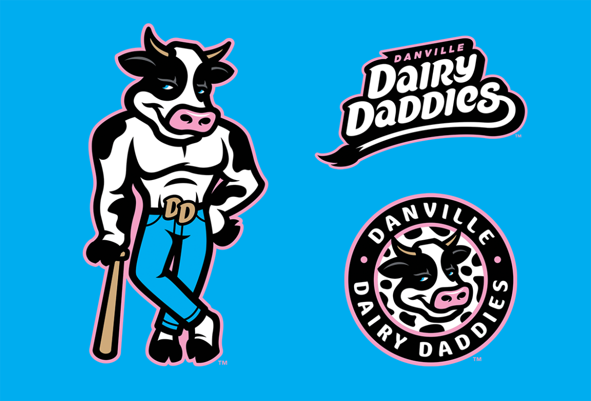
On 2/28/2024 at 3:54 PM, Green27 said:
#HowYouMooin'?
#LookingForMr.Goodbarn-
3
-
 1
1
-
-
4 hours ago, nash61 said:
Imagine this: a cap logo of either a single boxing glove, or two hanging gloves similar to the Red Sox logo, and a wordmark with the gloves hanging off the T in Knockouts.
This logo has been used by the Brockton Rox. Formerly an independent minor league team competing in the Northern (2002), Northeast (2003-2004), and Can-Am (2005-2011) Leagues, they've competed as a collegiate summer Futures Collegiate Baseball League member since 2012. As of last season, though no longer in use on the team's uniforms, this mark was still prominently displayed around Campanelli Stadium. The Rox are owned and operated by Brian Kahn, the same person who is bringing the Frontier League's New England Knockouts to Brockton.
4 hours ago, nash61 said:THEN you bring in the dog logos (again, missed opportunity for it not being a boxer breed)
Brockton High School's athletic teams are known as the Boxers and feature a dog of said breed in their logos. The Knockouts likely steered away from featuring a boxer dog in their logo package so as to avoid having their brand seem derivative of that being used by the high school.
Look, this is the Frontier League we're talking about. In spite of its excesses, I'd say that the Knockouts' identity package ranks amongst the top half of those in the league - indeed, maybe even the top third - by default. Then again, given some of what's trotted out by the other teams, that's not saying much.
My biggest problem with the Knockouts' identity package is that it doubles down on the trend to cram such entities with an ever-increasing number of alternate marks, official color palettes that seem to include at least a half-dozen hues, and - most mind-numbingly - marketing-speak explanations for each and every facet of the portfolio.-
2
-
-
The entire New England Knockouts' identity is so over-the-top as to be comically asinine.
There's "The Main Event" primary logo and the three alternate logos dubbed "The Other Cards". Oh, my... it isn't enough that the folks responsible for creating and signing-off on this identity package opted to stuff it beyond the bursting point with visual elements and explanatory marketing-speak that threaten to muddy it to the point of incoherence. Nope, they've also chosen to introduce quirkily-annoying themed headings to the subsections of the introductory one-sheet. Ohhhhhhh, such a... "treat".
The bulldog as a mascot seems a bit "on-the-nose"... though I suppose not as knowing a "wink" as going with the boxer breed would have been. Resisting that pun may have been the only place that the creative team showed restraint in putting this identity package together. The logo as a whole strikes me as being much too busy. The "bruiser" of a bulldog... wearing boxing gloves... wielding not one, but two baseball bats. It's all a bit much.
Also, I don't know that anyone from Brockton would describe Rocky Marciano and Marvin Hagler as being the City of Brockton's "infamous" ties to the sport of boxing. Being infamous means to have a a reputation of the worst kind... to be notoriously evil... to be regarded as causing or bringing infamy to a place. That isn't the reputation that Marciano and Hagler have in the City of Brockton, or the sport of boxing.
Finally, just in case anyone was wondering where the ball club hails from, let's slap a backwards snapback baseball cap atop his head to really hammer home the idea that our canine character is a born-and-bred, eternally-anchored-to-past-glories, South Shore Mass - hole Actually, that's the one element of the entire identity package that made me laugh out loud. Spot on
But, wait! There's more! The aforementioned "Other Cards"... each with its own name. Fancy that.
There's "The One-Two", a full-body depiction of our beloved mascot. He's "prepared to go the distance" with "[h]is belt... visibly displayed". I hate to nitpick, but if we're going to have marketing-speak smoke blown up our asses with the individual components of every sports franchise identity system introduction, is it too much to ask that the folks composing these things actually proofread what they've written? For instance, how would one go about invisibly displaying something? Sorry... I digress. But, come on, seriously. Also, couldn't this alternate logo be dubbed "The One-Number Two"? I mean, it sure does look like "our champion boxer" is poppin' a squat.
Movin' on, we have "A True 'K-O'". So, let me see if I have this straight: the term "K-O" was coined as a shortened term for "knockout". Fascinating. Who'd have known?
Last amongst "The Other Cards" is "The One City, One Fight" word mark. It seems a bit underwhelming given its task of making sure that Brockton's history as the "City of Champions" never be forgotten. A perfectly inoffensive cursive font, but nothing that
And finally, "The Colors"... each with a name drawn from a boxing glossary and - for the most part - randomly assigned to its corresponding hue. Five colors, though neither the tan of the baseball bats or brown of the bulldog were deemed important enough to receive a sobriquet. Why no love for "Clinch", "Feint", "Haymaker", or "Palooka"? What other colors might have been added? Maybe a deep Purple christened "Shiner", or a Silver Grey dubbed "Spit-Bucket"?
_________________________________________________________________________________________________________________________
Note: My apologies to any member of this community I might have inadvertently offended with the inclusion of a word that may have been interpreted as culturally or racially insensitive. I can assure you that this was not my intention and, further, I would hope that my posting history in the CCSLC forums would bear that out.
According to etymologists, the word in question is not culturally or racially insensitive in origin. Rather, when coined in 1944 by Maury Maverick - a former U.S. Representative who was serving as chairman of the Smaller War Plants Corporation - it was simply meant to convey his frustration with the propensity of people to engage in the use of convoluted, incomprehensible jargon when simple, straightforward communication would better serve the task at hand. As for the word's inspiration, Maverick is said to have had the garbled call and pompous strut of a turkey in mind.
Finally, I would point out that the last four letters of the word in question are not pronounced the same as the four-letter slur that people rightfully find so offensive. Despite appearing to be linguistically linked, the two words are of separate and unique origin.-
1
-
-
15 hours ago, WideRight said:
Here we are, guys. The design for the 16th and final team, the Memphis Mallards.
WOW! That Mallards secondary mark is phenomenal! The identity package overall is great, but that secondary ranks as a favorite of mine amongst anything you've ever produced. It really conveys a very specific attitude and energy. Top notch.
Further, the entire project has been an extremely impressive undertaking. Outstanding work. Your efforts are always a treat.-
1
-
1
-
-
-
Philadelphia
-
Red Devils
-
Philadelphia
-
Another outstanding effort by Dan Simon. Mighty Lex is the best mustachioed Legends mascot yet! I'm definitely going to be ordering some merchandise.
-
3
-
-
While the Birmingham Bears' "ursine figure, racing his way to the endzone, ball in hand" is wonderfully executed, he reminds me of a certain prospector who already "'rushes' towards pay dirt, football in hand" on another AAFL helmet.
Further, that nod of the houndstooth fedora and the Bears nickname may prove irresistible to fans of a college football program in Tuscaloosa, but it is going to alienate an equally large swath of supporters who shout, "War Eagle!" on the Plains come Saturdays each Fall. I don't see any way that an astute pro sports franchise would willfully write-off so many potential customers before the team had even taken the field.
Besides, what's not to love about a terrific modern update of a classic alternative football identity?
I have to go with...
Forged in Flame, Steeled for Success: Birmingham Vulcans Football!-
1
-
-
This will require some thought...
-
I presume you're looking for schools where the identity split manifests itself in more than just the word "Lady" being slapped in front of the athletic programs' overall mascots.
Arkansas State - Boll Weevils and Cotton Blossoms
Arkansas Tech - Wonder Boys and Golden Suns
Cal Lutheran - Kingsmen and RegalsCentenary - Gentlemen and Ladies
Central Missouri - Mules and Jennies
Claremont-Mudd-Scripps - Stags and AthenasHawai'i - Rainbow Warriors and Rainbow Wahine
Louisiana Tech - Bulldogs and Lady Techsters-
1
-
-
I do love the Warbirds identity. However, if the league has a surfeit of any color, it is blue.
Silverbacks -
21 hours ago, WideRight said:
Sharp eyed folks may notice that I slightly modified the "M" logo to lean to the left so that the waves and the M carry the same motion from left to right, instead of having the M moving from right to left as is the case in real life. Most football images with a left-right orientation tend to emphasize a left to right "forward" motion instead of a right to left "backward" motion.
You actually need to keep both of the Showboats' "M" logos, one with the letter leaning to the left and the other to the right. Why? Depending upon the orientation of someone viewing the logos, either version can emphasize "forward" motion.
In your modification of the Showboats' secondary mark, the smokestacks leaning to the left are supposed to impart the idea that the righthand side of the logo, where the wave lines originate, is the bow of the ship. The wave lines appear to be water flowing from right to left down the showboat's side as the bow cuts through the river's water. At least that's how it will appear with that mark applied to the right sleeve of the jerseys. However, in order to achieve the same effect on the left sleeve of the jerseys, the 2023 orientation of the logo has to be used (with the smokestack's leaning to the right).
The easiest way to member this is that if the secondary mark is ever going to be applied to the sides of a Showboat uniform (on the sleeves of the jerseys, on the hips of the pants, on the sides of the helmets) the smokestacks should be leaning back towards the player's back.
It may also help to think of a real world application of this phenomenon. Someone standing on the East bank of the Mississippi River in Memphis, watching a showboat move down the waterway from St. Louis towards New Orleans, would construe the vessel's "forward" motion as traveling from his right to his left. A person positioned on the West bank of the Mississippi River in West Memphis, watching the same showboat move down the waterway at the same time, would construe the vessel's "forward" motion as traveling from his left to his right.-
1
-
-
Columbus
Carolina
-
Rockers
-
Columbus
-
I just had the strangest experience.
I was scrolling through this thread when, suddenly, I found myself wondering what it would be like if a series of Wikipedia entries achieved sentience, took control of the mind of that kid from middle school who was always reminding the Social Studies teacher that she’d scheduled a quiz, and then discovered the CCSLC Concepts Forum.
I can’t imagine what triggered the episode.
-
2
-


North America Pro Soccer 2024
in Sports In General
Posted
Reportedly, his assailant was local professional boxer Quashawn Toler.
https://theathletic.com/5467316/2024/05/02/fc-cincinnati-aaron-boupendza-jaw-bar/