


Brian in Boston
-
Posts
8,471 -
Joined
-
Last visited
-
Days Won
3
Posts posted by Brian in Boston
-
-
On 10/23/2023 at 11:31 PM, Davidson said:
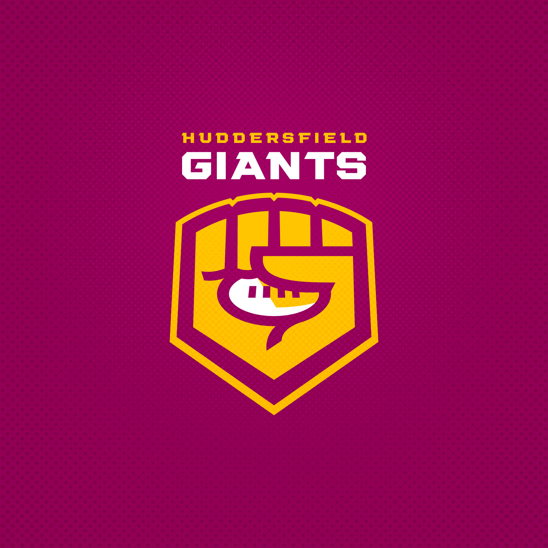
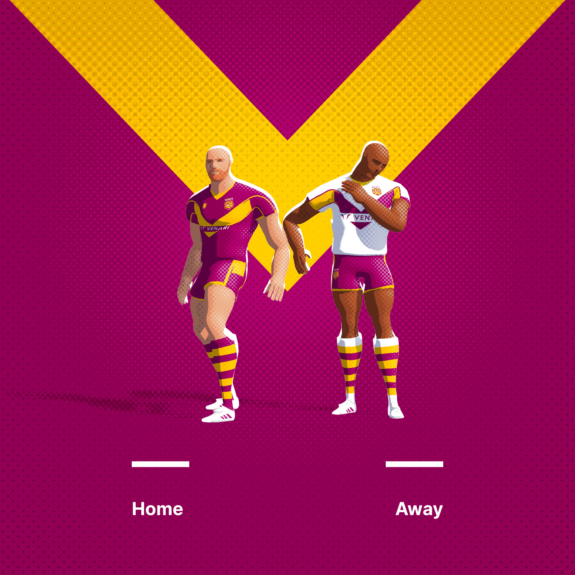
Huddersfield Giants. I always find depictions of mythic creatures like giants a bit awkward, so I thought I'd try and work a letterform into something that depicted enormous size.
Original Logo

Extremely clever!
-
"Fiber manufactured in San Diego County is the thread that binds our communities together. Shop local and look for the San Diego Fiber Council seal."
-
 1
1
-
-
13 minutes ago, Davidson said:
Thanks Brian, appreciate you saying. Very kind.
I've been meaning to comment about how much I've enjoyed the series since you posted the first concept. Each successive design has been a unique and well-crafted take. Then you unveiled this Gold Coast brand treatment and I found it absolutely breathtaking. It completely captured my attention in a way that the Titans' existing mark never had. Again, kudos! -
On 10/11/2023 at 1:18 AM, Davidson said:
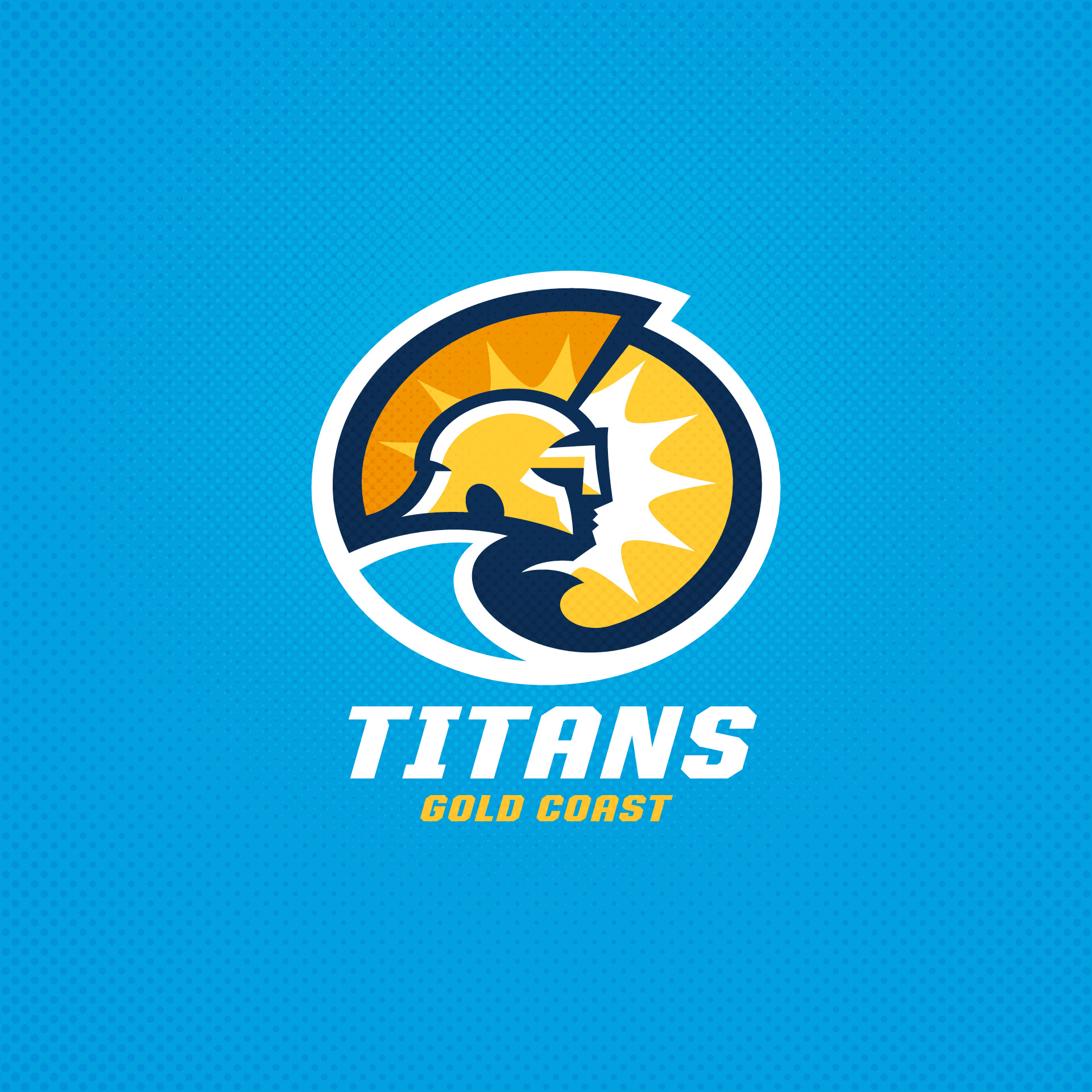
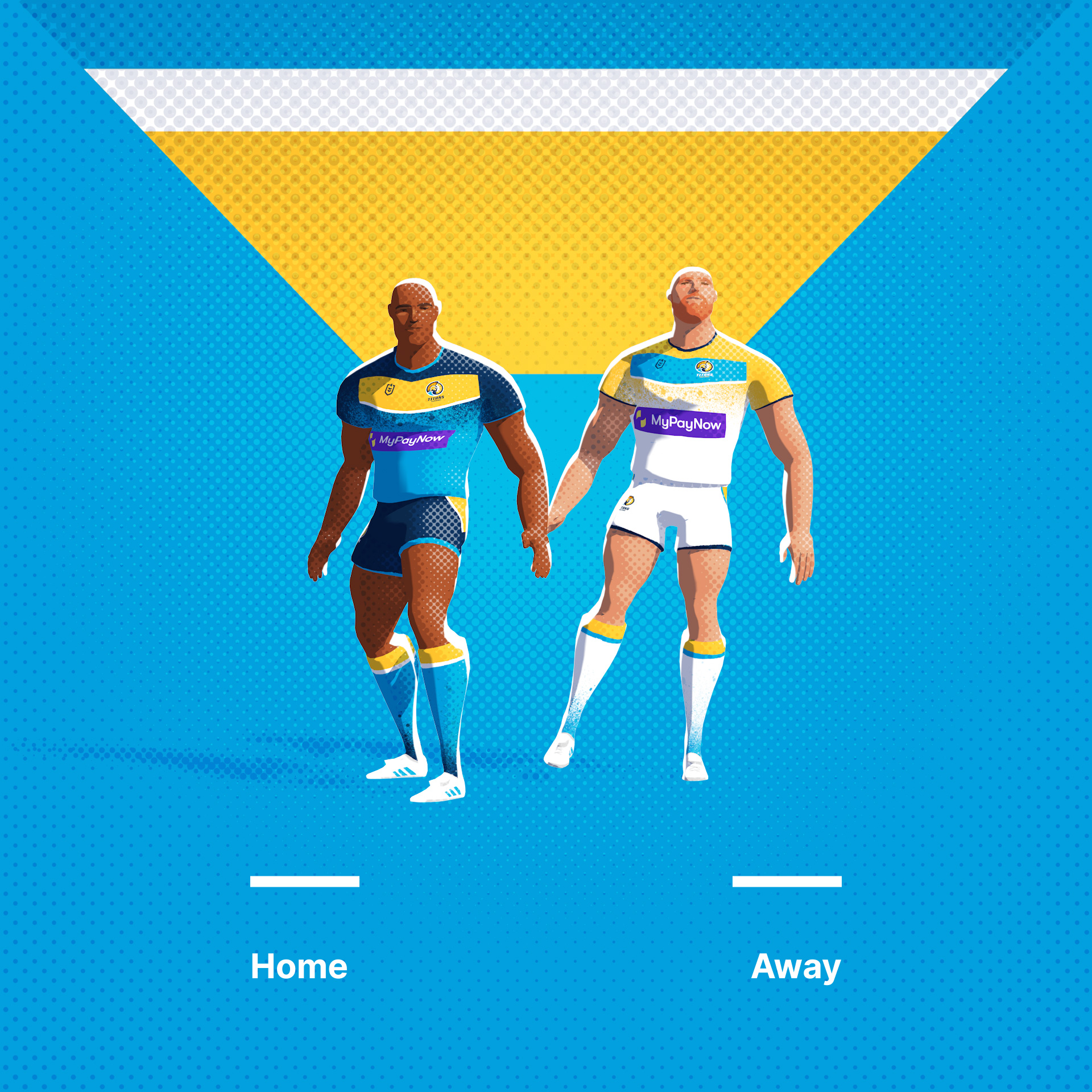
Gold Coast Titans, a relatively recent addition (2007) to the NRL. Always a little sad when teams choose names that have no local significance, so I've tried to work in a coastal / sunshine theme.
Original Logo
Phenomenal... absolutely PHENOMENAL! One of the finest marks I've ever seen. A truly outstanding piece of work, Frasier. -
On 9/25/2023 at 8:09 AM, kylonian said:
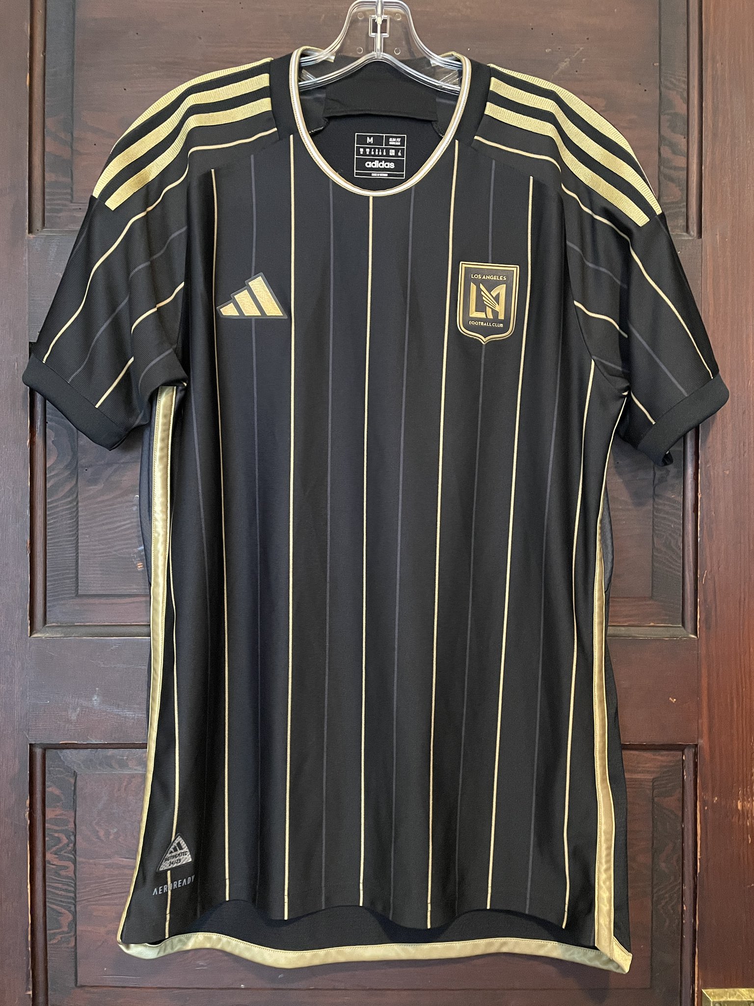
Didn't expect to be starting this so early but here we are! LAFC's new primary has leaked and personally I absolutely love it, gorgeous. Will be such a shame if it's spoiled by the huge Flex logo, but pinstripes seems like such a correct choice.
As a supporter and season ticket-holder since Day 1, I have to say that I'm just not feeling this. While I welcome the return of the club's badge to where it ought to be - positioned over a player or supporter's heart - the rest is leaving me cold.
I've always wondered what pinstripes might look like on an LAFC kit. Now that I know, I'm not a fan. I much prefer the subtlety of the black-on-black sublimated patterns that marked our inaugural and current jersey designs. The art deco motif on the present version is my particular favorite (though the positioning of the crest isn't optimal). -
2 hours ago, JH42XCC said:
I think the Pittsburgh Maulers should rebrand to the "Canton Maulers" or the "Ohio Maulers", since they play/would be playing all of their home games in Canton, OH anyway. Or even better, they could revive the old "Canton Bulldogs" name.
The National Football League holds the trademark for Canton Bulldogs through its properties division.-
2
-
-
There aren't many professional soccer clubs that eschew incorporating their name - or, at the very least, their initials - into their crest. Wracking my brain, I can think of Atlético Madrid, Botafogo, Cheltenham Town, Derby County FC, Fiorentina, Genoa, JEF United Chiba, Norwich City FC, Pumas UNAM, Salernitana, and Wolverhampton. I'm sure there are more, but clearly such clubs are in the minority.
I'll give Seattle Sounders FC credit for joining them and going so minimalist. It's nice to see a club "roll the dice" and buck tradition.-
2
-
-
On 9/25/2023 at 12:37 PM, Brave-Bird 08 said:
Class SC
Burgundy kits.
I agree that the kits will be Burgundy, as that's undoubtedly going to be the club's official color.
As for the team's name, I've heard that they're going with Fuẞballverein Walvagina.
The Fuẞballverein Walvagina badge is reportedly centered on a quartered shield and breaks down as follows:
Above the shield - filling the space normally given over to the crest, torse, mantling, and helmet in a coat of arms - is a full, luxurious head of hair.
Upper Left Quarter of the shield - a whale receiving oral pleasure from a panther
Upper Right Quarter of the shield - a flute
Lower Left Quarter of the shield - a bottle of Scotch... Scotchy, Scotch, Scotch
Lower Right Quarter of the shield - the KWVN-TV 4 news bug
Beneath the shield - a scroll shaped like a bold, thick mustache that contains the club's motto, Mantente con Clase, San Diego.
We can hope, right?
-
 4
4
-
-
4 hours ago, panthers_2012 said:
Frontier League getting a new team in New England, and they are dropping the traveling road team, Empire State Greys.
https://frontierleague.com/sports/bsb/2022-23/releases/20230921gltdyb
Brockton Shoemakers Baseball... the Heart and Sole of the game.-
1
-
-
While I'd concede that Leonard P. Zakim Bunker Hill Memorial Bridge is 4 to 4.5 miles "as the crow flies" across Boston from White Stadium, I can understand the impulse on the part of the club's ownership group to utilize a depiction of The Zakim in the NWSL Boston visual identity package. After all, Boston Unity Soccer Partners leadership has been steadfast in communicating that the club is committed to inclusion and empowering communities that historically have been marginalized. Mr. Zakim was a civil rights activist who fought tirelessly against antisemitism, racism, and other forms of discrimination. There's a connection there.
Now, that said, I don't think the depiction of The Zakim in the "NWSL Boston 2026" shield and "NWSL Boston - Coming 2026" roundel comes close to capturing how striking the actual structure truly happens to be. If the Leonard P. Zakim Bunker Hill Memorial Bridge is truly going to be the centerpiece of the organization's visual identity, I'm hoping that the graphic design professional hired to create the club's crest makes another attempt at depicting the span.
As for the club's color palette featuring multiple shades of green, there are several reasons the Boston Unity leadership team has likely opted to go this route:
First, the dark green/mint green/green-yellow combination is unique in NWSL right now and likely will be in three seasons. If Boston were to lean into the darkest shade - it looks to me to be somewhere between Kaitoke (Pantone Hex #004830) and British Racing Green (Pantone Hex #004225) - as the primary color, with the lighter shade - it strikes me as a melding of Mint (Pantone Hex # ) and Screamin' Green (Pantone Hex #76FF7A) - as the secondary hue, that would make for a terrific palette. As for the green-yellow shade, I'd use it as sparingly as possible... if at all.
Second, a palette comprised of shades of green could be seen as alluding to the site of the team's home stadium in Franklin Park, the largest "jewel" in Frederick Law Olmstead's "Emerald Necklace" park system within Boston and Brookline, Massachusetts. Why not pay homage to the abundant scenic greenery in the urban oasis the team will call home?
Finally, the controlling partner of Boston Unity is Jennifer Epstein - her father just happens to be Boston Celtics co-owner Robert Epstein. A passion for pro sports and green uniforms may just run in the family.
-
56 minutes ago, Digby said:
I absolutely love it (another Matthew Wolff joint I think?) but remain flummoxed at the name of the club, itself.
The club’s name appears to echo the moniker that’s been applied to an economic development region of central North Carolina that stretches 120-plus miles from just west of Winston-Salem to Fayetteville.https://nccarolinacore.com/why-the-core/location-infrastructure/
-
Bruce Arena is officially out as head coach and sporting director of the New England Revolution.
https://www.mlssoccer.com/news/bruce-arena-resigns-from-new-england-revolution
-
1
-
-
Rome Around-the-Bases
Rome Adowneys
Rome Ants Baseball… For Love of the Game.
-
1
-
-
18 minutes ago, Sodboy13 said:
It is here that I feel obligated to point out "Only The Lonely" is a forgotten little film that perfectly captures a certain slice of South Side Irish, down to the baked-in bigotry, the absurdist Catholic guilt tripping, and the ability to Know A Guy in seemingly any situation that arises within the city limits.
Maureen O’Hara’s final theatrical release. And, man… how I miss John Candy. Terrific cast overall, really: Ally Sheedy, Anthony Quinn, Kevin Dunn, Jim Belushi, Milo O’Shea, Bert Remsen.-
1
-
-
2 hours ago, McCall said:
John Hughes.
“Heeeeey… batta, batta, batta, batta, sssss-wing batta! He can’t hit, he can’t hit, he can’t hit, he can’t hit, he can’t hit… sssss-wing batta!”-
1
-
-
Rome Ants would appeal to baseball lovers.
(I’ll show myself out.)
-
1
-
-
I’d go with Rome Emperors or Rome Caesars. It not only ties into the city’s name, but plays off of one of the State of Georgia’s nicknames, “Empire State of the South”.
-
1
-
-
Union College has dropped the Dutchmen and Dutchwomen athletic identities and rebranded as the Garnet Chargers.
Garnet has long been Union’s official school color, while the Chargers portion of the new identity references Schenectady, New York’s “legacy as a hub of electrical innovation and invention”, as well as being “an apt metaphor for the high-energy, forward-looking Union College experience”.
Garnet Chargers beat out Garnet Griffins, Garnet Hawks, and Garnet Storm amongst four finalist identities. A Garnet Chargers mascot will be unveiled in the fall.
https://www.union.edu/news/stories/202308/welcome-garnet-chargers-era#
-
1
-
 1
1
-
-
1846 Milwaukee
Cream City
Milwaukee Brigade
Milwaukee Iron
Milwaukee Brigade would be my preference It honors King’s Wisconsin Brigade/the Iron Brigade of the United States Civil War, a Union Army infantry unit primarily comprised of soldiers from three Wisconsin.regiments. The name would also tie into the Iron District stadium location. I could see the brigade’s distinctive black wool Hardee hats being incorporated into the soccer club’s visual branding, with “Black Hats” being a nickname for the team.
After Milwaukee Brigade, I’d probably rank my remaining candidates Milwaukee Iron, 1846 Milwaukee, and Cream City.
-
On 5/24/2023 at 8:00 PM, Burmy said:
Yes they are...surpassing the five syllables of "Rainbow Warriors."
On 5/24/2023 at 8:23 PM, tBBP said:And "Golden Hurricane".
And "Fighting Illini" and "Fighting Leathernecks". -
Isn't the Toronto Argonauts organization the oldest extant North American professional sports organization to still be using some version of its original name? Sorry, but a team with that branding legacy shouldn't be embracing this type of sartorial trendiness. At the very least, there should be - as others have noted - a more equitable balance of Oxford Blue and Cambridge Blue by the "Double Blue".
-
4
-
 1
1
-
-
Armada San Diego
Armada San Diego FC
San Diego Armada FCSan Diego Armada
AFC San DiegoSan Diego AFC
Atlético San Diego
-
2
-
-
19 hours ago, McCall said:
Fußballverein Wal Vagina-
3
-
-
On 4/30/2023 at 9:18 PM, Bomba Tomba said:
Should name the conference something more marine-themed, given the mascots
There's really no need to do so.
When the Sunshine State Conference was launched in 1975, the athletic programs at just two of its member schools - Eckerd College and Rollins College - had marine-themed identities. The teams at Biscayne College (now St. Thomas University), Florida Southern College, Florida Technological University (now the University of Central Florida), and Saint Leo College (now Saint Leo University) did not.
The situation is similar today. The Sunshine State Conference is comprised of eleven member institutions. While the five schools B-Rich highlighted have marine-themed athletic identities, the other six do not:
Barry University BuccaneersEckerd College Tritons
Embry-Riddle Aeronautical University Eagles
Florida Southern College Moccasins
Florida Institute of Technology Panthers
Lynn University Fighting Knights
Nova Southeastern University Sharks
Palm Beach Atlantic University SailfishRollins College Tars
Saint Leo University Lions
University of Tampa Spartans
-
2
-


PWHL Branding and Uniforms 2023-24
in Sports Logo News
Posted
So many questions about these branding choices...
* Will it be possible for Boston to have a mediocre game, or will they always play either Wicked good or Wicked bad hockey?
* With Minnesota reported to be playing home games in Saint Paul, will the team's mascot be Mother Superior?
* Will the Echo have an answer for every team they play, or just the Sound?
* If New York turns in a terrible performance on the ice, will it still be appropriate to say they played Sound hockey?
* Does it seem ironic that a team dubbed Alert appears unaware that its namesake's moniker was plural?
* Is Torch meant to commemorate the burning of the Legislative Assembly and Government House during the War of 1812? A nod to the Great Toronto Fire of 1849? A tip of the toque to the Great Toronto Fire of 1904? Or was it simply chosen to keep Montreal from using it?