


Brian in Boston
-
Posts
8,476 -
Joined
-
Last visited
-
Days Won
3
Posts posted by Brian in Boston
-
-
The Binghamton Mets have announced that they will be rebranding in time for the 2017 New York-Penn League season.
A "Name the Team" campaign launches on April 7, 2016, with submissions being accepted through April 25th. On the latter date, six finalist identities will be unveiled for two weeks of fan voting. The team's new name will be officially revealed in October of this year. -
I can't say that I'm a huge fan of the name, but Dan Simon and his cohorts at Studio Simon have - as is their wont - designed a phenomenal family of marks. The primary logo is terrific and bound to appeal to fans.
-
 2
2
-
-
The summer collegiate Prospect League's new Lafayette, Indiana-based team has settled upon a name. The club will be called the Lafayette Aviators. Three possible primary logos are under consideration.

Personally, I'd go with the first logo as the primary mark and utilize the pilot from the third as a secondary logo.
-
The New York Collegiate Baseball League has added an expansion team in Rome, New York. The team will be dubbed the Rome Generals.

-
I'm a little surprised at the alternative spelling ("grey," as opposed to "gray"), but that's my only beef.
I suspect the decision to go with the alternative spelling was made so as to allow for both the team's place name and nickname to begin with the same three letters - GRE. It results in a measure of visual symmetry.
-
The New England Collegiate Baseball League's Hartford, Vermont-based expansion franchise has settled upon a team identity. The club will be known as the Upper Valley Nighthawks.

The logo was created by Boston-based graphic designer Stephanie Sohn.
-
Sacramento's entry in the collegiate summer Great West League has been dubbed the Sacramento Stealth.

-
The New Britain Bees of the independent minor-pro Atlantic League have unveiled their initial logo. The mark was designed by Skye Dillon - aka, the CCSLC's cward - of Skye Design Studios.
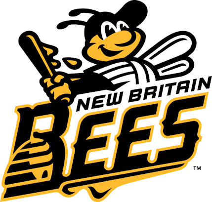
Additional marks are set to be released over the next few weeks.
Skye Design Studios is no stranger to creating brand identity packages for baseball teams, having previously designed logos for the Edenton Steamers (Coastal Plain League), Holyoke Blue Sox (New England Collegiate League), Springfield Sliders (Prospect League), and Wisconsin Woodchucks (Northwoods League).
-
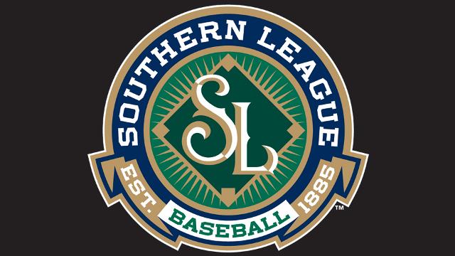
The Southern League has unveiled new logos. They were designed by Todd Radom.
-
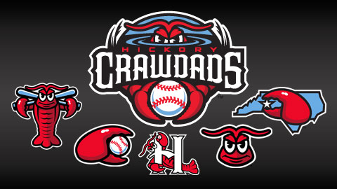
Very nice, but that "H" monogram is a mess. The crawdad obscures the letterform, and it doesn't read clearly as a letter.
The set could lose the H logo because it is kind of confusing to make out at first glance, but I'm guessing they needed something as the cap logo.
"We wanted to update the look of the Crawdads without abandoning our classic logos." - Mark Seaman, General Manager of the Hickory Crawdads


As one can see, the designers at Studio Simon simply followed the instructions given to them by the Crawdads ownership/management team: "update... without abandoning".
The only place where the crawdad in the new cap logo obscures the letterform any more than it did in the old cap logo is where the creature's antenna falls in front of the serif on the 'H', as opposed to behind it. That's the only change - and a slight one, at that - made to the relationship between the crawdad and the 'H'. Otherwise, the only changes made to the letterform are the stylization of the serifs and a slight tweak to the angle at which the crossbar meets the righthand stem.
-
1
-
-
The folks at Studio Simon turned in a typically outstanding job on the update to the Charleston RiverDogs logo package.
-
The NHL seemed to be most interested in courting Seattle.
Which may be why, per the Seattle Times and ProHockeyTalk, Ray Bartoszek was invited to the NHL's offices "for a chat" yesterday. Bartoszek - co-founder and managing general partner of investment firm RLB Holdings - is the man behind efforts to build a privately-financed arena in the Seattle suburb of Tukwila and secure an NHL franchise to play in the facility.
-
At least with "Whirlybirds" you could connect the name to United Technologies, parent company of Sikorsky Aircraft (which makes whirlybirds, aka helicopters).
Whirlybirds would have enjoyed a tenuous connection to Hartford, at best.
Despite United Technologies being headquartered in Hartford, Sikorsky's primary base of operations has always been in Fairfield County, Connecticut. Stratford, Bridgeport, Shelton... all have played host to significant aspects of Sikorsky's Connecticut operations and, by extension, the development of the helicopter. All are located in Fairfield County, which is more aligned with New York City than it is with Hartford.
The bottom line is that Brandiose "screwed the pooch" when it came to generating potential names for Hartford's Double-A baseball team. They were so intent on coming up with something fun, crazy, and outside-the-box different... so caught-up in the idea of creating a logo package that would revolve around images of a unique and/or goofy mascot - a goat, whirlybird, river-hog, praying mantis, or hedgehog - that they sacrificed adopting an identity truly relevant to Hartford.
Frankly, Brandiose has become a victim of their own success. They've become SO known as the guys who are ready, willing, and able to "push the envelope", few clients seem to want anything else from them. While it undoubtedly pays the bills, I can't help but wonder if going to the same aesthetic "well" doesn't get creatively frustrating for them?
-
A press release issued by the New Britain Rock Cats in the wake of the Yard Goats' name unveiling stated:
"A Minor League Baseball player is like that humble Yard Goat. Not a glamorous job but working day in and day out away from the big city lights to assure that the Major League affiliate is kept on track."
Ahhhhhhh... let the painfully-contrived justifications for the ridiculous team name begin!
-
Hartford Yard Goats it is. Was there ever really any doubt?
According to team owner Josh Solomon, the final choice came down to Yard Goats and Whirlybirds. River Hogs finished third, Praying Mantis fourth, and Hedgehogs was fifth.
Consultant Chuck Domino says the logo will be "unveiled in a couple of weeks - a month - down the road."
For the life of me, I can't imagine that it would take an entire month for Brandiose to produce a package of logos that feature a goat with a surly expression wearing a train engineer's blue-and-white-striped cap. After all, the secondary mark depicting said goat following through on a titanic "swinging-from-the-hooves" at-bat likely already exists in their in-house stock-image file. -
The list of possible names for Hartford's Double-A baseball team - currently playing as the New Britain Rock Cats - has been narrowed from 10 candidates to 5.
Hartford Hedgehogs
Hartford Praying Mantis
Hartford River Hogs
Hartford Whirlybirds
Hartford Yard Goats
http://www.courant.com/sports/baseball/hc-hartford-minor-league-team-names-0312-20150311-story.html
-
"I never saw any place before where morality and huckleberries flourished as they do here. The huckleberries are in season, now. They are a new beverage to me. This is my first acquaintance with them, and certainly it is a pleasant one. They are excellent. I had always thought a huckleberry was something like a turnip. On the contrary, they are no larger than buckshot. They are better than buckshot, though, and more digestible."
- Mark Twain, on the occasion of his first visit to Hartford, Connecticut
-
The summer-collegiate Great West League, which is set to launch in 2016, has announced the addition of a team in Portland, Oregon. The team, to be based at an upgraded Walker Stadium in Lents Park on the city's east side, has launched a website featuring the obligatory "Name Your Team" contest. The candidate identities are...
Portland Pickles
Portland Red Dogs
Portland Pliers
Portland Mud Hounds
Portland Pixels
Portland Posse
The contest runs through April 10, 2015.
http://portlandbaseballteam.pointstreaksites.com/view/portlandbaseballteam/home-page-822 -
We should point to "Yard Goats" as the point where Brandiose entered self-parody. The sad thing is I think we've said that about other things. We just have to keep moving the point.
Agreed. The team at Brandiose just seems to keep trumping its own standards of self-parody. It has become increasingly rare for them to be able to generate a simple, striking team identity package. Rather, they either mash-up several different disparate themes into one creatively-strained whole, cram as many images as possible into a logo package chock-a-block with myriad - often tenuously-related - alternate marks, or both.
Their all-too-common reliance on a logo featuring the team mascot involved in a swingin'-from-the-heels at-bat notwithstanding, the Frisco RoughRiders' package of marks that Brandiose recently created was a model of restraint when compared to most of what the design firm has been churning out for several years. One can't help but wonder, was that a result of team ownership/management making it clear that they weren't interested in a typical over-the-top Brandiose treatment?
If so, one wishes that the suits in Hartford had possessed the wherewithal to insist upon the same sort of restraint. Instead, it seems as if Josh Solomon-and-Company were more than happy to allow Jason, Casey, and their wingman consultant Chuck Domino (who signed-off on the purchase of Brandiose identity packages when he was calling the shots for the Lehigh Valley Iron Pigs, Richmond Flying Squirrels, and Reading Fightin' Phils) to lead them by the nose into the world of Yard Goats, Whirlybirds, and Blue Frogs.
-
I feel like Huckleberry Finn imagery would be more suited for a Missouri team than a Connecticut team. I mean, I don't mind a Mark Twain reference, but once you're getting that deep, you're losing the local flair.
I agree. A Huckleberry Finn-themed identity package is clearly the least Hartford-relevant of the Twain-centric ideas I proposed. Personally, I'd opt for a straight-up tip-of-the-hat to Twain himself (Hartford Twains, Hartford Comets, or Hartford Humorists), or a tie-in to Twain's locally-inspired work A Connecticut Yankee in King Arthur's Court (Hartford Hanks... perhaps, Hartford Knights).
All of that said, naming a Hartford-based team the Huckleberries and basing the logos on the plant/fruit leaves me cold. It isn't as if any of the four species of huckleberry that are native to the Eastern United States and Canada hold any particular relevance to the culture of Hartford, or the State of Connecticut as a whole. It wouldn't be the equivalent of branding a Maine-based team with a blueberry-themed identity, or a Mid-Cape Cod-based team with cranberry-themed logos.
-
I agree with the notion that a Mark Twain-themed identity is the direction the team should go in. Twain and his family lived in Hartford for 20 years, the last 17 in the home that's preserved as part of the Mark Twain House & Museum. Many of his greatest works - The Adventures of Tom Sawyer, The Prince and the Pauper, Adventures of Huckleberry Finn, and A Connecticut Yankee in King Arthur's Court - were written while Twain called the city home.
Hartford Comets - Twain was born in November of 1835, shortly after Halley's Comet made its closest passage to Earth of that year. He died in April of 1910, a day after that year's closest passage of Halley's Comet to Earth and 75 years since the comet had last been visible from the planet. I envision a primary logo that depicts Twain sitting atop a streaking comet.
Hartford Hanks - After Hank Morgan, the title character of A Connecticut Yankee in King Arthur's Court. The team's primary logo could depict the time-traveling Morgan outfitted in a chain mail tunic (or, an anachronistic armor breastplate) worn with 19th Century garb (bowler hat, rolled-up shirtsleeves with sleeve-garters, trousers, ankle-boots with spats) and wielding a sword like a baseball bat. A secondary mark could feature Morgan in the same garb, taking part in a joust, albeit while riding a penny-farthing bicycle.
Hartford Hucks - In honor of Huckleberry Finn, immortalized in several Twain works, most notably The Adventures of Tom Sawyer and Adventures of Huckleberry Finn. Logos would depict Huck Finn as we've come to know him: freckle-faced... unruly hair... wide-brimmed straw hat... overalls buttoned over just one shoulder with the cuffs of the legs rolled up to just below the calves of his legs... either barefoot, or in beat-up boots that have seen far better days.
Hartford Humorists or Hartford Twains - Straight-forward tips-of-the-hat to Mark Twain. I could see a logo package for either of these names being similar to that which Brandiose recently designed for the Frisco RoughRiders. In other words, where the new RoughRiders' marks depict the archetypical Teddy Roosevelt of the 1st United States Volunteer Cavalry era, logos connected to either the Humorists or Twains name would depict Mark Twain in all of his leonine-haired, mustachioed, white-suited glory.
-
So, apparently, the ten finalist identities in the "Name the Team" contest being conducted by the soon-to-relocate New Britain Rock Cats are...
Hartford Blue Frogs
Hartford Choppers
Hartford HedgehogsHartford Honey Badgers
Hartford Hound Dogs
Hartford Praying Mantis (or, Praying Mantises)
Hartford River Hogs
Hartford Screech OwlsHartford Whirly Birds
Hartford Yard Goats
Why can't I shake the feeling that Brandiose is landing this gig? Hell, why do I suspect that Casey and Jason are already acting as branding consultants and helped shape the list of finalists? -
Rhode Island Red Sox is just begging for a Rhode Island Red chicken logo/mascot.
I sincerely hope not. I'm of the mind that a Rhode Island Red-based identity package should be reserved for an ice hockey team in the state. Preferably, a rebranded Providence Bruins AHL franchise. Ice hockey is the sport that the Reds name - and, by extension, Rhode Island Red imagery - has been most identified with over the years. That tradition should be preserved.
-
1
-
-
Rhode Island attorney James J. Skeffington - a principal in the team's new ownership group - is on record as saying:
"Our sense is that if the state wants us here, it should be Rhode Island Red Sox. We're all Rhode Islanders. Whether you live in Pawtucket or you live in Westerly or you live in East Providence or you live in Central Falls, we're all Rhode Islanders. This is Rhode Island's team."

Minor/Independent/Collegiate League Baseball Logo/Uniform Changes
in Sports Logo News
Posted
Sadly, the identity change in New Orleans comes after the city's NBA franchise has adopted the traditional minor-pro baseball sobriquet Pelicans.